You may have already seen a few San Francisco Pen Show recaps, wrap-ups, posts, or photos. So many people have covered the show from many different angles, but I wanted to show San Francisco from a slightly different viewpoint.
I’ve been working with the Dromgooles at shows this summer, setting up a rack with only ink (a LOT of it). This allows Michael and Larry Dromgoole to sell pens while I get to do one of my favorite things – talk about ink all day. It does give pen shows a different twist. I’m not able to wander around or shop during the show, I have to purchase items before the morning start or after we have closed for the day. It is, however, a great way to limit spending!
My pen show weekend started mid-Thursday. I flew into the San Francisco airport and posted briefly on Slack to see if anyone else was at the airport and looking to share a ride. Before long, this crazy sign was spotted!

I made sure to thank my driver. With coffee.

Kimberly was running between the airport and the pen show hotel. She was able to squeeze me into her very complex schedule, plus I got to see a friend first thing!

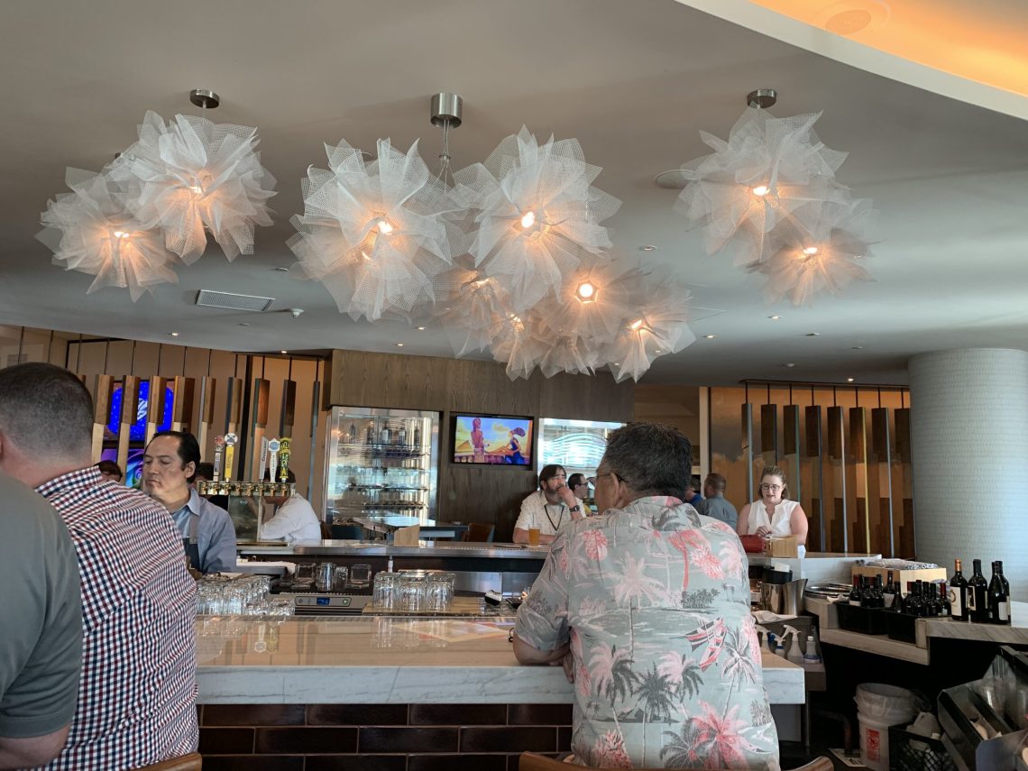
I checked into my room but I was called into the bar before I could put my suitcases away. More friends, with a cold beer waiting for me.

I’m never sure what color Jonathan Brooke’s hair will be at a show.

I haven’t been staying up late at pen shows this summer. With active kids at home, this is my chance to get more sleep.
7 am Friday I am setting up the ink shelves. So much ink.

At first, the show is quiet. A few early risers trickle in and I never have the correct inks out yet. But everyone is understanding and comes back an hour later. My current ink shelf setup takes 2-2.5 hours to get organized.

The show picks up speed quickly. By 10 am the show feels like it is full-swing, but it is only getting started.

People are everywhere. For the entire day, there are at least two customers looking for ink at the same time but typically four or five.

I fit in a few quick chats with other vendors. This is Sean from Pilot.

The first day passed in a blur. Suddenly I find myself in the bar again.
The Dromgoole’s group heads off campus to a swanky restaurant nearby. Parking seems to be an acquired skill in California!


A brief sleep and Saturday is overwhelming. There are so many people everywhere! The main ballroom is hot and stuffy, especially when you have the sun shining on your table all day. But it makes sparkly inks gorgeous.
I found my friend Greg roaming through the show with this sign – oddly he wasn’t actually buying pens. Every pen show brings a different mix of friends that I can only see at that show and Greg is one of them. The last time I was able to attend the SF show was 2019!

Other friends (like Kenro Cary) are at most pen shows throughout the year, but they are always a welcome sight as well.

On Sunday I was thrilled to see Kaoru at the Bungubox table along with her new husband! I snuck away from the ink table for a few minutes to make a quick purchase and steal a picture.

Before I know it, the pen show is done! The ink is packed up and on its way back to Houston with Larry Dromgoole. Just showing up at the bar, I find plenty of friends, pens, and paper. The food was excellent as well.

I love the shirt Angela wears to shows (inkyconverters).

I met the true love of my life at this show: Broccoli. She is the sweetest little puppy!

Unfortunately, my camera didn’t like the lighting at the bar. I took plenty of blurry photos, but I’m happy to have them. I’ve learned to appreciate every minute I get to see friends.

Even if they are goofy.

The big tables in the bar were all filled with pen people. The common themes wereexhaustion, laughter, and drinks.

And Leigh being mischievous.

Kimberly and Marty usually sell Retro 51 pens at shows but mixed it up in San Francisco with Rickshaw.

Franz and Daryl were spotted giggling at stupid text messages nearby.

And over in a corner, I spied someone trying to work on a post.

Angela nearly fell over trying to get photos of the group. Boxes in the background are a common site at the end of a show – I think I’ve seen the box at the bottom at half a dozen shows now.

I once again hitched a ride on the Pen Show Uber with Joe Crace and Jonathan Brooks. I’m not actually that much shorter – there was just no other space on the curb.

Safely on the plane, I watched checked luggage being handled with the utmost care.

This is why I hate checking bags.

Time to say goodbye to another San Francisco Pen Show. It is an amazing show with lots of work going on behind the scenes – thank you to everyone who made it such a success! My fingers are crossed that it won’t be another three years before I return – hopefully there are no more pandemics keeping us away!


