A Mess of Kawecos: Introducing the Blue Iguana to the Collection

I’m not even going to call this a review because I’m not sure what differentiates all the Kaweco AL Sports I seem to have in my collection as truly separate writing instruments. Remember when I shared my new Kaweco x Hello Kitty in Opal Green I mentioned staying tuned? Well a limited edition Blue Iguana ($92,Jet Pens) joined the collection late last week.

I’m not precisely sure why I find these to be my Kryptonite. I do love the weight of the metal versions in my hand (as opposed to the regular sports which are lovely as well). I love the metallic shine on the barrel and the rich array of colors they come in. The AL Sports start at around $75 for regular editions, which doesn’t put it out of range for me to have multiples. Of course the special editions are a different story, but yeah.

One of the interesting things I’ve done is to purchase different nibs over time. The Blue Iguana is an Extra Fine nib which is just a little on the small side for me, but isn’t too scratchy. The special Hello Kitty editions were only offered in Fine nibs. Somewhere on walkabout is a Vibrant Violet that is a Medium nib. I’m going to have to investigate that one. And the Deep Red is a Broad nib. So I do get to enjoy the pens in an array of sizes. I guess the next one has to be a double Broad?

Kawecos come standard with cartridges, but there is a converter if you so choose. I’ve purchased two, and use them now, but I figure I’ll finish up cartridges and then refill with a syringe in the future. Clearly I’ve gone with “signature” inks in my Hello Kitty Kawecos because I love matching a slightly darker ink with the pastel body. I’m not sure what I’ll do for the others – Blue Iguana makes me want to find my best orange ink!

I love these pens for their aesthetic but also because they write nicely and, even more importantly, reliably! Even if I don’t write with them for a week or two, they’re ready to go when I pick them back up. I’ve taken them on travels and had zero trouble with them. They’re the perfect pocket pen, purse pen, journaling pen, and more. And due to the faceted cap, they don’t roll away from me!

Have you tried Kawecos? What do you think?

Inktober Starts Saturday!

Inktober Starts Saturday!

I can’t believe it’s almost October. And I realized that the start of October means Inktober is here again!

Inktober 2022 prompts

If this is the first time you have heard the term Inktober, here’s a quick overview:

Inktober is an annual drawing challenge that was started many years ago by an artist named Jake Parker. The point of the challenge, for him, was to force himself to ink his drawings, which he felt made them feel more finished. Pencil sketches felt like more preliminary, rough drawings where inked drawings felt like committing an idea to paper and seeing it all the way through.

The rules, as Jake created it are:

  1.  Make a drawing in ink (you can do a pencil under-drawing if you want).
  2.  Post it*
  3.  Hashtag it with #inktober and #inktober2022
  4.  Repeat

Since the original inception, Inktober has taken many forms and mutations. Each year, Jake publishes his list of work prompts. Many other groups and people create their own list of prompts. YOU can create your own list of prompts.

(*For the full details, check out the rules and prompts)

Now about those rules….

I create my own set of prompts each year for topics/ideas I want to draw and make a list. This is YOUR challenge and you want to create a project that is actually going to be inspiring for you and achievable.

In the past, I’ve done these by making an ABC list for a topic: office supplies, my favorite things, or knitting terms (A is for Alpaca, etc). You can make any kind of list you want. Flowers of North America, All the Dogs in my Neighborhood, Famous Authors, etc. Your prompts don’t have to be October, Halloween or spooky-themed if that’s not your bag.

You can also use the provided prompts and keep the ones that inspire you and swap out others for something that you might prefer to draw. Bouquet sounds fun… booger? Not so much.

I remember someone making a list of fairytales she wanted to illustrate and chose a scene from the stories for each day in October. The goal is to know, at the start of the month, what you plan on drawing for each day so you spend your time drawing not thinking about what to draw.

Inktober 2019 - Hot Sauce
For this image in my “favorites series” I knew I would draw all the hot sauces in my refrigerator. All I needed to do was pull them out and put them on the kitchen table to start drawing that day.

Knowing what you want to draw can also help if you need to find a reference image. Say you want to draw your version of the Alice in Wonderland caterpillar sitting on the mushroom. Rather than searching the internet for the original drawing done for the book, search for an image of a caterpillar, a mushroom, etc. Then either bookmark the images so you have your reference or print them out. They don’t have to printed in color or on a nice copier, you just need the shape and a rough idea of what they look like to compose them into your drawing.

Any pre-plan work you can do will make doing your drawings frictionless. You look at your list, grab your reference pics and start drawing. You don’t spend 45 minutes looking for a picture or coming up with an idea before you get to the drawing part.

The online creative video learning site CreativeBug has many 31 day sketchbook challenges that will walk you through prompts and drawings including 31 Things to Draw with Lisa Congdon. There are many other Daily Drawing/Creative classes available on the site in the Art & Design Daily Practice section. The site is a paid subscription service but many local libraries have free subscriptions available. Check with your library web site to see if they offer CreativeBug as part of their services. Kansas City does!

About those rules… Part 2:

Yes, the original idea of Inktober was to get artists and illustrators inspired to push their drawings along but as the challenge has expanded to inspire first-time creators to try, the part about “post your drawing” can make a lot of people panic. Guess what? It’s your challenge. If you don’t feel comfortable posting your drawings, don’t. The purpose of this project is to draw for 31 days (or 30 days or 26 days or whatever…).  You are making a commitment to yourself and your own creative journey. Social media is for accolades and showing off. If you make one drawing all month that you want to hang on the world wide refrigerator door, great! If you make 3 or 4, super. If you feel awkward and uncomfortable showing people the crooked lines you drew trying to draw the barrel of a pencil or pen (see below), then don’t post them. Let the fact that you actually tried be your bragging. And then keep drawing until you do want to show one off. It will happen, I promise.

Inktober 2019 - Art Supplies
From my “ABCs of Office Supplies” series

Tools

All you need is a notebook and a pen. Maybe a pencil and eraser too for your under drawing.

I like to SERIOUSLY limit my tools when doing Inktober. I choose which pen will be my Inktober pen and which notebook. I will put my prompt list, taped, into the front of my book so I don’t have to scramble to find it. The minute you fire up your phone to look for the prompt list, time can be lost to reading that email or text and then, next thing you know, the time you’ve set aside for Inktober has been usurped by the internet.

From my first first or second Inktober challenge, I used only pencil for under sketch, Platinum Carbon Desk Pen and a waterbrush with grey ink for washes.

At the beginning of each Inktober, I pack a small case with the tools I’m going to use. After doing the challenge about four times now, I have my “kit” pretty locked down. I use:

  • light colored erasable pencil (usually non-repro blue)
  • an eraser
  • Platinum Carbon Desk Pen with Platinum Carbon Black ink
  • Small set of watercolors
  • Small #6 or smaller round brush or water pen
  • collapsible cup for water (but anything will work or I use the waterbrush)
  • a rag for wiping my brush

That’s it. In the past, I’ve tried a small, limited palette of alcohol markers and one year I used one waterbrush filled with grey/black ink for washes. Choose tools that work for you and just use those for the whole month. Part of the challenge is to get to know your tools and what they can and cannot do.

Be sure to test your chosen tools before you start Inktober to be sure they work together on the paper you have selected. Pick a couple pages in the back of your sketchbook for testing, color combos or tool combos so that you have a safe place to see if the brush pen and markers work together or if they bleed into a nasty mess before you start using them on your finished sketch. I once accidentally put plain Platinum Black ink in my Desk Pen and discovered it is not waterproof on my drawing. I had to start all over! Let me be your cautionary tale.

Some artists will actually just cut a square from the back of their sketchbook so they can have it in front of them while they are working to test their tools, make sure they have ink in a pen, etc.

What if I Miss a Day?

Don’t panic. And please don’t throw in the towel. Every year I’ve done the Inktober challenge, I’ve missed a day or two here or there because life happens. Here are some of my methods for catching up:

  • Do two drawings the next day
  • Just skip that day altogether (if you feel like going back to it, do it on November 1)
  • Just do it the next day and your Inktober challenge will bleed into November by a day or two. No big deal.
  • If you know you won’t be able to draw one day, try to do the drawing ahead of schedule. (This is your challenge and the challenge is to JUST KEEP DRAWING.)

Some years, I’ve combined all these techniques to complete my challenge.

Is This Your Year?

I look forward to seeing or hearing from anyone who decides to tackle the Inktober challenge this year. What theme or prompts will you be doing? Have you gotten all your supplies picked out and ready to go? What is keeping you from trying it?

The Desk is on Vacation This Week!

Which Way to the Pen Show?

This week, The Desk is taking a little holiday to attend the Dallas Pen Show. If you are in the Dallas area, please come by the Dromgoole’s tables and say hello to Jesi and I. We will be your hostesses at the Dromgoole’s Ink Bar. The irony that we will be spending the whole weekend at “the bar” is not lost on us.

Come by. Say hello! Buy some ink!

We will back here in our digital home next week with Pen Show recaps, ink reviews and more.

First Look: Kaweco X Hello Kitty AL Sport Part Deux

If you’re getting a sense of deja vu, let me reassure you this has happened before. But last week I found out about the NEW Kaweco x Hello Kitty Opal Green limited edition. Available in Gold or Silver this is another Taiwan exclusive edition. Like last year’s Pink edition, barrel is marked with both Kaweco and Sanrio’s Hello Kitty, and the nib features Hello Kitty’s face. Last time I went for gold, but with the opal green I preferred silver. Now the only question is what ink shall I fill it with?

PS Yes I know I have a little Kaweco problem. More about that in another week or two….

Ink Review: Ferris Wheel Press FerriTales

Ink Review: Ferris Wheel Press FerriTales

Alice in Wonderland-themed inks have been popping up lately, one of them being the Ferris Wheel Press ink line FerriTales. This ink line consists of three inks that are very saturated and have a touch of sparkle (Green with Curiosity, Red Ruby Flush, and Tumbling Time Blue) and three inks that are highly shading, multi-chromatic, and sparkling with rose gold shimmer. This latter group is what I’m reviewing here today.

First, take a look at these boxes! In San Fransisco, I was stationed at a table near a window with direct sunlight shining through for part of the day. I had to move the FerriTale inks out of the sunlight to keep the reflections from blinding anyone!

The FerriTale inks are on the expensive side – 20mL bottles for $21. The bottles are adorable – a miniature version of Ferris Wheel Press’ large 85mL bottles. The bottle lid is heavy – solid metal rather than plastic.

Today I’m covering Adventurtine, Blue Beryl Tonic, and Blushing Mushroom.

First, Blushing Mushroom. The base ink color is a slightly under-saturated dusty purple with medium shading and rose gold sparkle. In keeping with most Ferris Wheel Press sparkle inks, the shimmer is fine enough that it doesn’t easily clog a pen. I had a bit of a tough time finding a second matching ink – Pen BBS #404 is close but Blushing Mushroom is darker.

On Midori MD Light paper, Blushing Mushroom is a bit lighter and it shades even more. I love how many layers this ink can show in a single swatch.

The second paper in my tests is Tomoe River paper Tomogawa #7. This is the “old” Tomoe River paper and you may see it labeled as TR7 as the paper types become more differentiated. I’ll review the newest Sanzen Tomoe River paper in a future review.

In the meantime, Blushing Mushroom ink on Tomoe River paper. The shimmer was a bit out of control here! I’ve found that shimmer and Tomoe River paper don’t agree with one another as well as other paper types. I don’t mind shimmer all over my page, but it may be something to keep in mind!

Finally, Cosmo Air Light paper. Blushing Mushroom shows a greater amount of blue on CAL and the edges are crisper – the shading isn’t as dramatic as the two previous papers in my review, but it is still present. I love how easy it is to read the lettering I did on through the swatched ink. The color isn’t greatly different, but the letters still stand out nicely.

When I first saw the three inks I am reviewing here, I thought Adventurtine was the least exciting, but it became my favorite of the three once I swatched them. It is a light grey with undertones of pink and blue plus rose gold shimmer. With a dip nib, the ink resembles graphite, while wider nibs shade beautifully.


On Midori MD Light paper, the pink undertones show clearly and the ink swatch is haloed in a dusty blue. I was pleasantly surprised at how well the shimmer showed up on this paper.

Adventurine on Tomoe River paper (TR7) is fairly unsaturated in the swatch but shows up well in writing. TR7 gives the ink a watercolor character to the swatch.

Cosmo Air Light paper brings out more of the blue undertones in Adventurine while the pink nearly disappears. The first layer of the ink looks like a watercolor wash, but the writing is easily legible – it also looks less like graphite.

Blue Beryl Tonic also shades well, with several shades of sapphire blue and grey and pink undertones and rose gold shimmer. It reminds me of Troublemaker’s Milky Ocean ink in the swatch, but in writing, Blue Beryl Tonic is closer to grey.

Midori MD Light paper shows the layering Blue Beryl Tonic can lay down. This ink can get fairly dark around the heavier areas in the swatch and haloing is dramatic.

On Tomoe River Paper, Tomogawa #7, the sparkle in Blue Beryl again gets carried away. The tone is bluer and stands out well from the page in writing.

On Cosmo Air Light paper, the ink is again even bluer. The lettering below the swatch almost pops off of the page but the shading is scaled back.

I’ve been enjoying all three of these inks since I first received them. It took a while to obtain all three since they have been selling out at several retail stores each time a shipment is received! While the FerriTale inks are quite pricy ($1.05 per mL), I do think it is worth picking up one or two of the colors. The shimmer particles are small enough that the ink flows smoothly in medium nibs or wider, all colors are clearly legible, and the bottles are adorable. Which one of the three is your favorite?


DISCLAIMER: The Blue Beryl Tonic included in this review was provided free of charge by Ferris Wheel Press for the purpose of review. The other items in the review were purchased by myself. Please see the About page for more details

Link Love: Pen Show Updates

Link Love: Pen Show Updates

I received a couple emails this week with updates to dates for pen shows through the end of the calendar year. Check out our Pen Show Schedule for more details. We have not updated the 2023 schedule yet but will try to get dates nailed down for 2023 in the coming weeks.
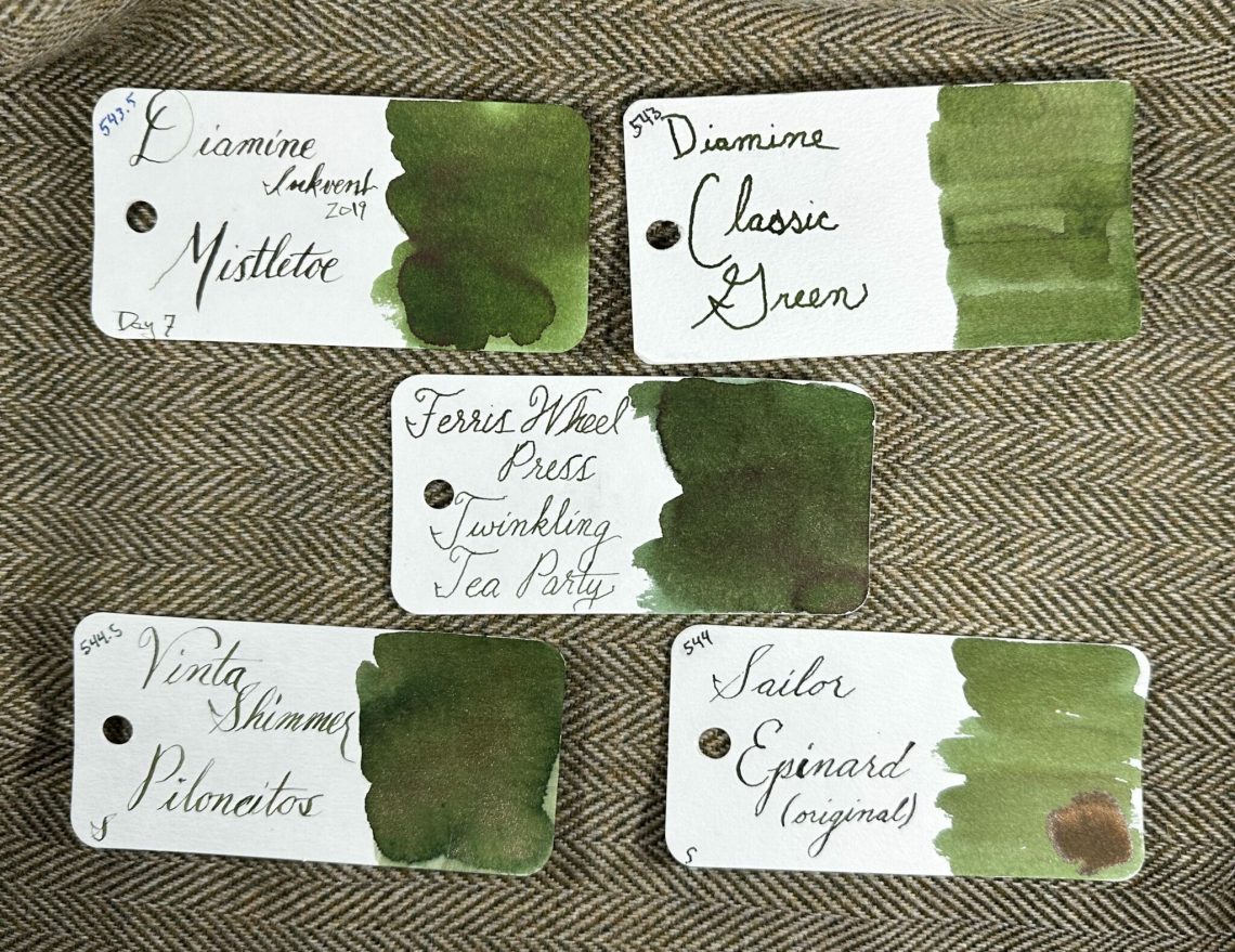
In other Pen Show News, Jesi and I will be at the Dallas Pen Show next weekend helping out at the Dromgoole’s tables. Jesi will continue her reign as Ink Queen and I will be her lackey. Or maybe the Dromgooles will just make me do coffee runs? Either way, you know where to find us both if you’re in the Dallas area for the weekend of Sept 22-23. Yep, you guessed it! At the bar! No seriously, we will be at the Dromgoole’s Ink Bar corner recommending ink, paper and more. Please come say hello!

Pens:

Ink:

Notebooks Planners, & Paper:

Art & Creativity:

Other Interesting Things:


We need each other. Please support our sponsors, affiliates or join our Patreon. Your patronage supports this site. Without them, and without you, we could not continue to do what we do. Thank you!

Product Review: Ryan McGinness 2023 Calendar To-Do List Pad

Product Review: Ryan McGinness 2023 Calendar To-Do List Pad

I confess that when I was contacted to review the 2023 Calendar To-Do List by Ryan McGinness ($40 available on Amazon),  I squeed just a little bit. Over the years, I’ve accumulated several of McGinness’ art and design books (the most well-known is FLATNESSISGOD).  I did my best to play it cool in our email correspondence, though I suppose now, the cat is out of the bag.

The 2023 Calendar To-Do List Pad was flawlessly packaged in a custom shipping box. The actual calendar came is a black, linen-finish box with silver foil stamping. You all know how I feel about excessive packaging but stay with me because there is a reason for the box so, in this instance, I am 100% okay with it.

Inside the box is a ribbon to make removing the pad easier.

When you lift it up, you can see how chonky this pad is! The pad measures 11.5  x 4.75″ and it’s two inches thick.

Under the cover sheet is details on how to use the box after the pad is removed. It recommends that you save the box and each day, put your completed page back into the box. I recommend putting the pages facedown so at the end of the year, you can flip the whole stack and it will be in order.

Once the year is over, put the lid on the box and store it for posterity. Or have a ritual burning depending on how it all went.

I love that there is a printed, handwritten note inside from the creator explaining that he has, for years, made these calendars for friends, family and his studio. He also explains the size was selected because it is exactly half of a letter-sized sheet of paper when cut lengthwise. It’s easy to imagine that, in the early days, he was printing these pages on his office copy machine and trimming them by hand.

Each page features a graphic illustration in a black circle at the top of the page. The overall design of this chonk of paper is excellent. As a design snob, I 100% approve. Good type design, art, layout and attention to detail.

One of the other big plusses for this pad is that Saturday and Sunday are given the same treatment as the workdays. Because not everyone rests on the weekend.

Did I mention the 2.5mm gird because YES! I love it.

Testing the Paper:

I confess that I entered into testing this paper with a bit of trepidation. The paper felt very lightweight and, like most people outside the fountain pen community, the design and “functionality” of a paper good tends to outweigh the paper performance particularly when compared with how incredible picky “pen people” can be in comparison.

But once I started testing gel, rollerball and ballpoint pens, I realized I had no issues.  Should I try a fountain pen? Will it make me sad?

Nope. No sadness. Fountain pen ink performed just fine. I didn’t drown it in ink but with the teeny tiny 2.5mm grid, some small stubs, fine and extra fine nibs and an italic, it passed with flying colors.

Even the view from the back… some show through but since these pages were designed to be used front side dominantly, I don’t think that’s a big deal. Of course, if you want live dangerously, you could throw Sharpie or paint pen on there but I recommend peeling the daily page from the stack so it doesn’t bleed through to the next page.

Final Impressions:

I already have a pretty specific planning set-up but I think this Calendar To-Do List pad will make a great addition. I plan on using it for a sketch-a-day, a quote-a-day, or other sorts of daily tracking that could be separate from my work/hustle/work planner.

This is a beautifully designed, field-tested day-on-a-page calendar to-do list that I would be proud to keep on my desk.


DISCLAIMER: The items included in this review were provided free of charge by Ryan McGinness for the purpose of review.

This review also includes affiliate links. The Well-Appointed Desk is a participant in the Amazon Services LLC Associates Program, an affiliate advertising program designed to provide a means for sites to earn advertising fees by advertising and linking to Amazon. Please see the About page for more details.