It is now mid-November which means two fundamental things:
I will forget that I need to take pictures early in the day, meaning they’ll now be badly (or artificially lit). You’d think after 44 years on earth I’d remember that fact, but every year I repeat the mistake.
November is NaKniSweMo. For a little history you can read more in this post from last year, but this means Ana and I are furiously knitting new sweaters in the month of November.
Since it’s already November 15, my knitting is actually starting to look sweater like. This year I opted for a somewhat simple striped pullover. I bought the yarn, a gorgeous blend of merino, cashmere and nylon, on my travels earlier this year (The Yarn Club in Virginia Beach if you’re ever in the neighborhood) and I’m on track to finish. Which means I can now stare at my project dreamily as I knit, loving that indescribable magenta/purple (called Sexytimes) and that fun speckled yarn (called Sugar Magnolia) and bask in the color.
So in my few hundred ink samples, I’d have to have a few that matched right? Well…. not exactly. It turns out this is a very specific shade of pink, and I don’t quite have anything that matches it.
My Colorverse inks (Purple Cosmo from Dromgoole’s and #09 Opportunity) seem to be some of the best matches in terms of intensity and tone. PenBBS #258 and Bungubox L’Amant pick up some of the shading but aren’t quite the right hue. Noodler’s Cactus Fruit Eel was one I thought would be a sure winner (and gritted my teeth because that ink took days and days to dry on the sample card) but it doesn’t match either. And Pilot Iroshizuku Yama Budo and Califolio Andrinople are, if you’ll believe it, too red/pink? What IS a girl to do?
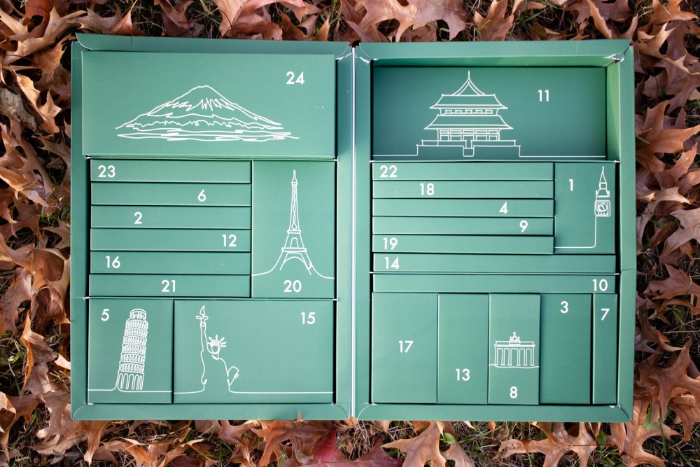
First, I have to honest with you all, I have been a terrible advent calendar buyer. I didn’t open my first Diamine Inkvent calendar until the following July. And last year’s Inkvent calendar? It’s still in the packaging. I feel like I was intimidated by needing to swatch and sample 24 inks in the month of December on top of doing our annual Inkmas posts?
So, this year, I decided to go a different route and I purchased the Cult Pens Japanese Stationery Advent Calendar. Thanks to a great exchange rate, the Advent calendar was only about $85USD plus shipping (or order over $135USD and receive free shipping). Each box inside the Stationery Advent Calendar includes a Japanese stationery product ranging from pens, erasers, markers, etc. It felt a lot lower stakes for me. Like a true treat everyday in December. And in the midst of all the holiday madness, a little treat is just what I think I’ll need.
I’m not going to spoil the surprise for you (or me) by opening any of the boxes ahead of schedule but I will try to remember to post the contents on Instagram as the boxes are opened. But look how cute the interior is?!?!
Each box is numbered and randomly placed in the outer box so I’ll have to hunt around to find the box that corresponds with the date on the calendar. I’ve never wanted to December to get here as much as I do right now!
The December 24th box is larger and I am such a kid that I keep shaking it trying to figure out what’s inside.
Cult Pens also offers an Around The World Stationery Advent Calendar for the same price but it features products from around the globe (EU, UK, etc.). There is still time left to order an Advent calendar for yourself or someone you know. My kit took about two weeks to arrive.
Did you purchase an Advent calendar? If so, which one?
DISCLAIMER: Some items included in this review were purchased with funds from our amazing Patrons. You can help support this blog by joining our Patreon. Please see the About page for more details.
Is it worth it to seek out a vintage Blackwing 602?
I have wanted a vintage Blackwing 602 just to try it out, since before this blog was even a twinkle in my eye. At the same time, I’ve never really wanted to spend $100 for an unsharpened vintage pencil. It just seemed silly. So, a couple weeks ago, a friend who was moving house mentioned that he had a big jar of pencils he inherited from his grandparents. I asked if I could see a pic of the jar and if there were any pencils with “a funny looking eraser cap”? He said “YES!” and I asked if he would bring them over so I could look through them. He said he would, if I was interested in them, we could “make a deal.”
So, I bought a large jar of pencils that included one Eberhard Faber Blackwing 602 that had been sharpened once, one unsharpened Microtomic and a box of colored pencils (Tina got the colored pencils) for $30. And I got to keep the vintage jar. Most of the pencils were good mid-century pencils ranging from standard #2/HB to softer and harder pencils used by artists. There were a lot of classic yellow-and-black Staedtler Noris pencils and some US-made Ticonderogas.
But, of course, the true treasure was a chance to handle and use a real vintage Eberhard-Faber Blackwing 602. I immediately put the pencil to the test next to the modern reproduction Blackwing 602 by Palomino ($27 for a box of 12).
The most notable differences in the exterior of the pencils is the color of the grey paint. The vintage Blackwing 602 is a little bit darker. The feel of the modern Blackwing 602 is smoother, glossier and the hex shape is a bit more rounded off, like the paint is so thick that some of the sharper edges of the hex shape are buried under the paint.
Of course, the vintage eraser is all dried out but I can swap it out with a replacement ($3 per set) from Palomino.
Obviously, the printing on the pencils is different. The “Half the pressure…” text is italicized on the vintage pencil while it’s more upright on the modern 602. The modern 602 is missing the beloved “Woodclinched” text completely. Overall, aesthetically, only the most discerning eye would notice a difference.
But how does it write?
I really wanted to know if I could tell the difference between the writing experience between the two pencils. I wrote with one then the other for at last an hour trying to see if I could notice a difference. And honestly, while I think the lead color is a tiny bit lighter in the vintage Blackwing 602, the difference is honestly negligible. If you prefer a little lighter (harder) graphite color, the Palomino Blackwing Natural which features Extra Firm graphite might be a good alternative. Palomino really did a great job recreating the 602. If you haven’t tried a modern Blackwing, what are you waiting for. Some things are just as good as the “good ol’ days” and the Blacking 602 is one of those things.
Chicken and Tuna — cats immortalized in ink colors by Dominant Industry (via Wonder Pens)
This week is full of delightful tidbits from across the pen community. There is a link to an illustrated Pen Zine, Dominant Industry made custom ink colors for Wonder Pens in colors inspired by the shop cats (of course), Crónicas Estilográficas writes about the Kanji nib for the Japanese Lamy and A Fleeting Ripple lists the pens he would run into a burning building to save. Makes you wonder… which pens would you try to save from imminent destruction?
We need each other. Please support our sponsors, affiliates or join our Patreon. Your patronage supports this site. Without them, and without you, we could not continue to do what we do. Thank you!
Recently Ana presented me with a Sea Foam L12 Erste from Hinze Pen Co (you can find her original review here) and I was presented with a common problem: what color ink am I going to use?
I’m someone who loves all kinds of ink colors, and by virtue of working for The Desk, I come into a lot of ink (free samples, purchases, and more). It’s always exciting to play with new colors, but it also means I have a drawer full of possibilities every time it’s time to fill up.
How do you choose an ink for a pen? Sometimes I like to go matchy-matchy, but sometimes I like to go for a contrast. Do you choose colors based on how it will look or how the pen makes you feel? For instance, in this case I could have gone with a burgundy (my first instinct was Papier Plume Bootlegger’s Sacrament or DeAtramentis Deepwater Obsession but then I looked at the seafoam green resin (with just a hint of shimmer) and wanted something and settled for Taccia Sabimidori – a rusty green that turns blue (almost like indigo oxidizing).
This also brings me to a larger question, how do you pick which ink colors you’d like to own? I have a drawer full of many of the hues in the rainbow (I was tempted to say all the hues, but I know that’s not true!). I do try and only purchase bottles of ink that I like enough to use continually, and don’t overlap too heavily with shades I already own, but at some point I feel like there are diminishing returns in finding something new and different to add to the collection? And let’s not talk about how many years of refills I have stored in that drawer! (In knitting we have an acronym SABLE – stash acquired beyond life expectancy – I feel like it might apply here.)
Anyway, thanks for joining me for some inky musings on a grey November day!
I can’t believe, in over 12 years of blogging about fountain pens, I’ve never reviewed a Platinum Plaisir. Thanks to Gentleman Stationer for sending over this extra special Platinum Plaisir Aura 2022 Special Edition ($41 available in 3 colors). This model of the Plaisir is a little bit fancier than the standard model (approx. $18) but the biggest differences is in the color choices rather than anything specific to the nib options or overall materials.
I received the Merry Pink color of the Plaisir Aura. This model features a white pearlescent barrel and cap color. The grip section is clear so that the user can see the contrasting color feed. As the name suggests, the Merry Pink has a pink feed. The Plaisir is available in Fine (03) and Medium (04) which are the same nib sizes available for the standard Plaisir models.
The Plaisir, like many of the other fountain pens in the lower end of the Platinum line, the pen opens and closes with a snap cap and features the “slip and seal” cap which keeps the ink from drying out in the pen. I love having snap cap pens in my office since most writing done during the day is short notes, meeting notes and lists and being able to quickly remove and replace the cap makes my life a little easier while still getting to use a fountain pen.
The only aesthetic issue I have with the pen is the bright silver-colored cap band. The engraved details make the cap band feel fussy when compared with how clean and modern the pen feels overall. Honestly, its the cap band that has probably kept me from purchasing the Plaisir in the past.
The Plaisir ships with a blue ink cartridge but if you want to use a converter, it will have to be purchased separately.
Comparison:
The most similar pen to the Plaisir is the Pilot Metropolitan (approx. $19.50). Both pens are roughly the same and feature an aluminum body. Both have rounded ends like a cigar shape though the Plaisir is a bit rounder.
The Pilot Mertropolitan is a little slimmer and just a little bit shorter.
However, the Metropolitan is heavier than the Plaisir. The Plaisir weighs 17gms capped or posted while the Metropolitan weighs 26gms. Uncapped, the Plaisir weighs 10gms and the Metropolitan weighs 16gms. The difference in weight is minimal but it’s interesting to note that there is a difference.
Both pens can be posted and are being about the same length posted as they are uncapped or capped.
The nib on the Plaisir is the same nib used in the Procyon, Prefounte and Preppy. They can be interchanged among each pen should you want to swap them out. Similarly, the Pilot Metropolitan nib can be swapped out with the Penmanship, Prera, Cavalier and Kakuno (I feel like the last two should be the Pavalier and Pakuno — just to keep with the predominance of Ps in the pen names). You can see why I immediately made a comparison between these pens.
With these lower priced fountain pens, the converters cost almost as much as the pen. The Pilot CON-40 ($7.25) and the Platinum Converter ($11) are both surprisingly pricey. But, the converters can be swapped across all the pens in the brand’s catalogue so you don’t need to have one for each pen if you don’t want to spend a lot of money on converters. With the fine nibs, the cartridges will last quite awhile so you don’t need one right away.
Writing Sample:
When writing with the Plaisir, the nib is smooth and has a little bit of bounce. When compared with the Metropolitan (also a Fine nib) they are quite similar but the Pilot Metropolitan Fine is a little finer and as a result has a bit more feedback.
Overall, the Plaisir Aura is a lovely pen (cap band is being ignored because the white iridescent and bright feed colors are cool). Would I recommend paying $41 for a Plaisir Aura? Sure, why not. We are the same people who pay $20 for a Metropolitan when we could get a similar nib for $10 in the Kakuno or Penmanship. It’s all about aesthetics and FOMO. I think the Plaisir Aura is a nice opportunity to get a cool looking pen for under $50. Platinum makes good pens and their converters, while pricey, are some of the best in the business.
DISCLAIMER: The items included in this review were provided free of charge by Gentleman Stationer for the purpose of review. Please see the About page for more details.