Inkmas Day 5: Colorverse From Cali

Inkmas Day 5: Colorverse From Cali

One of the first ink colors I chased when I started collecting fountain pens was dusky purples. At the time, there were no multichromatic inks or the array of shading and shimmer inks that are available today. It’s a good time to be a fountain pen ink connoisseur.

Colorverse From Cali ($12.50 for a 15ml bottle) is a light, dusty lavender on the cool side of the spectrum. It shades like crazy and is too light for an EF nib but if you like rockin’ a stub nib or a big juicy BB nib, this ink will help to brighten your cold, wintry days like a hothouse orchid. The powdery quality of From Cali reminds me of a flower petal.

When compared with many of the other powdery lavender inks in my collection, there is a clear division between the warm colors (like Troublemaker Foxglove, Kobe #57 and Ferris Wheel Little Robinia) and the cooler lavenders like Vinta Tabaum (Engima Blanks Exclusive), Papier Plume Violet, and Sailor Fuki-Musume. Tabuam and Papier PLume Violet are much more violet and Fuji-Musume is much more saturated so From Cali really does sit in a unique place being a more pastel lavender while still remaining a cooler color.

Tools:


DISCLAIMER: The items included in this review were provided free of charge by Vanness Pen Shop for the purpose of review. Please see the About page for more details.

Link Love: Countdown to the Holidays

Link Love: Countdown to the Holidays

Is anyone else thrown off by Christmas falling over a weekend this year? I feel incredibly ill-prepared. Maybe it’s two years of pandemic or a new job or four new cats in my life but I am just having a hard time believing that Christmas is only two weeks away. Any tips for getting the holiday spirit in a hot minute?

Pens:

Ink:

Pencils:

Notebooks & Paper:

Art & Creativity:

Other Interesting Things:

We need each other. Please support our sponsors, affiliates or join our Patreon. Your patronage supports this site. Without them, and without you, we could not continue to do what we do. Thank you!

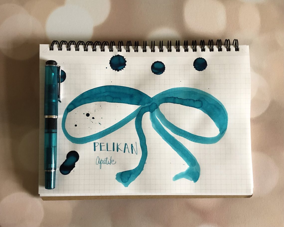
Inkmas Day 4: Pelikan Edelstein Apatite

Just last week I reviewed my new Pelikan M205 Apatite, so of course I had to check out the matching ink. As you know, each year I audition inks for addressing my holiday cards. My family and my husband’s family celebrate different religions, so the challenge is always to find something that’s festive and fun, but not too tied to any particular holiday. This year I wondered if Apatite was the answer?

Apatite is a turquoise blue, which leans towards blue-green, as does the gemstone apatite. This is one of my favorite colors, so it stands to reason that I have TONS of shades very similar to it in my inky stash. I immediately thought it was a good match for Sheaffer Green, and in certain lights it is. To be honest, I think the photo below is a bit skewed (my camera can’t do blues sometimes!) because I think Apatite leans more green, but in the photo it looks super close to Robert Oster Torquay.

I think I’m going to give it a go this year!


Inkmas Day 3: Colorverse Kingdom Series Taepyeong Seongdae

Inkmas Day 3: Colorverse Kingdom Series Taepyeong Seongdae

I think ink names are getting a little long. Today’s ink is Colorverse Kingdom Project Series 019 – Taepyeong Seongdae ($13.50 for a 30ml bottle). The color is a tribute to Korean history though I know little else about the specifics of this ink and the association of the color to Korean history.

What I can tell you is that it is another in a long line of inks I’ve purchased in an attempt to find my signature yellow-green ink. Jesi will often hand me ink samples and ask, “What about this one?” and I have to be very specific “too yellow”, “too bright”, “too muddy” or “too light”, for example.

Taepyeong Seongdae is a close contender as  the ink is a darker yellow-green without edging into a pine or forest green (too blue) hue. In a wider nib, Taepyeong Seongdae is a bit darker than I would like but in a fine or extra fine nib the color does not become too light to be useable. It has real potential though its a hair muddier than I would hope for. Overall it meets many of my ridiculously specific requests for a yellow-green ink.

It shades a good deal but does not show any sheening.

The closest ink color in my collection was the similarly named Kingdom Note Olive.Penlux Pine and Sailor Rikyu-Cha both lean a bit more brownish but are closer than the dozens of other yellow-green inks in my collection which tend to go more grassy or lime in color.

I’d say its a tie between Taepyeong Seongdae and Kingdom Note Olive. I reall ythink I need to make my own yellow-green ink at some point but I think I’m the only one who would want it.

Tools:


DISCLAIMER:  Some items in this review were purchased with funds from our amazing Patrons. You can help support this blog by joining our Patreon. Please see the About page for more details.

Inkmas Day 2: Vanness Exclusive Cranberry Sauce

Inkmas Day 2: Vanness Exclusive Cranberry Sauce

Vanness Pen Shop has become more than just a pen shop in the last few years. Lisa, queen of indie inks, is now actively creating her own inks. Just in time for the holidays, Vanness has released two holiday-themed inks: Sweet Tater Pie (review coming later in Inkmas) and Cranberry Sauce (14.75 for a 30ml bottle). I am one of those weirdos whose favors cranberry sauce over almost everything else on my holiday plate. I love the sweet, tangy contrast to the rich savory cornbread stuffing and creamy mashed potatoes. Of course, I would want to review Cranberry Sauce first.

The color is solidly richly cranberry reddish pink with a red wine undertone. While the ink does not appear to sheen, it is a good shader showing a range of tones from red wine to pinky, saucy cranberry jelly.

Surprisingly, I was able to find many similar colors in my ink collection but many are discontinued or pricey. Colorverse Conjecture was part of the Johannes Kelper set, Birmingham Pen Company’s Gerbera Pink is from their previous ink-carnation, Montblans’ Antoine de Saint-Exupery is, well, a limited edition Montblanc ink. Oster Dusty Pink is a bit more purple-y and Ferris Wheel Press Royal Rhubarb is a little more brick reddish. So, if you’re looking for a sweet, tangy cranberry color, Vanness Cranberry Sauce will have you craving seconds.

Tools:


DISCLAIMER: The items included in this review were provided free of charge by Vanness Pen Shop for the purpose of review. Please see the About page for more details.

On the first day of Inkmas…

This is my first post as a traveling reporter! I’m spending the weekend down in Houston, TX at the Dromgoole’s store and have had the worst time choosing an ink to feature today. Sitting in the midst of hundreds of inks, I find it very hard to focus on any single color. So I’ve chosen an all-time favorite of mine, Robert Oster Las Vegas.

I inked up the best TWSBI on the market – the glow-in-the-dark purple Eco pen – with Robert Oster Las Vegas as soon as the pen arrived. The two are the perfect combination. TWSBI Eco pens feature a transparent body so sparkle inks are even more fun – almost as good as a lava lamp.

I was very surprised when I first swatched Las Vegas – most purple inks are too blue, too pink, so dark that they look black, or so light they aren’t legible.

The sparkle is what makes Las Vegas so amazing, however. It’s hard to tell if the glitter is silver or purple with this ink, but it is perfect. The sparkle is fine enough to flow easily through a feed and it shows well while writing.

The above and below photos are on Cosmo Air Light paper, so the blue undertones are more obvious. Below is a different light angle to show the sparkle.

Tomoe River paper (TR7) shows a redder ink, but surprisingly darker. Typically, ink looks slightly lighter on TR paper than Cosmo Air Light paper.

The photo below is again on Tomoe River paper, angled so you can see the shimmer.

As I said before, most purple inks are too light or too dark. I knew Las Vegas was special when I wrote on wheat straw paper and the shade was still fabulous.

The shimmer shows up very well on this wheat straw booklet.

As the first post of the Inkmas season, I hope you love this quick look at Robert Oster Las Vegas! It doesn’t look too Christmassy, but it is absolutely great for any celebration.

Link Love: Inkmas is coming!

Link Love: Inkmas is coming!

Starting tomorrow, the staff here at WAD will start our annual inky tradition of an ink review a day until Christmas day. We want to share with you some of our favorite inks, whether they are just released or old favorites. So, don’t forget to check back in everyday for the next 12 days to experience our weird and inky holiday tradition. You can also use our Inkmas tag to check out previous Inkmas posts. There’s no better time to make a list of your must-have inks!

Pens:

Ink:

Pencils:

Notebooks & Paper:

Art & Creativity:

Other Interesting Things: