

type love by samlovesherdog on Flickr.
Lovely watercolor typewriter portrait shows the world you love letters of all kinds.
type love by samlovesherdog on Flickr.
Lovely watercolor typewriter portrait shows the world you love letters of all kinds.

I found a great round-up of luxurious home office spaces at Belle Maison like this jewel, in stark black and white with oh-so-much Hollywood noir glamour.
(via belle maison)

I have been wanting to try a Lamy pen without the plastic grip guides for “proper holding” for sometime. All of the low-end Lamys (Safari, Al-Star, Joy, Vista and ABC) feature this grip which helps a lot of people but as a left-hander who overwrites, it is a pain to use. So, I decided to take a chance with the Lamy Studio line which features a smooth cylinder grip and some very classic modern looks.
Let me say right off, I was not disappointed in the look of this pen at all. Because its brushed stainless steel, its weightier than the Al-Star I’ve owned and it looks much more refined and elegant than other Lamys I’ve seen.

The cap clicks on and off with an audible click and the cap can be posted on the end with the same audible click. I found the pen a bit too heavy with the cap posted but its good to know it can be posted with no issues. I bought a 1.1mm nib with this pen in an effort to simulate the quality of my vintage Esterbrook stub nib in a modern pen and I have to say it worked out much better than I expected.

As you can see in the writing sample, there is nice line variation though the edges are a bit crisper than with my Esterbrook stub. I suspect that an experienced nib tuner could tweak a Lamy 1.1mm nib to write just like the Esterbrook Fine Stub by softening the edges just a bit. I’ll certainly look into it in the future.
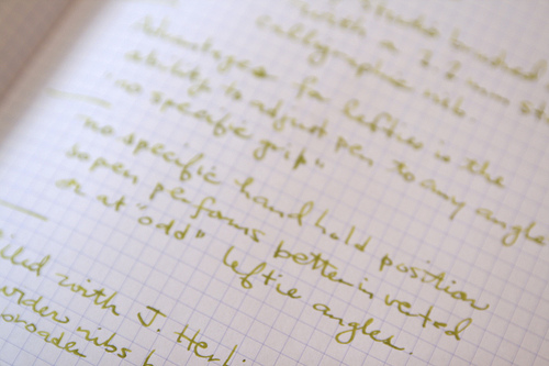
With my overwriting angle, I was still able to get a variety of line variation with no issues — pushing, pulling, dragging — the pen was smooth and efficient. I used J. Herbin Vert Olive ink for my tests. One of the reasons I like the stub/calligraphic nibs is that it allows me to use some of these lighter colored inks and still have good legibility.

Even my right-handed friend Madeline who is well-recognized for her calligraphy took the pen out for a test drive with some wonderful results.
List price for the Lamy Studio is $85 and the 1.1mm nib can be purchased for about $10 more from your favorite pen retailer.

While on the topic of the stationery cupboard, our pals over at Pencil Talk did a little side-by-side comparison between the prestigious Field Notes steno book and one found in your average corporate stationery cupboard. Which one would you pick?

This is a lovely audio story about how pencils and paper still make an impact on people. What would take to a desert island? Pencil and paper, of course. Favorite items in your “dream pencil case”? Hear more by listening to the story on the BBC.

I received my second Ink Drop shipment from Goulet Pens this weekend and it is full of sunny, springy bright colors! Included this month was Schaeffer Skrip Brown, Noodler’s Summer Tanager, Platinum Cyclamen Pink, Private Reserve Foam Green and Diamine Washable Blue.
To be honest, I am loving all of the colors and quite enjoy that this month’s samples are so widely different in color. Just when I want more color in my world, even my ink samples provide!
Also included was a vial of J.B.’s Perfect Pen Flush to help clean ink residue from inside your pens. I haven’t tried the Pen Flush yet but I’ll let you know all about it when I do. I’ll put it to the test with one of my craggy vintage fountain pens to really see how it works!
I ran a quick swab of each color and then just scratched out some text with a dip nib just to see how the colors looked in actual writing. Again, I am using my Miquelrius grid notebook as a constant for all my samples. It is not overly fond of dip nibs (bleeds a lot!) but seems to hold up well to the same inks when used in an actual fountain pen.
To demonstrate, when I dipped into the Noodler’s Summer Tanager, it bled so badly as to be nearly illegible. When I put the same ink into my Lamy with a 1.1mm nib, there was no bleeding or feathering at all. So, the same inks can behave radically differently depending on the tool. The Private Reserve Foam Green and Diamine Washable Blue performed best in the dip pen with very little feathering on the paper so I suspect they will be excellent in my fountain pens.

And since I now have four different brown inks here I can compare, I added the Sheaffer Skrip Brown to my brown swabs.

The Sheaffer Skrip Brown is the lightest brown I have so far and the most terra cotta in color. In writing, it looks the most “brown” where the Havana Brown and Chocolat look more like a brown-black. (Pardon my spelling in the photo)

I’ve been curious about the difference between a traditional Rhodia pad and the new Rhodia R pads. Enter Writer’s Bloc with their side-by-side comparison between the two pads. The biggest difference between the two is the paper inside. Click through to read the whole review.
(via Writer’s Bloc Blog)