(My cat Apple makes sure there’s plenty of room for stowaways in R2’s secret compartment.)
This recap from the SF Pen Show is really going to be a photo dump. There was SOOOOOO much to see and do: a whole wall of nib grinders in one hallway, an engraver from Waldmann doing on site engraving, walking tours of the show for newbies, classes, workshops, auctions, games and so much more. SF continues to remain “the fun show” in the pen show calendar and even with the change in location, the description is accurate.
Yes, there were some complaints about the even being crowded and parking being a challenge. If you plan to attend next year, plan accordingly: carpool, park at the airport and take the hotel shuttle, arrive early and be prepared that Saturday afternoon is going to be very busy. But who would have ever imagined that a pen show would be filled to capacity? And isn’t that a good thing????

Thursday night before the mayhem at the SF Pen Show. Most attendees never see the room like this but in less than four hours, the vendors will turn it from a featureless room into a pen lover’s paradise.

Once we are all set up on Friday morning and customers start arriving, we all start goofing off. This is Lisa at the Vanness Pen Shop table giving me a little peace. Usually, I only get one finger so it was definitely a good Friday! LOL.

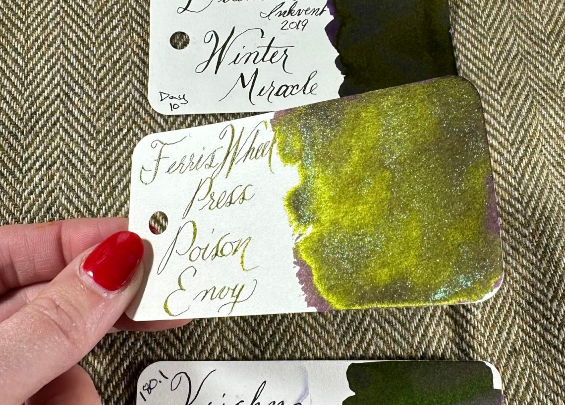
I got to wander around a bit throughout the weekend and talk with friends and make new one. I stopped at the Everyday Explorers Co. table and fell in love with their collection of cling stamps. By the time I came back with my wallet, this pen fan set was sold out but I did grab some of the coffee stickers.

My table neighbor was one of my favorite pen people, Joe from Gentleman Stationer. He brought a lot of his Lockby products as well as Pilot pens and some of his favorite non-fountain pens like the Lamy Pico and the Anterique Mach Ball .5mm Ballpoint Pen.

I was able to hang out with the great crew from Hinze Pens, including my pal Francisco. He’s got big plans in the works with the upcoming Chicago Planner Convention. We are spreading the love of fountain pens!

A view from the Hinze table…. a river of color and joy!

The SF fan favorite, Mai Do, had a corner at the SF Pen Show to many a pen nerds delight. They had a small selection from their shop including stamps, gel pens, paper and accessories. Such fun!
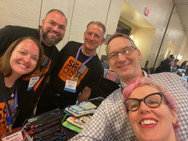
Oh, the gang from Rickshaw Bagworks was having a great time this weekend. At the registration table, Rickshaw provided fresh fortune cookies for attendees and inside each was a special fortune that could be a redeemed for a free sticker from Rickshaw or more …. almost like a golden ticket. Such a great idea!


I stopped by the Brute Force Design table to ogle the wonderful colors and style available.

I caught Audrey at Franklin-Christoph hard at work tuning and adjusting nibs for customers. And, of course, her nail game was perfect!

I even got a chance to catch Hugh at Kanilea Pen Co. tuning up nibs. Their pens and attention to detail always floors me. Someday, maybe I’ll actually decide which pen to buy!

The folks from Gravitas Pens made it across the pond and used my Col-o-ring Dippers as price tags which just tickled me! Super nice and the pens are so lovely. I wish I’d had a chance to get back over to their table to buy something.

Traveler’s Company and Plotter tables were swamped most of the weekend but I was able to visit with the team a few times just to say hello. By the time I had a notebook handy, I had missed ny opportunity to use their stamps because they were all packed up!!! boooooo!
There were lots of vendors from Japan and other places in Asia which is also makes the SF Pen Show a great opportunity for US attendees — Yamamoto Paper, Nagasawa, Bungubox, Toyooka Craft and more.

Above is the corner of the fun stationery goods that Enigma Stationery brought. Honestly, there was so much to see and I didn’t have nearly enough to see it all or document it. If you want a thorough walk through, check out Mike Matteson’s Friday walkthrough which will give you a “just like you’re there” walk around the show floor.

As always, the best thing about pen shows is getting to spend time with friends and just nerding out about pens. Above is me, Jesi and Julia experiencing sunlight for the first time in 48 hours…. it seared our tired, overwhelmed eyes!