The Workspaces of Famous Men

I love seeing he workspaces of authors and other famous folks. So finding this treasure trove of photos of workspaces totally made my day.

William F. Buckley at the eye of his personal paper storm.

This is cluttered space where writer William F. Buckley is a converted garage. He spent a lot of his life and even died here.

Neil Gaiman's writing hut
Neil Gaiman’s writing hut

The writing hut used by Neil Gaiman is one of the most amazing little places. I would love to have a place like this someday thought I doubt I would write anything as loved or amazing as The Anansi Boys, Neverwhere, or American Gods.

Churchill at his standing desk.

The new focus on standing desks and treadmill desks aren’t a new thing. Winston Churchill was a believer in a standing desk fifty years before the Nike FuelBand.

There are a dozen other workspaces to see on Art of Manliness. Enjoy!

(all photos via The Art of Manliness)

Signo e Signo: RT Showdown

New and old Uni Signo RT

You know you are a pen nerd when you hear that there’s a new design to a favorite pen and feel inclined to do a side-by-side comparison. If you’re still with me, shall I begin?

One of my favorite gel pen lines is the Uni-Ball Signo DX/RT line. When I first got into the Japanese gel pens, Uni-Ball was the first to include the silicone grip area on otherwise stripped-down and simple writing tools. Combine the soft grip with awesome fine-line gel performance and there wasn’t much I didn’t like about the Signo DX/RT line. So, I did get a little nervous when I heard they were updating the pen design. I didn’t really think there was anything that needed improving upon but I guess I didn’t give the matter as thorough a going-over as the folks at Uni-Ball. The new version is called the Signo RT1.

Signo e Signo

The previous design of the Signo RT featured a clear, plastic body with the retractable clicker, clip and silicone grip area all in a color to indicate the ink color. The new design features a transparent-colored plastic body to match the ink color. The clicker and clip are now one unit in opaque plastic to match the ink color. The silicone grip area has been lengthened all the way to the tip of the pen which hides the spring mechanism giving the pen a cleaner look.

The black versions of the RT1 are all opaque black — the grip, the body and the clip. There are black versions with a solid contrasting-colored plastic body as well.

Uni Signo RT vs RT1

When writing, the feel of the pen on paper was an identical experience. I did notice that, with the new RT1, the clicker and clip slide freely when the pen tip is in use. So whenever I set the pen down or twiddled it in my hands, the clip/clicker would slide out making noise and generally changing the weighting of the pen. That is really a bit bothersome.

The one distinctive difference I noticed was that the new RT1 inks seem a little bolder, a little broader. I tested both 0.38s, and the new RT1 seemed a little broader. I also tested the 0.28 RT1 and it seemed more comparable to the previous model 0.38 in terms of line width. Crazy. Has anyone else experienced this?

The bottom line? My opinion at this point is a bit of a draw. The new RT1 is less expensive and more visually unified in appearance. However, the line widths seem wider and the loose clip/clicker is a little annoying. The original RT has a finer point and more solid feel.

The Uni-Ball Signo RT UM-138 pens sell for $1.65 while the new Signo RT1 UM-155 sell for $2.50. If you love the original design, I recommend stocking up now as I suspect they will be discontinued.

Power Gems! Pilot Hi-Tec C Maica Review

Hi Tec C Gem Power!

I wanted to have a set of pens I could keep at work rather than to transport my pens back and forth so when I saw that there was a new series of the Pilot Hi-Tec C series called Maica, I decided I had my excuse so I bought all 12 colors.

Instead of the traditional clear plastic body with a hexagonal shape, the Maica series have a metallic-colored, round, plastic body. At the end of the cap is a blingy, plastic jewel. There is also a small loop on the cap which keeps the pen from rolling away though I suspect its purpose is to hold cell phone charms to really “jazz up” your pen. The caps can be posted onto the end of the pen but it does make them quite long for me. I tend to just lay the cap on the table.

Rainbow of Hi Tec C Maica

The Maica colors are pretty similar to the Hi Tec C “basic colors” set. The colors available from the Maica line are: Black, Blue Black, Blue, Light Blue (more of a turquoise), Green, Apricot Orange (a yellow-orange), Orange, Brown, Baby Pink, Pink (more magenta), Red, and Violet. The standard Hi-Tec Cs do come in a lot of other colors and a wider range of tip sizes but if you haven’t tried any Hi-Tec Cs yet or are just wanting some good standards, the Maica line offers a good assortment.

Maica tip

The tip of the Maica pens and the metal cap around the tip are exactly the same as a standard Hi-Tec C pen. I disassembled both the Hi-Tec C and the Maica to discover that the ink cartridges were also identical.

What I’m finding surprising is that the price is different. A single Hi-Tec C in the standard plastic body sells for $3.30 while the same Maica is $2.50. Curious. At present, the only refills available for the Hi-Tec C line are black, blue or red but the refills will fit into the Maica body.

Hi-Tec C Maica Writing Sample

In writing, the performance was consistent with the standard Hi-Tec C line. Occasionally, if left sitting for awhile, all the Hi-Tec C pens so need a little “priming” to get going but once they do, they write smoothly and consistently. I tuck a 3×5 inside my notebooks for those occasions when I need to scribble a pen back to life. These are definitely going to make note-taking during meetings more colorful and blingy.

(available through JetPens in sets of 12, sets of 6 or individually in either 0.3 or 0.4 sizes)

Link Love: Pictures and books and many pens

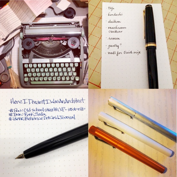
Clockwise, from top left: Hermes Typewriter cleaning by DovBee, Grocery list and calligraphy practice by Bakanekosan, Render K collection by imyke and Old School Vanishing Point by Pen Addict

Pens:

Books:

  • The Missing Ink Book Review (via Behind The Curtain): I’ve been meaning to read this book and have it balanced atop my precariously high to-read pile. I’ll get to it soon, I promise!
  • The Etiquette of Letter Writing (via Letter Writers Alliance Blog): I too have a copy of this book. Fabulous albeit a little unnecessary for today’s letter writer. I do not have a yacht. Do you?

Paper and Notebooks:

myInstagram
From my Instagram, clockwise from top left: My Cambridge leather satchel, my last order from JetPens, a handwritten note from my elderly neighbor and the drawing tools used by Brian Kesinger as spied at the Spectrum Live Art Spectacular.


Day of the Desks

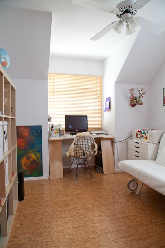
Beatriz Macias's home work space via Apartment Therapy
Beatriz Macias’s home work space via Apartment Therapy

Today I want to share some home office inspiration, from feminine and floral to sparse and even a dark, dramatic option. Enjoy!

A black and white minimal space (via A Merry Mishap)
Abigail Ahern's tropical drama from Interiorator
Abigail Ahern’s tropical drama from Interiorator
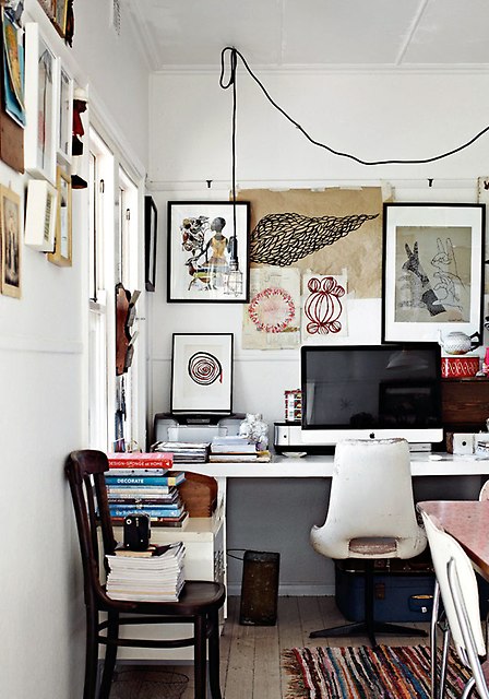
Organized clutter via Photo Forum
Shabby French glam via Tumblr
Shabby French glam via This Ivy House on Tumblr
Built-ins with patterned paper via The Decoist
Built-ins with patterned paper via The Decoist, by Jessica Lagrange
Mid Century made modern with vibrant wallpaper and metal work surfaces via The Decoist
Mid Century made modern with vibrant wallpaper and metal work surfaces via The Decoist, by Charles DeLisle / photo by Art Gray
Glam and sophisticated space via The Decoist
Glam and sophisticated space via The Decoist, by Cynthia Mason Interiors

News from the Pen World

telegram header

…. this just in….

TWSBI released their new notebooks… three sizes available in lined, grid and blank….STOP

New ink from Noodlers called Blue Nose Bear… blue with fluorescent, black-light reactive tones…STOP

in other news… The Pen Addict now has a Patter chat room on App.net… Yahoo bought Tumblr and updated Flickr on the same day!… STOP

And now, back to your regularly scheduled blog already in progress. STOP.

Apologies for Technical Difficulties


This is the police line "Do Not Cross" tape I was greeted with upon arriving home on Monday.
This is the police line “Do Not Cross” tape I was greeted with upon arriving home on Monday.

Over the last 48 hours, I’ve had a few glitches in the finely oiled machine that is The Well-Appointed Desk. On Sunday night, our power went out at 9pm and was not restored until 11am Monday, by which point I was already at work. So… I was unable to get a new post up on the blog at all on Monday.

Then, on my way home last night, the street behind my house was closed due to a package of questionable origin left at the charter school causing a bit of chaos and inconvenience.

Needless to say, I’m a little behind schedule this week now. Finely oiled, not really! But I’ll try to get caught up today and get some fresh content posted. Thanks for your patience!