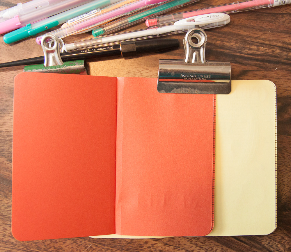
Link Love: Pens for All Price Points

rp_link-anaPost of the week:

I just love the budget-minded ingenuity that Missy Dunaway used to created a work table.

I made a table using my bed, a step stool, and a large piece of tempered hardboard I found at Lowe’s for $7.

Check out all her wonderful ink paintings done in a Moleskine sketchbook on her Tumblr site.

Pens:

Inks:

Pencils:

Paper & Notebooks:

Planners & Organizers:

Other Interesting Things:

Ask The Desk: Felt Tip Pen Conundrums

rp_askthedesk_hdr211111-1-1-1.png

Amanda asked:

I’m a university student that loves using felt-tip pens but I hate how they show through the other side of my pages! Are there any affordable felt tip pens that won’t show through the pages of a cheap spiral bound notebooks?

and then to make matters even more complicated, Grace asked this great big question:

I am a typical college student who fell in love with felt tip/plastic tip pens. I have gotten my hands on Sharpie pen, Monami Plus pen, and Stabilo 88. I mostly use them for rewriting and color-coding my notes. I write a lot and I write hard (press). I would like your suggestion/opinion on which pen I should use.

So far, the Sharpie pen held up the best. It writes neat and it’s the only felt tip pen that doesn’t bleed through the page. The only bad thing about it is that it tends to strip after a while and get on your hands. It’s like having black and sliver sparkles/glitter coming off fro the pen.

The Plus pen writes neat but the tip softens as times goes on, has a tendency to “trip and splash” on the paper. What I mean by that is… It starts off writing really smooth and thin. Then when there’s the smallest variation in paper (that wouldn’t be detected by other pens), the tip would flex and bounce, making an ink splash. It really doesn’t seem to last too long compared to the other pens that I have had in the past.

Stabilo 88 is fine but is a bit thicker, and that is understandable since it’s an art pen. It bleeds through but it really lasts a while. The color seems to darken after uncapping for a few seconds but comes back to the normal color after a few strokes.

So I am trying to narrow down the choices for the next choice of pens that I should use. From what I have, I know that the plus pen is out. I am leaning more towards the Sharpie pen and Stabilo (Sharpie > Stabilo). Now I have been searching for more pens and I discovered from various sites about Sakura Pigma Micron. Would you say that Sakura Pigma Micron is better than Sharpie pen for uses of smooth and continuous note writing in college? I’m looking in the aspects of: grip, cost, color variety, smoothness, bleeding, and the time it lasts.

Since both questions are about felt tip pens and the issue of bleeding through the paper I’m going to respond to them together. While Grace’s question is much more in depth, I hope Amanda will glean some info out of this as well.

But for both of you college-ladies-on-a-budget, the bad news is that felt tip pens will most likely show through, if not bleed through, most budget notebook paper. Be prepared to either use only the front sides of the sheets or get an extra sheet of paper or cardstock to use as a blotter between pages to keep the inks from bleeding to the next page. Cut down a manila folder as an option for a budget blotter but be sure its not coated or glossy or you could have a mess on your hands.

Onward to the pens!

For the greatest color range and a slightly finer tip than the Stabilo88s, I recommend looking for the Staedtler Triplus Fineliners. The tips seem to be the same but I find the Staedtlers to be a bit firmer and oh, the colors!

As for the Sakura Pigma Microns, they have very fine tips but tend to be pricier than Sharpie pens and the tips can go soft or dull very easily. As for the paint on the barrel of the Sharpie coming off on your hand, have you considered the Sharpie retractable model? It has a plain black barrel with a silicone grip section. There’s not as much ink in the retractable model as the regular capped model but if you can find a good price on a multi-pack at a big box store, it might be a good investment for comfort and no-paint-transfer. I also find that the Sharpie pens are the least likely to have show through on most papers, closely followed by the copycat Bic Intensity.

A budget option to the Sakura Pigma Micron is the ZIG Millennium line of felt tip pens. They can often be found in craft big box stores or online and the fine, fine lines of the 005 and 01 versions might not bleed through most papers but may not hold up to heavy-handed writing. But they are not as expensive as Microns so you won’t be heartbroken if you kill one. I have killed many many Microns so I know how sad it can be. I’ve also killed Copic Multiliners, and a whole army of fancy tech pens.

So for straight-up black felt tips, stick with the Sharpie pen in either retractable or regular capped. If you want to try something finer, try the ZIG Millennium. And for color coding, I recommend the Staedtler Triplus Fineliners.

I tested a bunch of these felt tips on the cheapest paper I had on hand, it was a budget-priced composition notebook that has basically newsprint paper inside just to show what kind of show through or bleed I got.

Cheap paper felt tip pen test Cheap paper felt tip pen test from the reverse

Best of luck with finals!

Ink Review: Akkerman Treves-Turquoise

Akkerman Treves Turquoise header

I must be on a blinded-myself-with-turquoise kick this month because Akkerman Treves-Turquoise is a kissing cousin to Private Reserve Daphne Blue which I recently reviewed. I guess I’m just ready for blue skies, turquoise swimming pools and burn-your-retinas summer colors. Akkerman Treves-Turquoise is definitely on the vivid end of the ink spectrum but its not quite as bright as Daphne Blue.

Akkerman Treves Turquoise

Treves-Turquoise does have a much more distinct red halo though, especially in wider nibs, in swatches, and in my painted lettering.

I started out testing this ink in my Pilot Retro Pop with medium nib but the ink seemed a little light. I switched to my Esterbrook 2442 stub italic and both the color and the red halo became much more evident. This ink is definitely at its best advantage in wider nibs.

It shades with a great ranges of blues from a light sky blue to a deep turquoise. When wet, the ink completely puddles so it would be fun to play with for some light watercolor washes but do not dip your carefully crafted manuscript or latest letter into the tub or it will be lost forever.

Akkerman Treves Turquoise Ink comparison

When comparing swatches, you can see how similar Treves-Turquoise is to Daphne Blue. If you’re on a budget, Daphne Blue is a perfectly fine substitute for Treves-Turquoise which is pretty pricey to acquire in the States. Treves-Turquoise is a richer color than Iroshizuku Ama-Iro so if you’re looking for something more retina searing, Daphne Blue or Treves-Turquoise would definitely be more saturated than Ama-Iro.


Special thanks to Junee Lim at Alt.Haven for sending me a sample of this ink to try out. I’ve had it for absolutely ages and FINALLY got around to trying it out. Luckily, Vanness Pens will be in Atlanta for the pen show and they stock Akkerman inks so I might be able to score a bottle of this ink of my very own in a couple weeks.

Review: Story Supply Co. Pocket Staple Notebooks

Story Supply Co. notebook

Story Supply Co. Pocket Staple Notebooks (3-pack for $10, available in plain, grid or lined) might seem like just another in a long line of pocket notebook makers but I think they are offering a little something different. First, for each 3-pack of 3.5×5.5 notebooks they sell, they contribute a story supply kit to a chapter of 826, which provide writing and tutoring to school age kids in many major metropolitan cities like LA, Chicago and DC, to name a few.

Story Supply Co. notebook inside cover

Besides contributing to a good cause, the standard Story Supply Co. Pocket Staple notebooks are a little different than some of the others on the market. The covers are simple navy cardstock on the outside (100# French Paper Co. Kraft-Tone cover, if you want the specifics)  which are heavier weight than most pocket notebooks on the market. On the inside, the paper is a creamy, ivory 70lb Cougar smooth (described as “natural” on the Story Supply Co site). The paper is slightly warmer in color than the standard Moleskine paper — where Moleskine paper is yellowy, Story Supply Co. paper is slightly more peachy French vanilla, if that makes sense. Not noticeably peachier but if you put it side-by-side with a Moelskine, the paper is not as yellow.

My package also included a snappy logo sticker ($1 each) to add to my already buried laptop cover and a natural finish round pencil ($1 each) which managed to vanish before I got to sharpen it. Either a cat rolled it away or my husband absconded with it. No one is fessing up.

Story Supply Co. notebook writing sample

Inside the front cover is space to put pertinent information like contact info, contents and dates. In the back is information about the Story Supply Co. and their contributions to the 826 programs.

Story Supply Co. notebook writing sample

In writing tests, I found the paper to be very smooth and all my standard pens and pencils to perform well to my naked (bespeckled) eye pretty well. I definitely discovered that felt tips and gel pens were the most well received on the paper, as were pencils.

Story Supply Co. notebook writing sample close-up

Upon closer inspection though, I noticed some feathering, even with the finest fountain pens. I think there is little-to-no sizing on the Cougar smooth paper which let the ink just run free. I was a bit sad because even my almost-never-feathers Platinum Carbon Desk Pen feathered on the Story Supply Co. paper.

Story Supply Co. notebook reverse of writing sample

From the reverse of the writing sample, there’s a little show through and it would probably have been more evident if I’d used pens or nibs wider than and 0.5mm or darker colors but I didn’t have any loaded up or handy. The Sharpie Pen and Microns performed fine on the paper and the gel pens, including the Gelly Roll pen I tried did just fine. After I photographed my writing samples, I did another test with my stash of Staedtler Triplus Fiineliners and they all did quite well too with a little show through on the back of the page with some darker colors if they were used to fill in letterforms and such but no feathering issues. So, I think, like most pocket notebooks, a standard EDC type of pen or pencil with a Story Supply Co. notebook would be a fine combination but its not meant to be used with calligraphy nibs or Sharpie markers unless you’re prepared for bleed through.

I probably should have considered this before I tried to watercolor on the paper, though it actually held up better than I thought it would. The paper buckled and curled but it didn’t pill so it performed a lot better than most. I will probably continue to abuse this notebook since I still have a week left in my Rock Your Handwriting challenge and I filled up my other notebook already.

All in all, I think the Story Supply Co. Pocket Staple notebooks offer an alternative at a similar price point to many of the other notebooks on the market. The distinguishing features being the warm ivory paper, heavier covers and the donations to children’s writing charities setting them apart.

For a review of the graph paper version of the Story Supply Co. notebooks and the pencil, check out Andy Welfle’s review over on Woodclinched. And for more review details of the blank paper version, check out Mike Dudek’s review on the Clicky Post.


DISCLAIMER: This item was sent to me free of charge by Story Supply Co. for the purpose of review. Please see the About page for more details.

Dark Lilac (Lamy) Festival Time

1931: A bevy of princesses serve Alice LaFetra (right), the 1931 Lilac Queen. The tradition of selecting a queen and court began a year earlier. — Courtesy Lombard Historical Society / Handout, Sept. 16, 2014 (via Chicago Tribune)

I grew up in a Chicago suburb known for its lilac festival so I was tickled by the Dark Lilac Lamy Safari offered this spring as part of its limited edition color series. I remember the whole town ends up smelling like lilacs by the end of April which I always liked. Its goofy and quaint and I’m glad to see that they still have the festival and crown a Lilac Queen, even a Little Lilac Queen. Some things never change. The new Dark Lilac Lamy Safari will forever remind me of the Lilac Festival so its release date is perfectly timed.

Frank over at Fontoplumo has generously offered readers of The Well-Appointed Desk the chance to win one limited edition Lamy Dark Lilac Safari fountain pen plus a pack of matching Dark Lilac fountain pen ink. The winner may select nib size (EF, F, M or B).

The Dark Lilac Safari series also includes a rollerball and ballpoint pen. Just so you know.

TO ENTER: Please leave a comment below and tell me what event signals the arrival of Spring for you. Oh, and READ THE FINE PRINT!


FINE PRINT: All entries must be submitted by 10pm CST on Tuesday, March 29, 2016. All entries must be submitted at wellappointeddesk.com, not Twitter, Tumblr or Facebook, okay? Winner will be announced on Wednesday. Winner will be selected by random number generator from entries that played by the rules (see above). Please include your email address in the comment form so that I can contact you if you win. I will not save email addresses or sell them to anyone — pinky swear. If winner does not respond within 30 days, I will draw a new giveaway winner. Parcel is shipped directly from Fontoplumo by standard first class post. If insurance or other delivery is request, winner will be required to pay for additional shipping charges. Winner is responsible for any VAT, taxes or import fees. This giveaway is open to all readers.


Fashionable Friday: Flower Bomb

FF-flowerbomb

I was inspired by the floral mixing and matching in the April 2016 InStyle magazine. Like all the trees and gardens in bloom, let the flowers go wild in your stationery world too!

(photo credit: David Alfons Wilhelm Bornscheuer, styled by Ali Pew)

  • Retro 51 Tornado Rollerball Pen “Bouquet” $35 (via Goldspot Pens)
  • Dooney & Bourke Daffodil Domed Satchel $239.99 (via 6pm.com)v
  • Paperblanks Lined Mini Journal in William Morris Windrush Print $11.95 (via Anderson Pens)
  • De Atramentis Lily of the Valley (35ml Bottled Ink) $14.95 (via Goulet Pens)
  • Viktor & Rolf Flowerbomb 1 oz Eau de Parfum Spray $85 (via Sephora)
  • Midori Flower Paper Clips $6.75 (via Jet Pens)
  • Pilot Iroshizuku Mini Ink in Kosumosu Fall Cherry Blossom $14 (via JetPens)
  • Lamy Safari 2014 Neoncoral fountain pen € 22,50 (via Fontoplumo)
  • Graf Von Faber-Castell Tamitio Rose Fountain Pen $180 (via Pen Boutique)
  • Filofax Cover Story Personal Primrose Organizer $46.80 (via Pen Boutique)
  • Visconti Van Gogh Sunflowers Fountain Pen $173.40 (via Pen Chalet)
  • Galison Mini Sticky Notes in Vincent Van Gogh Almond Blossoms $5.75 (via JetPens)

Review: Field Notes Sweet Tooth Colors Edition

Field Notes Sweet Tooth

I haven’t done a reveal post of one of the Field Notes Colors Editions in a long time but the new Sweet Tooth edition is a way more fun in use than I expected it to be. When described, a colored paper edition of Field Notes with perforated pages doesn’t sound like all that big a deal. Until I actually started using it.

The Pop Tone paper is 70lb and quite toothy (no pun intented) which makes it great for pencil and lots of pens. It also doesn’t bleed or feather and the bright colors are freakin’ fantastic for opaque gel pens. I don’t get a lot of excuses to humor my inner middle schooler and break out the giant box of Gelly Rolls but a 3-pack of Sweet Tooth is the perfect excuse. So much so that I’m thinking I’ll need to order about ten more packs so I don’t run out.

Field Notes Sweet Tooth writing sample

I actually think the “tangy orange” is more of a “cherry red” but I do agree that the other two colors are definitely “banana split” yellow and “blue raspberry” blue – in the most artificial candy-colored definition of those colors. I like the coordinated hot foil lettering on the covers, a subtle nod to candy packaging.

I don’t mind that the paper is unlined, in fact I actually prefer it. And it eliminated any issues  printing ink might have caused with writing ink adhering to the paper. So I’m actually glad they didn’t print on the paper. And it means there’s free range to doodle in any direction.

Field Notes Sweet Tooth reverse writing sample

From the reverse of my writing sample, there was no show through or bleed. You can see a little bit of indentation from my writing pressure where I went over the lettering with the clear sparkle Gelly Roll pen. On the yellow “Banana Split” paper, there’s a bit more show through because the paper is a lighter color but you should easily be able to use both sides of the sheet with all three colors.

The micro-preforation is tight and requires folding a couple times to get page to tear out but pages tear out cleanly. The advantage of the tight perforation is the pages are unlikely to fall out.

Field Notes Sweet Tooth writing sample

I even tested some fountain pen ink from my my Kaweco Dia II with Daphne Blue and didn’t have any issues. I’m sure thick, italic nibs might cause some issues but daily use fountain pens should be just fine though, with most Field Notes, I recommend felt tip, rollerballs, pencils and gel pens more often. Colored pencils were a particularly fun discovery as some colors really popped. Uni Posca and Sharpie water-based paint pens were also fun and didn’t bleed through. Aren’t these Field Notes the perfect excuse to use all those pens you bought on a whim?

I know folks are constantly tweaking their favorite Field Notes lists and when I initially saw Sweet Tooth, I didn’t think it would break my top five but now that I have it in hand, I think it will be my number one. I love it. I must order more.


DISCLAIMER: This item was sent to me free of charge by Field Notes for the purpose of review. Please see the About page for more details.