Review: Platinum Maki-E Nylon Bristle Brush Pen

Platinum Maki-E Brush Pen

Platinum Classic Brush Pen with Mt. Fuji and Cherry Blossoms Pattern ($52) is a nylon fiber brush pen with a beautiful slender black body. It features a gold toned clip and gold accents and a painted Mount Fuji and cherry blossoms designs. Its one of the most traditionally Japanese motfi pens I’ve ever owned and I’m surprised how tickled I am with the overall aesthetics of the pen. The overal shape of the pen is a smooth torpedo shape and the cap has a smooth, pill-shaped clip which is simple and understated.

The pen came in a simple black paperboard box with gold foil lettering and graphics on the exterior and red velveteen paperboard on the inside with a simple ribbon band to hold the pen in place. The packaging was elegant without being extravagant, if that makes sense.

Platinum Maki-E Brush Pen

Platinum Maki-E Brush Pen

But the real feature of the pen is the brush tip rather than a fountain pen or rollerball under the cap. The brush tip is made up of nylon fibers like a paintbrush but inside the aesthetics of a fountain pen. The pen works with a cartridge or a regular Platinum converter.

Platinum Maki-E Brush Pen Close-up

The bristles on the nylon tip come to a crisp point and the nylon fibers spring back quickly with a nice bounce. I decided to test the pen on both my usual Rhodia paper as well as some Strathmore Mixed Media drawin paper which is a toothier stock and found both the pen and the stock ink cartridge to perform quite well. The toothier Strathmore paper made it a little bit easier to control the brush pen versus the silky smooth Rhodia paper making me feel a little more confident in my mark-making.

Platinum Maki-E Brush Pen Writing Sample

The pen comes with a black cartridge with Platinum Black ink and the  Platinum converter ($7.50) will fit as well which will allow a range of inks to be used. The Platinum Black ink is not waterproof but its definitely water resistant. I’m inclined to keep only black ink in this pen for the duration as I expect it would be difficult to ever get all this black out of the bristles and feed. I’d also be cautious about leaving this pen sit too long without using it in case the ink dried in the brush. It might be difficult to get it cleaned completely if the ink were to dry. Altenately, the Platinum Black is a rich, dense black that looks fantastic so it appears to be worth the trouble it might cause if you like a good solid black line for drawing or calligraphy.

Overall, I really like this pen. As its one of my first brush pens over $10 (by a long shot) I don’t have a huge basis for comparison. However, the quality of the brush tip itself is a big upgrade from the budget-priced nylon bristle brush pens I’ve purchased in the past. Add to that, the overall feel of the pen and the beautiful Maki-E painting and I feel like I have a real treasure on my hands.


DISCLAIMER: This item was sent to me free of charge by Pen Boutique for the purpose of review. Please see the About page for more details.

Winner: Notemaker World Stationery Day Voucher Giveaway

NoteMaker Promo

Big thanks to Notemaker for helping us make World Stationery Day (and World Stationery Week) a big deal here at The Well-Appointed Desk. Thanks to everyone who entered the giveaway. Now, a drumroll for our winner…..

Screen Shot 2016-05-02 at 6.53.34 AM


Screen Shot 2016-05-01 at 10.14.27 PM

Congrats, Nicholynn! I hope you find your flexible nib pen. I will be contacting you via email to arrange everything! Thanks to everyone!

Cognitive Surplus Wax Seal Kits

Cognitive Surplus Wax Seals

Cognitive Surplus asked me if I’d like to try out their awesome array of Wax Seals. I had such a hard time choosing a design, they kindly sent me two because I could not make up my mind. I got the Erlenmeyer Flask and the Moon. The Erlenmeyer Flask came with a deep red wax stick and the Moon Seal came with a metallic silver wax stick.

If you love space and science themes, then their selection of of wax seals will be right up your alley too. Each kit comes with a brass seal mounted to a wooden handle and a coordinating wax stick in a small box with a lovely label. Each kit sells for $26.

Cognitive Surplus Wax Seals

Cognitive Surplus Wax Seals

The detail on the moon seal is excellent. This is so cool!

Cognitive Surplus Wax Seals

And the Erlenmeyer flask is also nerd cool!

Cognitive Surplus Wax Seals

I did my best to light the wax stick and pool the wax onto my envelope and then press the seal into it. I waited for for a few seconds for the wax to cool and the slowly wiggled the seal loose as the wax cooled and voila! the seal looks pretty good for my first try!

Cognitive Surplus Wax Seals

I had equally good luck with the moon seal and on my first try too. It looks so amazing! But I think my husband will steal it and take it to Skylab Letterpress. So if you want a letter sealed with moon wax, you better write a letter to Skylab.

Special Deal for Desk Readers: Receive 20% off your purchase when you use the coupon code WellAppointedDesk. Offer is good through May 15, 2016.


DISCLAIMER: This item was sent to me free of charge by Cognitive Surplus for the purpose of review. Please see the About page for more details.

Ink Review: Franklin-Christoph Emerald Midnight

Franklin-Christoph Midnight Emerald Ink

Please don’t shoot me for reviewing another teal blue ink so soon after Pelikan Edelstein AquamarineFranklin-Christoph Midnight Emerald ($12.50 for 2oz.) is a much deeper blue-teal color than Aquamarine. It’s in that space between teal and blue-black that you didn’t know you needed an ink. Did you?

FC- Midnight Emerald writing sample

I tested the ink in my Franklin-Christoph Pocket Ice 66 eyedropper with a Fine nib and the ink still shaded quite nicely. The ink dried pretty quickly in the fine nib and I didn’t have any smearing issues even with my left-handedness. The painted lettering took a little bit longer to dry on the Rhodia paper so I suspect a wider nib would also take a bit longer to dry. Not a scientific analysis but this ink dried faster than a lot of inks I test.

The color strikes a nice balance between being a teal and a blue-black. Professional enough for everyday work but unique enough to be fun to use.

The ink is not waterproof so it means clean-up is pretty easy despite the depth of color.

Franklin-Christoph Midnight Emerald Ink comparisons

Midnight Emerald is very similar in color to Akkerman #24 Zuiderpark Blauw-Green but Midnight Emerald is a tiny bit more blue than Zuiderpark. The price for Midnight Emerald is considerably lower. Diamine Twilight is  more blue black and Callifolio Olifants is more indigo blue so Midnight Emerald really does seem to hit an unusual niche.

Overall, Midnight Emerald is a really lovely color and I’m grateful to have it in my arsenal.


Erin Marie A lovely fan in Atlanta gave me this bottle of ink because she knew how much I loved teal colors but I forgot to write down her name so, if you’re out there, please leave a message in the comments so I can give you a proper thank you and shout out for this lovely gift which I will cherish. We had such a lovely conversation but I have a brain like a sieve sometimes and trying to remember Slack handles, real names, email addresses and Rav names often leaves me not remembering any name at all! So sorry!

Vintage Fountain Pens: Lady Sheaffer Skripsert and Sheaffer Imperial

Sheaffer Lady Skripsert & Imperial

One of the pens I was hoping to find at the Atlanta Pen Show was a vintage Lady Sheaffer Skripsert. A friend of mine showed me hers and I fell in love with it so I knew it was definitely a pen style I wanted to keep my eye out for.

The story behind the Lady Sheaffer Skripserts were that they were pens (and pencils) designed specifically for ladies in decorative patterns and posh finishes as fashion accessories from the late 50s into the 70s. They were available with either steel or gold nibs and some of the designs included raised, jeweled bands around the middle of the pen for an even more glamorous look.

 photo skripserts_penworld-1.jpg

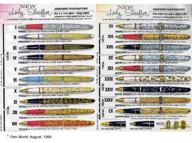
This ad for the Lady Sheaffer, lovingly known to collectors as “the shopping list” was published in Pen World magazine in 1994 and posted to the Fountain Pen Network Forum in a thread titled “Ladies in Tulle!” back in 2008.

Sheaffer Lady Skripsert & Imperial

Well,I totally lucked out because I found a vendor who had several different models to choose from including a very rare Christmas patterned one with holly berries on the cap (not to my taste but in retrospect, its incredibly rare!). I had a hard time picking just one of the many designs and he made me a deal on two different models, both with 14K nibs.

From what I understand, the later the Lady Sheaffer was produced, the more likely the ends are to be flat instead of rounded. So my guess is that the two I purchased are probably late 60s or early 70s.

Sheaffer Lady Skripsert & Imperial Nibs

Once I got home and could start doing more detailed research, I was able to determine that the black pen with gold “tulle” is definitely a Lady Sheaffer. The nib is referred to as a Stylpoint nib as it partially hooded. There’s also a bit of a flip up at the end of the nib which if you didn’t know that was how the nibs were designed might make you think the nib had been sprung. But its not. They were designed that way.

Upon further study, the gold pen with black diamond pattern is actually a Sheaffer Imperial Sovereign rather than a Lady Sheaffer Skripsert. The inlay nib should have been the givaway but I did not know enough about the long history of the Skripsert line to know all the nib variation so I took a chance because it was beautiful. I ended up with a great pen regardless.

Sheaffer Lady Skripsert Sticker

The Lady Sheaffer Skripsert was NOS (new old stock), complete with its original sticker, so really how could I pass it up?

Sheaffer Imperial Band

And the Sheaffer Imperial was hallmarked on the barrel with a crown and “14K G.F. Sheaffer U.S.A.” So I think the barrel and cap are gold plated as well as the nib. Swank!

Sheaffer Lady Skripsert & Imperial widths

What should have also been the give away that Imperial was a different beast is that the barrel is a bit wider than the Lady Sheaffer. They are the same length but the Lady Sheaffer is a little bit more tapered overall for a slightly more diminutive silhouette. Its not good or bad but it shows that doing your homework prior to a show is important. I ended up with a happy surprise and learning more about vintage Sheaffers in general but more research would have made me better informed overall.

Sheaffer Lady Skripsert & Imperial Writing Samples

Both the Lady Sheaffer and the Imperial wrote beautifully. The Lady Sheaffer had a medium nib which wrote pretty wet and its flip up angle took a bit of getting used to. I had heard the flip was designed to enable writing at more angles but could not find any information on the internet to corroborate that so I’m not sure. If you know why the Stylpoint nibs were designed with a flip, please leave a note in the comments. I theorize that it is a bit like the Fude de Mannen Japanese nibs that allow for a wider range of stroke widths at a wider range of angle but again, I don’t have any proof nor have I used the pen long enough to prove my theory.

The Imperial has a fine nib that is perfect! It writes beautifully and as soon as I get cartridges or converters for these two pens, I have a feeling that they will end up in regular rotation. They are both comfortable in my hand, lovely to look and and beautiful writers. How can you beat that?

In the end, I’m pleased with my vintage Sheaffer purchases but I would have been happier with myself if I’d been better informed before I got to the show. But knowledge comes with time and asking the right questions.

For more information about Lady Sheaffer Skripserts:

Link Love: From The Road

rp_link-anaMore Pen Show News:

Pens:

Ink:

Paper & Notebooks:

Planners & Organizers:

Other Interesting Things:

Giveaway: World Stationery Day from NoteMaker

NoteMaker Promo

Today, April 27, is World Stationery Day. If you’re wondering exactly what World Stationery Day is, it’s part of National Stationery Week and part of the London Stationery Show. The goal of World Stationery Day is to celebrate the written word and all things stationery.

In the spirit of World Stationery Day, the folks at NoteMaker in Australia want to help you celebrate by offering one lucky reader the chance to win a $250 voucher (that’s a “gift certificate” in American English) to spend in their fabulous online shop. How amazingly generous!

To enter this giveaway, see the info below in the Rafflecopter widget. The giveaway runs through Sunday, May 1 and the winner will be announced on Monday.

a Rafflecopter giveaway

(All the fine print is in the terms and conditions in the Rafflecopter widget. Please read them. Thanks!)