Link Love: Resolutions & Round-Ups

Link artwork by Chris Grine, illustrator of the web comic Wicked Crispy.

For the stationery, pen and ink community, the end of the year means new planners, prepping for February’s InCoWriMo/LetterMo and of course, our own version of round-ups, resolutions and Top 5/10/whatever lists. They are all accounted for here this week, so pour yourself a hot cup of your favorite beverage and enjoy.

Looking Forward & Looking Back:

Pens:

Inks:

Pencils:

Art & Supplies:

Paper & Notebooks:

Planners:

InCoWriMo/Letter Writing Month:

Other Interesting Things:

Giveaway: Write Your Own Adventure Planner 2017

write-your-own-adventure-1 write-your-own-adventure-2

Several months ago I decided to back the Kickstarter campaign for the Emma Kate Co. Write Your Own Adventure Planner for 2017 but couldn’t decide if I wanted the grey or pink version so like the planner junkie than I am, I ordered both of them. And customs and international post being what they are, the planners arrived today. So, 2017 starts today for me. And for you. The fact that both the grey and the peachy pink planners are both beautiful I had to resort to crowdsourcing to make a decision which planner to keep. So, I decide to keep the peachy pink.

Bob made the reasonable call that the grey planner was much more neutral and respectable for either a lady or a gentleman to carry (Is he thinking he’s going to enter the giveaway? Am I going to have to add a stipulation to the fine print about family members not being eligible?).

write-your-own-adventure-3

Inside the fabric hard cover covers is creamy stock and really nice page layouts where Saturday and Sunday are given the most space on both the monthly and the weekly spreads.

write-your-own-adventure-4

On each page, there is a quote or an inspirational phrase.

write-your-own-adventure-5

At the bottom of the weekly pages is space for three items. You could use these for your three most important to-do’s; breakfast, lunch and dinner plans; or morning, afternoon and evening events.

write-your-own-adventure-6

Inbetween each month are two pages of dot grid paper as well as more sheets at the end of the book for additional notes.

write-your-own-adventure-7

At the back of the book is a gusseted pocket for ephemera.

write-your-own-adventure-8

The panner includes two matching grosgrain bookmarks. And finally, the book pages are about a half an inch shorter than the binding to accommodate the adhesive tabs included to mark the month. I love that the tabs fit at the bottom of the pages instead of the top or the sides.

I have not had a chance to do any pen tests yet but the paper feels substantial, creamy and a little toothy. So, the giveaway winner will get to test the paper and let us all know how well it performs too.

TO ENTER: Tell me what your adventure plans are for 2017 are in comments. One entry per person.


FINE PRINT: All entries must be submitted by 10pm CST on Friday, January 6, 2017. All entries must be submitted at wellappointeddesk.com, not Twitter, Tumblr or Facebook, okay? Winner will be announced on Wednesday. Winner will be selected by random number generator from entries that played by the rules (see above). Please include your email address in the comment form so that I can contact you if you win. I will not save email addresses or sell them to anyone — pinky swear. If winner does not respond within 10 days, I will draw a new giveaway winner. Shipping via USPS first class is covered. Additional shipping options or insurance will have to be paid by the winner. We are generous but we’re not made of money. US residents only, please.

My Favorite Inks for 2016

When thinking about my favorite inks for 2016, I couldn’t narrow it down to just one color or even 10. But I had ranges of colors that ended up being my favorites this year. Some were colors that I discovered this year and some were new lines that were introduced this year and some are long held favorites I just can’t shake. Robert Oster, the new Sailor Jentle Four Seasons line, the J. Herbin 1670 colors are all worth noting. Lamy Dark Lilac was a big hit this year as well. Sheening inks were on the rise in 2016, while shimmering inks seemed to be too high maintenance for many fountain pen users and may not be as popular in 2017. That’s my prediction.

Pink ink became a big winner among pen enthusiasts of all persuasions. Boutique inks have become popular with brands like KWZ, Robert Oster, Papier Plume, and many others becoming the must haves. Boutique inks are the craft brews of the pen world.

The Blues:

inks-2016-blues2

Of course, I had to mention the coveted J. Herbin Emerald of Chivor even though technically it was released in 2015. I used the heck out of it in 2016. In the same boat is my beloved DeAtramentis Pigeon Blue, the only ink that I’ve purchased a second bottle. It’s my “house ink”.  It’s just this smoky teal blue that I like. Everyone has to find their house ink. This one is mine. My close second is Kaweco Paradise Blue which is a slightly greener teal blue-green with a bit of a red sheen. So pretty and a very reasonably priced ink. Good stable, everyday ink. Then there’s Robert Oster knocking my socks off with Marine, Torquay, Fire & Ice and Aqua. All amazing teal and turquoise blues with sheen. Fab!

inks-2016-blues

Callifolio is another brand I got to know well this year and Omi Osun, Oliphants  and Equinoxe 5 are all inks I use regularly. Oliphants is the “Pigeon Blue” I keep at work. Its a bit more saturated. Equinoxe 5 is a good blue black, a bit more saturated than Bungbox 4B. Robert Oster Blue Sea can sheen almost magenta and Bookbinders Snake Ink Blue Coral has a similar sheen but is a bit lighter in color.

*There’s one more blue that accidentally escaped down into the Grey and Purples. It’s Bungbox 4B (or Blue Black). It’s not necessarily a new color this year but it was new-to-me this year. It’s a deep navy blue-black with a bit of a red sheen. You can read my full review here. If you’re going to buy a very expensive bottle of Bungbox, this is a pretty good one.

The Pinks, Reds and Oranges:

inks-2016-pinks, reds and oranges

Sailor Jentle Irori blows my mind with the gold sheen on my swatch. I don’t see it as much in writing but the edges of the letters do darken a bit so wow! Lots of people have been happy about the Kin-Mokusei being a lovely orange and Papier Plume’s Sazerac is a wonderful orange with just a hint of amber making feel grown-up and not candy-colored. The Kobe inks were crazy popular at the DC Pen Show and I was happy to snag two bottles: #12 and #41, both unusual pink colors to add to my Callifolio Andrinople and Papier Plume Garden District Azalea. I am now a well-rounded connoisseur of pink inks.

And I love the Sailor Jentle Sakura-Mori. Its such a smoky petal pink (the swatch above looks a bit more saturated than it really is, sadly, since most were looking accurate today).

The Greys and Purples (and a renegade):

inks-2016-greys and purples

I love grey inks and was happy to find two new grey inks this year: Sailor Jentle Chu-Shu which is a grey-purple and Bookbinders Snake Ink Ground Rattler which is a perfect neutral grey.

In regards to purples, Sailor Jentle Four Seasons introduced a vivd purple violet Fuji-Musume that satisfies any bright purple urges I might have had. And Lamy’s Dark Lilac is a good deep  usable purple-black with a gold sheen. Dark Lilac satisfied on all fronts, it was finally a dark-enough-to-be-usable ink from Lamy’s limited edition line, it sheens and its actually a nice color. Win-win-win!

*The details about Bungbox 4B is above in the Blues section.

The Green, Golds and Browns:

inks-2016-golds and greens

And finally, while not everyone was as thrilled with J. Herbin’s Caroube de Chypre, I really liked it. It was hot chocolate with gold sprinkles. How can that be a bad thing? Callifolio’s Huere D’Orée is the warm wheat gold ink that made a good substitute for a lot of people who decided that KWZ Honey wasn’t for them. I really prefer it. Once again, the new Sailor Jentle Four Seasons inks hit on all fronts… I love the Waka-Uguisu green AND the Rikyu-Cha brown too. Finally, as mentioned in my reviews, Robert Oster’s Khaki and Papier Plume’s Streetcar Green are both new favorites for me this year too.

Before you think every new ink I try is my new favorite, here are a few inks I tried that I wanted to like but didn’t: KWZ Grey Plum, Bungbox Ink of the Witch, Bungbox Tears of a Clown, KWZ Green Gold 2, and Lamy Charged Green. Keeping in mind, I play with color for a living so generally speaking I do like most colors but I like some more than others.


Screwed By Passionfruit Ads

grinch

This is a story about the grinch (Jason Lynes, the owner and founder of Passionfruit Ads) that ruined ad hosting for me in 2016.

I’ve kept pretty quiet about this all year because I am not the kind of person who uses this blog to complain, throw people under the bus or generally be a bully, but I can’t keep quiet any longer because I am downright furious by someone who could not run his business with the least bit of professionalism. He hurt me and he has hurt many other bloggers including many folks here in the pen community, many who I recommended use the Passionfruit Ads service to manage their ad and sponsorships so in the end I feel partially responsible for other bloggers losing money to his trollish business practices. I mentioned it briefly in my year-end Cheers and Tears post but I decided that, with the deadline for the official closing of Passionfruit Ads having come and gone, I will finally speak out.

Passionfruit Ads offered a monthly subscription service to handle blog ad backend work, collecting funds from advertisers, providing statistics, a marketplace and other lovely services that made it a great service for bloggers and advertisers. Weekly, I would receive “payouts” from money collected from advertisers with a small percentage withheld for the service via PayPal. Easy peasy.

After using the service for several years, payments suddenly started to get a little haphazard in 2016, coming more monthly than weekly. Then they would list a projected payment date and would miss that. It started to get frustrating but its not my sole source of income and payments did eventually come so I didn’t sweat it. Too much.

Goodbye Passionfruit Screenshot

Then, in May, the screenshot above appeared without any fanfare, email announcement, tweets or other information. It seemed like things would be business as usual until December and I wanted to give the company the benefit of the doubt. Sure, he may be struggling and ready to move on but I didn’t realize things were dire. Little did I know, within a month or so, bad turned to worse.

passionfruit

This was also the same time almost all of my sponsors renew their ads. Payouts pretty much ceased completely. They sat in queue indefinitely for months. I sent email after email with no reply. May, then June than July passed and payouts never happened.

Passionfruit Ads contact info

By late summer, all lines of communication with Passionfruit Ads were removed from the site (the screenshot above shows all the info that used to appear at the bottom of the login pages on the Passionfruit Ads website when it still existed, all the accounts are now only visible via the Wayback Machine). Jason’s twitter account was closed, emails were no longer answered, his Instagram and Facebook accounts were closed as well. A private Facebook group was set up to help bloggers who were left struggling and to have a place to talk about what steps to take to try to get paid. In November, the whole Passionfruit Ads site was down. I had to frantically piece together the ads, email my sponsors and hosts the content directly on my site rather than through the javascript code I’d been using. Again, all without any notification from Passionfruit Ads. It was just gone — and way before Lynes had said it was going to be moved.

Fellow blogger, George Hahn, ended up posting a video on YouTube outing Jason Lyne and his seedy business practices which did, in the end, get him paid the money he was owed. Other bloggers have put together PayPal invoices and send daily reminders to Lyne in an effort to get paid. I know that has worked for one or two people. That is the tactic I’ve tried though it has not worked for me. I’m still waiting for my $450.

https://youtu.be/43seHIMDRLE

There’s been conversation amongst the bloggers who are still owed money about a class action lawsuit but, for most people only owed a couple hundred dollars, the legal fees would eat up what little money they’re owed. A couple hundred bucks is often a blogger’s operating expenses for a year for web hosting or the cost for a couple week’s groceries, but in the grand scheme of things, its chump change when you start talking legal fees and court costs.

So, anyway, I just thought I’d share one of the GIANT frustrations that has occupied both my time and my brain for the past six months — all for what might seem like a little (or a lot of) money, depending on your perspective. I don’t mean to be vindictive but sometimes its nice to know what goes on “behind the curtain”. I know not everyone wants to know how the blogging sausage gets made and in this case its probably best to become a blogging vegetarian. I certainly feel like I got put through the meat grinder this year.

Giveaway Winner: Montegrappa Fortuna Rainbow Fountain Pen

Montegrappa Fortuna Rainbow

Thanks and Pace to all the wonderful folks who sent love and peaceful thoughts out into the world this week. I’d like to announce the winner of the Montegrappa Fortuna Rainbow Fountain Pen giveaway.

screen-shot-2016-12-30-at-11-05-00-am

Congrats, Sue! I’ll be contacting you via email to arrange delivery and a very bright 2017 for you. May it pave the way to a joyous and peaceful year for you.

A special thanks to Kenro for arranging this amazing giveaway and a happy new year to all my readers, friends, sponsors and supporters this year. I couldn’t have done it without you.

2016: Cheers & Tears

cheerstears2016

When I started thinking about this topic I was originally going to call it Cheer and Jeers but I realized that I was more disappointed than angry at the outcome of most of things, so “tears” seemed more appropriate. Sad that time or money or effort had been spent in creating a product that didn’t live up to hype or expectation. I was happy to discover that in the stationery world, there was a lot more to be happy about this year than there was to be sad about though. Here are some of a few of the things that made us happy (and a little sad) about the stationery world in 2016. I am sure I forgot a few so I will take out an ad in Variety tomorrow for anyone I forgot.

The Cheers

In the Cheers column though, there were lots of things that to be happy about in the pen world this year. New products and new companies that appeared that thrilled and delighted so many of us.

The first thing I thought of this year was the launch of the Kanilea Pen Company. The excitement at the DC Pen Show on Friday at the launch of the first pens from Kanilea was palpable. Their pens, created from custom rods based on photos of Hawaiian landscapes are absolutely stunning. Fountain pens start at $395.

The launch of Robert Oster Signature inks in the US was another big win this year. Over 50 colors rolled onto our shores this summer and I’ve tried over a dozen bottles thus far and I’ve liked them all. There are the absolutely stunning sheening colors like Fire & Ice, Aqua, and Blue Denim and great traditional ink colors like Torquay and Khaki and so many more.  Robert Oster inks are available for $16 per 50ml bottle from Anderson Pens and Vanness Pen Shop.

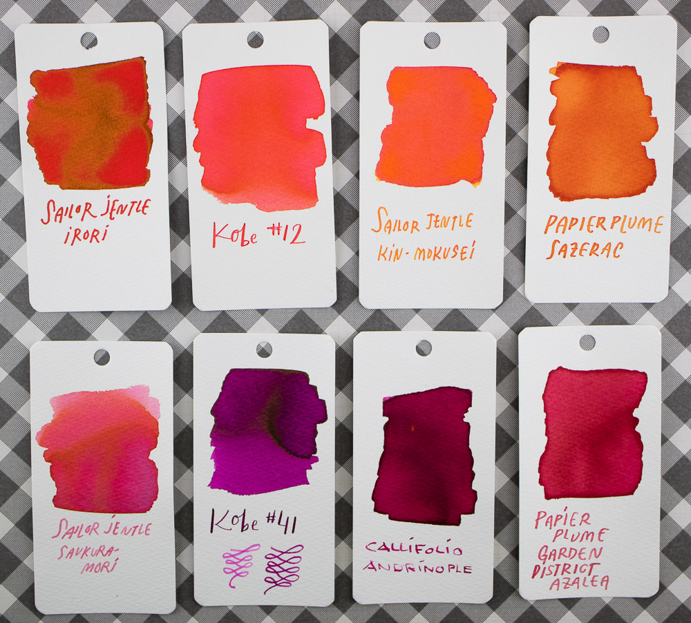
The launch of the new Sailor Jentle Four Season Inks also made me very happy. Tina also cheered about these. It came as quite a relief. The last batch did away with so many beloved colors and added in only one or two colors that I liked but the new range is much more appealing.

Karas Pen Co. introduced their Barstock Options this year allowing the possibility for a fully unique, fully customizable Render K or Fountain K with phenolic, brass, aluminum, copper, or delrin materials. The option of raw or tumbled aluminum as well as these more unique materials has made Karas signature pen model even more ubiquitous. The option of a steel or gold nib provides upgradability. Being able to convert a Render K to a Fountain K with the conversion tool as well makes Karas pens even more flexible than ever. There’s never been a better time to try this pen. I have started mixing and matching the threading from previous Render Ks, and Mini Ks to make some truly unusual versions of Karas Barstock models.

Despite many opinions in the opposition, the Field Notes Sweet Tooth edition was by far the favorite at The Well-Appointed Desk this year. The blank 70# colored paper in each book is great for drawing and note-taking and general goofing about which is what we’re best at.

The release of the Montegrappa Copper Mule fountain pen was a unique offering from Montegrappa this year that showed that the company was spotting cultural trends and recognizing prince points that were within the reach of the fountain pen market. It’s also a design meant to patina and age with use. Pen retails for $375/€295 and is available from many of my sponsors, Pen Chalet, Anderson Pens, and Fontoplumo.

Nock Co. started distribution to pen shops this year making it easier to get your pen case of choice which was a big win both for our favorite Pen Addict and for our favorite pens. It’s now possible to purchase Nock Co. cases at Goulet Pens, Anderson Pens, Vanness Pens and JetPens and I’m sure there are more partnerships on the way. Oh, and yeah for Tessa opening her own online stationery shop, The Stationer! Now I have another reason to wish I lived in England.

On the art supply side, the arrival of Plumchester, the new brand from Art Snacks was super exciting for both TIna and I. Their first product was a 1.5 brush pen, released through the November 2016 Art Snacks kit and then another product in the winter Studio Collection. Starting in 2017, products will be available for sale on their site. And we both really like the new Blackwing Colors colored pencils. I do hope it means that Blackwing will consider a larger selection of colors in the future but its a good start.

Retro 51 released the open numbered Tribute editions of the Tornado Fortress, Apollo and Tiger Shark pens allowing these classic designs to be available indefinitely. After the success of the Popper edition of the Flying Tiger in 2015, I was glad to see a new WWII aircraft design. And anything space themed is a big success at The Desk HQ. The new Tribute Editions are awesome designs and reminders of triumphs of the human spirit as well as beautiful pen designs from a brand that is known for doing some really clever creations. I also loved this year’s Slim Tornado line, especially the Sterling Silver Slim. It is gorgeous. A bit pricey but shows that they are raising the bar for what Retro 51 stands for. I like that they are a little more “ladylike” from a brand that tends to GO BIGGER rather than smaller. Since the holiday Popper Twinkle at the end of 2015, I’ve enjoyed seeing the occasional design that is more fashionable for we are so inclined. For as much as I love the Fortress and the Tiger Shark, sometimes I like things a little more delicate too.

The Tears

Retro 51, however, is also the first in my Tears list too though. I loved Twinkle so much and I even loved the 2014 Ugly Christmas Sweater so I was really, really disappointed in this year’s holiday Popper, Jingle Bells. Its a typographic travesty. Maybe that’s harsh. It just felt “phoned in”. If you need holiday ideas for 2017, just give me a holler next year. I’ll give you a list of other options.

I’ve been trying all year to figure out exactly what to say about the Cross Star Wars pens. And I finally figured out that they were clearly developed by people who did not actually have any love for the franchise. That has to have been the problem. Because as much as I wanted to be able to say “take my money” I just couldn’t do it. There just wasn’t any love in the designs of any of the Cross Star Wars designs at any of the price points. I don’t know if, at some point, there was passion behind the project and it was beaten out be committee or if someone just said “there’s a way to make money off this licensing agreement, let’s do it.” The pricey Townsend collection starts at $450 for the rollerball pen and the Darth Vader fountain pen features a two-tone gold and silver nib for $575. WTH? As a designer, I am having apoplectic seizures and I am making choking hand gestures at whoever let that design decision slide. At least offer the option to plate that nib black for a fee! Sheesh. Some of the engraving details are nice but overall I feel like Cross was afraid to break away from their overall  aesthetic to add too much engraving, color painting or texture. They could have anodized the clip on the R2 pen to be blue and used a fully silver nib to keep the look consistent for that pen. BB8 could have had orange enamel instead of rose gold. These are Star Wars fans. They could give two shakes about the “richness of rose gold”. Bleh!

The Star Wars Cross Click ballpoint pens for $45 look like the same style charm icon pens that Zebra Sarasa did for their scented Chupa Chups and Milky pens that sold for about $3 a piece. So I keep wondering if the R2, C3P0 and BB8 smell like machine oil when you write and the Stormtrooper and Darth Vader pens smell like cordite and plastic? Writing the name of the characters on the pen and sticking a charm on the clip does not make them a true Star Wars collectible. Its soulless and half baked. Either way, they should not cost $45 a piece.

The Montblanc M by Marc Newson was a pen I was really looking forward to seeing in person. I am an admirer of Newson’s design work. I love the O21c design he did for Ford many years back and I still believe he has some very innovative ideas but in regards to the M, I think he may have drunk his own Kool-Aid. One of the key tenents of good design is form following function so the fact that the pen does not post at all and the notch serves no discernible purpose disappoints me. Had it been done with a specific purpose, I would have been behind the design decision 100% but no. The clip looks so similar to the Lamy Safari that I’m hard pressed to understand how Montblanc expects people to pay over $500 for it even with a gold nib. It just seems a bit absurd. A sleek, modern design like this should have a “for the masses” price point. The magnetic cap is an interesting twist but its a small consolation.

Tina was not much of a fan of the Diamine Shimmering inks. She found them to be a bit of a letdown. They are not as sparkly as the J. Herbin 1670 series and yet they turned out to be just as high-maintenance. They required turning the pen to keep the sparkles distributed evenly and frequent pen cleaning and so forth. On the subject of “bling panning”, she was aldo not too crazy about the new Blackwing 530, although I do love the ferrule. She traded with someone in the Erasable Facebook group so that she could pull the ferrule off the 530 and put it on her favorite matte black Blackwing 24 – that’s where it belongs! J

The Black Ice Field Notes did not melt our hearts here at The Well-Appointed Desk. Neither Tina or I were particularly taken with this edition of Field Notes this year. Yeah for heavier #70 paper but the square perfect-bound format made it difficult to lay flat and the lined paper is well, lined. And its so dang shiny. The wrapping paper was awesome though.

The Personal Stuff

On a personal note, there were many ups and downs in 2016. In the cheers column, I once again was invited to be a part of the RelayCon Atlanta Pen Addict Podcast event which was a privilege. I am so grateful to be invited to participate. The Atlanta Pen Show is a blast and lead to the opportunity to meet and be interviewed by the Goulets for their Goulet Guests video series.  I met Heather Rivard and we launched Art Supply Posse which has been well-received. I attended five pen shows and got to work with Vanness Pens and Anderson Pens to see what it was like on the other side of the tables. I learned a lot about the business and had a great time getting to know the products better. Also, I’d like to thank Tina for hopping on board and helping with reviews and being a part of Well-Appointed Desk. I cannot wait to see what wonderful content she’ll bring to 2017.

On a less happy note, the service I used to manage my ads for the blog closed up shop and, in the process, stopped paying their customers while continuing to collect fees. As a result, I am still owed a good deal of money. Another blogger described the whole issue much more succinctly than I could. My work schedule also escalated this year with more projects than ever requiring longer hours than ever. When I wasn’t working on the blog or the podcast, I was at work. I also continued to struggle with cluster headaches with a surge of them in autumn. This lead to my unfortunate decision to step away from regularly contributing to the Art Supply Posse podcast. I was just stretching myself too thin. So, moving forward in 2017 I need to be more cognizant my work-to-play balance. I’m pretty sure 2016 had very little “playtime” and I hope to amend that in 2017. I’m also planning my pen show calendar.

What pen, pencil and paper-related items made you cheer this year? What are your goals or what are you looking forward to in 2017? I’m looking forward to thinking about the positive and the things I can accomplish.

Link Love: 2016 Wrap Up

rp_link-anaPens:

Ink:

Pencils:

Paper & notebooks:

Planners:

Other Interesting Things: