An Administration Remembered, Stationery-Style

(Photo credits: in order clockwise from top left: A reporter takes notes while President Barack Obama and Prime Minister Gordon Brown of the United Kingdom speak to the press in the Oval Office, March 3, 2009, Photo by Pete Souza;Pens to be used by President Barack Obama are set on the signing table with the bill prior to the signing of H.R. 803, the Workforce Innovation and Opportunity Act, in the Eisenhower Executive Office Building South Court Auditorium, July 22, 2014, Photo by Amanda Lucidon; The place-setting for attendees of President Barack Obama’s Cabinet meeting to discuss the economic recovery effort in the State Dining Room of the White House, June 8, 2009, Photo by Samantha Appleton; resident Barack Obama’s place is set at the table prior to the State Dinner for Prime Minister Shinzo Abe of Japan in the East Room of the White House, April 28, 2015, Photo by Chuck Kennedy. )

Over the years, I’ve frequently used photos of President Barack Obama writing as examples of an overwriting lefthander because of the tireless work of the staff photographer (usually Pete Souza) in the White House who has spent the last eight years photographing just about every time President Obama signed anything. And thankfully, the photos have been available for use by the press on the White House Flickr feed, now archived as the Obama White House feed.

I thought I’d share a few of my favorite pen related photo over the years. I’ve spent much time trying to figure out exactly what pens are used for the signing of legislation (I’m assuming either Parker or Sheaffer) and admiring the occasional photos of the handlettered place cards for luncheons and state dinners.

And that photo at the top left of the reporter who still writes in shorthand?!? That was back in 2009 but still! Pretty cool. I always like to see how other people work and live especially in such a world in which they meet foreign leaders, visit other countries and still occasionally dig in dirt, go for burgers and play basketball and manage to do it all under a microscope and smile through it all. I don’t think I pull that off. But I guess if I got all those pens, I’d sure try.

(Photo credits: in order clockwise from top left: Close-up detail of President Obama’s signature on a bill, and a pen used for the signing, aboard Air Force One on a flight from Buckley Air Force Base, Denver, Col. to Phoenix, Ariz., Feb. 17, 2009, Photo by Pete Souza; President Barack Obama signs a United States name plate at the conclusion of the U.S.-Africa Leaders Summit at the U.S. Department of State in Washington, D.C., Aug. 6, 2014, Photo by Pete Souza; President Barack Obama writes a response to one of the ten letters he receives each day from the White House Correspondence office on Saturday, July 25, 2009, Photo By Pete Souza; A copy of the menu sits on a table following the Congressional Spouses Luncheon, May 20, 2009. (Official White House Photo by Samantha Appleton).


These photos are official White House photographs and are made available for publication by news organizations and/or for personal use printing by the subject(s) of the photograph. The photograph may not be manipulated in any way or used in materials, advertisements, products, or promotions that in any way suggest approval or endorsement of the President, the First Family, or the White House.

Art of the Day: Unlikely Airline Art

I just had to share this video of my pal Amanda and her awesome habit of embellishing the sick bags in the seatbacks on flights to and from LA on Southwest. So if you ever happen to be on a Southwest flight, check the seatback pocket…

To see some of her previous work, check out the instagram hashtag #barfbaglettering. All her lettering is done with her trusty Sharpie markers and a kind heart.

If you want to try it yourself, there is also a #spewbagchallenge hashtag where other people have also submitted there lettering and artwork (may not be suitable for all audiences… you have been warned!).

Review: Blackwing Point Guard

Blackwing Point Guard

I received my Blackwing Point Guard in the mail last week. As a subscriber to the Blackwing Editions, I only had to pay shipping to receive it so I was willing to try it out, even though I had already heard through the blog phone tree that it wasn’t worth it. Curiosity killed the cat and cost me $3 in shipping and a trip to the PO Box.

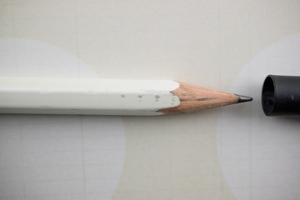
The first thing I noticed is that its heavier than any other pencil cap I own. Not like brass-heavy just more substantial, and larger than any of the other pencil caps. Since Blackwing pencils are already exponentially larger than pens and other pencils, sticking a Point Guard on one makes it almost impossible to get it to fit into any pencil or pen case. Euphamistically, its friggin’ huge.

It also does not fit onto the pencil very far. In the photo above, I aligned the cap with the marks on the pencil to show exactly how far the cap fit onto the pencil. I know some people can get a pretty long point on their pencil but that still leaves an awful lot of clearance at the end.

Blackwing Point Guard

Shown above, the Point Guard appears with a Sun-Star plastic pencil cap, a generic aluminum pencil cap and a Kutsuwa Stad Aluminum Pencil Cap. I also chose a selection of pencils to test all the pencil caps to see which worked with the most pencils.

Blackwing Point Guard

I chose common favorites beyond the Palomino Blackwings like the Prospector, Tombow, Mitsubishi, CDT, General’s Cedar Pointe, Natajar, Faber-Castell Grip 2001 (for its triangular shape), and the Mitsubishi Colour Pencil (its a round barrel and slightly wider) to get a range.

Blackwing Point Guard

My experience with the Point Guard mirrored many other’s. I found it very difficult to actually get it on to a Blackwing Pearl. I practically had to wrench it on. It sort of broke my heart a little to do it knowing I was marring the paint to do it. I really like Pearls.  But for you, I did it. And here’s the proof. Yep. It marked it up. And I had to wrench the Point Guard off again. I mean I looked ridiculous trying to pull the cap off. I can’t imagine trying to pull that cap off in a  meeting. I looked like I was wrestling a candy cane out of the mouth a rigor moritised-earthworm. It was not pretty. In a public place, I would have inevitably lost purchase on one or the other and let them fly across the room.  Hence, the need to bring in the other pencil caps for comparison. Were they all this difficult to use? Or did they all fall off?

Blackwing Point Guard

So I started testing the other pencil caps like the transparent plastic Sun-Star and the aluminum caps.Between the plastic Sun-Star caps and the aluminum caps, I was able to cap and shake test all of the pencils shown above and easily remove the caps without endangering those around me. They fit snugly but not TOO snugly. Mostly, these caps keep the points of your pencils from poking you or your carrying case or from the lead breaking in transit. Some of the caps fit better than others with some pencils but clearly the price points are drastically better so its easier to have an assortment of Sun-Star and Kutsuwa Pencil Caps on hand than it is to have more than one Point Guard.

The aluminum caps have slits up the side to make it possible for them to fit wider hex and round barrel pencils more easily. Of course, this means its also possible to stretch the aluminum out so that they no longer fit snugly around a standard hex pencil and wouldn’t pass Blackwing’s rigorous “3-shake test”.  But you can find two 8-packs of aluminum Kutsuwa Stad Pencil Caps on Amazon for under $9 so you can outfit an entire dozen of pencils and then some for the cost of ONE Point Guard.

Blackwing Point Guard

The bottomline: Don’t waste your hard earned pencil funds on the Point Guard. Buy an assortment of these other pencil caps instead or do a search on JetPens for Pencil Caps or ask at your favorite shop or web site for other pencil cap recommendations. I appreciate that Blackwing tried to innovate the pencil cap but in this instance, it just didn’t work.

Link Love: Reasons, Pencils & Videos

Link artwork by Chris Grine, illustrator of the web comic Wicked Crispy.

Pens:

Ink:

Pencils:

Paper & Notebooks:

Other Interesting Things:

Shawn Newton and Lisa Vanness talk about details regarding the upcoming Arkansas Pen Show. For more details, visit the Facebook page.


The creators of Flow Magazine talking about why they created a paper magazine empire.

Review: A4 Lihit Lab Teffa Bag-in-Bag

Guest review by Tina Koyama

When I travel, I always pack for a carry-on only – a roller bag that goes in the overhead bin and a standard-size backpack that shoves under the seat. (Yes, I do this even for three-week trips!) Especially for intercontinental flights but even for much shorter ones, I must have lots of different kinds of entertainment: Kindle books and music, of course, but also a sketchbook, art materials, my journal and a writing pen. I don’t expect to have my entire arsenal of everyday-carry supplies at my fingertips because then I wouldn’t have space on my tray table for snacks. But before takeoff, I like pulling out everything I might possibly want during the flight so that I don’t have to constantly dig around under the seat to get more things out (and risk knocking over my spouse’s beverage, which has happened). And I’d like to get it all out in one smooth operation.

A4 Lihit Lab Teffa bag in bag

Am I dreaming? Maybe. But when I saw the Lihit Lab Teffa Bag in Bag in the A4 size (Ana has reviewed the A5 size), I thought it would be ideal for organizing all my in-flight entertainment in one tidy place. I chose bright orange so it wouldn’t disappear into the black hole of my black backpack. The hard part is anticipating all my needs and carefully selecting what to put into it before the flight begins.

I was planning to use the large main compartment, which has a double zipper, for my 8-inch tablet. But when I got a super-thin 12-inch Surface for Christmas, I was delighted to find that it also fits comfortably in there. I don’t always travel with a laptop, but it’s nice to know that the Teffa could serve as a sleeve for the Surface (much more functional than the pocketless sleeve that came with the Surface) if I decide to bring it.

In the unzipped compartment on the left, I put a 6-by-9-inch handmade sketchbook, which is typically what I use when I travel. A softcover Baron Fig Flagship notebook (a favorite for pencil sketching) also fits nicely in this space. In the right-side compartment I put six colored pencils and one Blackwing. I like that the compartment is narrow enough that the pencils won’t fall down into a heap at the bottom, so they are all easily accessible.

I chose two brush pens and a Sailor 1911 Large fountain pen (with fude nib, my first choice for drawing) to put into the three pen slots. Described as being wide enough to accommodate thick pens, the pen slots nonetheless felt a bit tight when I pushed those pens in. I’m guessing they will loosen up with use.

Velcro pocket flaps open

The two front pockets (with Velcro flaps) were just the right size for a Field Notes notebook (for sketching and journaling), my phone and ear buds (not visible).

Except the laptop, everything shown came out of my usual everyday-carry. I could easily fill any of the compartments or pockets with more than what you see here, but I really want the bag to be slim and tidy while still meeting my in-flight entertainment needs.

A4 Lihit Lab Teffa inside backpack

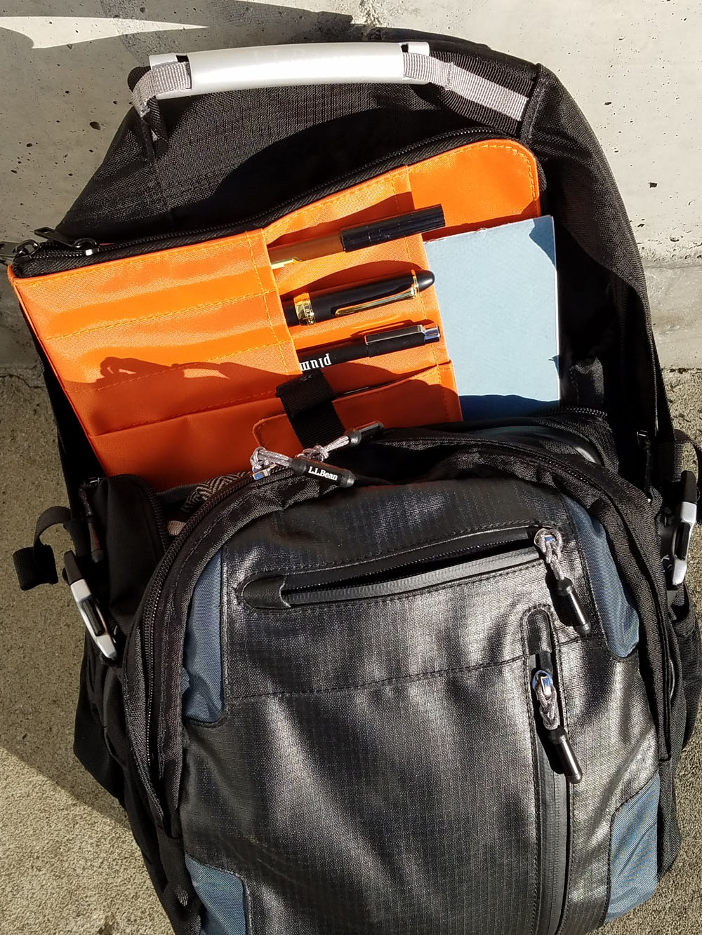
Filled, the whole Teffa bag fits easily in the padded laptop compartment of my backpack, and I can pull it out in one elegant motion! (Ya think? We’ll see if I can avoid tipping the beverage.) There’s still plenty of space in the backpack for my everyday-carry bag and snacks. That should do it, right?

So far it’s theoretical, since I haven’t flown with it yet, but there’s a test flight is coming up in a few months. In the meantime, I have to fight the temptation to add a few more colored pencils, a waterbrush, a pocket-size Rhodia journal (my favorite for longer trips when I have a lot more to say), and oh, look – a magazine would fit …!

tina-koyamaTina Koyama is an urban sketcher in Seattle. Her blog is Fueled by Clouds & Coffee, and you can follow her on Instagram as Miatagrrl.


DISCLAIMER: The items included in this review were provided free of charge by JetPens for the purpose of review. Please see the About page for more details.

Pen Review: Visconti Wall Street Limited Edition Green Pearl Celluloid Double Broad

Visconti Wall Street Green Pearl Limited Edition

The Visconti Wall Street Limited Edition Green Pearl is the first Visconti that I’ve ever had the privilege to use. In terms of looks, its probably the exact model I would have picked for myself. The layered green celluloid catches the light similarly to vintage Parker Vacumatics. As someone who’s heart is perpetually stuck in a 1940s film, this is an easy way to win my heart. The unique, rounded square shape is also quite appealing too. For starters, its far less likely to roll off the table and it actually feels quite nice in the hand.

Visconti Wall Street Green Pearl Limited Edition

Visconti Wall Street Green Pearl Limited Edition Cap branding

Visconti Wall Street Green Pearl Limited Edition Cap

Aesthetically, my one sticking point is the Visconti branded scimitar clip. I have just never liked this design decision and Visconti sticks it on almost every pen they design. Its like the un-design decision. Can’t think of how to design the clip? Stick the scimitar on it. Where the layered celluloid is supposed to create the illusion of floors of a skyscraper and the twinkle of lights in the windows and the shape of the pen is supposed to be reminiscent of the shape of a building, why stop at the clip? Could it not also evoke the decorative filigree on buildings like the Carbon and Carbide Building or other great historical architectural marvels? I didn’t mention the Chrysler Building because that seemed obvious but you know what I mean… right?

Most of the weight of the pen is in the cap and the clip, weighing an impressive 42 gms capped but uncapped and filled, it weighs a more manageable 25 gms. The chart below includes capped and/or posted weights for common budget-priced pens for comparison.

Fountain Pen Weights

In regards to length, the Wall Street can be used posted at an impressively long 7″ or unposted at a more diminutive 5.25″ which fit comfortably balanced in my small hands. Closed and capped, the Wall Street is 5.75″ which is only about 0.25″ longer thank your average Lamy Safari so its not a small pen but its not out of the ordinary size-wise.

Visconti Wall Street Green Pearl Limited Edition nib BB

This nib on this particular model is the BB, double broad “Dreamtouch” 23K gold correction: palladium. It is a soft, slightly flexible nib and is quite smooth though I had a bit of a learning curve finding the right angles to  get the best performance from the nib. The BB required being held at a slightly higher angle if I was writing from below the baseline (from my left handed angle) though writing from above, I had no issues with writing at all except that the pen laid down so much ink that dry time became an issue and I kept sticking my hand in wet ink. It’s a bit flexy but I would certainly not be inclined to use it as a flex nib.

In order to take full advantage of the flexibility of the nib though, writing from below the baseline was my best option. Just the weight of one’s hand and the movement and passion with which one is writing is enough to add some character and flair to the strokes.

However, when writing overhanded, I needed almost no contact with the paper to get ink to flow. The lightest of touches was needed and ink just appeared on the paper which was really nice. It meant that writing was easy and I wasn’t having to push or pull or will the ink out of the pen. It just flowed.

Visconti Wall Street Green Pearl Limited Edition Writing Sample

I did not talk in depth about the filling system which is a double reservoir power filler. The best information I could find to clarify what a “double reservoir power filler” was came from Inks and Pens who succinctly explained that its a glorified vacuum filler. Oh, well. That’s much easier to understand. The challenge is getting a full flush. Since this is not my pen, I did my best to fully flush the pen clean but it left a bit of clean water in the reservoir. Rather than disassemble a loaner pen, I’m going to leave the water in the pen than risk disassembly. It actually arrived with a bit of water in it so it seems to be an issue coming and going.

I confess, I waited until after I did all my testing and writing and experimenting to find out exactly how expensive this pen was. I know that Visconti pens are not inexpensive but I did not want the price of the pen to factor into my opinion of the pen. As many of you already know, I’m not a fan of the hype and fanfare around the Homo Sapiens line (see Pen Addict podcast episode 238) so I went into my Wall Street experience a little skeptical to begin with. However, I did warm to the pen in general. I did gasp a bit at the price.

If I wasn’t such an ink changer and didn’t think the clip was phoned-in, I might actually consider this pen as a possibility for my collection, with an extra fine nib of course. But with those caveats, I think I might rather put that kind of money towards a refurbished Parker Vac instead.

PS: I didn’t go into detail about the packaging because it was just fancy packaging. If you’d like to see photos of the box, check out this review for a different version of the pen, but the same packaging.


Big shout out to Casey (AKA Punkey) for loaning me this pen to try out. He is, as always, my enabler, my comrade and my favorite troublemaker.

My Cross Century Secret Stash (and a Cross Spire for good measure)

cross century assortment

Last summer, after answering an Ask The Desk post about finding a classic ballpoint pen, I developed a fascination with Cross Century pens. At the DC Pen Show, I acquired my first, an engraved Cross Century II in matte blue metallic and have since acquired three more: two classic Cross Centuries and a Cross Century II Starlight from NOS this December. You may be asking yourself, what’s the fascination?

First, the original Cross Century is similar to the Parker Jotter in that the design has been around for decades. Its classic, streamlined and elegant. Originally created in 1946 and still in production today, the Cross Century is a sleek, elegant design and, like the Jotter, worthy of being in any pen collector’s collection, whether you acquire your grandfather’s or purchase a new one. Or both.

cross-century II twilight grey

The Cross Century II is an updated version of the Century modified to accommodate rollerball refills, a more ergonomic grip section and the larger pens preferred by modern pen consumers. This also allowed for some innovations in their refills as well which Cross refers to as the “Selectip” refills which appealed to me because one of the options is a felt tip. Of all the major pen manufacturers, Cross is the only one I know of that offers felt tip as a refill option.

(This is the point at which I am NOT going to talk about the Star Wars Cross designs. Like they never even happened. Nevermind, those are the  “Townsend” line — they are still awful. I can gripe about the Marvel Century IIs. Those are bad too. Giant logos do not make for good licensed products. Okay, back to our regularly scheduled happy review.)

And then there’s the “Switch-It” mechanical pencil option that can be dropped into the ballpoint pen to turn it into a pencil. I love a pen manufacturer who considers giving their customers range and options! Of course, the actual implementation of the “Switch-It” refill is a little janky and it is only available as a 0.7mm mechanical pencil which steam a lot of people since the older Cross mechanical pencils were 0.5mm or 0.9mm so the fact that the Switch-It insert only has one width option is kind of lame. Anyway, actually using the Switch-It insert took a little practice since it doesn’t work like any other mechanical pencil I’ve ever used.

cross century plaid

While it took me awhile to figure out how to work the Cross “Switch It” Pencil refill on my own. I came to the same operating action as demonstrated in the video shown here:


cross-century pens open

And, of course, because I can’t leave well enough alone, I modified the Cross Spire pictured at the top of the photo to accept a Uni Signo 0.38mm D1 refill by jamming a bit of plastic in the end of the barrel to make up the space disparity in the length. It’s now one of my favorite everyday pens.

My engraved “The Well-Appointed Desk” Cross Century II Royal Blue Selectip Rollerball Pen $29.95 (plus engraving charges) is filled with the fine tip porous point black ink and the Cross Century II Starlight Rollerball in Grey has a fine tip porous point with blue ink. The Starlight was purchased NOS  and is no longer available but Anderson Pens still has some of the ballpoint pen models available.

cross-century writing

Cross refills are considerably more limited than Parker. Cross makes proprietary refill sizes and offer a limited range of tip sizes and colors, where PArker style refills became the industry-standard size. As a result, Cross pens are not nearly as popular unless you like plain black and blue ink and medium width ballpoint or rollerball refills. However,  if you are willing to do a little tweaking, there’s some opportunities to make these beauties work for you. And, in some ways, it looks like Cross is trying their best to help too like the Switch-It pencil refill.

Now, if they can build on that…

cross-century-3

The models shown above but not mentioned are: