Pencil Review: 2B Wood Pencil Sampler

Review by Tina Koyama

Most of my childhood memories of using pencils are dismal at best. I recall many papers looking messy as my left hand smudged across the page, even with standard-issue No. 2 pencils. As soon as I was allowed, I switched to any kind of fast-drying pen available back in the Dark Ages of the ‘70s and never looked back at pencils.

Fast-forward several decades to when I started sketching, and even then I went almost immediately to ink. It was my love for colored pencils in recent years that finally helped make graphite pencils friendly to me. In fact, now I love graphite pencils – for both writing and drawing.

I thought I’d preface my review of JetPens’ 2B Wooden Pencil Sampler with that background so you’d understand why I chose the 2B set. JetPens offers pencil samplers in a range of firmer grades that might be better suited to writing, but I tend to favor softer grades for drawing as well as writing. I was hoping 2B would be a grade that could serve as an all-purpose pencil.

From top, the pencils in the sampler are:

Appearance and Quality

Before I get to the writing experience, a couple things are worth noting about appearance and material quality. Right about the time I had gotten this sampler, I was reading David Rees’ partly practical, mostly satirical book, How to Sharpen Pencils, to improve my hand sharpening technique. The Staedtler Mars Lumograph was the only pencil in the pack that came pre-sharpened, so I was delighted to have four fresh pencils to refine my sharpening skills. The wood casing on both the Uni Mitsubishi 9800 and Uni Mitsubishi 9000 felt harder to cut through than either the Tombow Mono 100 or the Uni Mitsubishi Hi-Uni. At times the wood splintered. What’s more, the exposed graphite cores in the 9800 and 9000 broke when I cut away a bit too much of the wood, so I had to start over. The wood casing on the Hi-Uni was noticeably easier to carve, never splintered, and the core remains unbroken even with the same exposure. I’m not sure if this experience says more about my hand-sharpening skills or about the wood or core quality, but since pencil reviewers rarely mention hard sharpening, I thought I would.

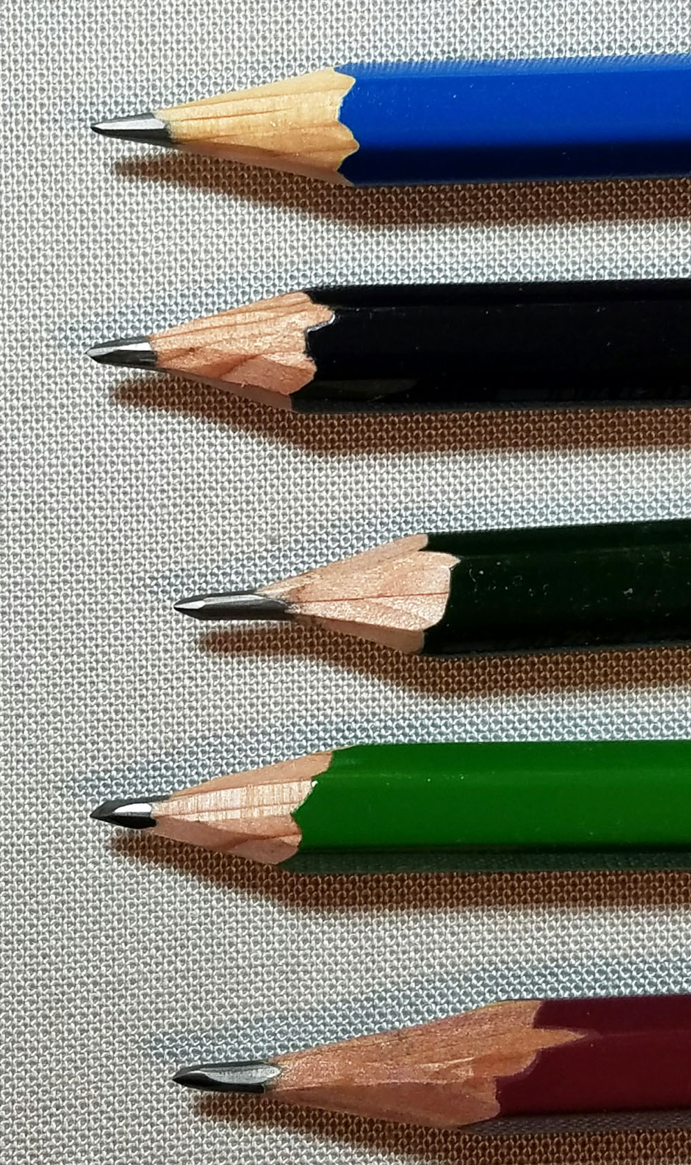
All five pencils are attractive and smoothly lacquered. All but the 9800 have painted caps (I tend to look askance at pencils with exposed ends; they look unfinished to me). The Hi-Uni has a pretty divoted yellow dot in its cap. I give bonus points, though, to the Mono 100, which has a distinctive white band wrapping over the cap – an elegant touch that makes it the most visually appealing of the five. (A practical reason why I appreciate distinctive caps is that I can identify them quickly in my bag, where all my sketching and writing implements stand upright, point down.)

L – Mono 100, R – Hi-Uni

Writing Experience

My scribbling, writing and erasing tests and sketches were all done in a Baron Fig notebook, which has just the right amount of tooth for my liking. All five pencils in the 2B sampler are pleasant writers. The Staedtler Mars Lumograph feels the roughest of the five, especially when I shade large areas, but when writing, the roughness gives way to a nice feedback.

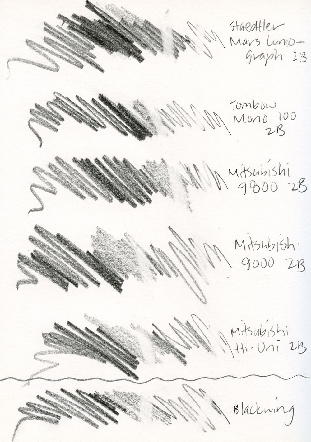
The Tombow Mono 100, Uni Mitsubishi 9800 and Uni Mitsubishi 9000 all feel equally smooth when writing. In fact, blindfolded, I’d be hard-pressed to tell them apart. Since I’m familiar with sketching and writing with the Palomino Blackwing, I used it as sort of a “control” factor so I’d have something to compare with. While not quite as soft as the Blackwing (which seems closer to a 3B or 4B), the Hi-Uni and the 9800 feel just as smooth.

Although I don’t usually use an eraser when drawing (or even when writing – I simply strikeout, an old habit from my years of ink use, I guess!), I put a Tombow Mono Zero eraser through my scribble tests to see how they erased. They all erased cleanly, though the four Japanese pencils erased slightly more completely than the Staedtler.

Despite the mild smudging I experienced (unavoidable in the lefty world), I decided that 2B is not too soft for writing in my planner and jotting notes (though I probably wouldn’t choose it for longer drafts). The softness just feels pleasant gliding across the page.

Incidentally, I was a fan of the Tombow Mono (not Mono 100) line and have almost all the grades, so just for fun, I compared a 2B Mono to the 2B Mono 100. I closed my eyes to see if I could tell the difference. Nada. (Maybe their cores are identical and only the branding is different?)

Sketching Experience

As mentioned previously, the Mars Lumograph has a bit of scratchiness that I notice when writing and when using the side to shade large areas. Although the Mono 100 appears just slightly darker and the Hi-Uni is slightly lighter, the four Japanese pencils are equally smooth as silk in just about any sketching application – the point and the side. In softness, however, the Hi-Uni has them all beat. Not by much, but there’s a certain velvetiness to it that makes it nearly silent. (Nothing annoys me more than a noisy, scratchy pencil when I’m trying to sketch stealthily in public!)

Mitsubishi 9000 2B, Blackwing

In all my sketches shown here, I started with one of the 2Bs and tried to get as wide a range of tones as possible with only that pencil. I found that with a 2B alone, I couldn’t get quite as dark a tone as I wanted for shadows, so I tended to reach for a softer grade to put in the final dark touches. In other words, a 2B is not a standalone grade for my sketching needs. (I wish JetPens had a 4B sampler – I’d have fun testing that to find the ideal standalone sketching pencil.)

Staedtler Mars Lumograph 2B, Staedtler Mars Lumograph 9B

Final Impressions

Although I’d be happy with any of the five 2Bs for writing, my top pick for both writing and drawing is the Uni Mitsubishi Hi-Uni. It seems to skim effortlessly and nearly silently across the page; I feel like I could write or sketch with it all day. Since writing this review, I’ve treated myself to the full Hi-Uni range, and the line has surpassed the Tombow Mono as my all-around favorite.

Tombow Mono 100 2B, Staedtler Mars Black 6B

It’s worth noting that my fave is one of the most expensive in the sampler – nearly three times the cost of the 9800. (Only the Mono 100 with its fancy banded cap costs a dime more.) So maybe, I have expensive pencil tastes. But here’s how I look at it: Ranging from $0.85 to $2.60, the sampler pencils average out to $1.70 each. In my mind, the sampler is an excellent value. I got to compare five pencils at a price, per pencil, that’s a lot lower than the two pricey ones – and the cheaper ones turned out to be great pencils, too.

tina-koyamaTina Koyama is an urban sketcher in Seattle. Her blog is Fueled by Clouds & Coffee, and you can follow her on Instagram as Miatagrrl.


DISCLAIMER: The items included in this review were provided free of charge by JetPens for the purpose of review. Please see the About page for more details.

Link Love: 100 Problems But A Notebook Ain’t One of ‘Em

Pens:

Inks:

Pencils:

Notebooks & Paper:

Planners & Organizers:

Art & Calligraphy:

InCoWriMo/LetterMo:

Other Interesting Things:

Giveaway: Decoylab Wall Calendar

One of my favorite local KC artists is Maiko of Decoylab. She makes amazing pieces like laser wood and acrylic clocks, laser brooches and necklaces (of which I own a bazillion!) and other beautiful crafted goods. The fact that such world-class talent is right here in my town often tickles me.

She showed me her large wall calendar $26 and I said it would be an awesome piece to have here on The Desk and then time got away from us and here it is the end of January! So, we decided, since not everyone is as prompt about getting organized for the new year, we could host a giveaway so the next 11 months could be beautiful and organized.

Maiko has kindly offered to giveaway one of her 2017 Wall Calendars. It is a simple, functional calendar that features large dates that can be read from across the room.

Full moon stickers and a large bulldog clips are optional. Calendar starts from October 2016 to December 2017.

  • Features:
    • Size 11×17
    • Large dates visible from afar (Date height 1.37″)
    • Plenty of space underneath the dates to jot down important dates ( 1 inch height)
    • Ships flat
    • Printed on 70lb text weight paper – same as copy paper weight
    • 100% post consumer waste paper
    • The paper color is slightly off white
  • Optionals:
    • 15 full moon stickers (full moon dates included)
    • 3 inch chrome bull dog clip

If you don’t want to wait to see if you win the giveaway, you can order one today. I did because I still have a sorry-looking free calendar hanging on my wall from LAST YEAR and I needed to remedy the situation ASAP. While you’re there, you might want to consider one of her amazing clocks. I’m partial to the Cuckoo Style A because it has squirrels on it. One of the most popular items is the DIY Western Auto sign which is a beacon on our downtown skyline that Decoylab turned into a desktop 3D bamboo kit you can assemble, paint and build yourself.


TO ENTER: Leave a message in the comments and tell me what New Year’s task you’ve procrastinated or if you are hyper-organized what Decoy Lab item you’re dreaming of owning. One entry per person.

FINE PRINT: All entries must be submitted by 10pm CST on Saturday, January 28, 2017. All entries must be submitted at wellappointeddesk.com, not Twitter, Tumblr or Facebook, okay? Winner will be announced on Saturday. Winner will be selected by random number generator from entries that played by the rules (see above). Please include your email address in the comment form so that I can contact you if you win. I will not save email addresses or sell them to anyone — pinky swear. If winner does not respond within 10 days, I will draw a new giveaway winner. Shipping via USPS first class is covered. Additional shipping options or insurance will have to be paid by the winner. We are generous but we’re not made of money. US Residents Only.

Pen Review: Pilot Custom 912 Waverly Nib

Pilot Custom 912 Waverly

The Pilot Custom 912 Waverly ($224) is a most unusual fountain pen. And its not unsual for its exterior. From the outside, it looks like what the Brits might call a “saloon car”. Not in a bad way. It’s an upscale 4-door black sedan in the nicest possible way but no one would look at the outside of this pen and ogle. It’s understated and refined. It has simple silver hardware withe very little ornamentation or flash. It’s not fancy.

Pilot Custom 912 Waverly nib close up

When the cap is removed, you see beautiful etching on the 14K gold nib, a razor fine point and the letter “WA” etched on the nib. “WA”?

Pilot Custom 912 Waverly nib close up

When turned to the side is when you see, this is not ordinary nib. Did it get dropped? Nope. It is meant to be bent at an angle like this with the tip flared up ever so slightly. According to Pen-Info.jp, it is designed this way to allow any writer to write at any angle. For a left-hander, this means that some of the issues that can sometimes confound a left handed writer with softer gold nibs, extra fine nibs or writing overhanded or at odd angles, can be avoided with a nib like this.

Pilot Custom 912 Waverly

Pilot Custom 912 Waverly writing sample

So, do my writing results prove it? Indeed they do. I have been writing consistently with the 912 since before Christmas (Merry Christmas to me!) and the pen performs flawlessly. My previous experience with a Pilot Custom 74 F was not as successful partially because of the softness of the nib and the angle of my writing. This is clearly a vast improvement. Do I wish I could put the beautiful nib in a sports car package? Yes. But I’m okay driving around in the saloon car sometimes too.

Check out fellow lefty and Desk-contributor Tina Koyama’s review of the Custom 912 Waverly as well.


Included an affiliate link but I purchased this pen with my own money and all opinions are my own.

National Handwriting Day

Actual handwriting from Hallmark lettering artist Sarah Cole

Every year, National Handwriting Day sneaks up on me. Luckily, I have a whole bunch of writing samples from previous National Handwriting Days.

Hand written by Madeline Tompkins of TagTeam Tompkins

Hope you get to put pen or pencil to paper today and use your handwriting.

Handdrawn lettering by Hallmark designer/illustrator Lauren Tobaben


Fashionable Friday: Marble Madness

I spent two days this week marbling paper for a project for work so I am in the “marbling zone”. It’s definitely a trend right now and fountain pens have always utilized marbled resins and plastics so this was an easy crossover. Hope you enjoy your own Marble Madness this week.

  • Genuine Ingenuity Sleeveless Top in Indigo Swirl $49.99 (via Modcloth)
  • Aurora Optima Nerla Perla Fountain Pen $445 (via Anderson Pens)
  • Palomino Blue Eraser-Tipped HB Pencil $13 per dozen (via Fresh Stock Japan)
  • E+M Marble Nib Holder – Silver-Black $1.80 (via JetPens)
  • Paperblanks Mini Blank Journal in Rococo Revival Crystal Chandelier $12.95 (via Anderson Pens)
  • Pelikan Classic M200 fountain pen marbled green € 119 (via Fontoplumo)
  • Monteverde Prima Fountain Pen in Black Swirl $37.50 (via Pen Chalet)
  • Bookbinder’s Blue Coral Snake Ink (30ml Bottle) $12.50 (via Anderson Pens)
  • Delta Matte Journal Fountain Pen in Ivory $120 (via Pen Chalet)
  • Franklin-Christoph Model 03 Anderson Pens Special Edition $165 (via Anderson Pens)
  • Pilot Iroshizuku Fuyu-syogun Ink (Old Man Winter) – 15 ml Bottle $13 (via JetPens)
  • Kaweco AL Sport fountain pen in Grey / Gunmetal aluminum € 65 (via Fontoplumo)
  • Hand marbled original artwork marble case – iPhone 7 PLUS – Aqueous Orbit in Silver & Turquoise – by Roo Bannister $57.14 (via Marbleous Roo on Etsy)

Thanks to my sponsors for providing some of the images I use for Fashionable Friday. Please consider making your next purchase from one of the shops that support this blog and let them know you heard about them here. Thanks for your support and for supporting the shops that help keep it running.

Book Review: A Year of Living Danishly

A Year of Living Danishly

After reading the article in the NYTimes about hygge and creating my New Year’s Hygge-themed Fashionable Friday, I decided to get more familiar with the concept of hygge and what might make the Danes so happy and well-adjusted. So I decided to read The Year of Living Danishly: Uncovering the Secrets of the World’s Happiest Country by Helen Russell. I wasn’t entirely sure what to expect from the book. Was it going to be a self-help book like Marie Kondo’s Life Changing Magic of Tidying Up book?

Well, it turned out to be more of a memoir of Russell’s year of living in Denmark having relocated there after her husband got hired on to work at Lego. Each chapter is one month of their year with an aspect of the Danish culture revealed in that month. She discusses politics, taxes, trust, sex, childcare, healthcare, traditions, pastries and family to name a few things. And while she finds many things to recommend the Danish way of life, there are also many things that perplex her as well. In the best way, the book is not rose-colored glasses. I found it very interesting and enlightening in the way that any book about someone immersing themselves in a new way of life discovers what is really important and what they can easily live without.

Russell is British so, while the book is witty, the humor is quite dry. Some parts I laughed out loud though but I do lean to the dry humor.

So, if you’re looking for a book to make you reconsider how you see your place in the world, and whether you have it good where you are, this might be a book you would enjoy. I certainly found parts that made me think that I have it quote good where I am and parts where I thought “Why can’t we do thing more like the Danish?”

This book isn’t specifically pen- and paper-related but I do think anyone who wants to think about how to slow down, get hygge or simplify their life might appreciate the ideas offered in this book. We tend to be a literary lot in general and I know we all appreciate a good cup of coffee and a snegle.