Links of the Week:
For the ladies out there who like podcasts and books (of the romance genre):
My favorite trash-talking, book-loving ladies got together on one podcast – finally. They were all at the Romantic Times Booklovers Conference in Atlanta so that made it easier. Romance Podden, normally recorded in Swedish (so I can’t listen to it often), is hosted by my favorite pen show co-hort Julia was on my favorite book podcast Smart Podcast, Trashy Books recently. SQUEEE!!!! As a result, there are two episodes with Sarah Wendell and Julia and Melody of Romance Podden talking about language, trashy books and generally being their sassy selves. So, if you haven’t come out of the “petticoat closet” yet and need a good push, come join us. Warning: NSFW without headphones.
Now, on a more sombre note, Lori wrote about Susan Wirth, our dearly departed:
- In Memory of Susan Wirth (via The Desk of Lori)
I am still collecting photos and stories and Susan was definitely the godmother of the Fountain Pen Girl Gang. So if you have anything to contribute to the upcoming memory book, send it along to me: chair @ wellappointeddesk.com. Thanks!
Pens:
- Montegrappa Game of Thrones Rollerball And Ballpoint (via Pen Addict)
- FPRevolution Guru Fountain Pen – Steel Flex Nib Pen for Beginners (via Gourmet Pens)
- Diplomat Aero in Sunset Orange (via Pen Addict)
- Aurora Kappa Fountain Pen (via Inkdependence)
- Kaweco Special Ballpoint Pen – New Shiny Brass (via Clicky Post)
- Pilot G-Tec (via Write to Me Often)
- Applied Pens Streamline Fountain Pen (via Pen Paper Pencil)
- Sailor 1911 Large Ballpoint Pen (via Ed Jelley)
- Schon DSGN Classic Pen (Aluminum) (via Nib & Ink)
- Baron Fig Squire – Experiment No. 108 (via Pens and Junk)
- Edison Menlo with Draw Filler (via My Coffee Pot)
- GW Pens Gem Pen “Rose Quartz” (via Squishy Ink)
- Introducing Benu Pens (via Gentleman Stationer)
Ink:
- Diamine Ancient Copper (via Write to Me Often)
- Akkerman 28 Hofkwartier Groen (via My Pen Needs Ink)
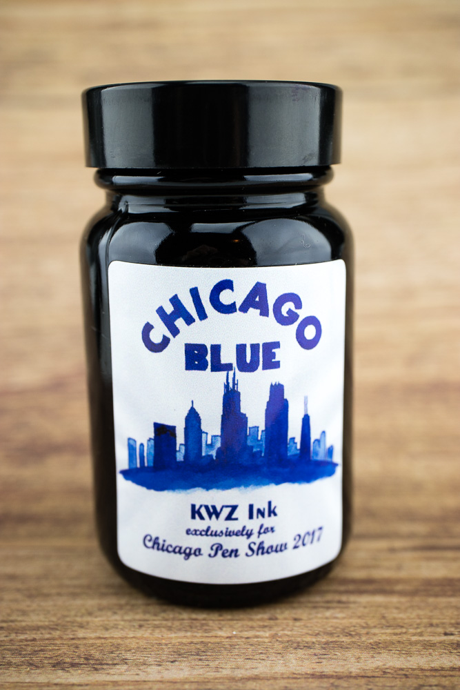
- KWZ Inks – Rare and Exclusive (via Fountain Pen Inks and Bleach)
- Rohrer and Klinger Alt-Goldgrün (via Alt. Haven)
- Robert Oster Tranquility (via Inkdependence)
- Franklin-Christoph Tenebris Purpuratum (via Gourmet Pens)
- Robert Oster Midnight Sapphire and Astorquiza Rot (via The Gentleman Stationer Tumblr)
- Robert Oster Royal Red (via Pen Chalet Blog)
- Video: Montblanc Miles Davis Jazz Blue (via Anderson Pens Blog)
- Robert Oster Marrone Mustard (via Pen Chalet Blog)
Pencils:
- Caran d’Ache Swiss Wood (via The Desk of Lori)
- Tree Pencils (via Pencil Talk)
- Muji 2B (via Pencil Talk)
- More Vietnamese Monos (via Bleistift)
Notebooks & Planners:
- Pocket Notebooks subscription box meta-review (via United Inkdom)
- Field Notes Bonus Subscriber Shipment 2017 Surprise (via Bleistift)
- Plan & Note planner pros & cons (via Quo Vadis Blog)
- Inky Fingers Currently Inked (via Paper Pens Ink)
- My Current Pocket Moleskine Set Up (via Seaweed Kisses)
Other Interesting Things:
- Chicago Pen Show 2017 Journal – Part 4 (via Pen Habit)
- How to make your own watercolor and other diversions (via Leigh Reyes)
- Personal Freedom and Paper (via Quo Vadis Blog)
- Get your desk surface back (via My Life All in One Place)
- A Visit to Baum Kuchen Los Angeles (via Paper Pastries)
- 3 Quick “Crayola Calligraphy” Projects (via The Postman’s Knock)
- On Self-Employment, Workaholism and Getting my Life Back (via Lisa Congdon, Today is Going to Be Awesome)