Pen Review: Pilot Juice 6-Color Metallic & Pastel Sets (with Bonus White Gel Pen Comparison)

Pen Review: Pilot Juice 6-Color Metallic & Pastel Sets (with Bonus White Gel Pen Comparison)

Sometimes its nice to go back to my tried-and-true basics: gel pens. For many of us, it was the gateway into better pens whether it was in school or later in life. And what better way to liven up a wintery day (or a bleary Thursday) than with some metallics and pastels! So I thought I’d go over the Pilot Juice Metallic 0.5m 6-Color Gel Set ($9.90) and Pilot Juice 0.5mm 6-Color Pastel Set ($9.90) as well as do a quick comparison of some of the white gel pens available and which ones I like best.

Like all the other Pilot Juice pens available, the metallic and pastel set in 0.5mm come with the spring-loaded clips and rubberized grips. They are all retractable so they are easy to use and feature the same conical tips. The metallic set come with metallic violet, metallic pink, metallic blue, metallic green, silver and gold.

I tested the pens on both white paper and black paper. Then I tested the color over black Sharpie marker to see contrast.

The 0.5mm is fine line enough to dry quickly and work for anyone with small handwriting like myself. Because it is very fine line, they are not as sparkly or glittery as a Sakura gel pen but they also don’t take an age to dry or get gloopy. The colors are nice and vivid but since the points are very fine, if you re using these on colored paper like construction paper, you may pick up loose paper fibers since the pens are very fine tipped and pointy. A light touch will work best and you may want to use a paper towel to wipe the end to remove any loose fibers.

The pastel set comes in the same packaging and features all the same great features as the metallics: retractable, conical tip, spring-loaded clips, etc.

The colors in the set are pastel yellow, pastel violet, pastel pink, pastel blue, pastel green, and white.

When tested on white paper, the pink and purple were the only truly usable colors. The green, purple and yellow would work for coloring or underlining and not much else. On black or dark colored paper or to go over other colors, ink or pen, though, the pastels and white were a lot more usable.

Again, the Pilot Juice 0.5mm are very fine line and sharp so on construction paper, you are likely to pick up paper fibers if you are heavy-handed but with a light touch or small or detailed work, these can be a nice addition to your collection.

I decided to include the Sakura Ballsign 5-Color 0.6mm Pastel Set ($12) for comparison since I had it available. It is a little bit wider tip but I think it will give a good comparison colorwise to the Pilot Juice Pastel set. It does lack the pastel yellow however.

You’ll notice that the pastel blue, pastel pink, pastel green and pastel purple included in the Ballsign set are all fairly usable on white paper as well as on darker stocks. And the white is much more opaque on black. I don’t know if its the shades of pastel they chose or the extra 0.1mm that makes the difference?

So, after comparing the Pilot Juice to the Sakura Ballsign, I decided to pull all the white gel pens I had in my stash and do a quick comparison of all the ones I had to show the difference in opacity on dark paper.

Above I have:

Clearly,  the Pilot Juice is very light but it is also very fine and the Uni-Ball Sign Broad is pretty opaque but the broadest of the lot. My favorite middle ground is the Signo Angelic which is pretty fine but also pretty opaque and can be layered up a bit.

The Y&C Gel Extreme did well on dark paper but I’ve not had as much success with it over ink and other artwork so if you’re looking for a pen to draw or write on colored paper, the Y&C might be good for you but I wouldn’t recommend it as much for using over other inks. I find it cuts or lifts up the other colors.

The Ballsign is okay for doing little bits of dotty snow or stars or the occasional highlight. Its okay but the Uni-Signo and Angelic are definitely better options.

Sakura Gelly Roll is good for doing eye lights or other “final touch” highlights but takes an age to dry so be prepared to leave your drawing or lettering out to dry if you use it.


DISCLAIMER: This item was sent to me free of charge by JetPens for the purpose of review. Please see the About page for more details.

Link Love: Windy City, Look Out!

Link LoveThis week was filled with reviews and hands-ons with the Wancher True Urushi Kickstarter Pen which reached its Kickstarter goals in about a nanosecond. They have unveiled the two additional color options for the Urushi already: yellow and green and the backers keep rolling in. It’s all pretty epic.

But yesterday, the Andersons rocked the US pen world by announcing that they are opening a second brick-and-mortar location in downtown Chicago! They will be divulging more details today at 10:30am CST on their podcast so tune in for details.

News of the Week:

Pens:

Ink:

Pencils:

Paper & Notebooks:

InCoWriMo:

Art & Art Supplies:

Other Interesting Things:

Ink Review: Sailor Shikiori Yozakura

Ink Review: Sailor Shikiori Yozakura

Next up in the new Sailor Shikiori line is Yozakura (20ml for $15). I was going to save this one for last because I thought it was going to be my favorite of the four but it ended up taking second place. So, there. I ruined the finale. You can skip ahead if you want. Or keep reading, if you want the full story.

When I saw Yozakura, it pushed all the right buttons for me initially — that slightly off kilter smoky purple/pink hue plus awesome Sailor ink in a nice bottle and, for me, the bonus of not being in a giant bottle. I thought it would be a win all around.

However, my penchant for fine and extra fine nibs would be the downfall here as the ink is lighter and more translucent than other inks in a similar vein. While Yozakuza was able to get some okay color (when dry! It dries darker than when its wet.) in wider nibs, in extra fine pens, its really quite light for regular usability. It does dry to a readable color but in actual writing, I found it a bit challenging to use.

I think with dip nibs, fude, calligraphy nibs and other specialty nibs it would be okay.

If Yozakura is the sort of smoky purply color appeals to you, I’d recommend Robert Oster Viola or Australian Opal Mauve instead. I love those colors for the range of shade and sheen and they are legible even in fine nib pens.


TOOLS

The Great Eraser Rub-Off Challenge, Round 2

Review by Tina Koyama

A while back Ana conducted a massive Eraser Rub-Off, in which nine erasers battled for dominance in the obliteration of graphite and colored pencil markings. I decided it was time for Round 2, with a little twist. (Sorry, no video from me!)

In addition to the usual eraser needs when I’m writing with graphite pencils, I also have a specialized need: erasing colored pencils. While I don’t often erase large areas of color (if that’s needed, I start over), I sometimes want to brighten a highlight that I’ve inadvertently lost or, more likely, forgotten to save the white of the paper for. That specialized task usually calls for an eraser that can cleanly rub out a tiny area.

My long-time favorite for this task has been the Tombow Mono Zero with a rectangular eraser ($5.25),whose precise corners are ideal for putting in small highlights in colored pencil sketches where I need them. It’s also an all-around great eraser for basic graphite writing, too. So in Round 2, I considered the Mono Zero to be the defending champ. Would any of the new challengers threaten or take its title?

The challengers are:

  1. Kokuyo Miri 5 Function ($3)
  2. Kokuyo Kadokeshi 28-Corner ($3.50)
  3. Moleskine (which comes in a set with a sharpener) ($5.95)
  4. Pentel Ain Clic Knock ($2.50)
  5. Uni E-Knock ($1.65)
  6. Tombow Sand ($2.65)
  7. Seed Sun Dolphin 3 (electric) ($22.50)
  8. Palomino Blackwing (10/$2.95 for refills; I used the one attached to my pencil)

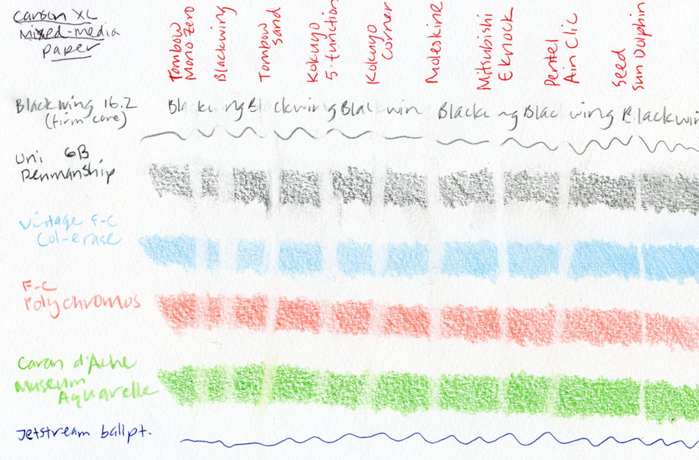
The writing utensils I used for the challenge were a Palomino Blackwing Volumes 16.2 pencil (which has a “firm” core), a Mitsubishi Penmanship 6B graphite drawing pencil, an indigo blue vintage Col-erase colored pencil, a scarlet Faber-Castell Polychromos colored pencil, and a bright green Caran d’Ache Museum Aquarelle water-soluble pencil. The colored pencils I chose cover the range of erasability, from most easily erased (Col-erase) to most troublesome (heavily pigmented Caran d’Ache). Since the Tombow Sand eraser is intended for ink and typewriting, on a whim, I decided to toss a Jetstream ballpoint pen into the mix.

The papers I tested on were a Plumchester sketchbook, which has a smooth surface similar to many journals and notebooks, and a Canson XL mixed-media sketchbook, which has a relatively toothy surface.

Before I show you the results, I have to confess that I went into the challenge with some prejudices. I had high hopes for the two Kokuyo erasers with such funky shapes! Surely all those corners and edges would be excellent for making small targeted erasures. And they both get bonus points for cool design, right?

I also had high expectations for the Seed Sun Dolphin electric eraser. I had been wanting to try an electric eraser for a while, but frankly, I was a bit intimidated by some of the fancy models I’d seen in the architectural section of art supply stores. This battery-operated model looked closer to my pace.

OK, now on to the results.

On the Plumchester’s smooth surface, most contenders performed satisfactorily in easily rubbing out graphite writing. The heavy shading from the Uni Penmanship took more effort, but most took the graphite off cleanly. The one exception in both cases was the Moleskine, which was the challenge’s only black eraser. It had a harder time cleaning up the Penmanship’s shading and even the Blackwing’s writing without smudging, or maybe it was just leaving behind some of its own black material. Most of the white erasers created medium-to-long strings that were easy to blow or brush away. The Tombow Sand eraser made small dust particles instead of strings.

As expected, the colored pencils presented a tougher challenge for all contenders. Still, the Kokuyo 5 Function, the Uni E-Knock, and the Pentel Ain Clic Knock did very respectable jobs on the Col-erase and Polychromos – at least as well as the Tombow Mono Zero defending champ. The Moleskine did OK too, at least in taking off pigment, but it also left a dark smudge as it erased. The electric Seed did the best cleanup job on all colored pencils, beating even the champ.

Not surprisingly, the toothy mixed-media sketchbook gave all contenders a heavier workout. Although erasing took more effort, most erasers did satisfactorily on graphite (the Blackwing did a bit worse than others). The Tombow Sand smeared. The Uni E-Knock did a particularly clean job on both graphite and colored pencils. Caran d’Ache’s high pigment content was especially challenging for all but the electric Seed.

Of note: None of the erasers could touch ballpoint pen on either paper – not even the Tombow Sand eraser that is intended for ink. (If you want indelibility, ink still wins.)

You can see for yourself how the contenders performed, but I’ll mention a few other points. While the Sand eraser did a good job of rubbing out colored pencils, I could feel that the paper had been abraded by the eraser’s particles. If you don’t plan to draw or write again on the erased surface, it’s probably OK, but if you rework it, I’d be wary of damage to the paper’s surface.

The two Kokuyo erasers, which I had high hopes for, competed admirably in terms of rubbing out marks, but both were disappointing in operation. Although they have all those small corners and edges that should be able to target tiny areas, I had difficulty seeing where the corners and edges were aiming, so my erasure often ended up wider than I wanted.

The electric Seed Sun Dolphin takes a bit of practice to control and use effectively. The switch feels misplaced on the boxy base, at least for my hand, making it a bit tricky to hold at the right angle for erasing. If you leave it too long on one spot, it can sort of run away with you.

The Winners

The electric Seed Sun Dolphin erased the most completely as well as with the finest point – two of my most important erasing requirements – so I was very pleased by its performance. As a final test, I made the small tomato sketch and deliberately didn’t save out the white of the paper for the upper-left highlight. I used heavily pigmented Caran d’Ache Pablo colored pencils in a Stillman & Birn Alpha sketchbook. After three layers of pigment, I used the electric Seed to erase out the highlight, and since I had practiced aiming and controlling the thing, I was able to point it where I wanted it. The highlight is not as bright as it would be if I had saved the paper, but it’s perfectly adequate for my purposes, and the paper’s surface doesn’t feel damaged. With that, I declared the Seed Sun Dolphin the winner of the Rub-Off!

I realize, however, that it wasn’t quite fair to throw that electric into the mix, and for most people who just want to erase a word or letter, it’s probably overkill. So I also chose a manual champ: The Uni E-Knock. It erased as effectively as, and sometimes better than, my former favorite Tombow Mono Zero. It also has a slightly chunkier barrel than the Zero, which I find easier to hold and use. The plastic body isn’t quite as classy looking as the Zero’s modern styling, but it gets points for being see-through. I just wish it had a rectangular eraser like the Zero. Honorable mention goes to the Pentel Ain Clic Knock, which also did a fine job, and its triangular-shaped eraser has good corners that are easy to aim. However, its body loses points for being as sharply triangular as its eraser and for its strangely robotic-looking knock mechanism.


tina-koyamaTina Koyama is an urban sketcher in Seattle. Her blog is Fueled by Clouds & Coffee, and you can follow her on Instagram as Miatagrrl.


DISCLAIMER: The items included in this review were provided free of charge by JetPens for the purpose of review. Please see the About page for more details.

Ink Review: Sailor Shikiori Yonaga

Sailor Shikiori Yonaga (20ml bottle for $15) is the other new blue color added into the smaller bottles released this year from Sailor as the Shikiori line. We talked a bit about it this week on Ep. 292 of The Pen Addict and neither Brad or I were clear as to whether Sailor was moving away from the larger Jentle bottles completely. I’m still looking into it so as soon as I know more, I’ll let you know. In the meantime, the larger bottles are available on Anderson Pens for all the Jentle Four Seasons colors. The only small 20ml bottles are the four new colors including Yonaga.

My initial impression of Yonanga was that it was just a vibrant indigo blue. It’s that shibori blue. The deep, rich indigo color. However, I let my swatch sit long enough to discover that there is actually a sheen of green/gold to the ink that you might not notice right away. It appeared after the ink had time to sit for awhile and dry completely. The green/gold sheen rose to the surface of my Col-o-ring swatch card after a couple days. Maybe I didn’t notice it right away because it was overcast when I did the swatch (hurray, January) or it took some time for the cast to rise to the surface.

I noticed the sheen a bit more on the Rhodia writing sample but my gut reaction to Yonaga was lukewarm initially to this color overall. I don’t tend to go for deep blues in general. However, upon reflection, I am really appreciating the depth of this color.  If blues are your cat nip, this one might just be one you’d want to consider.

I pulled out a few comparable blues from the collection thinking I’d have so many that were exactly the same only to discover that they were all just a little different. Parker Quink Blue Black is a little dirtier, while the Bookbinders blues are both more vivid blue. The Robert Oster Dark Star Blue is probably the closest match and, milliliter-to-milliliter,  a better value, But if I had to pick from Sailor’s own line of awesome blues, Souten wins with a fabulous blue and a wonderful sheen too.

Addendum:

Another little tidbit about these Sailor Shikiori inks! Accodring to the JetPens newsletter, the new Shikiori colors Yonaga, Shimoyo, Yodaki (review soon) and Yozakura (review tomorrow!), they were all made to match the new Tsukuyo-no-Minamo fountain pens ($70). They look like a gold accented version of the ProColor line with gold tone hardware and sparkle infused translucent bodies with contrasting caps. Gaudy or pretty? I can’t decide?

Well, well. That explains something.


TOOLS

Eye Candy: Kaweco x Bungbox June Bride Something Blue

Eye Candy: Kaweco x Bungbox June Bride Something Blue

One of my first fountain pen loves was Kaweco fountain pens. When I was given the opportunity to get a limited edition Bungubox June Bride Something Blue AL-Sport, I said yes immediately. I didn’t know what it would cost with the premium and currency exchange and shipping but I threw caution to the wind and bought it.

The pen came in a specially stamped black tin box with the BunguBox logo and the “June Bride Something Blue” name on the lid. The type face leaves something to be desired but that’s the designer in me talking.

Inside the tin is the pebbled finished turquoise aluminum Kaweco which is a gorgeous color and stamped in white matte foil or silkscreen is the same type “June Bride Something Blue”.  Also included is a piston cartridge converter. This is the first time I’ve gotten one of these from Kaweco so I’m crossing my fingers that its more efficient than the squeeze converters.

(Amusing upside photos of the cap as seen from the perspective of a left-handed writer.)

I purchased the fine nib but I have yet to ink up the pen. I have so many other Kaweco Sport pens that this one has made its way into the “collector” category at the moment rather than into the “user” category. Have I become that kind of pen collector?


Link Love: Vintage Colored Pencils

First, my apologies for the lateness of Link Love this week. Recording Pen Addict yesterday morning threw off my schedule and then the review for the Wancher True Urushi Kickstarter pen was supposed to go live on Wednesday was delayed until this morning so that also toppled my schedule a bit. Throw in my getting over a cold and my road tripping visitors and you had the imminent delay! So, I hope I made it worth your wait.

Big news this week is that Ink Smudge popped back up in my feed due to a weird RSS glitch so there was a back log of posts. Most importantly because there’s a great “Being Left handed” post that joins Maybelline from On Fountain Pen’s post about the Lamy Nexx (also a lefty) and a regular staple on Link Love Junee from Alt. Haven who is another favored lefty. Enjoy a plethora!

The Art & Art Supplies section is all of Tina’s Vintage Colored Pencil reviews this week which are so fun to see gathered together. No nepotism here!

Everyone is gearing up for LetterMo and InCoWriMo so get you pens, paper and stamps handy there’s still time to participate. You can always write to your family, your local friends or even your local politicians.

Pens:

Ink:

Pencils:

Paper & Notebooks:

Letter Writing:

Art & Art Supplies:

Other Interesting Things: