Ink Review: Monteverde Rose Noir

When I learned about Monteverde’s recently released Noir Collection I made a beeline for them.  I’ve been concentrating on wine colors and purples this year (2018 is Ultra Violet) so I added Rose Noir to the shopping cart immediately.

Monteverde Inks

Rose Noir is a yummy, plummy purple that leans more red than blue. It reminds me quite a bit of the Platinum Classic Lavender Black that I reviewed a while ago, except darker and moodier.

Monteverde Rose Noir

Monteverde Rose Noir

The ink performed very well in terms of flow, but there is quite a difference in coverage as you work with different nibs. In the wider nibs, the color lays down much darker than in the finer nibs and this can be the difference between a paler rose color and the darker plum color.

Monteverde Rose Noir

Sadly, this one isn’t water resistant either, although I’m loving the watercolor appearance and might have to play with that as a wash elsewhere. What surprised me most about this ink is that in really saturated samples, there’s a slight green sheen that appears.

Monteverde Rose Noir

When I was looking for something fun to use as a writing sample, I found out that there is a Rose Noir cocktail so I’m sharing that with you, perfect for Valentine’s Day!

Monteverde Rose Noir

Tools:


Laura is a tech editor, podcaster, knitter, spinner and recent pen addict. You can learn more about her knitting and tea adventures on her website, The Corner of Knit & Tea and can find her on Instagram as Fluffykira.


DISCLAIMER: The items included in this review were provided free of charge by Pen Chalet for the purpose of review. Please see the About page for more details.

Ink Review: Monteverde California Teal

Recently Pen Chalet had a half price ink sale on Monteverde inks.  The Desk took the opportunity to stock up on inks for review. Today I’ll be reviewing California Teal.

Monteverde Inks

As the name suggests, the ink is a beautiful teal that leans toward the green end of the spectrum. In the bottle it appears blue, but I find the blue tones only come out in much lighter applications. When written with a F or M nib, like the Franklin Christoph that I used, the ink has a decidedly green tone.

Monteverde California Teal

That said, the ink is lovely to write with. It flows well and isn’t too wet, but gives nice coverage with a variety of nibs. In heavy applications, it even has a purple sheen to it, although I don’t see that so much just in writing with smaller nibs.

Monteverde California Teal

Monteverde California Teal

Unfortunately, this one isn’t water resistant at all. I tried at 10 minutes, 1 hour and overnight with much the same results on each.

Monteverde California Teal

I think California Teal most closely resembles Robert Oster Spearmint (review forthcoming), but it does lean just a little bit more blue than green. However, when compared to J. Herbin Emerald de Chivor and Organics Studio Walden Pond, I still end up in the more green than blue camp. What do you think?

Monteverde California Teal

Tools:


Laura is a tech editor, podcaster, knitter, spinner and recent pen addict. You can learn more about her knitting and tea adventures on her website, The Corner of Knit & Tea and can find her on Instagram as Fluffykira.


DISCLAIMER: The items included in this review were provided free of charge by Pen Chalet for the purpose of review. Please see the About page for more details.

Ink & Fountain Pen Review: Lamy AL-Star Vibrant Pink

Ink & Fountain Pen Review:  Lamy AL-Star Vibrant Pink

Every year, one of the most anticipated releases is the Lamy AL-Star and Safari fountain pens and accompanying limited edition inks. It is an absolute frenzy, especially since over the last few years, there has been more interest in both the pens and the inks than there has been available supply.

So, when information was leaked at the end of 2017 about the Vibrant Pink AL-Star fountain pen (€ 22,73 € 22,73 Outside EU) and Vibrant Pink ink ( 50 ml bottle: € 10,90 € 9,01 Outside EU / T10 cartridges 5-pack € 2,00 € 1,65 Outside EU ) for 2018, how could I resist?

I mean, its pink and it’s an AL-Star! Imagine how torn I would have been if it had been the Safari? The Vibrant Pink AL-Star is actually a lovely shade of fuchsia. The color ranges from a deep raspberry when its cast in shadow to a bright, hot pink when it reflects the most light. Overall, the effect in person is a bit deeper and richer than a lot of the initial photographs portrayed the pen. It’s not as candy colored as I initially expected it to be.

When lined up along other pink pens in my collection, the Lamy Vibrant Pink is on the darkest edge of pink, darker than my Sailor Pink Love so it’s not as “kiddie” looking as I feared it might look.

I was only able to get cartridges at this point so I dipped a paint brush into the cartridge to do my swab. I did get sheen and evidence of the gold. It was more evident when wet. When dry, the shimmery quality is less evident but the ink maintains a good deal of shading.

In my painted title, the gold halo is super evident. I think it bodes well if you write with a wide nib or plan to use the ink for calligraphy. Fancy fun!

Comparing swatches, my instinct is to say that Lamy Vibrant Pink is closest to Sailor Jentle Peche but I think Peche is a little bit warmer pink and Vibrant Pink is a little bit cooler pink. I do think if you want a spot-on match to the overall Vibrant Pink AL-Star, Callifolio Andrinople is still a great choice.

As for the Vibrant Pink ink, all I can say is that I am thrilled that Lamy made a genuinely usable pink ink with a luscious golden sheen that sells for reasonable price. Now, the hope is that they can actually deliver enough bottles to sate the appetites of the rabid ink fans out there.

Addendum:

There were some comments on The Pen Addict slack and on Instagram for more comparisons with other pinks so I’m uploading some additional pink swatch comparisons.

Some folks were interested to see Vibrant Pink compared to Pilot Iroshizuku Yama Budo, J. Herbin Rose Cyclamen and Kobe #41. In all instances, Vibrant Pink is more pink where the other inks are more bluish/violet in hue.

Comparing Vibrant Pink to all the Pilot Iroshizuku pink options, Vibrant Pink falls between Kosumosu and Tsutsuji in the spectrum. It’s cooler in tone than Kosumosu but a little warmer than Tsutsuji.

Above, is J. Herbin Rouge Opera which is a little more red than Vibrant Pink and the only swatches I own of Platinum Cyclamen Pink and Diamine Hope Pink (such old swatches!). Both Cyclamen Pink and Hope Pink look to be about the same hue but the cards I used don’t show any sheen so I’m not sure the full variation of the inks. I’m going to have to get new samples of these inks!

I hope this addendum helps.


TOOLS


DISCLAIMER: This item was sent to me free of charge by Fontoplumo for the purpose of review. Please see the About page for more details.

Friday Faves: Galentine’s Day


This is for all my pink-loving, let’s have a letter-writing-and-pajama party girlfriends out there. Valentine’s Day is great time to celebrate our friends, our pens and our love of all things pink!

  • Love Letter Enamel Pin $9 (via PennyPaperCo on Etsy)
  • Lamy AL-star vibrant pink fountain pen (special edition 2018) € 27,50 € 22,73 Outside EU (via Fontoplumo)
  • Trusco Ridged Tool Box $35 (via Fresh Stock Japan)
  • Pen UNO – Minimalist Pen in Rose Gold $45 (via Ensso)
  • Vintage Pastel Pink Stripe Notecards (other options available) starting at $4 (via Sapori)
  • Graf von Faber-Castell Tamitio Rose Maechnical Pencil 0.7mm €80.99 (via Appelboom)
  • MT Flowers Washi Tape $3.50/per roll (via Cute Tape)
  • Callifolio Andrinople Fountain Pen Ink 40ml bottle $12 (via Vanness Pens)
  • Twig Berry Brooch Bamboo Pin $12 (via DecoyLab on Etsy)
  • Flower Fields stash bag in Posy Pink $20 (via Skinny LaMinx)
  • Baron Fig Squire in Rose Quartz $55 (via Baron Fig)
  • Baron Fig Guardian Pocket Size in Rose Quartz $45 (via Baron Fig)

Ink Review: Colorverse Ink Andromeda #16, Einstein Ring #04 and Lights on Ceres #05

Ink Review: Colorverse Ink Andromeda #16, Einstein Ring #04 and Lights on Ceres #05

(This is part four of a series of reviews about the new Colorverse ink line. Please refer to the overview for details about the whole collection.)

Continuing with the grouped reviews of Colorverse inks, today I am going to go through the purple-pinks I bought. I know a lot of people were waiting on these so thanks for your patience, I know they will be worth the wait.

For information about the packaging and an overview of the Colorverse, please see the overview from the beginning of the week.

I got three pink-purple colors in the first batch of Colorverse Inks: Einstein Ring #04 and Lights on Ceres #05 from Season One: Spaceward and Andromeda #16 from Season Two: Astrophysics (ignore the “Season 1” written on my swatch).

Lights on Ceres is definitely the lightest of the three colors and my first thought was that it might be this year’s Callifolio Andrinople. With the new Lamy AL-Star release in Hot Pink this year, Lights on Ceres might also be a good match so I’ll be curious to see how similar the Lamy Hot Pink ink is to Light on Ceres, though Light on Ceres does not have any of the sheen that is being seen in early swatch samples of Lamy Hot Pink.

Einstein Ring is a deep raspberry-purple color with a distinct gold sheen. I think the Pantone chip is a pretty good match too.

And, hello Andromeda! I admit, this was the first bottle I opened. Andromeda is more magenta raspberry than Einstein Ring and the sheen is very apparent gold to gold-green like a lovely patina. There is a lot of color similarity though in hue between Andromeda and Einstein Ring so most people probably will want to choose one or the other but not both.

In writing, you can see that Andromeda and Einstein Ring start to look a lot more similar. If you prefer a bit darker, more purple ink, you may prefer Einstein Ring. If you like your purples a little more on the pink side, than Andromeda will be more to your taste. If you want more sheen, Andromeda will appeal more. And if you are wanting the pinkest of the Colorverse colors, than Lights on Ceres though it shades beautifully, it does not have any noticeable sheen.

Compared to some other inks, Einstein Ring is probably closest in hue to R&K Alt. Bordeaux. Private Reserve Arabian Rose is a pinkier and Diamine Syrah is more red.

Even with my epic ink stash, I had a hard time finding another ink that was the same color as Andromeda and nothing in my collection had the same sheen that it has. R&K Magenta or Callifolio Grenat is close in hue but no sheen.

And finally, does Lights on Ceres compete with Callifolio Andrinople? I think it does though I think Lights on Ceres is a little redder. If you do want a pinky-red that sheens though Pelikan Edelstein Turmaline sheens gold in a similar hue range.

Overall, Andromeda is a clear winner and I really like Lights on Ceres. Einstein Ring is a good deep purple-red but I do feel most people would choose either Andromeda or Einstein Ring and not buy both like me. But go crazy. Like loves like.

Tomorrow… we go a little crazy!


TOOLS

Pencil Sharpener Review: KUM Lefty Aluminum Can Sharpener

Review by Tina Koyama

Ana warned me. 

When I said I wanted to review the Kum Lefty Aluminum Can pencil sharpener, she said she had found it difficult to get used to reversing her hand when she used a sharpener made for lefties.

I was so tickled to see any sharpener made for lefties that I wanted to give the Kum can a try. And there was another reason that made me want to give it a shot: It has two hole sizes, and I’ve had good luck with conventional two-hole Kum sharpeners that accommodate my larger-barreled colored pencils. 

But dang it – Ana was right. Even though my hand is twisting in the natural direction, it feels all wrong! (Argh! We lefties spend our lives adapting to a righty world, so when something is made lefty for us, we have to re-adapt to being ourselves! End of self-righteous, I mean, self-leftist rant.)

Rant notwithstanding, I decided to give the sharpener a fair shake. Before I get to its function, though, let’s look at its design, which is strange, to say the least. It’s literally a small can that sternly proclaims, “for left-handers only.”

KUM Lefty Can Sharpener

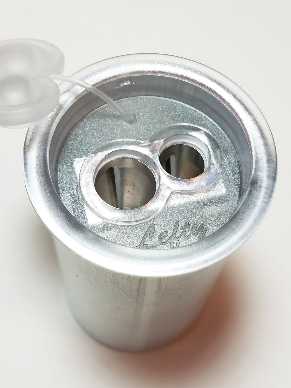
The plastic pop-off top has a double plug (to match the double holes) that is awkwardly attached to the lid with what reminds me of the plastic tether attaching a hang tag to clothing. It does prevent shavings from leaking out of the holes, though.

Kum lefty 2-hole can sharpener

Once you remove the lid, the wedge-shaped sharpener, attached to the lid, is revealed. It looks identical to other Kum double-hole sharpeners – except the blades are reversed, of course. The lid keeps all shavings neatly inside the can, which has a larger capacity than most portable sharpeners. The lid is secure, and I’m confident that it wouldn’t pop off inadvertently in my bag.

Kum Lefty Can Sharpener open

I gave the Kum lefty my usual test pencils: a Blackwing (standard diameter), a Caran d’Ache Museum Aquarelle colored pencil (slightly larger than standard), and a Derwent drawing pencil, which has an even larger barrel. The Blackwing fits in the smaller hole and, as I’d hoped, both the Caran d’Ache and the Derwent fit in the larger hole. I was pleased to find that all three sharpened up very nicely. The Blackwing didn’t get a long point, but the average-length point is perfectly serviceable. For my purposes, it’s more important that the thick cores on the two colored pencils sharpened evenly and smoothly.

Kum Lefty pencil sharpener pencils tested

Though its appearance and design leave much be desired (Is it supposed to look nostalgic? Klutzy, as lefties are stereotyped to be? Or just ugly in a normal kind of way? I’m stumped), it does the job – and the job can be done with my left hand in a natural direction. Now I just have to train my left hand to remember what natural is.


tina-koyamaTina Koyama is an urban sketcher in Seattle. Her blog is Fueled by Clouds & Coffee, and you can follow her on Instagram as Miatagrrl.


DISCLAIMER: The items included in this review were provided free of charge by JetPens for the purpose of review. Please see the About page for more details.

Link Love: Chinese Pen New Year!

Link Love: Chinese Pen New Year!

Posts of the Week:

I am really enjoying learning more about the world of Chinese pens through the posts on Frank Underwater’s site.  And with Chinese New Year just around the corner, it seemed perfectly appropriate to celebrate them, Check out his two posts this week:

Pens:

Ink:

Paper & Notebooks:

InCoWriMo & Letter-Writing:

Art Supplies & Art:

Other Interesting Things: