Link Love: Cases and Places

Link Love: Cases and Places

This week, in Other Interesting Things, we have Cases and Places! Its pen show recaps and pen and notebook cases.

Pens:

Ink:

Pencils:

Notebooks & Paper:

Other Interesting Things:

Ink Review: Colorverse Andromeda & Red Shift

Ink Review: Colorverse Andromeda & Red Shift

I admit it. I made you wait for this review. I couldn’t help myself. I was saving these for the end of the the Series One and Two colors (that I currently own — but I’m headed to Little Rock and will be attempting to replenish my stock. I made Lisa promise not to sell me any more ink from LA to LR because I needed to “dry out” for a bit).

So onwards to Colorverse Andromeda #16 and Red Shift #19 ($36 for 2 bottles, 65ml and 15ml of same color ink per package). These are more of the red/magenta/pink inks but in Series Two: Astrophysics line. The previous inks reviewed were from Series One: Spaceward (plus Andromeda — I am getting seriously spacey with my reviews!)

So, here are all the swatches together.  The Colorverse ink colors range from reddish brown to a deep purple. The colors earlier in the range have more shading and the ones later in the range seem to feature more sheen. Red Shift does not, however have much sheen but is a lovely cool red magenta. Andromeda is the sheen queen with a clear golden sheen.

I loaded both Andromeda and Red Shift in color coordinated Jinhao Shark Pens and took them for test drives. They have been in the pens for going on two weeks now for testing purposes and have been performing very well. They have been tossed around on a daily basis in a zip pencil case so they have been upright, upside down and all-around. Occasionally, there have been some hard starting issues but that may have been a result of being upside down for a day or so more than anything or not having the caps screwed down tightly. Overall though, the ink flow has been excellent.

I have been testing all the Colorverse inks in a variety of these shark pens on a range of papers in this same method to get a good sense of daily, long use abuse. So far, the only issues I’ve had is with dry times on some papers with Quasar and Black Hole. They were very specific cases though.

In swatch comparisons, Andromeda falls in between Kobe #41 Sumakikuyu Rose which is a bit lighter but has similar sheen and Colorverse #4 Einstein Ring which is a little darker but does not have any sheen.

Colorverse #19 Red Shift has more inks that are similar to it. Pelikan Edelstein Turmaline is probably the closest and it has some sheen too but it was a color of the year for 2012 so its a bit harder to come by now. Caran d’Ache Divine Pink is a bit lighter but is similarly priced for less volume so you might as well buy the Colorverse ink if that’s what you want. Lights on Ceres #5 is a little more pinky.

Overall, if I haven’t made it abundantly clear by accidentally reviewing it twice, you need to buy Andromeda if you like magenta/purple/pink ink. I do like Red Shift too. So there. My inkpinions have been made as clear as possible.


TOOLS


DISCLAIMER: These items were sent to me by Vanness Pens for the purpose of review. Please see the About page for more details.

Ask The Desk: Uni Signo Prussian Blue Ink Match, Dry Converters & Rose Gold Ink

Ask The Desk: Uni Signo Prussian Blue Ink Match, Dry Converters & Rose Gold Ink

Jessica asks:

I’m usually a blue-black ink girl, but ever since purchasing a Uni-ball Signo DX in the new color Prussian Blue, I am in love with this bright navy blue color. I’d like to buy some fountain pen ink samples in this color and I’m wondering if you know any inks that are the exact shade of this gel pen. Diamine Prussian Blue bears the same name, but is by no means a color match – too grey. Do you have any suggestions for fountain pen ink color dupes to Uni-ball Signo’s Prussian Blue color? I have no preferences as to price or brand.

Thanks to some help from Elaine over at JetPens, I pulled together a few of my best ink matches for the Uni Signo Prussian Blue gel ink which I reviewed a couple months ago. It’s not exactly a blue black color and it certainly doesn’t match any Prussian Blue inks that I could find.

I did find a few inks that were fairly close matches. Some colors were close hue matches but had a bit more shading or sheen and certainly the width of the nib will influence how close a match it will be to the Uni Signo Prussian Blue.

So in order of how close a match I think the colors are, here are my recommendations:

  1. Pen BBS #41
  2. Bookbinders Snake Ink Blue Racer
  3. Colorverse #12 Crystal Planet (a little bit lighter with a reddish sheen)
  4. Noodlers Ottoman Azure (darker but no sheen)
  5. Sailor Jentle Souten (close color match, red sheen)
  6. Robert Oster Blue Sea (sheen, slightly blacker)
  7. Noodler’s Bad Blue Heron (darker)

Rosemary writes:

I had to clean several fountain pen converters for a set of Jinhao Fountains pens.
After cleaning them, I saw that water had gotten behind the rubber gasket of the convert and WILL NOT COME OUT! I tried a cotton bud, but it wouldn’t fit. I tried shaking the converter as hard as I could hoping to sling the water out to no avail. I tried sitting them up on their open ends on paper toweling hoping to coax the water out for several days and nothing.
Nothing worked!
These converters have no heart! They were immune to a woman’s tears, pleading and her getting down on her knees and begging!
Should I just give up and buy another dozen converters? Or do you have some magical fix up your sleeves?
Thank you for reading and not snickering too hard at my inability to clean converters.

Since the water is above the gasket, it won’t actually infiltrate your ink and dilute it if you refill your converter as is, it won’t effect the new color. Only the aesthetic of your converter. So, unless you have a demonstrator pen and you can see the converter when the pen is in action you can take the “out of sight, out of mind” tactic I employ if I get water above the gasket. However, if this really bothers you, I have a solution.

Thanks to the folks over at Vanness Pens, I found out that you can disassemble the whole converter if you really want to get serious about having a clean and dry converter.

The metal cap can be twisted off which will allow access to the back section of the converter.

Voila! Now all the parts and pieces can be cleaned and dried and then reassembled. No more water behind the gasket. Your converter will now be perfectly clean and free of unsightly condensation.


The last question came in from an undisclosed location. I was asked to find an ink color that was similar to rose gold. Now, there are many tones of rose gold — some more gold, some more pink so this presented an unusual challenge. So, here’s my best guess:

I chose DeAtramentis Pearlescent Whisky Brown Bronze ($14 for 35ml) and Whisky Brown Copper ($14 for 35ml) as the closest matches to Rose Gold.

Do you have a better suggestion?

Ink Review: Colorverse Sea of Tranquility

Ink Review: Colorverse Sea of Tranquility

Colorverse Sea of Tranquility #10 (65ml and 15 ml included for $36) is the only green ink available in the Colorverse universe thus far so it gets its own review. It is a bright kelly green color and not at all what I would have initially thought of when I heard the words “sea of tranquility.” Even when I Google it, the images that come up are either photos of the moon which are decidedly not green or more earthly ocean images which lean more blue and teal.

(For more info on packaging and details about the Colorverse brand, check out my Colorverse overview post.)

So, names aside, the Sea of Trnaquility is a bright crisp green with lots of shading and no evidence of sheen.

I ended up doing two swatches since I stuck the Pantone chip on my first one and updated my swatching techniques by adding a finer, monoweight writing on the second (you may have noticed that on some of the previous posts).

In writing samples, Sea of Tranquility is definitely vivid and the shading helps keep the color bright and lively. It seems oddly appropriate to review this color this week. It’s very shamrock-ery and touch-o-the-Irish. I’m not sure that’s what Colorverse was going for when they created this color but its certainly making me want to dance a jig and drink a Guiness, maybe have a nice meat pie.

I initally assumed, as I always do, that I would have at least half a dozen greens that would exactly the same shade of green as Sea of Tranquility and I’d feel like a giant dolt for buying 80ml more but, alas, it turns out that the other bright green inks in my stash are not quite the same shade. Phew! Most of them — Private Reserve Spearmint and Avacado , Papier Plume Ivy 108, Pelikan Edelstein Aventurine and Kaweco Palm Green are all just a bit darker — some a little blacker, some bluer. Some inks were lighter or more yellow-green like Diamine Meadow.

So while I found the name of Sea of Tranquility to be a bit of a misnomer, the color itself is surprisingly refreshing. Maybe it should have been called Little Green Men?


TOOLS


DISCLAIMER: These items were sent to me by Vanness Pens for the purpose of review. Please see the About page for more details.

Just days away: Arkansas Pen Show!

Just days away: Arkansas Pen Show!

Just a quick reminder that The Well-Appointed Desk will be at the Arkansas Pen Show this weekend. Just to whet your appetite The Desk will once again have a table with the steadfast and true Skylab Letterpress and will be selling a variety of goods including:

  • Col-o-ring Ink Testing Books
  • Typewriters
  • Letterpress printed paper goods (fountain pen tested!)
  • Vintage office supplies
  • Vintage pencils
  • Oh, and I’ll be introducing an exciting new product (as Steve Jobs used to say, “There’s just one more thing…..”)

Credit cards and cash will be accepted!

Don’t forget to visit Vanness Pen Shop while you’re in Little Rock. They are hosting an Open House Friday Night, March 16th from 6pm until they kick us out after the Pen Show. Lisa, Mike and the gang are wonderful hosts and the shop is amazing! Brad, Matt and I will be there as well to help out so come celebrate St. Patty’s Day early.

Ink Review: Colorverse Supernova & Quasar

Ink Review: Colorverse Supernova & Quasar

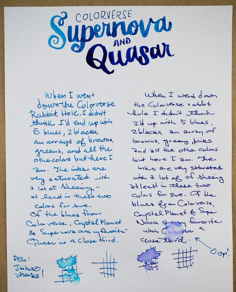
Some days… you just think to yourself I can’t possibly have enough blue ink. Today was one of those days. So, of course, I bought Colorverse Supernova #14 and Colorverse Quasar #13. Because when you think you don’t have enough blue ink you tend to buy really expensive blue ink that come with two bottles in each box. Each set comes with a 65ml bottle and a 15ml mini bottle of each color. So, I’m loaded for blue!

(For more details about Colorverse ink, check out my overview post.)

I decided it would be best to line all the Colorverse blues up for a side-by-side comparison. Proxima B  is by far the darkest, Saturn V is a tried-and-true workhorse blue. Crystal Planet is an out-of-this-world International Klein Blue. Supernova and Quasar introduce red sheen with Quasar being more like Saturn V with sheen and Supernova being Crystal Planet bit darker version with sheen.

In writing, the sheen shows through, even with fine nib pens. Supernova shows more shading than Quasar and tends to look more turquoise than in initial swab samples. Water resistance? Nope.

Compared to other swatches, Supernova was similar colorwise to some favorites like Bay State Blue, Private Reserve Cosmic Cobalt and Kaweco Royal Blue but adds that fan favorite sheen to the mix which shifts the hue a tiny bit but the underlying color is that same bright blue. Sailor Jentle Nioi-Sumire has a similar sheen but is a bit more violet blue.

Quasar was a bit harder to match. Surprisingly, the new Krishna Moonview was quite similar in color but I’ve not been able to experiment with the Krishna inks much so I don’t know a lot about its overall performance yet, Those are next up in my queue to start reviewing. Interstingly, Organics Studio Nitoogen was quite similar in color so if you are looking for a similar color to Nitrogen with LESS sheen, Quasar might be a good alternative. Quasar has some sheen but not the dizzying sheen found in Nitrogen. Sailor Jentle Souten has a similar sheen but is a little lighter in color. It was not light enough to match Supernova but not as dark as Quasar. Ink colors are a constant game of degrees of difference. One ink has too much shading, one does not have enough. One is too dry, one is too wet. Ad we as ink consumers are always looking for the perfect pen-and-ink combination.

If you are still searching for the perfect blue, maybe one of the Colorverse blues will be the one for you. I’ve certainly enjoyed experimenting with them. I will definitely pull together a list of my favorites at the end of these reviews. I am discovering that the more inks I acquire, the more colors I like.


TOOLS


DISCLAIMER: These items were sent to me by Pen Chalet for the purpose of review. Please see the About page for more details.