Chicago Pen Show 2018 Recap

By Laura Cameron

The Chicago Pen Show is only the second pen show I have attended, and I upped the ante for my second show by working in the Vanness Pen Shop booth for the weekend.  This left me with very little time to shop and wander the show, but I got to meet and talk to so many wonderful people at the booth and in the evenings at the bar.  Apparently, spending most of my time in the booth meant I took very few photos, so I apologize in advance.

Ana and I drove up to Chicago on Wednesday night, to prepare for Thursday’s booth setup.  On Thursday morning we had some time to kill so we had a leisurely breakfast, extended knitting and inking time, and then Ana took me to Portillo’s (home of the Italian Beef) to treat me to “a piece of chocolate cake bigger than [my] head,” as she had been promising me for weeks. Then it was back to the hotel to spend the rest of the evening setting up the booth.

Chicago Pen Show 2018

I should interject here that I celebrated my 40th birthday on Saturday, May 5 while at the show.

Technically, the first pen I got at the show was an amazing gift from Ana, a Parker Vacumatic that came to her through the late Susan Wirth.  I was really taken with Vacs at the LA show and spent a little time learning about them there, but my concern was how to purchase a vintage pen in good condition.  I was so touched at the significance of receiving a pen that had been touched by Susan, even though I never had the opportunity to meet her.  Later on in the show I went and saw Ron Zorn (Main Street Pens) and he got the pen in working order for me.

Chicago Pen Show 2018

Friday morning dawned bright and early and we were in the booth and ready to go. I later learned that the morning was only open to traders and weekend pass holders, and the public didn’t get to purchase admission until the afternoon. So the morning was a bit slow, but we got to meet and chat with lots of people. I made one big purchase on Friday, my first Jonathan Brooks (Carolina Pen Company) pen. I couldn’t resist the glitter!

Chicago Pen Show 2018

This photo really doesn’t do the pen justice. It is a cross between grey, periwinkle and lavender body with lovely sparkle and glitter. My ink whisperer suggested I pick up a bottle of Akkerman #7 Queen’s Night Blue and that it would match perfectly. I couldn’t find it at the show, but it’s on its way to me now!

Saturday was a crazy busy day. I didn’t even have time to consider that it was my birthday, or to really even take a break, but it was a wonderful day. I met so many people I know from online, and many that I didn’t, but all were lovely. Sales were brisk and I managed to keep super busy all day. By the evening it was time for the Pen Mixer. Vanness Pen Shop hosted a Pen Mixer after dark, a way for people to get to know each other and meeting with some big names in the industry to talk pens, nibs, ink, calligraphy, photography and paper. It was a super fun evening (if you go to a pen show with a pen mixer don’t miss it!) and the only slightly disturbing thing was the presence of an 8-foot, 26.9lb gummy snake. Don’t ask because I don’t even know what to tell you.

Chicago Pen Show 2018

Chicago Pen Show 2018

Sunday we worked the booth until about noon, and then packed it up. Sunday afternoon and evening were spent finishing out the show, and chilling in the bar with people just enjoying the last bits of the weekend. I got to sit and chat with Ralph (Regalia Writing Labs) and watch the BYOB podcast do an interview with Ana and also Paul Erano (check out their feed for those episodes to air soon).

Chicago Pen Show 2018
Photo credit: Yvgenii of BYOB Pen Club

And then, too soon, it was over. We came home and I spent a few days with what I call pen show hangover. I’m ready to do it again!

The haul for the weekend is below. In addition to the pens, I was able to get my hands on a Musubi notebook from Atelier Musubi, Coloverse Ink in Photon and Gluon, and the special show ink from Papier Plume, Bootleggers Sacrament. Not pictured – some amazing work on pens/nibs I already owned from Dan Smith, The Nibsmith.

Chicago Pen Show 2018

Ink Review: Waterman Audacious Red

Ink Review: Waterman Audacious Red
Sometimes, we discover there are great products that have been around for quite some time that we never got around to reviewing. This is one of them.

There are some great inks that overlooked because some new, hot colors/brands, etc just got released. I thought it might be a good time to take a minute to remember one of those tried-and-true classic inks (and brands) that often get overlooked: Waterman. While it drives me absolutely insane that Waterman insist on changing the name of their inks every couple of years, I’m glad they keep their ink colors and formulas consistent. As a classic brand with a rich history, it would serve them well to lean into their tradition. But don’t listen to me, what do I know, right?

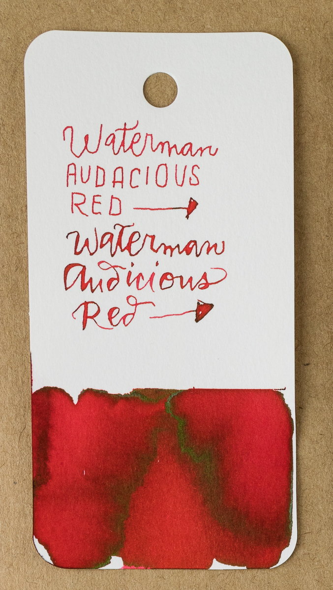
Today, I’d like to review Waterman Audacious Red ($11.30 for 50ml bottle). It is a bright, vivid red that still ships in Waterman’s classic bottle with the angled base making it easy to tilt it to fill your pen and get those last few drops out of the bottom of the bottle.

In the swatch, a green-gold sheen is evident around the edges of the vivid red color. There is a slight hint of watermelon red in the lighter shading areas so the red appears clean with a pink undertone rather than an orange cast.

In writing, Audacious Red just had good flow. There was a bit of shading with the fine nib and a tiny bit of the green-gold sheen. It would probably be more noticeable in a large nib.

Compared to other inks in my stash, KWZ Grapefruit and Bookbinders Snake Ink Red Spitting Cobra are both a little more orange. Conway Stewart St. Blazey is a pretty close match but is not widely available and Sietz-Kreuznach Tomato Red is a close match but a touch more pink. Everything else was either much darker (browner or blacker), much pinker or much more orange. Even the J. Herbin Rouge Caroubier wasn’t close. Weird, huh?


Tools:


DISCLAIMER: The items included in this review were provided free of charge by Vanness Pen Shop for the purpose of review. Please see the About page for more details.

Ink Review: Monteverde Emotions, Kindness

At the LA Pen Show, Vanness Pens debuted the Monteverde Emotions ink line. I was particularly smitten with Kindness (30mL for $8.00) so I was delighted to get the chance to review it.

Kindness is a lovely bright pink ink, with a green sheen in heavy applications.  It is darker than bubblegum, but lighter than magenta.

Monteverde Emotions Kindness

While it appears a bit lighter on the Monteverde site, I found it to be a kind of cherry-leaning pink.

Monteverde Emotions Kindness

In darker applications I definitely got a green sheen, and in between so many lovely shades of pink.

Monteverde Emotions Kindness

Monteverde Emotions Kindness

Monteverde Emotions Kindness

Sadly, as with other Monteverde inks, this one isn’t very water resistant. It is, however, a nice ink, not too wet and not too dry.

In terms of color comparisons, it is probably closest to Lamy Vibrant Pink in its intensity, but also approaches Colorverse Lights on Ceres and Red Shift. It is quite different from KWZ Raspberry that is a much bluer pink.

Monteverde Emotions Kindness

This year I seem to have been taken over by a small girl’s love of pinks and purples, and I’m definitely going to load this up in a pink pen and enjoy it!


Laura is a tech editor, podcaster, knitter, spinner and recent pen addict. You can learn more about her knitting and tea adventures on her website, The Corner of Knit & Tea and can find her on Instagram as Fluffykira.


Link Love: Some People are Habit Forming

It is with both a heavy heart and happiness that I give you this link. On Friday, my dear friend and comrade in blogging and pen show mania, Matt Armstrong (AKA The Pen Habit) announced his retirement from reviewing. He didn’t shut the door on the pen community completely but he is leaving for now. I hope he will come back at some point, even if its every once in awhile, for a good chat, a pen show or just a chance to tell us what he’s been up to.

Link of the Week:

You may also enjoy Stephen (SBRE) Brown’s video reply:

Pens:

Ink:

Pencils:

Notebooks & Paper:

Art Supplies & Creativity:

Other Interesting Things:

Notebook Review: Story Supply Co. Ithaca

Review by Laura Cameron

Ana came home from the Atlanta Pen Show with lots of new things for me to try and among those were Story Supply Co.‘s new limited edition Ithaca.

Story Supply Ithaca

Ithaca is named for Homer’s Odyssey and debuts just in time for National Poetry Month.  The notebook is a limited edition run so RUN, don’t walk, over to Story Supply Co. to get a package for yourself!

Story Supply Ithaca

Ithaca comes in two sizes: Pocket 3.5″ x 5.5″ (8.75 cm x 13.75 cm), 3-pack for $12; and Prime 5.25″ x 8″ (13 cm x 20 cm), 2-pack for $14.

I received the Prime size, so the remainder of my review will focus on that, although I believe all the details are pretty much the same for both sizes.

Ithaca has a beautiful blue linen cover out of sturdy coverstock.  Inside, there is a coverpage that fades from blue to white to yellow to orange on a slightly glossy paper.  The remainder of the book is made of 64 pages of dot grid 70# natural text stock.  The paper is smooth to the touch, and the dot grid is pale grey. You’ll notice in some of the photos that my camera just barely picked it up.  Finally, the notebooks are stapled together with orange staples, a bright pop of color that I appreciate against the dark blue.

Story Supply Ithaca

I tried a variety of pens (fountain pens, rollerballs, ballpoints and gel ink pens) and the paper handled them all wonderfully. There was no feathering at all, and just a bit of show-through in areas where I applied the ink with a heavier hand.

Story Supply Ithaca

Story Supply Ithaca

All in all, Ithaca is a lovely edition and a really nice introduction (for me) to Story Supply Co.


Laura is a tech editor, podcaster, knitter, spinner and recent pen addict. You can learn more about her knitting and tea adventures on her website, The Corner of Knit & Tea and can find her on Instagram as Fluffykira.


Ink Review: L’Artisan Pastellier Encre Classique Carmine

Ink Review: L’Artisan Pastellier Encre Classique Carmine

By now most pen folks have probably heard of Callifolio inks, if only because of the frequent mentions of a certain shade of pink ink: Andrinople. The French company that makes that ink, L’Artisan Pastellier also makes another line of  fountain pen ink called Encre Classique (Classic Ink). There is not a ton of information about the differences between the two ink lines available. I did my best to scout around on the L’Artisan Pastellier website via Google Translate but the general vibe I got was that this operation is probably made up of classic French, more inclined to spend time making their fine art supplies and drinking wine than maintaining a modern online presence with a grand social media strategy and SEO sorted out.

Encre Classique inks are available in about 26 colors and the biggest difference I noticed, other than price ($7 per 30ml bottle vs $12 per bottle for Callifolio inks) and bottle shape (Encre Classique come in a more traditional round bottle to Callifolio’s pie slice triangular bottle) is that the Encre Classique color range feature a wider selection of reds and greens while the Callifolio inks have a wider selection of blues and browns.

If you are looking for a some vivid basics, Encre Classique inks would be a good place to look to build an ink collection as the colors are rich in pigment and well made by a brand I’ve come to trust for their quality in the Callifolio line. I feel pretty confident that the Encre Classique will be equally good. I would place these inks as a competitor to J. Herbin though the inks are a little drier.

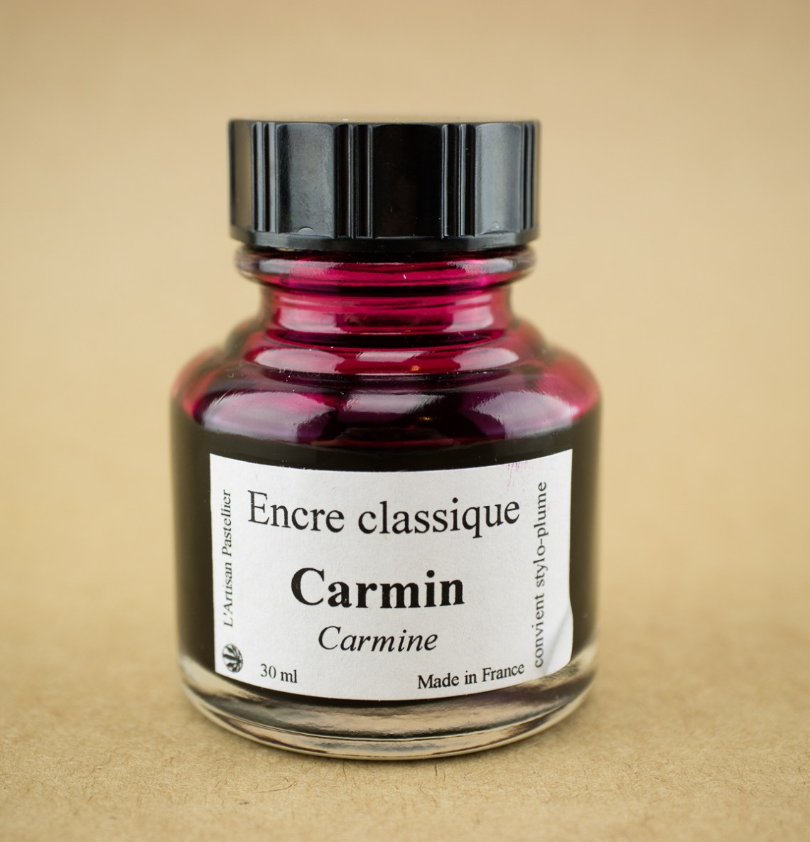
Now, to the specific ink I am reviewing. I got a bottle of the Encre Classique Carmin ($7 for 30ml bottle) which is actually one of the more muted colors in the line. Its a burgundy/red wine color which I discovered had a bit of a gold sheen.

I got a bit messy on my Col-o-dex card but the gold sheen is evident in the upper left. Even with a dip pen, there is evidence of shading to a cherry blossom pink or dusty rose color which is kind of nice.

In writing, I used a fine nib Esterbrook which gave a range of burgundy to dusty rose shaded writing. With a wider nib, the writing is definitely darker when more ink is laid down and the color leans towards more of a red wine/burgundy. The water test shows little-to-no water resistance so spilling your drink is definitely a no-no with this ink.

When cross-referencing with other inks in my collection, it appears I have a real penchant for this dark, smoky pink/burgundy color these days. Carmin is very similar to Colorverse Andromeda with a little less sheen and $28 less price tag. Kobe #41 is a little more purply. De Atramentis Apple Blossom is very similar and it comes with a floral scent. And the Krishna Azaella (Floral) is a bit more fuchsia and is a similar price for a smaller bottle.

I’m very glad I gave Encre Classique Carmin a try. I like the color, the ink is well-behaved and reasonably-priced and I am looking forward to trying more in this line in the future.


Tools:


DISCLAIMER: The items included in this review were provided free of charge by Vanness Pen Shop for the purpose of review. Please see the About page for more details.

From the Archives: Maruman Mnemosyne N183A Inspiration Notebook A5

Mnemosyne 183

Sometimes, we discover there are great pens that have been around for quite some time that we never got around to reviewing. This is one of them.

Review by Laura Cameron

Several weeks ago Ana and I were discussing what products needed to be tested and reviewed and she handed me a Mnemosyne notebook. I laughed and told her I’d been using one for ages now and she asked me why I’d never reviewed it before. So today I’ll talk about my trusty Maruman Mnemosyne N183A Inspiration Notebook ($10.00 via JetPens)

I bought my Mnemosyne back when I was first getting into fountain pens and I wanted to try a bunch of different kinds of paper. At $10.00, the Mnemosyne is perfectly priced for trying out and I ordered one from JetPens right away.

Mnemosyne 183

The Mnemosyne N183A is an A5 sized notebook (6.5″ x 8.25″/16.25 cm x 20.5 cm) oriented in what I now think of as “landscape” format. The notebook contains 70 pages of 80gsm acid-free paper. The pages are primarily blank, although there is a small line at the top of the page designated as “Title/No.” I usually use this line to document what pen and ink I’m using, but that’s up to you. The notebook is called Mnemosyne after the Greek goddess of memory and this line offers you a way to memorialize and organize your writings.

Mnemosyne 183

The N183A is spiral bound with a dual ring system that allows you to fully open the notebook and fold the front pages behind the back cover. I had no trouble opening and turning the pages, or folding them behind. The pages are also perforated, making this a great notebook if you want to pull your sheets out and use them elsewhere. The notebook itself is very light, weighing in at 8.7 oz/247 g and most of that weight is the paper. The cover is made of a flexible black plastic, and there is a yellow cover sheet at the front of the book. The back of the book is sturdy cardboard.

Although I don’t have information on exactly how this paper is produced, it feels slightly slick and coated when used. It performs very well with a variety of pens and ink and, while there is sometimes a bit of bleed through or ghosting on the back with heavier applications (think ink splotches!), I haven’t had any feathering issues at all. This notebook has been my go to notebook when testing new inks, as you’ll note from most of my ink reviews.

Mnemosyne 183

Mnemosyne 183

Mnemosyne 183

I have tried a variety of notebooks and papers since joining the fountain pen community and while I may be pretty smitten with Tomoe River paper, I really can’t say enough good things about the Mnemosyne. It really is an excellent notebook at an affordable price.


Laura is a tech editor, podcaster, knitter, spinner and recent pen addict. You can learn more about her knitting and tea adventures on her website, The Corner of Knit & Tea and can find her on Instagram as Fluffykira.