Preview/Review: Karas Pen Co. Reaktor Galaxie Pens

Preview/Review: Karas Pen Co. Reaktor Galaxie Pens

Karas Pen Co. has been quietly working away in their secret hideaway in the desert to create a new line of pens they are calling Reaktor. The series is doing some particular unique things in the machined pens field. First, they are aiming to sell these pens starting at $40 for the Galaxie ($45 for the XL) which is making them competitive with many entry level “good pens”. In the ballpoint and rollerball arena, this is comparable with the Retro 51, Schon DSGN or BigiDesign. Those brands sell pens that range in prices from $50 and $150. Of course, they are often limited edition, handmade or more modular. But Karas is definitely making the move to compete in this field and do it with a SNAP CAP! You heard that right. A snap cap. How cool is that?


To start, Karas trimmed the packaging down to recyclable plastic tubing. They are sturdy, reusable or recyclable. The square tubes are easily stackable and color coded. Pens with anodized grip sections in red or blue ship in matching colored tubes. The black models ship in a black tube and the tumbled finish ships in the clear tube.

I love the tapered end of the new Reaktor line.

Once the cap is removed, the look of the uncapped pen has a beautiful line. The cap still has a classic “Karas” industrial look but the pen is much more refined and elegant. I really like them.

When the box of Reaktor pens arrived, my husband and I spent a whole evening trying all the different varieties. We tested the different sizes and finishes to see which we preferred. Since I have small hands and Bob has considerably larger “man hands,” it was worth having both of us trying both the Galaxie and the Galaxie XL.

Bob definitely preferred the XL. He found the standard Galaxie a wee bit too short for his long hands. He also liked the clip. As a girl, I don’t always have a need for a clip, other than as a roll stop, but I kept going back to the Galaxie. The size is perfect for my small hands.

They are light and easy to hold and the snap cap is fun. The clip is sturdy if that’s what you need and the Galaxie is streamlined and sleek without it if you don’t need a clip. I am definitely in the Galaxie clipless camp. It slips effortlessly into my dress pockets and I don’t worry about toting it around to meetings, having it bumping up against my phone, keys, change or, often times, a pocket knife for the many  projects I work on at work or in the studio that require opening a box, trimming an edge or some other fiddly detail. If someone would just make the perfect pocketable, snap cap X-acto!

What you really want to know when I get a hold of a ballpoint or rollerball is what refills did I use? And of course, I couldn’t leave well enough alone. The Galaxie XL ships with the notorious Schmidt 8126 rollerball which, for this lefthander, is basically useless. I immediately popped it out and tried a Pilot G2. Voila! Fits fine. This established that most of the refills in my Refill Guide in the G2 list should fit, though some were a little wiggly and may require trying a couple different springs for a perfect fit.

So, if liquid rollerball ink is not your cup of tea or you want a wider variety of colors, start disassembling all those gel pens you purchased early on in your pen life and see if they fit. Just open them gently or you’ll have refills and springs flying everywhere. Don’t  ask me how I know that.

As for the standard Galaxie, it takes a standard Parker-style refill so there are many options. If, like me, you prefer gel ink to ballpoint, I cannot recommend the newly discovered Premec Gel Refill (Black 0.5mm 2-pack) highly enough. I found them on Amazon. There’s also other sizes available as well but the 0.5mm is a good place to start. If you’re looking for a more universal option, Tofty’s Parker-style adapter-to-D1 is another good option then you can fill the Galaxie with Jetstream D1 refills.

The Galaxie XL ($50) and Starliner XL (the fountain pen version, $55) will be the first to release in early July, in limited numbers to Karas Coin Club Members first. If you’re not a Coin Club member, you can join here. Annual membership starts at $25 per year and includes early access to new releases, limited editions and, of course, their cool coin plus many other benefits.

Needless to say for Karas Kollectors, these pens are a no-brainer. For others, these is a great entry into “nice pens.” In some ways, it may even be a better option than a Retro 51 as it doesn’t have that finicky twist mechanism. Though for some, the cap might be a no-go. But a snap cap is definitely light years better than a twist cap. And the price point is awesome.


DISCLAIMER: The items included in this review were provided free of charge by Karas Pen Co. for the purpose of review. Please see the About page for more details.

Eye Candy: Heidi Swapp Memorydex Card Tray

I’ve been on the lookout for alternative options for Rolodex rotary card files for the Col-o-dex cards ($15) because I know that they are hard to come by, expensive and large. I stumbled across the Heidi Swapp Memorydex Desktop Card Tray box which is considerably smaller and considerably less expensive (just $9.54 Prime at the moment). It’s also in a simple gold and white striped paper wrap.

Memorydex Col-o-dex box option

I’ve had mine for about three weeks and in my humid, Missouri summer house, one corner of the paper is coming loose but its nothing that a little glue or double stick tape wouldn’t fix. It would be easy to remove the paper and recover the box in another paper if you’re the crafty sort.

Memorydex Col-o-dex box option

Overall, I really like the low profile and the tray fits perfectly inside my Ikea hack table so that the cards stay dust-free and out of direct sunlight.

Memorydex Col-o-dex box option

I love the mint lining on the box and it actually matches the mint tabs that we sell almost perfectly.

Memorydex Col-o-dex box option

So, if you are looking for an alternative to the larger Rolodex wheel and something considerably less expensive, the Heidi Swapp Memorydex Desktop Card Box is a good option.


DISCLAIMER: The item in this review include affiliate links. The Well-Appointed Desk is a participant in the Amazon Services LLC Associates Program, an affiliate advertising program designed to provide a means for sites to earn advertising fees by advertising and linking to Amazon. Please see the About page for more details.

Ink Review: Colorverse Voyager I 2018 LE Set

Ink Review: Colorverse Voyager I 2018 LE Set

The Colorverse 2018 Voyager I set ($50, see below for a special bonus offer) is the first limited edition set released by Colorverse and it was highly sought after and greatly anticipated. The set includes four of their now-recognizable small 15ml bottles in a beautiful packaged box with all the accoutrements that Colorverse has become known for as well. While I am not normally a fan of packaging, Colorverse creates an experience with their packaging. Every detail has been considered. Every flap is designed, every side of the box includes artwork that goes along with the theme of Voyager I.

Inside this set, they’ve included an envelope with some blank paper to test inks along with stickers and a napkin in a cellophane bag. There is also a pamphlet showing the inks from the previous series.

The cute little bottles which I have, on occasion, had trouble fitting some larger nib/grip sections into the small openings. In these cases, I’ve had to take the converters out of the pens and fill them and then put them back into the pens. In the case of a pen with a piston, I think you’d just be out of luck or have to transfer the ink into a different bottle.

There seemed to be very little sheen with these inks but good potential for shading with all of them. There may be a little sheen with Pale Blue Dot and Jupiter FlyBy. They are all very saturated.

For writing samples, I’ll start with my favorite which is Pale Blue Dot. However, I do have a caveat with this color, which is to say that if you’ve already purchased Morning Star, Photon/Gluon or Gravity Wave, then Pale Blue Dot is not a strikingly different shade of teal blue. If you are new to Colorverse, then this is a great introduction to their line. It’s slightly more green than Morning Star and does not have as much sheen to it as Morning Star, but it’s definitely swimming in the same waters if you’ll pardon the pun.

Golden Record is the ink with the absolute best name and also the most misleading name. It’s not actually gold per se. And it does not contain any glistening particles or sparkle as one might have thought it might. Instead, its actually more of an Aztec Gold or burnt orange. Now, I am a little bit literal about the whole space them of this set and really wanted the Golden Record ink to be reminiscent of the actual Golden Record aboard Voyager I so this was a bit of a letdown for me in that regard. However, when I can actually step away from the whole theme of the set and appreciate the color for what it is, its actually really pretty. So, I have to wonder if Colorverse may have missed the mark with the color or maybe limited themselves a bit too much with their whole space and science themes initially. Though it looks like they are starting to break away from that a bit in their upcoming projects. Anyway, I think if you’re going to do a Voyager I set and name an ink Golden Record, it damn well better look more like gold. But if you’re not a big space nerd and you just like cute little bottles of ink, this may be a-okay with you.

I had a similar issue with Jupiter Fly By. Its a lovely shade of warm brown but what it has to do with any of the photos I’ve seen of the fly-by photos of Jupiter from NASA, I have no clue. To me, the ink is too dark. Golden Record is closer to the color of some of the photos of the landscape seen in the photos of Jupiter. However, the ink is a warm reddish brown which is not unpleasant and falls between Hubble Zoom and Space Laika in the Colorverse color wheel.

Finally, Interstellar Space is a deep forest green. I think Colorverse took some creative liberties with what interstellar space might look like but I’ll let that go. This ink, consistency-wise, is the wettest ink from Colorverse I’ve seen. With dip pen and glass nib, I had a very hard time using it at all and it actually feathered and bled a bit on my swatch card! Quelle horreur! With other Colorverse inks, some people have complained that the inks are a bit dry and that’s definitely not an issue with Interstellar Space. Because Interstellar Space is so dark, in fine nibs, there’s not much shading.

The only other green in the Colorverse world is Sea of Tranquility and Shrodinger in Shrodinger/Cat (which I forgot to photograph). Schrodinger is a very Kelly Green so Interstellar Space is definitely the darkest green thus far in the line.

So, my feeling about the Voyager I set is that if you’ve never bought any Colorverse inks before, this set is a great introduction that offers variety and the full experience of the packaging, stickers and delight of those little bottles that you won’t get from samples. It also makes a great gift.

If you are a space nerd, even though it misses the mark with some of the color details, everything else is really spot-on and therefore its a must-have.

If you have already purchased a few bottles of Colorverse, this set might replicate some colors you already own. You may want to purchase the ink you really want rather than duplicating them with this set.

BONUS OFFER: Vanness Pens is offering a 10% discount on the Voyager I set as well as all the Colorverse Series 1, 2, & 3 inks through July 1, 2018 with the code “pinkhairdontcare” (no quotes).


TOOLS


DISCLAIMER: The items included in this review were provided free of charge by Vanness Pen Shop for the purpose of review. Please see the About page for more details.

Link Love: Nick Stewart Blue Black & Pineapple Cake

This week there’s a new Retro 51 from Anderson Pens, Nick Stewart (Mr. Fountain Pen Inks & Bleach)  introduces his own inks and I added a new category, Off-Topic, where I included a DIY for making an awesome pineapple cake from Think.Make.Share. designed by Kelsey at the Mothership. It’s super cute and very clever and I think I could even handle it and I am not exactly the world’s greatest baker. I think I would employ a box mix for the cake though. And maybe, Cake Mix Doctor it. Go forth and ink up and then bake a cake!

Pens:

Ink:

A very special blue-black: “Randall” by Nick Stewart (via UK Fountain Pens)

Pencils:

Paper & Notebooks:

Art & Creativity:

Other Interesting Things:

Totally Off-Topic:


DISCLAIMER: The item in this review include affiliate links. The Well-Appointed Desk is a participant in the Amazon Services LLC Associates Program, an affiliate advertising program designed to provide a means for sites to earn advertising fees by advertising and linking to Amazon. Please see the About page for more details.

Ink Review: Pilot Iroshizuku Kiri-same

Review by Laura Cameron

I don’t use grey inks very often, but I do love every Pilot Iroshizuku ink I’ve tried, so I was happy to get to review Kiri-same (15ml for $9.90).

Kiri-same, or Autumn Showers, is a light to medium grey.

Iroshizuku Kiri-Same

It shades beautifully, ranging from a light silvery grey to a more steel colored grey in heavier applications.

Iroshizuku Kiri-Same

Iroshizuku Kiri-Same

The ink writes beautifully. It loaded into the pen well, and flows smoothly. I find it to be a slightly dry ink, but it hasn’t dried out in my nib; it writes perfectly every time.

Iroshizuku Kiri-Same

As I said, I don’t have a lot of greys to compare to. Kiri-same is definitely darker than PenBBS #261 (and doesn’t have sparkle either!) and isn’t as blue as Pilot Iroshizuku Fuyo-syogun (review forthcoming). It is the perfect grey for stormy days.

Iroshizuku Kiri-Same


DISCLAIMER: The items included in this review were provided free of charge by Jetpens for the purpose of review. Please see the About page for more details.

Vintage Review: Esterbrook Ballpoint Pen Brought Back to Life

Review by Jessica Coles

It’s no secret that I (Jesi) love Esterbrooks.  I believe for the price and quality, there is no single pen better as an introduction into vintage pens.  Of the Esterbrook models, the one that is most prolific on the market today is the J series due to its popularity at the time of production and the durability of the pen itself.

The J series contained fountain pens, pencils and, later on, matching ballpoint pens (which were denoted FJ).  These three used a black jewel on the top of each, but the shape was slightly different for each tool: domed for the fountain pen, concave for the pencil and pointed for the ballpoint (below, the ballpoint pen is the one on the left).

This small detail allowed the user to find what they needed without looking.  An amazingly helpful detail if you had chosen all three in the same color or if the were grabbing a pen from a shirt pocket or a purse.

As a person who loves to collect, I mean sell, Esterbrooks, especially the J series, I have been hesitant to sell the ballpoint Js.  Esterbrook used propriatary refills for their ballpoint pens and until now I have never found a suitable replacement.  But a then I was sent a sample from John Hubbard whose company, Bamapens, has invested thought, time, and knowledge of vintage pens into creating a solution!

First, let me apologize.  When I received the adapter, I didn’t stop to take a photo.  I popped it into the nearest Esterbrook ballpoint and started writing.  Since these are vintage pens, most of the time they are not clean inside by the time they come to me.  Hence the ink and dirt residue on the adapter.  It was actually a beautiful white when received!  However, I think the reside lets the labeling stand out beautifully.

John was kind enough to include a pen refill with this as well and he chose a great one.

This is a D1 sized Uni JetstreamSXR-200-07.  It seats perfectly in the adapter, no wiggle room but also easy to install.

The adapter itself is 3-D printed by John through Shapeways where they are available for sale and are printed to order.  You need an adapter?  Well, let me just print that for you.  I love it. So much like the Jetsons!

The adaper fits perfectly into the pen.

But how did it perform during a writing test?  Once again, perfectly.  The D1 refill is a great fit and this adapter still allows you to click away and annoy those around you.


I am a recent convert to Uni products and I love using them.  Combine that with an Esterbrook?  As far as ballpoint pens go, I think it just doesn’t get any better.  Thank you, John, for bringing life back to the Esterbrook FJ!

Brush Pen Review: Tombow Fudenosuke Double-Sided Gray/Black

Review by Tina Koyama

One of the simplest sketch tool combinations I use is a black brush pen to make a line drawing shaded with a gray marker. When I’m feeling minimalist, I grab one of each, and I’m good to go. I was excited when the Akashiya Keicho double-sided brush pen first came out: It has a black brush tip on one end, and a gray one on the other – an ideal two-in-one tool. The Akashiya Keicho, however, contains water-soluble inks. While I sometimes enjoy the effects of inks that wash, I kept wishing Akashiya would come out with a waterproof version.

I don’t know about Akashiya, but Tombow did – the Fudenosuke double-sided gray/black brush pen ($3.80).

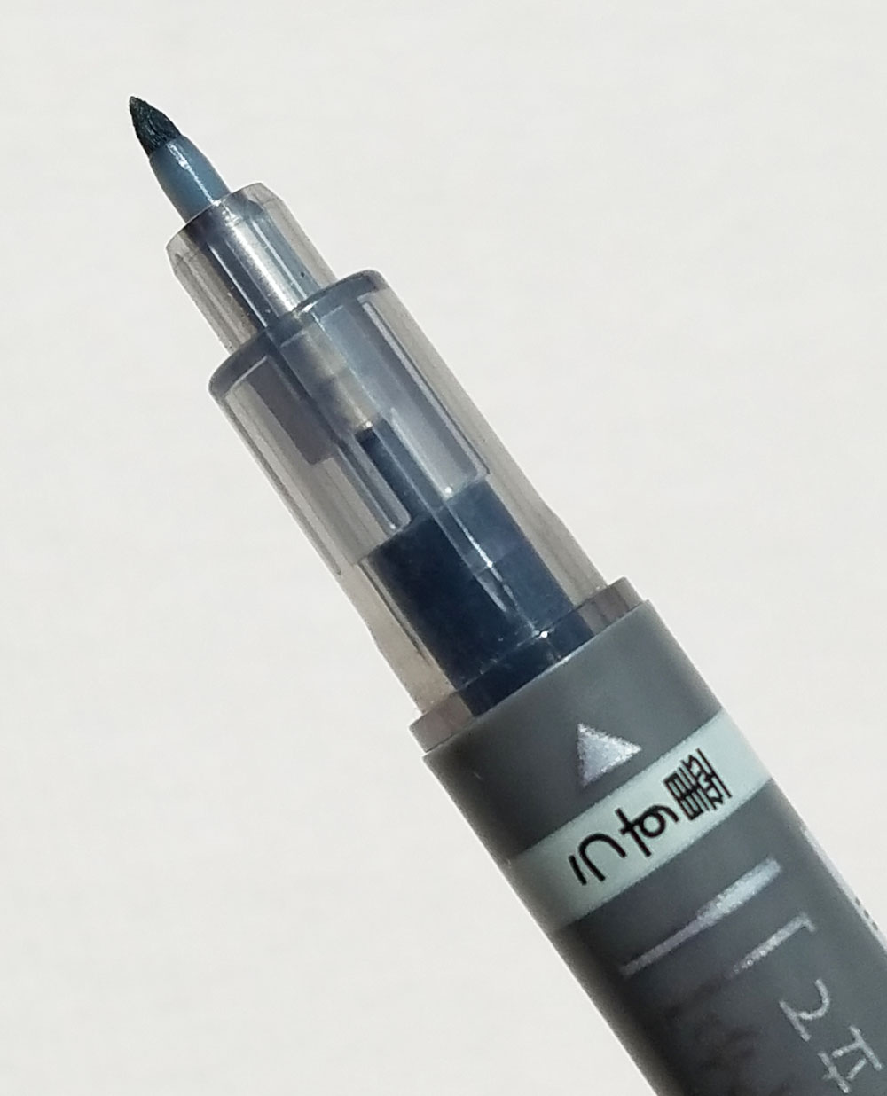
Compared to the Akashiya Keicho, the Tombow’s tips are much smaller and firmer. I’ve been sketching with this one consistently for more than a month, and so far, the tips haven’t mushed down (a pet peeve of my heavy-handed self).

The slightly flexible brush tips are similar to sign pens that are intended for Asian calligraphy and other fancy writing. With pressure, the tips are just spongy enough to give my writing or drawing line an interesting variation without so much flexiness that I lose control. Like any brush pens, the tips impart a fine line when held upright and a wider line when held at an angle.

For action sketches (like the one below in which I was observing an art class), the black side keeps up with my speed-drawing, and then I use the gray side for fast shading. My only complaint is that I like being able to make a wider mark when I’m shading a drawing, and the Tombow’s tip is smaller than I would like. Calligraphers, however, would probably appreciate that the two tips are small enough for lettering and corresponding drop shadows.

For me, the biggest benefit of the Tombow Fudenosuke is that the ink is waterproof. In the sketch below, I used the black side to make the line drawing, then added shading with the gray side. Finally, I added color with watercolor pencils, and when I activated the pigment with water, the line work and shading stayed clean and crisp.

Final Impressions

The gray/black double-sided Tombow Fudenosuke is a handy, compact tool that now has a permanent place in my sketch kit. I would like it even better if the gray side were wider, but its waterproof inks make it more versatile, so it gets big bonus points for that.