Review by Jessica Coles
Just before leaving for the San Francisco pen show, I received an item to review: Baron Fig’s newest notebook called the Wander Dream Journal. As this is the first time Baron Fig has tried their hand at adding content to a journal, I was intrigued to see what was inside.

The first look at the journal was wonderful. The outer box is well-made and solid, printed in jewel tones with whimsical dream scenes. The notebook is covered in heavy-duty dark blue cloth with nighttime icons printed in silver and a thick blue cloth ribbon is included along with an elastic band to hold the book closed. The cover of this notebook is not quite fully rigid but in use gives the support needed to write without a solid surface underneath.

The feel of this notebook is striking. It’s smaller than an A5 (about 3/4 inch smaller all around) and the cloth covering the notebook is slightly corse while the silver icons are pressed into the surface, not just printed. When opened, the cream paper has a noticeable pleasant texture and an enjoyable new-book smell (only detectable when very close to the notebook. I love the smell of books, old or new!).
Now, I have heard talk about poor paper quality in the past with Baron Fig notebooks, and, in fact, experienced it for myself when the company put out their first round of journals. However, I had also heard that this had changed. I’m happy to report that it has dramatically improved since my first experience.

The paper is more absorbent than most fountain pen friendly notebooks, so sheen is not going to show in this journal, however, this also means that ink dries very quickly. In a notebook that will most likely be used when the writer is half awake, this seems like a great feature. Ink dried almost instantly, even when using wet inks. However, very wet or broad nibs did tend to bleed through the paper slightly. To sum up the paper feel, it is the exact opposite of Clairefontaine paper; the Baron Fig paper is quite toothy (or textured).
As for the content: each page layout is divided into three main sections: Recall, Visualize, Interpret. The Recall and Interpret sections are lined while the Visualize section has been left blank, encouraging a quick sketch of a part of your dream.

The sides of this layout contain other ways to capture more dream data. Emotion (positive, negative?), Sleep Quality, Time (was the dream set in the past, present, future?), Color (did you dream in full color or black and white?), Viewpoint (first person?), and Type (Lucid, Fantasy, Nightmare?).

These prompts are wonderful for catching nuances of your dream that may otherwise be lost in the retelling. An explanation of these is also included in the back of the notebook alongside iconic Baron Fig illustrations.


I started my first tests of the paper using an ink that I purchased at the SF pen show: Akkerman #10. This is much easier to say than the full name of Akkerman Ijzer-galnoten Blauw-Zwart (the literal translation is Iron Gallnuts Blue-Black) ($28 per 60ml bottle). I was surprised to find that Akkerman made an iron gall ink. I also love the name. Iron Gallnuts. This was enough to send Ana and me into a fit of giggles after a very long day of working at the show.

In a comparison, the closest inks were Robert Oster Midnight Sapphire and ColorVerse Proxima B.

I love the ink. I have a special place in my heart for a dark blue-black, especially those that shade well. This iron gall ink was only in my pen for two days and I used a gold nib (non-reactive). I had no problems cleaning it out completely and the ink was very well-behaved. With my Franklin-Christoph medium cursive italic nib, the shading was beautiful. It was also a great pairing with the cream paper of the Wander journal. There was no bleed-through, only light show-through, and no detectable feathering.


I also tested several other writing instruments in the Wander journal. Waterman Pink (cartridge) in a wet, medium nib which did bleed through, along with a Pilot brush pen but the TWSBI broad and 1.1 nibs did not. Surprisingly, a Pentel Sparkle Pop gel pen did bleed through. An extra fine Sharpie also bled through the paper, although not enough to leave ink on the next page. All the inks appeared much darker than they do on Tomoe or Clairefontaine paper.


My favorite writing instruments on this paper were the cursive italic nib with Akkerman #10 and a pencil. Both wrote as though they were made to pair with the journal. The toothy-ness of the paper is great for catching the pencil lead slightly but not rough enough to keep a nib (even a cursive italic with sharper edges than most other nibs) from gliding over the page.
I have also enjoyed the journal content for recording dreams. I wasn’t brave enough to show those I have written down, but I will say that the prompts have made the recording easier on my sleepy brain! I have also noticed that I can remember the dreams a bit more clearly as if I’m training my mind to take note of specific pieces of the dream for the morning time report!
- Paper: Baron Fig Wander Dream Journal ($22)
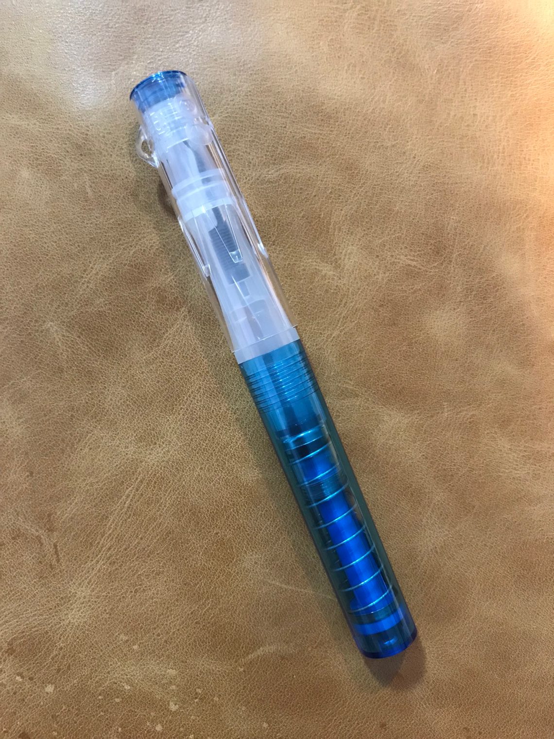
- Pens: Ranga Bamboo pen ($100), Franklin Christoph Medium cursive italic nib, 14kt ($120)
- Swatches: Col-o-Ring Ink Testing Book ($10)
- Ink: Akkerman Ijzer-galnoten Blauw-Zwart (60mL for $28)
DISCLAIMER: Some items included in this review were provided free of charge by Baron Fig for the purpose of review. Please see the About page for more details.


 (From top to bottom: Callifolio Grenat, Taccia Ebi, Robert Oster Hippo Purple, Birmingham Pen Co. Ebenezer Penny Carmine, Monteverde Mercury Noir)