Kokuyo Jibun Techo 2018 Planner: In retrospect

Kokuyo Jibun Techo 2018 Planner: In retrospect

Last year, I enthusiastically jumped on the Jibun Techo planner bandwagon and purchased the 2018 planner with all intents and purposes of making it my sole planner for 2018. The unusual, slim size of the B6 Slim size seemed portable and the 24-hour calendar seemed like it might help track not only my work schedule but my my complex blogging, and non-jobby-job stuff as well. I purchased the more techno-looking model, with color-coded days but a more “professional” model is also available with a simpler type treatment and color scheme.

2018 Jibun Techo planners

In the front of both books are places for project tracking and monthly planning. Sundays are more clearly visible in the professional calendar while the personal calendar make Saturday and Sunday colored fields.

2018 Jibun Techo planners

The month-on-two-pages is in the front of both books for long-term planning but both planners include two ribbon bookmarks. I was inclined to put one on the current week and one on the current month for ease of use.

2018 Jibun Techo planners

Both models feature the thin. Tomoe-esque paper. I can’t say for sure it’s Tomoe or, if it is, what weight it is, but it is pretty darn similar. The week-on-two-pages layout offer full 24-hour daily accounting options as well as a side margin for to-do lists. There are weather symbols at the top of each day and a space to note other info for the day (a birthday, a national holiday or event, etc) and at the bottom of each day is a place to note breakfast, lunch and dinner. The grid is 3mm throughout.

2018 Jibun Techo planners

The thin paper allows for a bit of show through so I’m glad I used the Kokuyo matching pencil board.

As for the usefulness of the Kokuyo Jibun Techo Planners, I had a hard time keeping up the use of this planner. The 24-hour time system was alien to my American, non-military brain. I kept having to count what 19 or 21 was. If I had to count on my fingers when to slot my 3pm meeting, things got messy. Make of fun me if you must but I’m a designer by trade and I can be mathy in a pinch but I have to switch over to that brain and it takes me out of the crazy headspace that makes cool designs, doodles, lettering and other things.

I did finally figure out a use for the “Promise List” in the Jibun Techo. I am often promising to do things for people throughout the year, bring an ink to a show, a pen to pen club etc. and the idea of keeping track of these things in a list seems like a solid idea. Though actually accounting for them on the specific week is probably just as useful. I just need to remember to keep my planner out and handy at all times.

To repurpose a quote, the best planner is the one you have with you.

I am going to seek out a planner with more free space and less mathy space. Also, the planner had really small squares, even for someone like me with tiny handwriting. That said, my meetings often take place in a specific space that needs to be noted along with the place so I require more space for one or two meetings per day with locations and descriptions written in requires-more-space English.

Some things included in planners that need to go the way of the dinosaur:

  • Address/contact pages especially with a fax number area (when was the last time you wrote someone’s contact info down?)
  • Password pages (its time to use a digital password manager like 1Password, LastPass or Dashlane)
  • Time Zone and Subway Maps (while charming, in the age of GPS mapping and cellphones are they necessary anymore)
  • To-read/to-watch lists (isn’t that what GoodReads/Amazon and Netflix queues are for?)

While I appreciate analog as much as anyone, I like to reflect on what I read, watch and listen to rather than keep a concise list in my planner. I am more likely to jot a movie recommendation or two on a daily page and then migrate it quickly to a shopping list or online queue. Then turn it into a longer written entry in my journal when I’ve read or watched it.

Stay tuned, there is an even bigger planner post coming later this week with more Japanese planners. Maybe there will be a gem in there?


A big shout-out to reader Elise who shared her Jibun Techo with us in order to do this post.

Preview: 2019 Midori Planners

We have a plethora of Midori planners to share with you this week. Thanks to Vanness Pen Shop for sending these along to us to share with you. This is a combination preview and giveaway so read through for details about each planner. At the end will be information about how to enter to win one of these giveaway packages.

Giveaway #1: The 2019 Midori Pocket Cat Planner

Midori 2019 Cat Pocket Planner

This is a diminutive Midori Cat pocket planner ($9) includes the month-on-two-pages  and starts with October 2018. It’s a mere 3.25″x5″ (12.2×8.3cm) and includes tabs for each month (in Japanese but most people can probably suss out the first tab is January, the second is February, etc). The paper is bright white and the illustrations throughout are sweet, little cat sketches. There is a protetctive plastic cover over the cardstock paper cover to keep the booklet from getting damaged and provides a little pocket in the front and back cover for notes and ephemera. If you need something to stick in your pocket, purse or glovebox to keep track of  upcoming days, birthdays or just check on things, this would make a great little calendar. It would probably be a bit too small for everyday planning, however.

Midori 2019 Cat Pocket Planner

Giveaway #2: The 2019 Midori B6 Slim Seasons Planner

Midori 2019 Flower Planner

The Midori Slim Seasons Planner for 2019 ($11) is a larger than the pocket planner but is not as large as a standard  Traveler’s Notebook. The Seasons Planner measures 7″x3.75″ (17×9.5cm) providing a bit more space for the month-on-two-pages calendars. The paper is ivory and the illustrations are flowers, birds, leaves and kokeshi dolls. The Seasons planner has the same protective plastic cover over the flexible, cardstock cover. This is another good pocketable calendar. I don’t know that it is a full-blown planner but would make a nice addition to a larger hobonichi if you needed a monthly calendar to refer to occasionally for scheduling, family calendar planning or quick appointment noting (i.e. 3pm dentist appointment 6 months out that you can later transfer to a desk planner or a drinks date with a friend next Tuesday that you can make a digital reminder later, rather than fumble around trying to figure out how to set the reminder right then).

Midori 2019 Flower Planner

Giveaway #3: The 2019 Midori Ojisan B6 Datebook & Stickers

Midori Planner Stickers

Midori makes some of the most ridiculously fun planner stickers ($3 per pack) so it made sense to pair the stickers with their silly 2019 B6 Ojisan Datebook ($22).

I conferred with a friend at work who is from Japan for more information about “ojisan”. Ojisan is the Japanese term for “middle aged man” or “uncle”. In the case of Midori’s planners, I think they are using it in the “middle aged man” sense in the way that we might make “dad joke” references, kind of weird things middle aged guys do sometimes. In the process of telling me the story, my friend also said there is a term for middle aged lady in Japan too. It’s obasan and she said the last time she was in Japan, a bunch of kids were yelling that at her. She said it took a minute for her to realize they were talking to her. “Wait… you’re calling me ‘old lady’? Hmpf?!” I found a web site that goes into a bit of the minutiae of when and how ojisan and obasan is used in Japan, if you’re curious.

Midori 2019 Ojisan Planner

Now, about the planner itself. The B6 size is approximately 7″x4.75″ (17.5x12cm) and features bright white paper (despite my rainy day photos suggesting otherwise!).  The months are indicated by die cut tabs and feature both month-on-two-page calendar pages and week-on-one-page plus notes for each week.

The month-on-two-pages start with October 2018 but the weekly pages don’t start until January 2019. There are a few notes pages in the back plus maps and address pages as well.

Midori 2019 Ojisan Planner

Midori 2019 Ojisan Planner

The tabs are laminated for durability and feature ojisan making the numbers of each month with his body.

Midori 2019 Ojisan Planner

This is a close-up of one of the illustrations of ojisan on the notes pages.

The B6 Ojisan Datebook includes a decorative protective plastic cover, a thin ribbon bookmark similar to the ones found in other Midori notebooks. The actual notebook is slid into the green vinyl, plastic cover. Without serious disassembly, I am going to assume the cover of the planner is blank or has minimal decoration, like other Midori notebooks.

Giveaway #4: The 2019 Midori Professional Planner A5 Slim

Midori 2019 Professional Planner

I would think the creators of the ubiquitous Traveler’s Notebook would have made the  2019 Midori A5 Slim Professional ($20) the same size as the Traveler’s Notebook A5 Slim… but no. It’s about 0.5″ (1.5cm) too wide to fit into a Traveler’s notebook cover. Not that everyone would want to put this into a leather cover but it sure would be nice. It’s essentially the same size as a Traveler’s Notebook cover so if you have a custom cover designed to be “wide” or “oversized”, this might fit inside it. That said, on its own, the polyvinyl cover over the cardstock is probably plenty durable, it’s just not as posh as I would associate with “professional”.

Midori 2019 Professional Planner

The Midori Professional goes back to the ivory paper. The monthly calendar is two-months-on-two-pages which does not offer a ton of space but is probably fine for marking vacations, holidays and project tracking. The whole planner actually starts the last week of November 2018. Along the margin is the week numbers.

Midori 2019 Professional Planner

The week-on-two-pages provides equal space for each day plus a space for notes. More than half of each block is tiny 2.5mm grid.

There are a good number of lined note pages, password keeper pages, to do sheets, project sheets, time zone maps, etc. in the back.

In Conclusion

So, while this is not all the Midori planners available for 2019 nor all the planners that Vanness is selling for 2019, this is a fairly wide selection showing the range of options available for pocketable to silly to appropriate for the most business-y of settings. I’m sure there will be one that meets your needs.

(As for pen tests, I found a video on YouTube done for some 2018 Midori planners. The video is over 45 minutes long but at the 23-minute mark she shows her pen tests for one of the planners proving the paper is relatively fountain pen-friendly.)


TO ENTER: Leave a comment below and tell us which Midori Planner you most desire by Giveaway Number. No number in your entry and your entry will be disqualified, okay? One entry per person. We will pick a winner for each Giveaway lot.

If you have never entered a giveaway or commented on the site before, your comment must be manually approved by our highly-trained staff of monkeys before it will appear on the site. Our monkeys are underpaid and under-caffeinated so don’t stress if your comment does not appear right away. Give the moneys time.

FINE PRINT: All entries must be submitted by 10pm CST on Friday, Oct. 13, 2018. All entries must be submitted at wellappointeddesk.com, not Twitter, Tumblr or Facebook, okay? Winner will be announced on Saturday. Winners will be selected by random number generator from entries that played by the rules (see above). Please include your actual email address in the comment form (where it say “email address”) so that I can contact you if you win. I will not save email addresses or sell them to anyone — pinky swear. If winner does not respond within 7 days, I will draw a new giveaway winner. Shipping via USPS first class only. US and APO/AFO only, sorry.


DISCLAIMER: The items included in this review were provided free of charge by Vanness Pen Shop for the purpose of review. Please see the About page for more details.

Eye Candy: Penlux Inks

Eye Candy: Penlux Inks

Penlux ink boxes

Penlux ink is available from The Pen Show. Each bottle is 50ml and is made by Sailor for Penlux. The colors are based on antique Japanese colors. Originally, I purchased three colors (Amber, Pine and Rouge) from the Dolives at the DC Show ($30 each) but there are six colors currently available. I broke down after the DC Show and ordered the other three colors from the website. I couldn’t help myself.

Pen Lux Ink Box

I keep saying that I don’t care about packaging but I realize I am clearly lying. I want the packaging to be good, protective, interesting and/or environmentally sound. The boxes for Penlux meet all this criteria. The boxes are simple, coated paperboard that fold like origami with the top flap tucking in to close the box. Penlux boxes are elegant. Japanese design and worthy of an upscale fountain pen ink. It’s simple and protective. The packaging makes the bottles stackable and giftable. I was also told that the characters on the front of the box are the Japanese characters for “ink.”

Pen Lux Ink

Inside, the bottles are simple. square glass with a faceted, plastic cap. They are elegant but do not have the color name indicated on the individual bottles so keeping the inks in the boxes is handy for identification purposes. I ended up putting small labels on the caps with the names just in case the bottles got separated from the boxes.

Pen Lux Ink Swatches

Penlux swatches

The colors in the line are Pine, Amber, Rouge, Peacock Blue, Cobalt Blue and Charcoal. There are also black and blue black available in standard Sailor flat, tea bottles but I skipped those. What I noticed most about these inks, though made by Sailor, was that the colors had a matte, almost chalky quality. The colors seem opaque and fairly dry. Maybe this is what they mean when they describe it as traditional Japanese ink?

Penlux and Sailor swatches

I definitely felt compelled to compare the Penlux colors to their closest Sailor cousins. I was quick to discover that in the regularly available Jentle line, there was no close match for the Amber. Penlux Rouge and Sailor Grenade were fairly close although the matte, opaque coloring of the Penlux ink made it seem darker and it had none of the green sheen of Grenade. Penlux Peacock Blue also had no close match though Sailor Blue Black might come close. Penlux Charcoal is definitely more black than Sailor Chu-Shu which leans more purple than grey or black.

Penlux and Sailor swatches

Penlux Pine and Sailor Rikyu-Cha are definitely kissing cousins. Pine is a bit warmer making it slightly more brown where Rikyu-Cha is a touch more green but they are very close.

Penlux Cobalt hangs in there with Sailor Jentle Souten and Sky High with less shading. I also think its a serious contender to the new Akkerman Delft Blau for sheer pop. It would Yves Klein a run for his money.

Penlux and Sailor swatches

If you are looking for something a little different, Penlux is definitely an inky treat. Amber and Cobalt are the standouts for me with Rouge and Peacock Blue as the runners-up.


I purchased these inks with my own money.

Tools:


Ink Review: Robert Oster Carbon Fire

Review by Jessica Coles

Have you ever seen someone who has absolutely found their niche in life?  Sean Connery? He was absolutely meant to be an actor.  Billy Joel?  Piano entertainer.  It’s a pleasure to see them at their work because it seems to be a natural extension of themselves. Sometimes I wonder if Robert Oster should be on that list as well with his new inks.  2018 has been a busy year for him with new inks popping up every few weeks, including one of the more recent releases, Carbon Fire ($17.00 for 50 mL at Pen Chalet).

I used this ink in my review of the Monteverde Monza Flex pen last week.  Even though the pen didn’t give much variation in line width, Carbon Fire still showed shading through the beautifully rich blue.

A bit of sheen shows when the ink is allowed to pool, but that sheen isn’t very evident with writing.

In fact, with normal writing, the color seems to be a normal deep blue. The ink writes a tad on the dry side.

But I found that Carbon Fire seems to hold a secret within that color.  A red sheen shows as a halo around the edge of my writing.  This is a huge change from other inks we have seen in the past that could be classified by the sheen color rather than the ink color.  The sheen is quiet and surprising.

This halo sheen doesn’t show on all paper.  When testing on Rhodia paper, no sheen could be found.  However, on Tomoe paper and Col-O-Ring cards, this secret sheen is waiting to be discovered.

I have greatly enjoyed using Carbon Fire — the blue is perfectly acceptable for work situations and won’t call attention to itself, but occasionally you may find yourself taking a second look when you see the sheen peeking out when you don’t expect it.

Tools:


DISCLAIMER: Some items included in this review were provided free of charge by Pen Chalet for the purpose of review. Please see the About page for more details.

Planner Review: Baron Fig Confidant Dateless Hardcover (Plus Embellishments)

Review by Tina Koyama

Back when I worked a “normal” 9-to-5 job, I was usually able to find a planner that met my needs. But when I went freelance 15 years ago, I became frustrated by most of the format choices. I wanted both a Sunday-through-Saturday monthly calendar and a Monday-through-Sunday weekly spread in the same book. Since my working hours varied widely, I wanted Saturday and Sunday to have the same amount of space as all the rest of the days – not crammed together to accommodate a symmetrical page layout. (Even when I worked normal hours, my weekends were always as busy as the other days – like we don’t have to plan our leisure time?) I also wanted the monthly grid to have at least five rows so that on longer months, some days wouldn’t have to share a square.

I don’t usually have many appointments, so hourly time slots get in my way. Instead, I prefer freeform space for weekly goals and tasks that I can also use for appointments when I have them.

The past several years I got so fed up with commercial options that I started making my own planners. Using an A5-size Rhodia or Leuchtturm notebook with a brightly colored cover and good quality paper, I ruled my own grids and made a planner exactly the way I wanted. It was a bit tedious and time-consuming, but I didn’t mind spending a rainy afternoon making one each year. It was worth my time to get the ideal planner for my needs. (If you’d like to see what they looked like, take a peek at my personal blog.)

Imagine my delight when I saw Baron Fig’s latest planner – the Confidant Dateless Hardcover ($22.00)! Could I finally stop making my own? Let’s take a look.

As always, BF’s flagship hardcover product came in a sturdy box with the same pattern as the planner’s cover. (The box makes great storage for washi tape, by the way, if you have a modest collection like I do.)


The dark gray fabric cover – a lovely and pleasant-feeling alternative to the more typical faux leather found on many notebooks and planners – is subtly debossed with motifs of the four seasons. The same seasonal motifs are also used on BF’s Vanguard Pocket Dateless Planner Set. The clean, understated design is exactly what I would expect from Baron Fig.

A pale gray, woven fabric ribbon marker is almost an Ana-approved length – just a half-inch longer, and it could be used to open the book to the marked page. The ribbon is a nice touch that is consistent with BF’s other Confidant notebooks, but since I always leave my planner open on my desk, I won’t use it much.

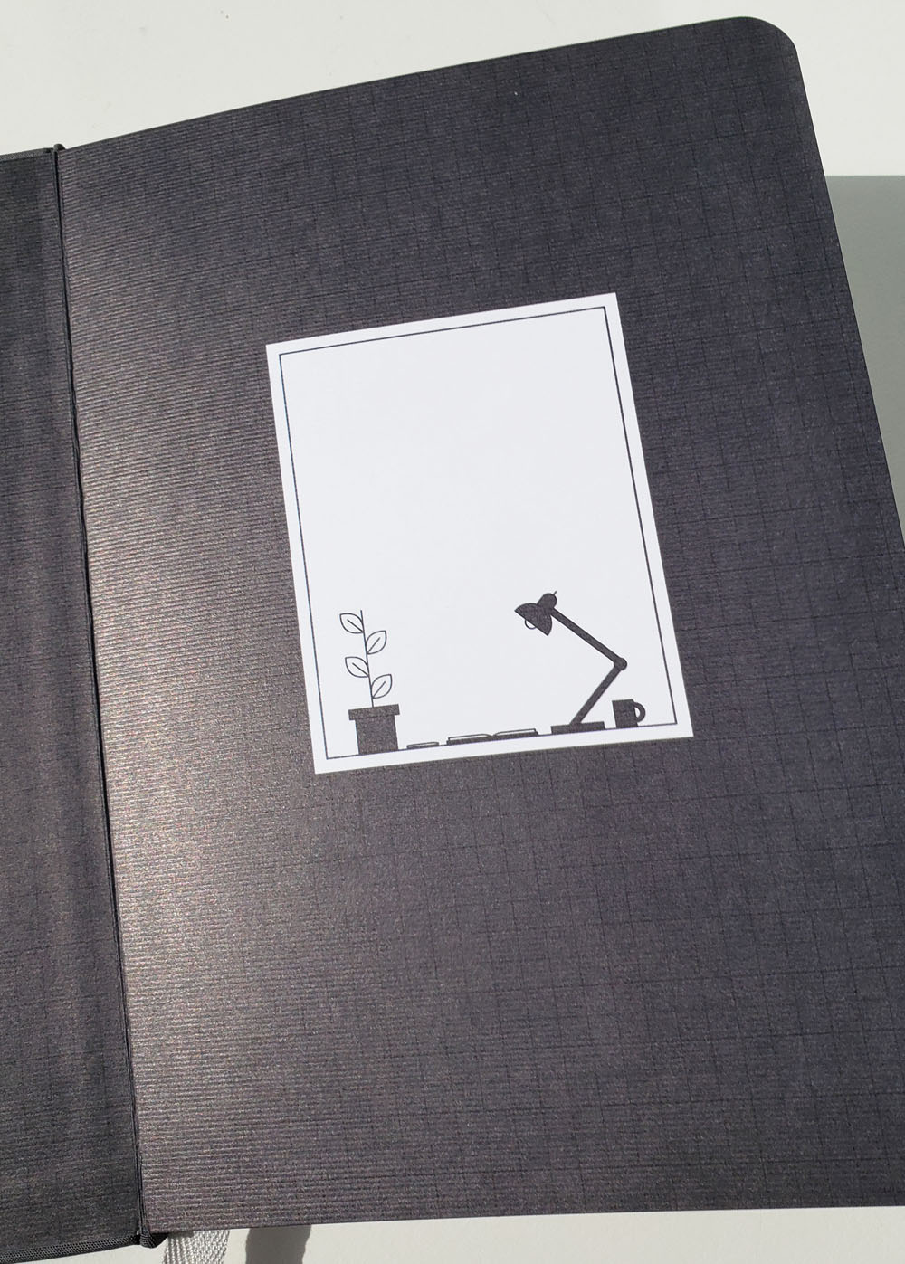
The flyleaf includes a bookplate with a sweet image of a desk that really appeals to me. (Do I daresay it’s cute?)

The main planner section begins with a monthly 7×5 grid layout – yes! Crowded months no longer have to share a space. The day columns on the undated calendar are also blank, so the week can begin with either Sunday or Monday (or any day), as desired.

The monthly spread is then followed by five weekly page spreads. Again, the format is completely blank, so you can start your week with any day. Most exciting to me is that each of the seven days has equal space! A completely freeform eighth space is available for to-do lists or notes – in exactly the spot where I would put it.

A huge advantage with BF’s binding is that any page spread will stay open on its own. It’s ideal for people like me who keep their planners open on the desktop. (When I DIY’d Leuchtturm or Rhodia notebooks, I had to use a binder clip on one side to keep them open.)

The fifth weekly spread is followed by the next monthly spread, and so on, so this planner can be started at any time of the year and used for a continuous 12 months.

After the last planner page, the Notes section begins, which is filled with 43 unformatted dot grid pages. The last dozen of these sheets are perforated for easy removal. I’m going to use this section for distant planning in 2020 – a page per month. I had a similar section in my DIY planner. It’s a nice place to put reminders for tasks I do annually and events happening in the following year when I don’t yet have the next year’s planner set up.

Having used various Baron Fig notebooks before, I was already familiar with the paper, which is pleasant to use with all the pens and pencils I’ve tried on it (I especially like sketching with graphite on this paper). Since I always write appointments and notes in my planner with pencil, I didn’t throw my full arsenal of media at the paper, but I did test several pens and markers I considered for filling in the dates and monthly headers. The Art Alternatives Fineliner pen bled a bit where my pen point paused; the rest did not bleed at all, even my juicy Sailor fude nib. I ended up choosing the Art Alternatives Fineliner for the monthly headers, and I apparently wrote fast enough without pausing that I saw no bleed-through. I used a Sakura Pigma Micron 0.5mm for the dates.


Indeed, the BF dateless format is everything I want in a planner. I’m used to filling in my own dates, so that’s nothing new, and this time I didn’t have to make all the rulings first, which is the most tedious part of the task anyway. I’m a happy planner!

Well, almost. The only thing about the BF planner that I can’t abide by is all that gray. Gray cover with gray-on-gray debossing, gray ribbon, gray end sheets, gray section dividers, gray header on each page – gray, gray, gray. (If you lived in Seattle where we have overcast skies the same color as those headers nine months out of the year, you’d feel the same.) Why couldn’t there be a tiny dash of color somewhere – like those cheerful primaries used in the Vanguard dateless planners?

Since I’m used to DIY-ing it, giving a bit of color to an otherwise-perfect planner is small potatoes. First I needed to take care of one functional item that I always put into my self-made planners: index tab dividers to make it easier to flip to each month. Hobonichi Index Stickers added both color and function at once. In fact, I stacked each tiny month number tab over a slightly larger tab to make them sturdier and easier to hold.

Those subtle pastels in the index sticker set weren’t quite bright enough for me, though. If I was going to fight the gray, I intended to do it big time. How?

The eight-pack of Mark’s Maste Washi Tapes in the Basic Colorfully Color Pattern Mix is what I’m talking about! I easily slapped a strip on each monthly page for a bright splash of color. (Thankfully, the tape is repositionable, so when I laid it down crookedly, it was easily fixed.)

I also used strips of washi to mark certain special occasions and personal holidays.

Then for good measure, I also picked up the Midori Seal Collection Planner Stickers – Line, which includes adorable motifs of pencils, pens and brushes. I used up the whole sheet randomly putting bits of color on the weekly spreads. They will give me a fun surprise every time I turn a page.

I’m not the type who enjoys taking time to decorate my planner page each day, but stickering and washi-ing this BF planner was a fun way to spend a rainy Sunday afternoon.

Final Impressions

I’ve been waiting my whole freelance life for the Baron Fig Confidant Dateless Planner – it’s a huge win for me and the way I like to plan. Its flexible, versatile format would fit nearly anyone’s lifestyle. Now if I could just persuade BF to offer me a color other than gray. . . but in the meantime, washi is my friend.


DISCLAIMER: The items included in this review were sent to use for free by Baron Fig. Please see the About page for more details.

Link Love: New Found Loves?

Pens:

Ink:

Pencils:

Notebooks & Paper:

Art & Creativity:

Other Interesting Things: