Ink Review: Lamy Crystal Agate

Ink Review: Lamy Crystal Agate

By Jessica Coles

Today we continue down the path of Lamy Crystal inks.  I picked up two of these cute bottles at the Dromgoole’s table in Atlanta during the Atlanta pen show; Lamy Azurite and Lamy Agate ($16 each for 30mL).

I have noticed a trend across many ink brands towards more well made but smaller bottles. I am not sure yet if I like this trend, especially for inks that I love. However, the less ink in the bottle means it is easier to achieve an empty ink bottle; this also means less guilt about collecting multiple colors.

I love the detail Lamy put into these bottles including the band at the bottom of the bottle which matches the ink color.  On the Agate bottle, this is hard to notice since it is also the color of the metal cap.  But it is there!

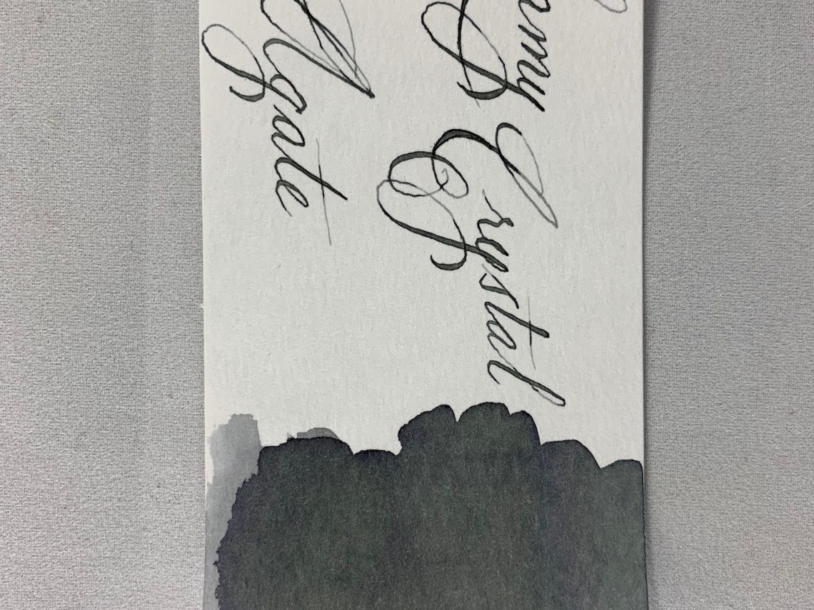
In testing Lamy Crystal Agate, I chose a TWSBI Eco-T with a 1.1 nib so I could see the shading at its best and I think this was a great choice.  Agate is an ink that loves to shade and the contrast between the two tones is beautiful.

In the writing sample below, Agate has medium flow (neither wet nor dry) and it dries at a good pace to keep up with my handwriting (approximately 20 seconds). I noticed that as I wrote, the ink was a warm gray as I wrote but changed to a cool grey with green undertones as it dried.  This can be a good trait as it is fun to watch, or it can be negative if you find yourself unable to stop watching ink dry!

There was no bleeding or feathering on my paper (I used a Birmingham Pen Company Tomoe River notebook).

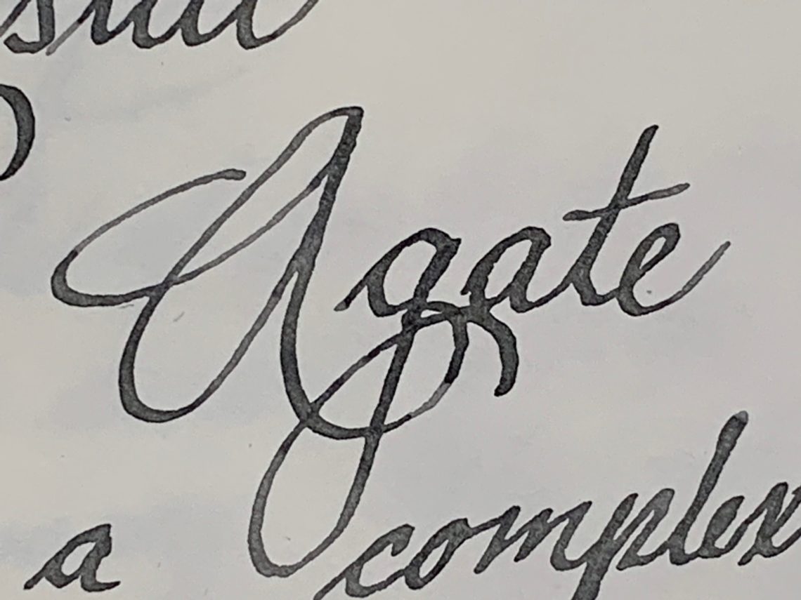
When you look closely at the swatch, the gray ink shows a few of its component colors; blue and green. I have found that gray is usually a very complex color in ink – not just a washed out black.

This can be seen more clearly on Col-o-Ring cards along with the shading of Agate.  There even appears to be a touch of purple at the edges of the darkest areas.

Comparing Lamy Crystal Agate to other swatches in my collection showed that it is closest to Diamine Silver Fox (one of my favorite gray inks) although a few shades darker, more in line with Diamine Graphite in darkness level.  Neither Diamine ink shows the complexity that is present in Lamy Crystal Agate, however.  To compare the shading and the mixture of color, I threw ink a swatch of Papier Plume Bayou Nightfall.

I have absolutely nothing bad to say about Agate.  The bottle is beautiful and well designed containing a reasonable amount of ink; the price, although higher than standard Lamy inks, is still at the lower end of ink prices and the ink itself is lovely. I’m glad I picked up Agate and plan to add it to my standard rotation.

I think the Lamy Crystal inks have been an amazing addition to their standard line-up and I’m glad they’ve been added in permanently.  If you pick up a bottle, you may find yourself wanting to display it as well!


Disclaimer: All items in this review were purchased by me.  For more information, visit our About page.


Atlanta Pen Show Haul

Atlanta Pen Show Haul

Once again, I took very few actual photos of the Atlanta Pen Show event. Between working behind the Vanness Pen Shop table Friday through Sunday and participating in the Pen Addict podcast on Saturday night, I had very little time to wander around and take photos. We stayed very busy.

Jesi and I had a great time. We talk all the time but getting to spend time together was also an amazing opportunity.

Atlanta Pen Show purchases 2019

When I did have a few moments to wander, I made purchases, of course! Most of those purchases happened late on Sunday when the show tends to slow down and I have a few minutes to get away from the table.

I bought the following items:

Atlanta Pen Show purchases 2019

Besides purchasing pens at the show, I also received an amazing gift from my friend Julia Skott from Sweden. You might know her better as one of the hosts of the MakeDo podcast and she was recently interviewed on Art Supply Posse. Getting to see Julia and her husband Pontis each year is one of the things I look forward to most each year. She brought a lovely assortment of her ceramic mugs this year and there was quite a bit of enthusiasm for her pen cups and mugs. There’s even talk that Julia might try to get a table next year.

Atlanta Pen Show purchases 2019

Before I left Atlanta, Brad, Myke, Tif, Julia, Pontis and I went to Ponce City Market and visited a stationery shop and an art supply store as well as eating a lot of food before heading to the airport on our various journeys. We mostly bought pencils because, why not?

Buying more stationery after a pen show makes all of us do a happy dance.

#al-staralways, #safariforever and the new #kawekoFTW buttons

Finally, Brad and I made another round of pins for our annual AL-Star vs. Safari rivalry. This year, we added Kaweco into the mix as we felt that the introduction of the Sport Frosted line for 2019 made real waves aesthetically in the low priced, entry level range of pens. Both Brad and I will try to have these pins available at any pen show we are attending this year. I’ll be at the Chicago Pen Show and will have these available. So, you’ll have to decide which is your favorite this year.

Link Love: Paper Dragons

This week has sunny yellow inks, flashbacks to the Atlanta Pen Show and some unusual pen reviews like the Omas Tokyo, the Faber-Castell Neo Slim and a Wing Sung 5502. If you saw this week’s Fashionable Friday you may have noticed a peek at some nail polish that will be available on Friday so I included the full review here from our favorite polish maven and nib tuner, Dr. Audrey Matteson from Right on the Nail. Best of all, Viking built a paper dragon for the start of Game of Thrones’ final season. I have not watched the series but I can appreciate anyone who builds a paper dragon.

Pens:

Ink:

Pencils:

Notebooks & Paper:

Art & Creativity:

Other Interesting Things:

Ink Review: De Atramentis Deepwater Obsession Black-Red

Review by Laura Cameron

When I was in Arkansas last month, I had the opportunity to spend some quality time with the Vanness walls of ink and, with some help from the friendly shop staff, I found a new to me ink: De Atramentis Deepwater Obsession Black-Red (35mL for $14.00).

Deepwater Obsession Black-Red is a gorgeous black cherry colored ink with rich intensity.

In lighter applications it is almost dusty looking, and in the darkest applications it is almost black.

In the course of normal writing, however, you don’t see those lovely shades; more just a rich red-black color.

The ink doesn’t sheen at all, and barely shades in the course of writing unless you vary the flow of ink to the nib (like with my dip nibs).

And those ink splotches? A bit red on the edges, but almost black!

The lighter shades of Deepwater Obsession Black-Red are similar to Platinum Classic Lavender Black, but are definitely slightly redder. Compared to Diamine Wine Divine, Deepwater Obsession is a little more plummy and of course it doesn’t have the sparkle of Wine Divine. Perhaps the closest in my swatch collection is Birmingham Pen Company’s South Side Market Boysenberry.

Overall I love the color of this ink, but if you’re looking for fun shading or sheening, this doesn’t have all the bells and whistles. It’s just plain old good deep black cherry red.


DISCLAIMER: Some of the items included in this review were provided to us free of charge for the purpose of review. Please see the About page for more details.

Notebook Review: Beech Tree Paper Kraft Notebooks

Notebook Review: Beech Tree Paper Kraft Notebooks

The Beech Tree Paper Small Notebooks come in a variety of sets for the plain or lined versions. The blank notebooks are available in a variety of options from single books up to 100 book packs ranging in price from $1 to $100. There are also lined notebook options but not quite as many options as with the blank books.

All the small notebooks are 3.5″ x 5.5″ with 40 pages of 24lb white paper and 100lb covers. The blank books are available with black, white, gray or kraft covers and are available with square or rounded corners.

The lined books are only available with kraft covers and square corners. They feature 0.25″ (6.5mm) lines and a 0.5″ (12.5mm) margin at the top. The lines are a medium grey. The lines are a little darker than I prefer since I do like some lighter and brighter inks and pencil but if you are using standard black or blue ink, the lines should be fine. This is why I tend to choose blank paper and place a piece of guide paper behind my working page rather than use pre-printed lined or graph paper.

Beech Tree Press mentions on their site that their notebooks are unbranded. When they arrived for review, they were wrapped with a plain paper band. Since I received mine for review I wasn’t sure if the plain paper wrap was standard or if all orders were shipped this way. As such, once the band is removed, there is no indication as to where the notebooks were purchased. If you use your notebooks quickly, and decided to order more, you may remember where you purchased them. If it takes a bit longer to use them up, you may not remember so I recommend writing in the back cover, the name of the company so that you remember that these are Beech Tree Paper notebooks.

I’m all for minimal exterior branding so that, as users, we can draw, sticker or doodle on the books to our heart’s content. However, I also appreciate being able to flip open a notebook and have some indication of who made it should I want to buy another one or should someone ask me, “Hey, where did you get that notebook?”

Beech Tree Notebooks writing test

I knew the 24lb paper was not going to perform as well as Clairefontaine or Tomoe River but for notebooks that cost less than $1.50 each, it was worth testing these for a good option for the budget conscious.

Beech Tree Notebooks writing tests

Some wider or wetter inks showed a little bit of feathering but not as bad as I was expecting. Once I got to a stub nib though, it became much more noticeable.  Fine and extra-fine nibs seemed to do okay though. Gel pens and water-based brush pens performed well too. Of course, pencils performed beautifully.

Beech Tree Notebooks writing tests

Showthrough was visible with stub nib, flex nib, parallel pen and a tiny bit with the rollerball. There was bleed through with the parallel pen and the flex nib to the next page but only dots of ink.

Beech Tree Notebooks writing test

I tested these heavier tools only because I sometimes write or draw with whatever is in my bag or on my desk which is not always the most appropriate tool. I try to carry a gel pen and pencil in my bag for sketching and for using on papers that are not fountain-pen friendly but occasionally, I turn to my pocket notebook and jot the name of a pattern, something I heard on a podcast or and idea I had while working before I forget what it is with whatever I was last using.

Beech Tree Notebooks reverse side

The brush pen had no showthrough at all.

Beech Tree Notebooks writing tools

These were the pens and pencils used in the test, in case you were curious.

Overall, these notebooks are on par with many of the pocket notebooks available on the market at a fraction of the price. I prefer blank notebooks over lined so I appreciate that but if you like graph or dot grid, you may be less inclined to purchase these. Rounded corners are only available in the blank notebooks as well so I definitely think they are the more flexible option with a guide sheet. While the paper is not 100% fountain pen-friendly, it’s on par with many pocket notebooks.


DISCLAIMER: Some items included in this review were provided free of charge for the purpose of review. Please see the About page for more details.

Giveaway Winner: Compoco Airplane View A5 Journal & more.

I’m running a day late, but thanks to everyone who entered the giveaway for the Compoco Airplane  View A5 Journal! Our winner is Teejay:

Congratulations Teejay! I hope you have a wonderful trip and enjoy your new journal.

For the rest of us, don’t forget that Compoco is currently offering a discount to Well-Appointed Desk readers. Receive 15% off your order through the month of April with the coupon code 15well!

Notebook Review: NAVA Design My Colors Book

Notebook Review: NAVA Design My Colors Book

A long time ago there was an Italian notebook that featured multicolored pages and then it was immediately discontinued so it became impossible to find so I never got a chance to try it out. When I saw the NAVA Designs “My Colors” Book ($16) which featured an exposed coptic binding with a rainbow of colored paper signatures, I knew I had to give it a try.

Nava My Colors Book spine detail

The notebook is A5 sized notebook with 192 pages and six different colors of paper. The papers are all perforated for easily removed. The covers are cardstock, 360gsm. The interior pages are 192gsm.

Nava My Colors Book writing sample 1

The first thing I wanted to try was colored pencils. I like using the opaque colors from colored pencils on the bright colored paper. I got some good contrast with both lighter and darker pencils.

Nava My Colors Book

Between each section of color is a splash of contrasting color.

Nava My Colors Book

The pops of color and the paper being a little smaller is really interesting.

Nava My Colors Book writing sample 2

When I tried all my regular pens that I used for testing, the paper in the My Colors Book, I didn’t have any issues with feathering. Obviously, some ink is too light to show up on some of the colors of paper but generally, the paper is amazing and fun.

Nava My Colors Book writing sample reverse and tools

On the reverse, there was no bleed through. And I thought I’d share all the tools I used. There was a lot.

If you are looking for a fun notebook for doodling, sketching or collage, I think the My Colors Book would be a good option. The price is good. The only downside is the type on the cover and I wish the cover paper stock was a little heavier.


DISCLAIMER: The items included in this review were provided free of charge by JetPens for the purpose of review. Please see the About page for more details.