Fashionable Friday: Pirate Treasures

Fashionable Friday Pirate Treasures

I was inspired in equal parts by the new Montegrappa Mini Mule and the May Allure’s Most Wanted Beauty Products article (I read the article in the paper edition but you can enjoy it digitally too).

  • Alexander McQueen Treasures Print Scarf $495.43AUD ($347.74US) (via Cettire)
  • Montegrappa Fortuna Mini Copper Mule Fountain Pen MSRP $350 (coming soon to your favorite fountain pen retailer)
  • Auden Alana Sea Shell Drop Earrings $168 (via Neiman Marcus)
  • MT Big Black Dot Stripe Washi Tape $3.50 per roll (via CuteTape)
  • Pen House Pen Saijiki Kazahana Fountain Pen Ink $31 for 50 ml bottle (via Vanness Pens)
  • Thick Plot Notebook $60 (via Story Supply Co.)
  • Soap Rocks $13 each (via Bloomingdales)
  • Blackwing Pencil Roll $59.95 (via Blackwing 602)
  • Esterbrook Twelve Pen Nook MSRP $175 (available soon from your favorite pen retailer)
  • Benu Briolette Fountain Pen in Gold Ore – Fine Point $80 (via Goldspot Pens)
  • Conklin Duraflex 120th Anniversary Fountain Pen, Special Price $60 (via Pen Chalet)
  • Reaktor Starliner Fountain Pen, starting at $55 (via Karas Pen Co.)
  • Leonardo Momento Zero Horn ST Fountain pen €122.31 (via Appelboom)
  • LAMY Benitoite Crystal Fountain Pen Ink $16 for 30 ml Bottle (via JetPens)

Thanks to my sponsors for providing some of the images I use for Fashionable Friday. Please consider making your next purchase from one of the shops that support this blog. Let them know you heard about them here.

Thanks for your support and for supporting the shops that help keep it running.

Notebook Review: My Graphic Notebook

Notebook Review: My Graphic Notebook

By Jessica Coles

I recently came into possession of a new notebook named My Graphic Book ($16 at Vanness) that lives up to the name quite well. This notebook consists of six sections, each featuring a different kind of graph in various bright colors.  My first thought was that this could check several boxes for me; a rainbow of colors, graph paper that begs for doodling plus the bright colors seemed to give me permission to have a notebook that was set aside for fun.

Please excuse the slight bend in the cover.  I’m fairly tough on notebooks!

First, an overview of the paper in general.  All sections in the notebook use the same paper, bright white, smooth paper (I have not found information about the weight of the paper but it is fairly thick) that feels wonderful to write on it.


I was somewhat disappointed at first when fountain pen ink bled through the paper.  But then I remembered something.  There are writing instruments that are not fountain pens!

My obsession with fountain pens didn’t start with fountain pens.  It started as an obsession with pens in general.  Gel pens were a huge part of my notetaking in school; between classes and journaling, I could easily write gel pens dry on a regular basis.  Micron pens, Stabilo pens, Gelly Roll pens… I don’t use these pens as much anymore, but why not? They are so fun! I decided to get out ALL of them and play with color in this notebook.

I was actually pleasantly surprised to find how well this paper did with nearly every pen I threw at it, even Sharpie marker. By far my favorite was the Stabilo 68 pens that don’t play well with my usual Tomoe River paper.  I had forgotten how many of these I actually owned, so there was no problem finding plenty of colors.

The first section of the Graphic Book is blue dots at a spacing of 7mm.  The larger distance between dots helped remind me not to take myself too seriously here – this notebook was to be fun.

The next section consists of bright green lines.  The spacing alternates between 3 and 4 mm.

I got out my super fine gel pens for this section.

Nothing bled through with this pen.

Did I mention?  Each section in the notebook is marked off from the others with a matching Day Glo divider!

The next section consists of neon orange lines, surrounded by neon orange dividers. These lines reminded me of the handwriting pages that were given out in grade school.

The lines made me nostalgic for those handwriting exercises, so I gave that a try!

Next came a neon red grid. It was hard to get the photo to come anywhere close to the actual color here – it seems the red is a bit bright for my camera.

Here I brought out the Stabilo markers for fun.

The fifth section is a VERY bright neon pink.

The grid in this section was even more playful and reminded me of quilts.

So I made pinwheels using Stabilo 88 markers and got out my Day Glo gel pen!

The best color was saved for last.  Purple.

This grid also ended up being one of my favorites.  The heavy lines are a 10mm spacing, the medium lines at a 5mm spacing and tiny 1mm grid over all of it.

I didn’t have the chance to get as involved with this graph, but you’d better believe that this one will get more color soon!

The binding for this notebook consists of six signatures (or group of sheets that are folded together) that are each sewn.

The signatures are then glued at the sewn edge.

This allows all of the colors and textures to be seen on the spine.

I have enjoyed using this notebook – I often make the mistake of keeping notebooks only for serious reasons.  My Graphic Book pulled me back into the fun parts of doodling with good paper, it’s a wide variety of graphs and amazingly bright colors. I highly recommend it for having lots of fun.


DISCLAIMER: Some of the items included in this review were provided to us free of charge for the purpose of review. Please see the About page for more details.

Link Love: Helvetica NOW vs. Public Sans

Link Love: Helvetica NOW vs. Public Sans

The clock is ticking down to the Chicago Pen Show for us here at The Well-Appointed Desk. In the rest of the world, attention is focused on the launch of Helvetica Now and Public Sans. Well, at least in the typographical world. Nick Stewart continues to work his way through the Sailor Studio ink colors in his beautiful, bleachy ways. Austin Kleon is looking out for me with his tip for remembering your hotel room number. Tools and Toys is giving me an excuse to buy another (Kipling) bag.

Posts of the Week:

Pens:

Ink:

Pencils:

Notebooks & Paper:

Art & Creativity:

Other Interesting Things:

Fountain Pen Review: Retro 51 Tornado Fountain

Fountain Pen Review: Retro 51 Tornado Fountain

Review by Laura Cameron

You may or may not remember that in my first post on The Desk I talked about how my Retro 51 Tornado in Black Cherry (and truly Retro 51) was my gateway drug into the fountain pen world. My love for Retro 51s hasn’t abated, so I was intrigued to hear that they were making product improvements and that there would be a redesigned version releasing this year. Ana ordered one in Aquamarine from Vanness Pen Shop ($65) for me and I was off to the races. (For the purposes of this review I’ll compare the Aquamarine to my Black Cherry).

On it’s face, the new Tornado looks similar to the old Tornado. The new colors (Aquamarine, Ultraviolet and Orchid) are designed in a “frosted metallic” style meaning they have a matte finish both on the pen body and the silver trim. (Former editions of the Tornado were a shiny finish.)


I started by comparing the exteriors of the pens – the length appears to differ only slightly, by less than 1/8th of an inch, and the weights are roughly the same as well (new: 33g and old: 32g, but that may be the result of uneven ink fills).

So now let’s look at the real differences: the nib and the grip section. The previous versions of the Retro 51 Tornado used Schmidt nibs and came with the Medium as the standard nib (though I believe Fine was available on request). The new versions have upgraded to the Jowo #6 nib, and are now available in Extra Fine, Fine, Medium and 1.1 stub italic.

They’ve also re-worked the grip section. It appears to be approximately the same length, but the new grip is somewhat contoured, whereas the older grip narrowed in a straight line.

My final test was filling the pens and letting them sit for a while. Although I love my Retro 51s (and I have SEVERAL more not pictured here), historically they have dried out pretty quickly and often require water to get them started again. I let both pens sit untouched for a week, and sure enough my Black Cherry needed a bit of assistance to get the juices (inks) flowing, but the Aquamarine started right up. This test isn’t exhaustive – I really should let the new Retro sit for more than a week and see what happens, but so far I’m impressed.

Overall, I think the changes Retro has made to the Tornado Fountain Pen are great. The section was never a deal breaker for me, but I think many people will really like the new contoured grip. And I’m always a fan of more nib choice; making it a Jowo #6 nib opens up a lot of possibilities. I still think that Retro 51 is a fun brand and makes a great fountain pen for those newer to the hobby looking to upgrade their pen experience!


DISCLAIMER: Some of the items included in this review were provided to us free of charge for the purpose of review. Please see the About page for more details.


Eye Candy: Papier Plume Bad Bad LeRoy Brown & Lake Michigan Winter (Chicago Pen Show 2019 LE Inks)

Eye Candy: Papier Plume Bad Bad LeRoy Brown & Lake Michigan Winter (Chicago Pen Show 2019 LE Inks)

For the third year, Papier Plume is offering a limited edition set of inks for the Chicago Pen Show. This year’s offering is a riff on the extremely popular Lake Michigan Summer (from Chicago Pen Show 2017) called Lake Michigan Winter and a new deep brown called Bad Bad LeRoy Brown.

The ink comes in Papier Plume’s classic glass, 30ml bottles with wax topped caps. Lake Michigan Winter features an icy blue wax seal on the cap pressed with the signatue Papier Plume fleur de lis seal and Bad Bad Le Roy Brown has a deep chocolate brown wax seal with the same seal.

Papier Plume Lake Michigan Winter

Lake Michigan Winter turns up the density on the deep sea teal tone of Lake Michigan Summer creating a deeper, denser color. As this was one of the most popular limited edition colors that Papier Plume has released, I can fully understand why they would do a remix of this color. It’s a stunning color and I expect there will be a rush of people wanting to grab a bottle of this.

Papier Plume Lake Michigan Winter comparison

When compared with the copious amounts of teals and blue-greens already in my collection, I was flabbergasted to discover that I had few things truly similar in color. Robert Oster Morning Mist was probably the closest. I have Robert Oster Peppermint but it was too green. Other colors like Kaweco Paradise Blue  went too vibrant or too turquoise.

Papier Plume Bad Bad LeRoy Brown

Bad Bad LeRoy Brown is a deep, rich brown. In a wide application, its almost too dark but in a finer nib, it has a lovely milk chocolate quality. I find that when you find a good warm brown ink and a good cool brown ink, I don’t find that I continue to look for more. I then start looking for golden browns or more unusual hues. That said, LeRoy Brown is a good, solid deep brown.

Papier Plume Lake Michigan Winter

When compared with other brown inks in my stash, You can see the range of values. Kaweco Caramel Brown is more reddish, Smoky Quartz has an orange undertone, Diamine Espresso is definitely a cool brown, Robert Oster Chocolate is clearly red-brown and the new Lamy Crystal Topaz has more red with a green sheen. LeRoy Brown is almost a neutral brown by comparison — at least, based on these initial swatches.

Both inks will sell for $10 per bottle and will be available starting Friday, May 3 at the Chicago Pen Show. There will be 180 bottles of each color at the bottles are $10 each.


Tools:


DISCLAIMER: The items included in this review were provided free of charge by Papier Plume for the purpose of review. Please see the About page for more details.


Pencil Sharpener Review: Høvel Pencil Plane

Review by Tina Koyama

When I first became aware of its Kickstarter campaign a while back, the Høvel Pencil Plane (£50, about US $65) was not something that caught my interest. It seemed like a novelty, and because I had no experience with woodworking, it also seemed like a new way to injure myself (I’ve only just recently become comfortable with knife-sharpening pencils).

Fast-forward to a couple of months ago when a video by TJ Cosgrove (writer of the blog Wood & Graphite) was posted in the Erasable podcast’s Facebook group. (I could never make a video for this review as cool as his, so if you haven’t viewed it yet, go look now.) Mesmerized, I became curious and fascinated by this gizmo.

Curiosity, however, was not my only motivator. I do have an actual need for a device like this. Some of my favorite colored and other art pencils have barrels that are thicker than average pencils, so finding sharpeners for them is challenging. At home I can use a knife, but it’s a TSA problem when I travel. I tried the Caran d’Ache Pencil Peeler (which I reviewed here last year), and it does the job of knife-sharpening pencils without being an actual knife, but it isn’t ideal. It requires the pressure of a knife, but it can’t be pushed on in the same way as a knife. It’s a weird tool.

Perhaps the “plane” concept makes sense? I decided I would find out.

Made by Makers Cabinet (formerly called Brahman Design) of the UK, the Høvel comes in a sturdy cardboard box with a slide-out drawer.

I called it a “gizmo,” but in appearance, the Høvel is much more elegant than that term implies. Made of solid brass and “built to last a lifetime,” it’s very heavy, shiny, smooth and substantial. It comes with 10 replacement blades that are carefully wrapped in paper to fit in a die-cut slot. (Designed in London, the Høvel is machined in Shenzen, China, but I was told that the hands that counted and carefully wrapped those blades were all in London.)

Assembling the Høvel is simple, but you have to pay attention to the direction of the blade. Unscrew the thumb screw (this is an ideal design feature – no additional tool needed), and place a blade between the magnetic clamp and the slot. Replace the screw. Instructions are included on an enclosed sheet and the box bottom, but the best way to understand the assembly is to view Makers Cabinet’s how-to video.

I also found that I had to adjust how much of the blade was exposed. When I first assembled it, the blade didn’t seem to be making enough contact with the pencil, so I loosened the screw and fiddled around a bit, as instructed. This amount of exposure worked best for me:

The first pencil I sharpened was a notorious Caran d’Ache Museum Aquarelle. I call it notorious because it is my favorite colored pencil, but its slightly larger-than-average barrel diameter gives me no end of trouble in conventional sharpeners. I started with one that had last been sharpened with my electric Bostitch Quiet Sharp 6.

My first approach was to hold the Høvel with thumbscrew side up and plane against the pencil. Used in this way, the shavings collect in the indentation next to the thumbscrew. Instead of the wide petals of shavings that most handheld sharpeners produce, the Høvel makes tight, tiny curls! (I don’t know why, but they delight me.)

I managed to produce a respectable point on my first attempt – long core exposure (ideal for a colored pencil) but without a deadly sharp tip.

Another method can be used to plane with the Høvel: Turn it blade side up and place in the wooden base (sold separately £20; available in ash or cherry). Instead of pushing the Høvel against the pencil, you would pull the pencil against the blade. Although I don’t have a wooden base, I held one edge of the Høvel against the tabletop at an angle, and I was easily able to pull the pencil against the blade. (If you do this with a piece of scrap paper underneath, cleanup will be easy.) In fact, after sharpening most of my test pencils using the first method, I tried the second method, and I think I prefer it.

One reason is that, compared to knife-sharpening, very little pressure is needed to plane a pencil. When I first began using the Høvel, I was thinking about my Opinel, and I applied too much pressure. By moving the pencil against the blade instead of vice-versa, it’s easier to remember how little pressure is needed (and for me, it’s also easier to hold a pencil than the Høvel).

Next I took a brand new, unsharpened Blackwing Volume 811 pencil to Høvel from scratch. As expected, it took longer to plane the paint and wood away to get to an appropriate conical shape, but it took less time than I imagined. (If this were a review of the 811, I would have shown you all those tightly curled shavings glowing in the dark, but in this review, that would be nothing but a gratuitous distraction.)

In fairly short order, I had a nice point on the 811, too.

For my third test, I planed a Conte crayon. Like the Museum Aquarelle, the fat Conte should have a long core exposure without a sharp point. This was the easiest and fastest of all my test pencils to sharpen.

I know that lots of pencil aficionados like to get a long point on their writing pencils, and I’d seen several images of super-long points that were achieved with the Høvel, so I kept going on the 811 to see if I could achieve that, too. I think I need more practice, as I found myself simply wasting graphite instead of exposing a nice tapered core, but it gives me something to work toward.

While I was working on that, though, another thought occurred to me. Although I personally don’t mind when pencils get a little dull (they write more expressively with line variation, and I have large handwriting that accommodates dull points), I know that some people can’t stand even a bit of dullness. They seem to sharpen frequently (maybe even compulsively) to retain a lethal point. I realized that with the Høvel, it would be possible to plane only the graphite tip and maybe just a bit of the wood near the graphite to get a sharp point again. So for my final test, I found a dull Blackwing Volume 10001 on my desk. . .

. . . and tried to plane as little as possible to get a sharp point. In short order, the point was sharp, and I had taken off very little wood. Compulsive sharpeners may find that their pencils last a bit longer with a Høvel. And while it doesn’t take much time to plane off a bit of graphite and wood, you may find yourself taking longer to sharpen simply because you want to.

Final Impressions

Using a Høvel requires more engagement and presence of mind than simply shoving a pencil into my electric Bostitch (or even a hand crank or portable). As when I’m sharpening with a knife, I need to pay more attention and think about the paint, the wood, the graphite or pigment, the angle of the blade, and the amount of pressure needed. Sometimes I simply need to shove a pencil into the Bostitch to get the job done instantly. But I prefer to take the time to engage with my tools thoughtfully, and the beautiful Høvel makes that a pleasure.

In a recent Erasable podcast, Maker’s Cabinet’s Noah Bier hinted that some new products would be released very soon. I wonder what else they have up their sleeves?


Tina Koyama is an urban sketcher in Seattle. Her blog is Fueled by Clouds & Coffee, and you can follow her on Instagram as Miatagrrl.

DISCLAIMER: Some of the items included in this review were provided to us free of charge for the purpose of review. Please see the About page for more details.

Ink Review: Lamy Crystal Agate

Ink Review: Lamy Crystal Agate

By Jessica Coles

Today we continue down the path of Lamy Crystal inks.  I picked up two of these cute bottles at the Dromgoole’s table in Atlanta during the Atlanta pen show; Lamy Azurite and Lamy Agate ($16 each for 30mL).

I have noticed a trend across many ink brands towards more well made but smaller bottles. I am not sure yet if I like this trend, especially for inks that I love. However, the less ink in the bottle means it is easier to achieve an empty ink bottle; this also means less guilt about collecting multiple colors.

I love the detail Lamy put into these bottles including the band at the bottom of the bottle which matches the ink color.  On the Agate bottle, this is hard to notice since it is also the color of the metal cap.  But it is there!

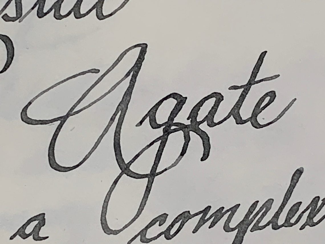
In testing Lamy Crystal Agate, I chose a TWSBI Eco-T with a 1.1 nib so I could see the shading at its best and I think this was a great choice.  Agate is an ink that loves to shade and the contrast between the two tones is beautiful.

In the writing sample below, Agate has medium flow (neither wet nor dry) and it dries at a good pace to keep up with my handwriting (approximately 20 seconds). I noticed that as I wrote, the ink was a warm gray as I wrote but changed to a cool grey with green undertones as it dried.  This can be a good trait as it is fun to watch, or it can be negative if you find yourself unable to stop watching ink dry!

There was no bleeding or feathering on my paper (I used a Birmingham Pen Company Tomoe River notebook).

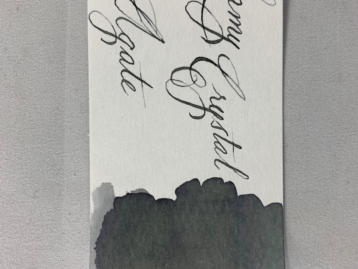
When you look closely at the swatch, the gray ink shows a few of its component colors; blue and green. I have found that gray is usually a very complex color in ink – not just a washed out black.

This can be seen more clearly on Col-o-Ring cards along with the shading of Agate.  There even appears to be a touch of purple at the edges of the darkest areas.

Comparing Lamy Crystal Agate to other swatches in my collection showed that it is closest to Diamine Silver Fox (one of my favorite gray inks) although a few shades darker, more in line with Diamine Graphite in darkness level.  Neither Diamine ink shows the complexity that is present in Lamy Crystal Agate, however.  To compare the shading and the mixture of color, I threw ink a swatch of Papier Plume Bayou Nightfall.

I have absolutely nothing bad to say about Agate.  The bottle is beautiful and well designed containing a reasonable amount of ink; the price, although higher than standard Lamy inks, is still at the lower end of ink prices and the ink itself is lovely. I’m glad I picked up Agate and plan to add it to my standard rotation.

I think the Lamy Crystal inks have been an amazing addition to their standard line-up and I’m glad they’ve been added in permanently.  If you pick up a bottle, you may find yourself wanting to display it as well!


Disclaimer: All items in this review were purchased by me.  For more information, visit our About page.