Link Love: Chewie is my Co-Pilot

Link Love: Chewie is my Co-Pilot

This weekend, with it being May the Fourth be with You, we also mourned the passing of Peter Mayhew, the actor who portrayed Chewbacca in the original Star Wars films. Laura spent the weekend being my personal Chewbacca, keeping me entertained and full of snacks as we drove back and forth from Chicago, avoiding any Imperial entanglements.

Meanwhile, back at the cantina, Gentleman Stationer and fountain pen scoundrel, Joe is experimenting with budget fountain pens and both Pen Addict and UK Fountain Pens took Conway Stewarts out for a spin this week. Mountain of Ink has started diving into Sailor Studio Inks and there’s lots of journal keeping and bullet journaling advice in our notebooks section this week.

And in our last section this week are some real gems: Women of the Bauhaus, concept sketches for the rebuilding of Notre Dame, and Yoga Joes — to name a few.

Love to you all, until next week,
Ana, Laura, Jesi & Tina

Pens:

Ink:

Notebooks & Paper:

Art & Creativity:

Other Interesting Things:

Chicago Pen Show 2019: The Haul

Ana already covered the Chicago Pen Show, but I wanted to chime in with my experiences and of course the things I picked up! I spent most of my weekend behind the Vanness Pen Shop table working, so I didn’t get the chance to wander the show floor and take photos. I took almost no pictures the whole weekend!

I did get a chance to visit with a few of my favorite vendors and bring home a few treats though.

The first thing I picked up was one of the Chicago Pen Show inks from Papier Plume, Lake Michigan Winter (first look here). Some year’s there’s a run on the show ink, so I made a beeline for them!

My second purchase was this beauty from Franklin Christoph, a Pocket 45 prototype. I did get a chance to walk by the FC table once the prototypes were out, but by the time I got back to shop this one was missing. I was disappointed, but ready to turn my energies to other makes. That evening, however, Jesi showed me her haul. She had bought the one I had my eye on. But Jesi had her eye on several from FC, so we arranged a trade of sorts and I ended up with my previous, so beautiful, so blue.

There was new paper at this show and it was all the rage! Jesi will be reviewing the paper for the blog, but we’re all excited about folios from Wild Pages!

Finally I picked up another blue ink (need to match my ink to my pen right?) from Vanness Pen Shop and, of course, a Chicag-o-Ring (limited edition Col-o-Ring)!

I did receive a few other pens for reviews (those will be forthcoming) and I did a lot of eating, drinking, cake-enjoying, and spending time with friends. This show marks a bit more than a year since I’ve started to go to pen shows and it was a treat to see everyone again and feel like I’m starting to get to know people on my own (rather than trailing around after Ana and Jesi!)

The Chicago show is a medium-sized show and lots of fun, with great friendly people. I would recommend it as a “first show” if you can get there!

Chicago Pen Show 2019 Recap

Chicago Pen Show 2019 Recap

Turns out, this is my fourth year attending the Chicago Pen Show and my first year as a vendor. The previous three years, I’ve worked as a helper for Vanness Pen Shop. This year, I had the table next to them and Laura and Matt Armstrong (you might remember him as the legendary Pen Habit) held down the fort with Lisa at Vanness Pen Shop. It was a new experience to have my own table and to introduce the Chicago community to The Well-Appointed Desk Shop and Skylab Letterpress product offerings as well as share a special Col-o-ring design we made especially for my hometown: The Chicag-o-ring. But what you are really here to hear about is everything else that was at the show.

Because I was working, it was hard to walk around and take photos but I was able to do it on Sunday. I wasn’t able to capture everything. If you want a thorough overview of the show, check out Mike Matteson’s Friday video which will have way more detail than I was able to capture.

Here’s Laura putting on her best “I’m not deliriously tired” happy face for me in front of the Vanness table.

It took me until Sunday to find where the organizers hid the ink testing stations but there were lots of folks using it so it was clearly easier for others to find it. Vanness brought current and past seasons of the Colorverse ink from Korea which is always a big hit. The ink display and wax from Papier Plume is also a feast for the eyes.

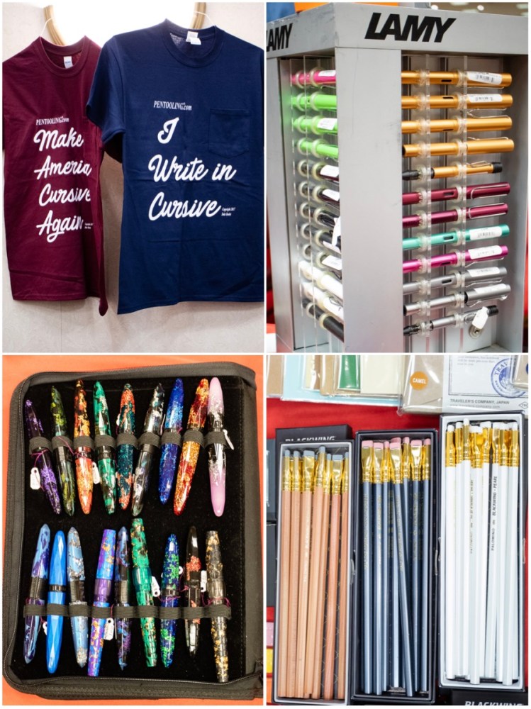
Above is the always amusing t-shirts from Pentooling and the array of product that Dromgoole’s brought all the way from Houston, TX. Yes, there were pencils at the pen show! Plus they brought an array of Lamy pens and lots of Benu pens.

This was the first year for Atlas Stationers from Chicago to have a table at the show and they arrived with lots of goodies including a rainbow of Sailor and Platinum Procyon pens. They also had the Caran d’Ache representative with them and all the eye-searing colors of the 849 fountain pen and new colors of the 849 ballpoint. Jonathan Brooks from Carolina Pen Company was pretty much sold out of pens by Sunday but he still had a few bottles of his Robert Oster Carolina Blue ink available. Pentooling had trays and trays of tools for repairing pens and a new vendor was on the scene with 3D printed pen holders and accessories. They were not at the table when I walked by but lots of kids came by over the weekend (and some adults too!) to show me the 3D skulls he makes and some of the other pieces. I think Brad may have gotten one of these in Atlanta too. I can’t believe I’ve missed him at two different shows.

Of course, there were tray after tray of pens. Above is Hirsch’s amazing vintage collection, Desiderata’s new turned acrylics and wood, Mario from Toys from the Attic and his collection (in the acrylic stand) and Sarj’s (#onemanpenshow) notebooks of prestige pens. There were treasures to be found at every corner.

Out in the Atrium, Edison Pen Co. was searing eyeballs with their candy box of colored acrylics and resins to choose from. So many options!! Then just across from Edison was Ryan Krusak and his beautiful rare wood pens and skrimshaw work. There was more eye candy in the form of Shawn Newton’s custom pens and the last photo above is from the Papier plume table (I think!).

Of course, one of the best things about the show itself is the people. I wasn’t able to get photos of all the people who I am always thrilled to see at each and every show but here are a few of the wonderful characters you can meet: Sarj Minhas (and his pal who I’ve met repeatedly but forgot his name! So sorry!!), Shawn Newton who is always ready to ham it up for a photo, Hirsch Davis who had the table just across from me and we talked on and off all weekend and finally the legendary Richard Binder, inky hands and all.

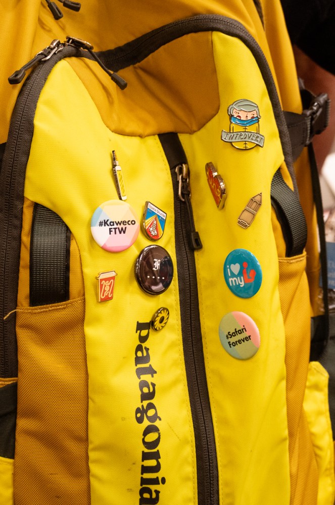
Ms. Tiny Badge allowed me to photograph her flair. I have that Introvert pin too.

The three photos above are from Taccia, some of the most spectacular pens at the show. They were in the Atrium under the skylight so they got all the best light which only enhanced the color and beauty. For the day I can afford one of their urushi pens! I even got to peek at some of their future designs that were not quite ready for the spotlight yet and they are gorgeous!

Speaking of gorgeous, and brilliant and sparkling in the sunlight, our very own Jesi was also in the Atrium with her table: Vintage Pen Shop.

She was doing a brisk business all weekend selling her restored Esterbrook fountain pens using her Esterbrook testing station and enticing passersby with the rainbow of color options.

Holding down the fort at the Franklin-Christoph table was the one-and-only Scott Franklin.

By Sunday, there’s not much left in the Franklin-Christoph prototype tray. Certainly not after Jesi and I get finished with it.

So now, onto my purchases (at least most of them… a few things always get forgotten in the bottom of a bag or suitcase that has yet to be unpacked).

I picked up a new Rhodia pad for my ink and pen reviews from Vanness, an Esterbrook Deskmater desk pen set new in the box (would you look at that packaging!!!), a bottle of Robert Oster Carolina Blue from Jonathan Brooks, and two bottles of Oster from Lemur Ink. I also picked up a bottle of MontBlanc Ladies Edition Pearl from the Dolives.

In regards to pens, I got one pen at the auction on Friday night. Its a Wahl with lovely orange colored resin, gold hardware and a slightly bouncy nib. I don’t know a ton about it as it was a bit of an impulse purchase as most my auction purchases are. I got two pens from Franklin-Christoph: a Pocket 66 in translucent pink with glitter and a Pocket 45 in gold pearl. They are forever to  be known as Princess Sparklepants and Honey Bee. Oh, and that other pen… yeah. It’s a Sailor. It’s a 2015 Sapporo (Pro Gear Slim) Starburst Galaxy. I am sure I’m going to get no end of grief about it from Brad and Myke, but I won’t go on about it for 19 minutes, I promise.

And the coup de gras of the weekend was purchasing a whole tray of Lady Sheaffer Skripserts including several prototypes. The four designs in the middle are all alterations, prototypes or variations of production designs and there are variations of the Petit Points on each end plus a spare barrel.

I think it fleshes out my collection pretty well, don’t you?

Until next year, Chicago, peace out! (Thanks to Vanessa for this photo!)

Ink Review: Diamine Purple Rain

Ink Review: Diamine Purple Rain

By Jessica Coles

Purple inks.  Purple inks are by far my favorite. When I hear about another purple ink, it’s only a matter of time until I have it in my pen.

I heard about Purple Rain from Diamine when it first came out, but I only came into possession of my bottle recently; this ink belongs to a line that was only released in Germany.  Other inks in the line are Calligraphy Passion, November Rain, Skulls and Roses and Smoke on the Water which can all be found at Fountainfeder in 30mL or 80mL bottles (3.70 Euros and 9.70 Euros).

Of course, I couldn’t help but get the larger bottle!  Shipping from Germany was not bad at 4 Euros and the packaging kept the ink bottles quite secure.

I inked up a new pen (Online Calligraphy pen, also from Fountainfeder) immediately and fell in love with the dark purple ink. Purple Rain feels a bit on the dry side of normal when writing, but I never found it bothersome.

If the purple wasn’t enough, a change of the angle of the light to the ink reveals a beautiful gold sheen.

This gold sheen is somewhat subtle and at times cannot be seen until the page is moved around under the light.  I love that characteristic since I get the colors of both the ink and sheen – this also helps with the office appropriateness!

In the two photographs below, I tilted the paper first towards me and then towards the light to give an idea of the level of sheen.

The sheen did make color comparison difficult, however.  Below, Purple Rain seems to contain more red than the other swatches, but the main ink color is very close to Private Reserve Purple Mojo.

I am quite happy to have added Purple Rain to my collection. The ordering was easier than I had imagined it would be – don’t worry about ordering overseas for your ink! While the shipping may take slightly longer, expanding your search will greatly benefit your collection!


Disclaimer: All items in this review were purchased by me.  For more information, visit our About page.

Link Love: Virtual Travel Edition

As you are reading this, Laura and I are ensconced enrobed (?) in boxes and nestled into the fine interior of my beloved 10-year-old MINI Cooper on our way to the Chicago Pen Show. Ms. Jesi Coles will be joining us via United Airlines on Thursday. You will find Laura behind the Vanness Pen Shop table this weekend and you will find me manning The Well-Appointed Desk table. Or maybe the other way around? Since the tables are side-by-side, we might flip flop as needed. Either way. Maybe we will all be at Jesi’s Vintage Pen Shop table?

While there is no after party or event planned this year, The Well-Appointed Desk is well represented this year and will be available for Ask The Desk questions at all three tables and at the bar every evening. Please say hello!

This week’s links seems feature a fair share of other travel like Azizah’s trip to Laywines and Pencilcase Blog’s trip to Sakura Pen Gallery. HeyMatthew raps about the Atlanta Pen Show too. The pencil section is more about sharpening this week and we’ve got more for writing than art-making in terms of creativity down in the “other interesting things” section. Hope to see you’all soon!

Pens:

Ink:

Pencils:

Notebooks & Paper:

Art & Creativity:

Other Interesting Things:

Ink Review: Robert Oster Honey Bee

Review by Laura Cameron

When I was in the ink mecca a few months ago I pored over the Robert Oster swatch books and selected Honey Bee (50mL for $17.00) to come home with me. I chose this one since I have a lack of yellows in my ink stash, and this one looked gorgeous.

Honey Bee is, as you would expect, a rich golden honey colored ink.


While this ink doesn’t appear to sheen, in heavier applications it shades quite nicely from a light golden yellow to a richer darker yellow-brown.


I saw a bit of variation in the larger nibs, but in general standard writing with a fine or medium nib resulted in a nice light gold that is fairly easy to read.

In comparison to other colors, my stash is woefully lacking in yellows. Honey Bee is definitely more yellow than Pilot Iroshizuku Ina-ho (“Rice Ear”), but is much closer to Pen BBS No. 134 (sparkle not withstanding).

I don’t have Honey from KWZ, which looks quite similar to Honey Bee, although possible with slightly greener tones. However, I do know that some people shy away from KWZ inks because of their particular odor, and I can say that Honey Bee has no such smell.

Overall, I’m glad I added this one to my ink stash – it’s glorious honey gold tones are perfect when I want a rich yellow ink.


DISCLAIMER: Some of the items included in this review were provided to us free of charge by Vanness Pen Shop for the purpose of review. Please see the About page for more details.

Fountain Pen Review: Hinze American Graffiti with Custom Clip

Fountain Pen Review: Hinze American Graffiti with Custom Clip

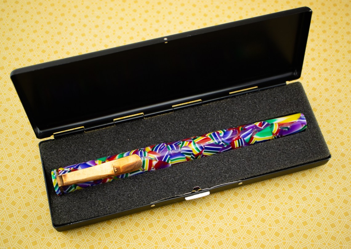
I have been waiting to do this review for WAY TOO long. Hinze Pens are such a unique and under-recognized pen maker on the scene right now. Jim Hinze is creating oversized acrylic/resin pens in amazing colors, some even include diamond dust for a stunning effect. The larger pens are made to be comfortable for writers who may have hand issues like arthritis or other gripping issues as well as people who just prefer larger pens.  I tested the American Graffiti Fountain Pen with a custom brass clip (a similar model is listed here). Even though the pen is large, the acrylic/resin material makes it light enough to be be used by someone like me with smaller hands.

Hinze American Graffiti Fountain Pen

Hinze American Graffiti Fountain Pen

Hinze American Graffiti Fountain Pen

Hinze Pens ship in a metal tin with cut foam lining. The cases are simple but protective and worthy of the craftsmanship of the pens.  The Hinze logo is printed on the lid of the box. As discussed in the past, I don’t want a lot of packaging on my pens because I don’t want ostentatious, wasteful materials that I have to figure out how to store or recycle. However, I also want the packaging to be worthy of the product in both presentation and protection. If the packaging has potential secondary use, that’s great too. The Hinze box, being a metal tin, appears to fall into the category of secondary use potential by removing the foam liner. It’s also low profile so I can keep it without requiring a separate wing on my house (Aurora, I’m looking at you!).

Hinze American Graffiti Fountain Pen

The pens take either JOWO or Bock nibs and with custom orders, you can select which nib type you prefer –#5 or #6 size. Though I think a larger #6 nib will probably look more proportional on Hinze’s larger pens. If you prefer a beret on a yeti, that’s your choice. I’m not going to judge. Chuckle maybe.

Most of the Hinze nibs are etched with the Hinze logo. I got mine late in the pen show weekend and the pickings were slim so I ended up with a plain steel EF nib.

Since Hinze pens use mostly JOWO nibs (or you can request JOWO nibs), this makes them compatible with Franklin-Christoph nibs. If you had a Franklin-Christoph custom ground #5 nib (maybe a Masuyama or something that was ground especially for you at a show), then this would be a legitimate reason for requesting a Hinze pen with a #5 nib. Go, you beret-wearing Yeti! You look fabulous and write like a dream. Alternately, you can order JOWO nibs from Peyton Street or Franklin-Christoph in #6.

Hinze American Graffiti Fountain Pen

For size comparison, pictured above left to right, Kaweco Sport, Pelikan M200, Bob’s Hinze Fountain Pen, the Hinze American Graffiti, Sailor ProGear Slim, Lamy AL-Star and Pilot Metropolitan Pop. Clearly, the Hinze pens are larger than most of my other pens by leaps and bounds.

The Hinze pen I tested was larger than the one my husband owns and, with the brass clip, it was heavier too. However, when uncapped, it was actually lighter. Bob’s pen (which, for the record is the only fountain pen he uses on a regular basis) is 5.75″ long capped and 5.5″ long uncapped. Bob’s pen weighs 24gms  capped and filled and 18gms uncapped. The design of his pen is straighter and does not allow for the cap to be posted. The American Graffiti that I tested was 6″ long capped and 5-9/16″ uncapped. The American Graffiti weighs a whopping 32gms capped and 16gms uncapped. It can be posted making it a baton at a length 7-5/16″.

Hinze American Graffiti Fountain Pen

The same pens as pictured previously, this time posted with the exception of Bob’s Hinze which cannot be posted. The Hinze American Graffiti is way ahead of the pack in length.

Hinze American Graffiti Fountain Pen

Despite being a considerably larger pen, writing with the Hinze pens is actually a comfortable affair. The barrel of the pen is not so wide that I cannot grip it comfortably. The only other truly large pen I’ve used that was just too wide for me was the Wancher Dream Pen. While it was very lightweight it was too wide for me to use comfortably. I’d compare the writing width of the Hinze pens to be consistent to writing with a kid-sized crayon or wide width pencil. This completely explains why my husband loves this pen so much. I always tease him that he writes as if he’s using a crayon and his Hinze pen is fitted with a 1.1mm stub nib and red ink so it really is just a grown up crayon.

I think that pretty much sums up the joy of Hinze Pens. The colors of the materials are beautiful from diamondcast sparkles to swirly, funky colors mixed with anodized nibs and a comfortable feel like a jumbo crayon, Hinze Pens delight adults like a new box of crayons delight a child.


Tools:


DISCLAIMER: Some items included in this review were provided free of charge for the purpose of review. Please see the About page for more details.