Dr. StrangeInk

Dr. StrangeInk

or How I Stopped Worrying and Learned to Sell Some Ink

By Jessica Coles

My interest in fountain pens began nearly a decade ago and it used to be under control.  Especially at the beginning of my obsession, it was easy to keep my collection small since I couldn’t really afford much.  But that changed quickly when I became enamoured with ink.  I could buy a few different inks and use them all in any pen! Wait, they sell samples of ink? Ink subscriptions?

Well, you can probably guess what has happened to my ink collection over the course of a decade.  Totally out of control.  Maybe that isn’t the right way to describe it.  I have control over the actual collection with a great system of organizing bottles, samples, swatches and knowing how to find any of them quickly.  Most of that is thanks to the Fountain Pen Companion and Col-o-ring swatch cards (not to mention a deep love of organization). However, even the best organization system can’t make up for a serious lack of space.

The older kids grow, the more space they seem to use. Since the house isn’t growing, space inside seems to be shrinking and my studio has recently been invaded by teens.  In order to stay sane during the process, I’ve decided to part with a large portion of my ink collection. The easiest way for me to do so is on my own website since it is already set up to handle orders, shipping, and inventory management. At the moment there are nearly 90 inks loaded into the store ready to go. I’ve set two prices for shipping, but if I can ship ink in a less expensive way, I refund the surplus that was collected for said shipping.

I was initially quite hesitant to post about this on Well-Appointed Desk, however, Ana forced me to do so. I hope it is a way for some people to find joy in the huge variety of ink that is out there at a lower cost! The ink sale can be found here.

Kickstarter: Ensso ITALIA Fountain Pen (Sponsored)

Kickstarter: Ensso ITALIA Fountain Pen (Sponsored)

ITALIA is the latest Kickstarter fountain pen project launched by LA-based ēnsso, who has previously created several successful projects like the UNO Minimal pen, the XS Pocket Fountain Pen and the PIUMA Minimal Fountain Pen.

ensso ITALIA Black Keys

The ITALIA Fountain Pen is currently available for pre-order on Kickstarter, with Early Bird backer prices starting at $55 (for the black), $59 (for brass), and $79 (for titanium). These prices are limited offers and reflect a discount off the future retail price.

Though the ITALIA draws inspiration from vintage Italian pens, it’s a modern-looking pen. It’s milled from solid titanium, brass, or aluminum. The pen has conical ends and the grip and cap band are blank embossed with a Greek Key or three stripes design.

ensso ITALIA black

The pen is 139mm (5.47″) when opened or closed (nib included) and 150mm (5.9″) in length when posted. The ITALIA comes with a #6 Bock nib and a Schmidt ink converter. It accepts short and long standard international ink cartridges.


Disclaimer: This post contains paid advertisements and/or sponsored content.

Let’s Talk About Sepia Ink

A Little Background

At every pen show I’ve worked, at least one person will ask about a particular ink color. It’s almost always sepia. They ask me to help them pick out a “good sepia”. This is inevitably a loaded question because sepia is a moving target. It’s like asking someone to recommend a good movie, book, bottle of wine, a brand of beer or the best coffee. Inevitably, everyone defines the characteristics a little differently. You might prefer a chardonnay over a merlot. I might prefer a period drama over an action film. Someone else might think their coffee’s tangy roast with an astringent hint of lemon is more appealing than dark roast with a buttery finish. Similar problems occur when someone asks about a “good sepia.” They might even pronounce it differently.

Cuttlefish (Broadclub Cuttlefish) - Sepia latimanus - P6042161
(Cuttlefish (Broadclub Cuttlefish) – Sepia latimanus by Jan (Arny) Messersmith (via Flickr)

What exactly is sepia? Well, it depends on who you ask. Sepia is a genus of cuttlefish. It’s also the name of the color of ink derived from the cuttlefish (of the same name)’s ink (you know, squid ink?) used by many from the ancient Greeks and Romans up until the 19th century. Sepia is also the name given to the photographic toning process that creates a brownish tint to photographs and utilizes sodium sulfide, thiourea (or ‘thiocarbamide’), or polysulfide toners. All three of these processes were used on traditional silver print photos. Today, sepia toning is done digitally using a duotone process.

(“Mr & Mrs Sepia, Cuttlefish Kingpins of Nebraska” via Photographic Print Toning on Wikipedia)

Why does this make it so difficult to select a “good sepia” fountain pen ink? Well, representations of all of these different types of sepia colors are mostly seen in reproductions today and have faded over time or have been modified by digital means. Not to mention that even original sepia inks would have had variations depending on where they were created and the diets of the cuttlefish, etc.

(Moses Harris’s The Natural System of Colours via Wikipedia)

So, if you are on the hunt for your perfect shade of sepia, please help us help you by coming armed with more information than just a “good sepia.” Any pen shop owner (or clerk) will be much better able to help you, if you give them more information to go on. This can apply to more than just sepia inks too. If you have a photo, a clipping from a magazine, a bit of fabric (Yes, Mike Vanness’ latest polyester supersuit counts) or ribbon. Anything can help determine the color you are looking for.

Also, being able to describe the color you are looking for with words like: warmer (more red, orange, yellow) or cooler (more green, blue), more saturated (brighter), less saturated (not so bright, duller, smokier) can help a lot too. Using tried-and-true fountain pen ink words like “shading ink”, or wet ink, dry ink, “sheening ink” etc will also help.

Warm Cool Color Wheel
(Warm and cool colors on color wheel via ColorPsychology)
Warm and Cool Grays
(Warm and cool grays via Wikipedia)

Sepia Inks

Sepia

After a thorough scouring of online sources, I found more than 17 inks that had “sepia” in their name. I picked these 17 as a good representation of the range of variation. (Yes, I know there are others.) The sepia inks show above all have “sepia” in their name. As explained, depending on how the ink maker was defining sepia, or which specific species of sepia cuttlefish or region it might have lived (if they were actually trying to mimic squid ink) or if they were just using the word “sepia” to describe the color as being brown-ish may have determined how they arrived at calling their ink sepia. Or they might have chosen the word arbitrarily. Unlike ochres and umbers which are named for natural pigments, sepia has become essentially a fancy word for brown.

Sepia quote

These ink colors, when laid out next to each other, range from a greenish olive through yellow-browns (both warm and cool) in to warmer, darker browns into a plum. Clearly, there are some wide definitions of “sepia.”

If you were to ask me, which of these colors were the best representations of “sepia” as defined by the previous section, I’d have to decline responding. I’m more inclined to describe any or all of these colors as being some other color: warm browns, cool browns, golden wheats, olive and plum. DeAtramentis Standard Sepia Brown is a deep chocolate to me. The two Kobe inks are deep coffee browns. I’d describe the Stipula Sepia as a very red-orange brown and the Visconti and a reddish-ruddy brown. Both the Diamine and Leonardo are almost honey-colored and might be similar to Robert Oster Honey Bee, KWZ Honey or Franklin-Christoph Honeycomb. As for those outliers, the Organics Studio Green Sepia and DeAtramentis Beethoven Sepia, those are playing fast and loose with the definition of Sepia altogether.

How do you describe sepia? Do any of these inks look like what you think of as sepia? Are you ready to use a different word to describe your perfect brown-ish ink?

(To note, the samples used taken from vendor web sites. Links and details are provided below. However, YMMV regarding actual color fidelity in final use. Large swatches like these provide the range of color variation but once in a pen, color can often appear darker or lighter depending on ink wetness, opacity and nib width. Also, as we all know from experience, what we see on screen may not be the full range of color seen in person. The human eye can see a far greater range of color than can be displayed on your laptop, monitor or mobile phone.)

Sepia Inks (in order, top to bottom and left to right):


Thanks to my sponsors for providing some of the images I used here. Please consider making your next purchase from the shops that support this blog and let them know you heard about them here. Thanks for your support and for supporting the shops that help keep it running.

Ink Review: Troublemaker Inks Petrichor

Ink Review: Troublemaker Inks Petrichor

By Jessica Coles

It’s no secret – I love finding new inks.  New and exciting colors and bottles, new ink properties and behaviors to analyze and sometimes new adventures in finding, ordering and waiting for the delivery.

Troublemaker Inks is a small and relatively new ink manufacturer located in the Philippines.  I say relatively new because they have been around for a while, they have just exploded in popularity due to their newest batch of inks described as shading colors.  These shading inks are Kelp Tea, Petrichor, Abalone, and Milky Ocean.

I first heard about these four inks on Instagram, immediately went to the Troublemaker Inks website and placed an order.  For all of them.  The website is bright and well-designed and the ordering very simple.  The ordering was so seamless that I didn’t even realize that I was ordering from a different country until PayPal showed me a currency conversion. Easy-Peasy.

For this review, I’m going to talk about Petrichor.

Petrichor is an ink not unsimilar to Sailor 162 or Sailor 123.  The ink contains several colors together which show in differing ratios depending on the width of your nib and the paper being used.  Below are several comparisons to show the various colors in the ink.

First, the greys:

Then the teals, the dominant color:

Lastly, dusty pink, present in the center of the shading in Petrichor:

So what color is Petrichor when writing?  I used Tomoe River, 52gsm paper (from Curnow Bookbinding and Leatherwork) to try to show as many colors as possible.

Here, the main color seems to be a medium grey with an undertone of teal.  Later in the writing, the grey is still dominant, and the shading is more noticible.

In a large glob of ink, all the colors are present plus a bit of dusty purple.

On my hands, the various colors are still there!

Luckily, Petrichor is relatively easy to wash off.

Although it is very difficult to show in photos, the overall impression of the ink on Tomoe River paper is a grey ink with teal and purple undertones.

The best part? ALL SHIPPING IS FREE.  Anywhere. In the world.  No international shipping charges.  No minimums to hit. Not that I would have had a problem hitting a minimum order amount.

Now for the tough part of any online ordering. The waiting. And waiting. And waiting. This was the only negative part of my experience with Troublemaker Inks.  The waiting.  I placed my order on June 5th, received a shipping notification on June 13th and then nothing.  The tracking number provided did not update for weeks.  I heard from pen friends that Troublemaker had a tough time keeping up with the sudden increase in demand and had needed to restock bottles! I can absolutely understand why.

Suddenly, I opened up the mailbox and a ray of light shone down on me.  It was here!  The inks were packaged safely in paper and bubble wrap, sealed with a thin layer of plastic wrapped around the bottle opening.  Rather than paying for the shipping in one chunk, the package was covered with various stamps from the Philippines.  I do mean covered.  Every inch of the front side of the envelope was either the address or stamps.

For the review above, I threw the ink in the first available pen I had that was uninked – a Moonman C1.  I had ordered this one thanks to Joe at the Gentleman Stationer. It’s a great pen for watching ink.

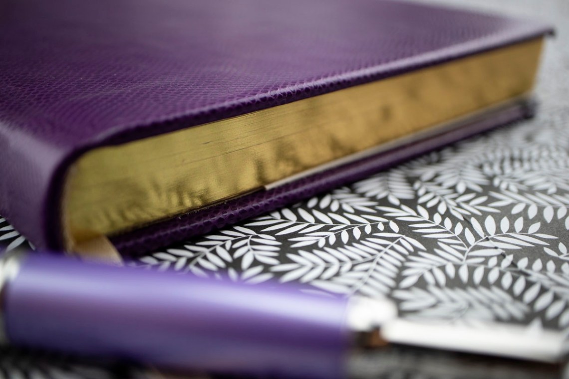
The bottles for these inks are dark plastic, square and include a small example of the ink color printed on the label.

Some inks made by Troublemaker are offered in various viscosity choices from dry to lubricated.  When I was presented with a choice when ordering, I chose the suggested: wet. It was #3 on a scale of 1-4, 1 being the driest and 4 described as lubricated. I would say that while writing, this feels a tad on the wet side of normal – not noticeably different from my typical ink choices.

Would I recommend these inks?  Absolutely.  These are wonderful additions to the ink world in every way.  Be prepared to wait about a month, though.  This wait might become longer as popularity increases, though, so act soon!


Disclaimer: All items in this review were purchased by me.  For more information, visit our About page.

Link Love: Walt Whitman, Sex God?

Link Love: Walt Whitman, Sex God?

Did the title of this week’s Link Love catch your attention? I thought it might. Just hop down to the “Other Interesting Things” section to find the article from Hyperallergenic about Whitman’s swarthy, marketing ways. Oh, yeah… he might have been all Walden Pond-ish but he knew a thing or two poetry and, as Robin Williams once extolled in Dead Poets Society, “wooing women.” That scamp!

Pens:

Ink:

Pencils:

Notebooks & Paper:

Art & Creativity:

Walt Whitman, Swarthy as f***, from the Gutenberg Digital online files.

Other Interesting Things:

Ink Review: Robert Oster Toffee

Review by Laura Cameron

Earlier this year I had occasion to look for a warm brown to match a pen (of course!) and I stumbled on Robert Oster’s Toffee (50mL, $17.00).

Toffee is a warm, rich, golden brown that shades beautifully. I picked it up because it reminded me of toasted marshmallows and matched a white and brown Shawn Newton pen that came home with me from the Arkansas Pen Show.

When I arrived home, I was pleasantly surprised that Toffee wasn’t really like anything else I have in my ink stash. Noodler’s Rome Burning is much greener, Monteverde Brown Sugar and Diamine Chocolate Brown are much darker, and Pilot Iroshizuku Tsukushi is an entirely different tone.

Of course I can see lots of shading and variation in my sampling, but I was excited to see that there is some shading in the course of regular writing as well. As you can see it varies between a rich golden brown, and a a darker, nuttier brown. This one isn’t a sheener, but delivers a dark brown punch in the ink drops.

Overall I’ve been really happy with this ink. Not only is it the perfect match for my pen, it’s a lovely addition to my collection!

Tools:

DISCLAIMER: Some of the items included in this review were provided to us free of charge for the purpose of review. Please see the About page for more details.

Notebook Review: Lett’s Notes Legacy Notebook

Notebook Review: Lett’s Notes Legacy Notebook

The Lett’s of London Legacy Notebook in Purple (£20) is one of the most luxurious notebooks to cross  my desk in some time. The embossed, leather-look cover and gilt edges with the gold foil logo embossed on the cover is the height of elegance and sophistication.

Lett's Note

The notebook is 202mm x 133mm (approx. 8″x5.25″, a little smaller than A5) with deeply rounded corners and includes an ivory,  satin ribbon bookmark. There are 240 numbered pages with sewn binding.

Lett's Note

The edge gilding absolutely gleams!

Even the spine is embossed with the gold foil logo. It’s a pleasing detail.

Lett's Note

Inside the cover, on the end papers, is a bit of the history of Lett’s.

Lett's Note

Inside the back cover is a secretary pocket to hold miscellaneous paper. It’s not gusseted so it won’t hold a ton of things but will hold a few.

Lett's Note

The next page is a table of contents.

Lett's Note

It turns out the 90gsm acid-free, cream colored paper is a pleasure to write on. True to their word on the web site, the paper really is fountain pen-friendly. It did great with ballpoint, felt tip and rollerball too.

The lined paper features classic, light blue lines with the double header lines in light red. I could totally embrace this book. It feels good in the hand, writes beautifully and looks classic.

Lett's Note

Pencils had a lovely feel on the paper in the Lett’s Notes as well. In this close-up, you can see there’s no feathering with fountain pen ink either.

Lett's Note

There’s no fountain pen bleed through on the reverse side of the paper either.

The Lett’s Notes Legacy notebook should soon be available in the US, but even through the UK site, the price is competitive with the average Moleskine and is leaps and bounds better in terms of quality and presentation. It would be worth paying the shipping premium to get it from the UK. It’s a far superior product to most notebooks currently available, even if lined paper isn’t usually your bag.

(In case anyone is curious, the pen is a Pilot Decimo with a new stub nib ($140)


DISCLAIMER: The items included in this review were provided free of charge by Lett’s of London for the purpose of review. Please see the About page for more details.