

Back from San Francisco and just in time to launch ourselves head first into planner season. Hobonichi did their official 3-day rolling kick-off this weekend which may have been missed by many in America as it coincided with our Labor Weekend festivities. JetPens will get you up to speed with their Planner recommendations.

If you missed the SF Pen Show or want to relive the highlights, I pulled out some of the links from this week into their own section, including the Pen Addict Podcast recap where Brad, Myke and I relive our favorite moments, as well as some great photos from Kelli at Mountain of Ink and a massive haul from The Poor Penman. Now we know why he’s poor.
SF Pen Show Recaps:
- The Pen Addict Podcast: Episode 747 – A Well-Appointed Recap (via The Pen Addict)
- SF Pen Show Recap & Haul (Pt. 1) (via The Poor Penman)
- SF Pen Show Recap & Haul (Pt. 2) (via The Poor Penman)
- 2019 San Francisco Pen Show (via Mountain of Ink)
Pens:
- Kubo’s Pens (via Crónicas Estilográficas)
- Video-Review: Pilot Justus 95 (via Scrively)
- PenBBS 309 Hawaii Fountain Pen (via Writing at Large)
- Video: Top 3 pens of Azizah (Gourmet Pens) (via Appelboom on YouTube)
- Video: Diplomat Aero Volute Limited Edition Fountain Pen (via Gourmet Pens)
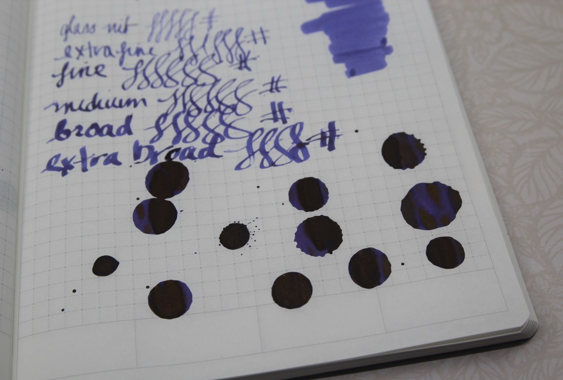
- Wancher Shizuku Glass Nib Fountain Pen: A Review (via The Pen Addict)
- From Skeptical to Impressed: The Blueberry Esterbrook Estie SE (via From the Pen Cup)
- Too many pens: Wing Sung 3013 (via Scribbledmonboddo)
- Visconti Breeze Lime Fountain Pen Review (via The Pen Addict)
Ink:
- Colourverse Kepler’s Laws (via Alt. Haven)
- Troublemaker Inks (via Nick Stewart’s FOUNTAIN PEN INK ART)
- Herbin Vert de Gris (via An Inkophile’s Blog)
Pencils:
- Tombow Mono KM-KKS 4B Pencil (via The Pen Addict)
Notebooks & Paper:
- Art Supply Posse 72: Enon from Dapper Notes or with images on YouTube (via Art Supply Posse)
- Stationery In Real Life: Making Do (via From the Pen Cup)
- Should You Keep a Dream Journal? (via Rhodia Drive)
- North of Rosemont Pocket Notebook (via Fountain Pen Love)
- The Best Planners for 2020 (via JetPens Blog)
Art & Creativity:
- Congresswoman Alexandria Ocasio-Cortez Unveils a Series of Green New Deal Art Posters (via Hyperallergenic)
- Japanese Artist Paints Adorable Watercolours Of Pet Hamster Doing Human Things (via Design You Trust)
- Margaret Bourke-White, Fearless Photographer (via Kottke.org)
- Rosemary & Co Travel Brushes (via Jane Blundell Artist)
- Incredible 19th-Century Botanical Catalog Put Online and Made Interactive (via My Modern Met)
- 8 Famous Artists’ Studios That You Can Visit Today (via My Modern Met)
- My Sketching Lifestyle in Plumbago (via Fueled by Clouds & Coffee)
- List of 100% cotton watercolour sketchbooks (via Parka Blogs)
Other Interesting Things:
- The graphic delights of British biscuit lettering, unpacked and sorted (via Quartz)
- The thief of playtime (via Austin Kleon)
- How Does Waffle House Stay Open During Disasters? (via Kottke.org)
- The Em Dash Divides (via The New York Times)
- Where’s the Iridium? (via Nibs.com)
- Inku-numa expo in Tokyo: A paradise for ink enthusiasts (via fude fan)
- Pen Rolls vs. Pen Cases: A Review of the Rickshaw Bagworks Deluxe 6 Pen Roll (via The Gentleman Stationer)
- Download FREE September 2019 digital wallpapers (via Think.Make.Share.)


 Tina Koyama is an urban sketcher in Seattle. Her blog is


