Fountain Pen Review: Esterbrook Estie Honeycomb (Medium Nib)

Fountain Pen Review: Esterbrook Estie Honeycomb (Medium Nib)

Both Jesi and Laura have already reviewed the Easterbrook Estie already but I was feeling left out so I wanted my chance to try this new incarnation of the Esterbrook brand. I was able to get an Esterbrook Estie Honeycomb with gold hardware and a medium nib.

I won’t talk much about the history of Esterbrook here since Jesi went into detail about it in her review or about the adapter available for the Estie which makes it possible to use vintage Esterbrook nibs with your modern Estie pen using a cartridge or converter since that’s also been covered.

One of the details that neither Jesi nor Laura mentioned was the packaging. It’s the same box that is used for the Phaeton 300R as well. The red fabric box has a sort of origami unfolding and cream interior that is inviting. It’s not as “pen coffin-y” as a lot of pen boxes. There is an elastic to hold the pen in place and it lays on a padded platform. The lid is foil stamped, in white, with the Esterbrook logo. After my comments regarding the Vertex packaging, the Esterbrook packaging is the perfect balance of protective without being “too much”. I’d always prefer boxes that can be completely recycled or can have legitimate second-use but that’s not always something that pen manufacturers are thinking about when planning their boxes. Maybe someday?

Esterbrook Estie Honeycomb

Esterbrook Estie Honeycomb

While I normally prefer silver hardware on my pens, with the warm golden tones on the Honeycomb, the gold hardware really works with the resin material creating a warm overall look.

Esterbrook Estie Honeycomb

The nib is a stock Jowo nib etched with the Esterbrook name and “1858”.

Esterbrook Estie Honeycomb

This really is a beautiful pen. I know I don’t have a ton to add about the aesthetics but the cracked, caramel resin is stunning to look at. I just kept taking pictures of this pen.

Esterbrook Estie Honeycomb writing sample

The true delight was the nib. (Ignore that I wrote “Fine” on my writing sample. It is definitely on the finer side of medium).

I haven’t used a medium Jowo nib before and it wrote beautifully. I really like it. And to be completely honest with you, I usually hate medium nibs. Both Bob and I have been picking up this pen and using it and commenting on how much we are enjoying it. That’s say A LOT. He usually writes with a fire hose and I usually write with a needle and we both like this pen and the nib. I usually like small pens and he likes oversized pens. To say that this is the perfect “in-between” sized pen that works well for larger hands and smaller hands might just jinx the magic.

Esterbrook Estie Honeycomb pen comparison

To compare it to some other pens in my collection, left to right: Franklin-Christoph P45 (different model), Birmingham Pen Co. Model-A, the Esterbrook Estie (regular size), Sailor Pro Color (different model), and Pelikan M605. The Estie is a little bit longer than the ProColor but similar in width to the most of these models.

Esterbrook Estie Honeycomb pen comparison

All of these pens post except the Model-A but the Estie gets a bit top heavy for me. The Estie is 6.875″ (175mm) posted which is really long for me. Uncapped, it’s only 5.25″(133mm) and capped it’s only 6″ (152mm) which is considerably more managable in hands that wear kid-sized gloves.

pen weight comparison chart

In terms of weight, the resin material keeps the pen light and easy to hold at only 26gms filled and capped and 17gms uncapped. You can see why this pen is so appealing.

Overall, if you have yet to consider an Esterbrook Estie, there are now several resin colors to choose from as well as the standard size and the oversize models. Being able to try out vintage nibs on the Estie (with the addition of the adapter, from Pen Chalet or Goldspot) makes this pen a no-brainer.


Tools:


DISCLAIMER: The items included in this review were provided free of charge by Kenro Industries for the purpose of review. Please see the About page for more details.

Link Love: Tropical Storm Notebooks

Link Love: Tropical Storm Notebooks

When I started Link Love this week, I had so many clever things I was going to say about this topic or that but then procrastination took over. Then, I backed up my kitchen sink and the Roto-Rooter guy had to be called to clean it out and my ability to be observant about the kismet of weekly links completely lost its luster.

Suffice it to say, new things were released and the marketing forces were strong in specific directions this week. Like the proverbial stationery weather forecaster, I predict trends to continue in this direction for the next week or two. Take necessary precautions. And, don’t put too much garbage down your drain.

Pens:

Ink:

Pencils:

Pencil Review: Moon Try-Rex (via Polar Pencil Pusher)

Notebooks & Paper:

Art & Creativity:

Other Interesting Things:

Fountain Pen Review: Opus 88 Fantasia (Broad Nib)

Fountain Pen Review: Opus 88 Fantasia (Broad Nib)

After enjoying the Koloro and Picnic, I decided to try another Opus 88, the Fantasia ($104USD). It is a pen designed with a similar combination of ebonite and resin materials as the Koloro line but put together in a rainbow of variations. The cap features stripes of colors while the barrel is translucent, revealing the ink within.

While designed to be a smaller, more pocketable pen, the Fantasia posts to feel like a full-sized pen giving the best writing experience possible.

The Fantasia appears to use Jowo nibs, recognizable by the decorative scrollwork. Since Opus 88 pens are eyedroppers and hold a lot of ink — even the smaller Fantasia — it seems appropriate to get larger nibs on their pens to take advantage of the ink capacity. Where a Kaweco Sport is confined to a cartridge worth of ink at best, the Fantasia can keep writing for weeks with even the broadest nib.

Opus 88 Fantasia nib

The heaviest part of the Fantasia is the cap. The clip and the ebonite add weight to the pen, weighing 24gms capped or posted. The translucent resin barrel and ebonite end cap are lighter, weighing just 13gms unposted. There are threads on the end of the pen that help keep the cap firmly attached to the end of the pen and help create a full-length pen for a more comfortable writing experience. It takes a bit longer to post with the threads but is worth the effort for longer writing.

pen weight comparison chart

Opus 88 Fantasia pen comparison

Compared to other similarly-sized pocket pens, the Fantasia is longer than a Kaweco Sport and slightly shorter than a Franklin-Christoph Pocket 20. It’s capped length is 4.75″ (120mm) and uncapped it’s 4″ (100mm).

Opus 88 Fantasia pen comparison

Posted, it’s the lengthiest at 5.75″ (146mm).

Opus 88 Fantasia writing sample

In writing, the broad nib definitely lays down a lot of ink. (Pardon the slightly shaky penmanship of this writing sample, it was done while I was still pretty medicated last week). I love writing with pen but the broad nib is a little wet and wide for my normally small writing. For doodling or calligraphy, the broader nib definitely gives me more options.

One trick I learned in using this pen? The thread in the cap end aligns with the groove in the piston end used to release ink into the nib section. It’s a perfect match that helps to loosen or tighten the piston as needed. How clever is that?

This diminutive Opus 88 is unique, colorful and yet still works in all the ways that a fountain pen needs to work. There are five color options for the Fantasia and it is difficult deciding which of them is my favorite. I suspect this model won’t be around forever so if you like this design, get one soon. I don’t think they will be around too much longer.


Tools:


DISCLAIMER: The items included in this review were provided free of charge by Appelboom for the purpose of review. Please see the About page for more details.

Fountain Pen Review: Karas Pen Co. Vertex (Delrin)

Fountain Pen Review: Karas Pen Co. Vertex (Delrin)

Karas Vertex Packaging

The new Karas Pen Co. Vertex Fountain Pen is interesting for a number of different reasons. It features a snap cap, the pen is made out of delrin ($130 for black or white delrin), it can be eyedropper filled and features a translucent ink window (nine color options to choose from). There are acrylic bodies available in dark green and black too.

Karas Vertex capped

The shape is the most sophisticated that Karas has designed thus far. It’s a modified cigar shape with a flat cap.

Karas Vertex Cap

The end of the cap is concave which is a nice design decision. Simple and stylish.

Karas Vertex uncapped

The clear ink window is flush with the body of the pen. There is a bit of a step down to the nib but overall, the design is top notch.

Karas Vertex Nib

This is the first Karas pen to come with a custom Karas etched nib. It’s the only branding on the pen.

Karas Vertex Pen Comparisons

When compared to other pens, left to right: Lamy AL-Star, TWSBI 580, the Karas Vertex in the center, then the Sailor Pro Gear Slim and a Franklin-Christoph Pocket 45 for size comparison. The Vertex is 5.25″ (133mm) long  capped, 5.125″ (130mm) uncapped and 5.875″ (149mm) posted.

Karas Vertex Pen Comparisons uncapped

The Vertex posts solidly and doesn’t get too back heavy. It weighs just 15gms uncapped and 22gms capped/posted (filled with ink via eyedropper without converter) so it’s light but well-balanced.

pen weight comparison chart

Karas Vertex writing sample

One of the only issues I really have with the Vertex relate to the note that was included in the box regarding handling of the pen. It leads me to wonder if the issue is with the seals in general or if, as with most eyedropper pens, there is just a general tendency to leak. My habit is to open eyedroppered pens with the nib facing downwards so that ink will collect in the cap and not in my lap (let’s just say experience is a valuable teacher). So, the note recommending to aim up is a little counterintuitive for me.

The other issue I have is with the Vertex packaging logo and the actual packaging which feels at odds with the pen. The heavy machined-metal, presentation box with the overly large, graphic logo seems completely alien to the pen itself. The Vertex pen seems to the pinnacle of Karas’s design achievements but the presentation box and logo feel like they belongs to an entirely different product. While I know the packaging shouldn’t matter, it does. It tells the customer how you want them to perceive your product. Is it to be cherished or used and abused? The packaging is your product’s business card. In the case of the Vertex, the box made me expect to find the Pen Type-C or something equally space age and not the refined Vertex. It just sent the wrong message.

So, if you can overlook some seriously odd packaging decisions and remember “up with nibs!” then the new Vertex is a gorgeous pen that shows that Karas is becoming a serious contender in the pen community.


Tools:


DISCLAIMER: The items included in this review were provided free of charge by Karas Pen Co. for the purpose of review. Please see the About page for more details.

Friday Faves: Ana’s September Faves

Today, we are kicking off a reboot of our Friday Faves. And this time, it’s really our faves. I’m going to kick it off but every couple weeks, one of our staff writers (or maybe a friend of the blog) will provide a list of their current favorite things, both stationery-related and other favorite things.

So, here goes my current faves for the month of September:

Friday Faves: Ana Sept. 2019


I just started reading the third installment of the Dr. Greta Helsing series and I love it. It is a weird and wonderful story about a human doctor who attends to the needs of the supernatural. We’ve been binging Supergirl because I needed something fun and uplifting to watch and Supergirl fits the bill. It’s filled with girl power kick-assery without being saccharine-y. This week, I participated in an embroidery workshop at work where I worked on the Dropcloth Embroidery Sampler so that’s been my analog activity of choice. I’m waiting on yarn to arrive to finally finish the sweater that has been languishing since February. Hopefully, I’ll get to that this weekend.

Snackwise, I still live by Tostito’s Black Bean and Garlic Chips. They are pricey but delicious. And looking to the cooler mornings, I love our Messenger Coffee subscription with a little splash of “cream”.

Getting down to my desk tools, I acquired a beautiful Sailor Pro Gear Slim Graphite Lighthouse with a MF nib recently and has been my constant companion recently along with a lovely minty, green bottle of Bungbox Kaoru. Having met the ink’s namesake, I am more enamored with the color than ever. And after much waffling, I am back in a traveler’s notebook, using the Galen Leather Everyday Book refills while I wait for a couple new notebooks to arrive in the mail.

Ink Review: Penlux Mo Plum and Tangerine

Ink Review: Penlux Mo Plum and Tangerine

By Jessica Coles

Penlux is not a common ink company in the US, although they have been creating ink for some time now. The ink is made by Sailor and sold on the Taiwanese market – six colors are commonly available and three were reviewed last year by our own fabulous Ana. Recently, Penlux released two limited edition inks in their Mo line: Tangerine and Plum ($24 each at Pen Chalet).

The first thing I noticed about both inks was the packaging – the colors used have a deep, rich color and are well-matched to each ink. That wasn’t all, though. The boxes are each one piece and use no adhesive at all.

Not something I expected!

Next, the bottle size was impressive for a limited edition ink. I’ve come to expect the smaller 15-20mL bottles (thanks especially to Sailor Studio), but Penlux has lavished us with 50mL heavy glass bottles with Tangerine and Plum.

So now for the real test of these inks… The color.

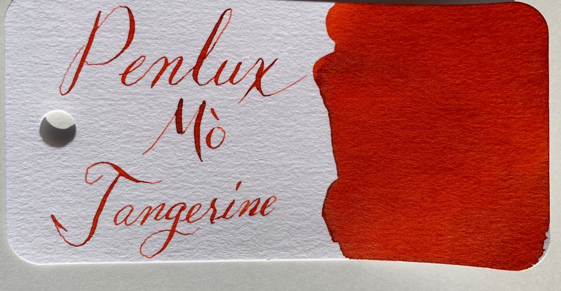
Just like the colors on the packaging, both Plum and Tangerine are rich, saturated colors that feel luxurious. The names fit each color perfectly – Plum is a deep, dusty purple that is close to burgundy, shades very well and has a bit of green sheen. Tangerine is a bold orange that leans heavily toward red with a hit of gold and brown sheen. It shades from a dusty coral to dark, rusty orange.

I took the comparison photos outdoors since the studio lights were not showing the sheen at all. Plum falls somewhere between Callifolio Bourgogne and Noodler’s Black Swan in Australian Roses (the older version), but the sheen falls between the gold-green of Sailor 653 and the green of Krishna Anoki.

Tangerine is a bit of a hard color to compare. The closest is Taccia Aka Red, but the shading can range from Diamine Pumpkin to Akkerman #9.

Writing samples help to show this color range. Both inks felt slightly to the wet side of normal, did not feather and only showed through when I had pools of ink to show sheen. Plum shows a bit of water resistance although much of the color is lost. Tangerine was not legible after meeting with water.


Taken separately, Tangerine and Plum are each beautiful, rich, saturated colors. Taken together, these inks would make a fabulous halloween pairing! If you do decide to purchase these inks (and I highly suggest you do), make sure to do it soon. Out of the 999 bottles produced of each color, only a small percent are available to purchase in the US.


Disclaimer: Some of the items in this review were provided for free for the purpose of this review. Other items in this review were purchased by me.  For more information, visit our About page.

SF Pen Show 2019 Recap

Once again, the SF Pen Show was so busy I forgot to take pictures. Luckily, so many other people did take pictures. If you want to see more photos, check out the hashtag on Instagram #SFPenshow2019. Here are some highlights. Most of them are of the people which are, of course, the best part of the show.

Many of the SF Pen Show attendees first welcoming sights was Kimberly and her PSUber and what a sight it was! For many of us, it was the only time we got 15 minutes to talk with her because after that, we were run off our feet.

Kimberly's pick-up list

This is the only photo that appeared of this power squad. Jesi and I are throwing each other some serious shade… who was threatening to steal a pen or ink? One wonders? Jaclyn (Inkpothesis) smartly keeps out of it. Bob shows off his latest finger painting.

These are two of my favorite people to see at a pen show: Julia Scott and Leigh Reyes. They both radiate passion and creativity.

Miroslav and Ray: The Twins

The adorable pen show twins: Miroslav and Ray who dressed identically everyday of the show and kept Jesi thoroughly entertained.

What a fun photo of Kim and I — photobombed by Bob!

Pen Show Panarama

A panoramic view of the show from Jesi’s corner of the room.

Another Panorama

A view of Stephen’s beard mostly.

Newspaper article

A write-up in the SFChronicle about the pen show that looks like it was taken from the exact same angle as the photo above.

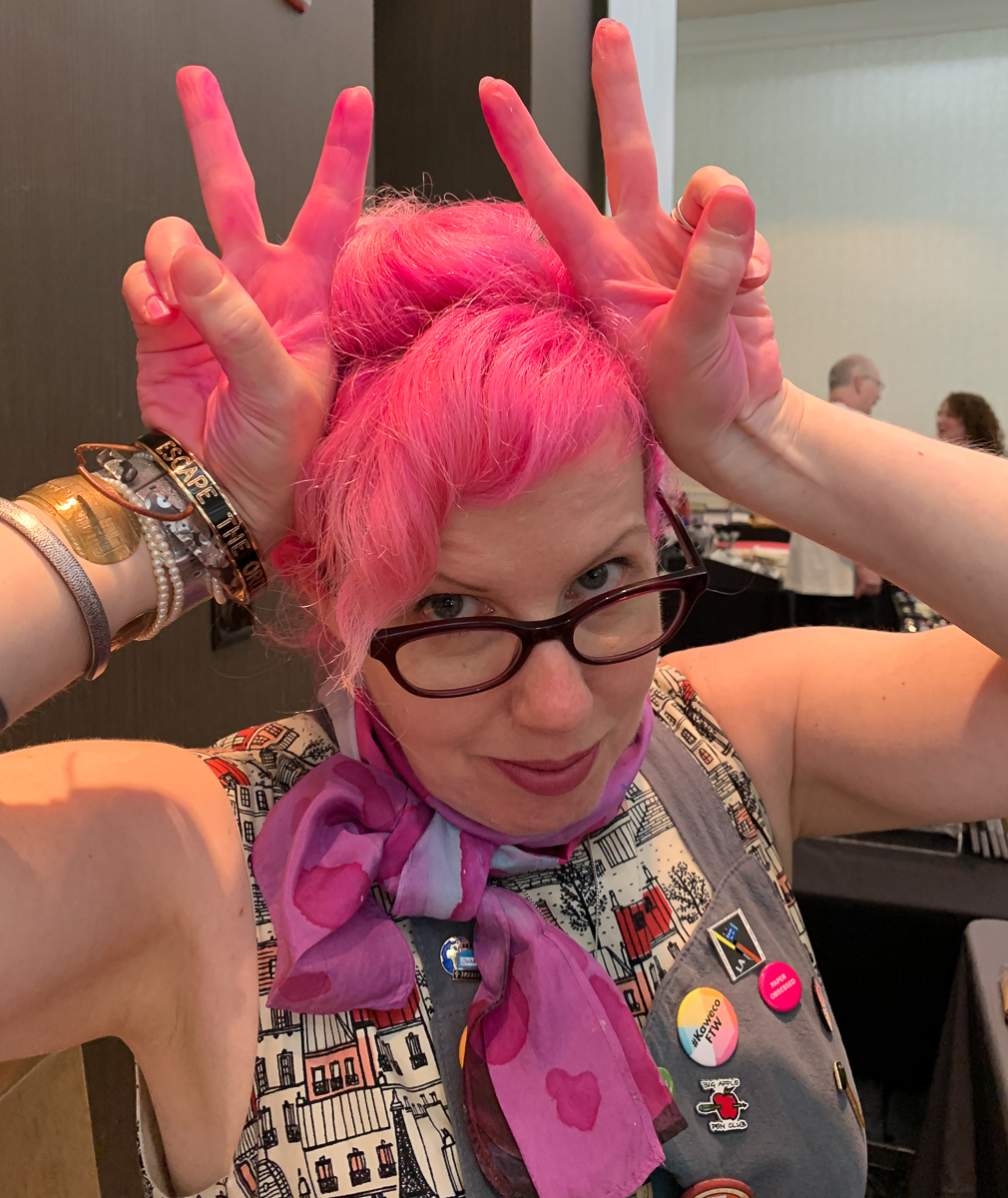
This was a notorious moment in SF. I was asked to show a customer at the Vanness table what color Organics Studio Unicorn Blood was. We didn’t have a swatch so we decided to open a bottle to do a quick little swatch. A little bit got on the lip of the cap and a bit got on my hands. I tried to wipe it off. It is really pigmented and when I used a handy wipe, it just went EVERYWHERE! So, now you know. Unicorn Blood is the same color as my hair.

Another photo of my pink hands

Super hard-working Gena, AKA @customnibstudio, was tuning and modifying nibs all weekend. I wanted to get some nib work done but she was booked solid and when she had time, I was busy setting up or  packing up our tables. I am going to have to just send her my pens.

One of the greatest things that was introduced at SF Pen Show was Alexander’s interactive vendor map. He released it using the information that was available as of Thursday night so there was some discrepancies but it was darn close. If other pen shows could nail down their vendor map a couple weeks before the show and make an interactive map available online, this could help attendees plan their visit and research who other vendors are before attending. Being able to add additional information to a map like this (links to web sites, Instagram, Facebook, etc) would make it easier for people to learn about each vendor while also figuring out where they are located on the show floor.

Oh yeah! I was also honored to participate in yet another live recording of the Pen Addict podcast. We interviewed Hugh and Karol from Kanilea Pen Company.

Myke tries out fatherhood

Myke took a turn holding the baby that made the rounds on Sunday and this photo is now legendary. We think Adina might either be thrilled or concerned with the enthusiastic way Myke took to childcare.

Jesi and Kaoru

Jesi posed with Bungubox owner Kaoru. Jesi sold her an Esterbrook pen and also bought a San Francisco Sailor so the two had a lot to smile about.

Very tired friends

As always, the best thing about pen shows are friends. Jesi and I never seem to get to spend enough time together but we enjoy every minute. We are tired but happy.

Despite working so hard, I did make a whirlwind shopping spree on Sunday and was able to leave with a handful of goodies. There was also a metric ton of ink that left with Bob and Mike in the van since trying to fly with ink if you don’t have to is pointless.

Once I got back to Kansas City, I succumbed to what I call “con crud”. Tuesday and Wednesday, I just thought my voice was scruffy from talking too much but by Thursday it was clear that this was officially “con crud”. Friday, I was down. My much-anticipated 3-day weekend was lost to the “crud”. I am still recovering but hopefully will be 100% myself by the end of this week.

So, don’t forget the key aspect of any good pen show preparation: Emergen-C! And lots of it. I took a ton of it but I still got sick. So, remember to practice good hygiene and get some sleep so you don’t get “con crud”.


Any photo not credited to an Instagram source came from Jesi or Jaclyn. Thanks for sharing your photos, ladies. I promise to make a better effort next year!