Ink Review: Sailor Studio 223

Ink Review: Sailor Studio 223

By Jessica Coles

A few months ago I reviewed my first Sailor Studio ink – 123. This is one of the most popular inks in the Sailor Studio line up, typically selling as fast as retailers can order it! There’s a good reason for this; Sailor Studio 123 is an incredibly unique ink that contains a rainbow of colors. Since Sailor creates these inks in families that share characteristics while the saturation level varies, I decided to try the closest ink to 123 – Sailor Studio 223 ($18 for 20mL at Dromgooles)!

The label on 223 shows a light to medium grey with cool undertones.

But as soon as the bottle is opened, the underlying characteristics of the ink begin to show. The cap shows blues, purples, and pinks.

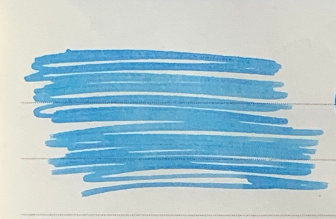
The swatch card also started revealing the complex miix of Sailor Studio 223. The ink has an overall color of grey, but has a main tone towards pinkish-purple. the edges of the heavier ink applications show blue and green halos with a very slight sheen of black.

In writing, the ink can vary as well. I chose a Sailor Zoom nib to demonstrate the difference your nib selection can make. As you can see, shading is present even in an extra fine nib (in this case it was actually a Zoom nib writing upside down).

To show the relationship to Sailor Studio 123, here are the two ink swatches with Papier Plume Bayou Nightfall for comparison.

Grey. Grey is a tough color to pin down since it can swing from warm to cool but still be filed under the general term of grey. These were the closest greys I had, with Papier Plume Oyster Grey being the winner.

So what makes up this color shifting ink? I used a paper towel to catch stray drips as I filled the Sailor. This is the most saturated of the stray drops. No water was added.

Another drop spread out farther:

This last example was one where I added a bit of water so the colors could spread further. I’m fairly certain the entire rainbow is present.

Sailor 223 may actually be my newest favorite Studio ink since it is more legible in normal writing. For those who admire 123 but dislike pastel inks, try 223 instead. Plus it isn’t sold out everywhere!


If you have ever tried to purchase Sailor Studio inks, you know how tough it can be to find a store selling it, pay for the shipping and wait for the slow boat to make its way overseas (unless you are lucky enough to live in Japan). Good news! Sailor has recently started allowing sales of these small bottles of sunshine by select retailers in the US. However, Sailor did put a restriction on these sales – orders for Sailor Studio inks can only be taken over the phone. Dromgoole’s was kind enough to provide this bottle of 223 for review and you can find ordering instructions here. The entire staff is great to talk to when ordering and if you order before the Dallas Pen Show, you can pick up your ink at their table  – no shipping cost!


Tools:

  • Paper: Nanami Seven Seas Writer ($26 from Nanami Paper), Col-o-ring cards ($10 from Well-Appointed Desk)
  • Pen: Bungubox San Fransisco Sailor with a Zoom steel nib ($230 from Bungubox)
  • Ink:  Sailor Studio 223 ($18 for 20ml bottle from Dromgooles)

DISCLAIMER: The ink in this review was provided free of charge by Dromgoole’s for the purpose of review. Please see the About page for more details.

Link Love: Hubba Hub Love

Pelikan Hub 2019

Just two more days until Pelikan Hub 2019 and it feels like my whole world is revolving around this Friday night worldwide party. Of course, this is the first year that I am a hubmaster. Can you believe it? As an introvert, throwing a party makes me want to throw up so it’s taken the better part of a year to work up the energy and courage to do this. But I think I’m ready. I couldn’t have done it without help from Laura (my sidekick in blog writing, knitting, tea drinking, road tripping, and all-around best bud) and Bob (Husband #1) and many folks from our local pen club who have offered to bring food and drinks. It takes a village to organize a good party!

Pens:

Ink:

Pencils:

Notebooks & Paper:

Art & Creativity:

New words to learn

Other Interesting Things:

Notebook Review: North of Rosemont

Review by Laura Cameron

Last month North of Rosemont contacted us and asked if we’d be interested in trying their pocket notebooks. Of course I wanted to try!

North of Rosemont is headquartered in Montréal and produces pocket size notebooks based on a few key principles.

To use only the highest quality, premium paper. To be sturdy and stylish for everyday use. To be made in Canada yet remain affordable.

NO+RO generously sent me a pack of two notebooks ($14.95 CAD), one in the Deep Blue color and one in the Grey 67 color.

Let’s start from the beginning: the outside. The covers of these notebooks are made out of 100lb paper with a vellum texture. The Deep Blue and Grey 67 are colors in the permanent collection, and it looks like there are other colors available as limited editions. The books are staple-bound.

Inside each notebook are 48 pages of 70T bright white paper, with NO+RO’s signature dot grid. The grid is actually made up of little crosses rather than dots! The paper is advertised to be high quality and super smooth and the second part is definitely true! There are also grey and white speckled front and end pages.

The interesting thing about these notebooks is that they are advertised as “smart size” and have 20% more surface area than regular pocket notebooks. This means that rather than being the standard size of 3.5″ by 5.5″ (9cm x 14cm), they are 4″ x 5.75″ (or 10cm x 14.5cm). While I’m often of the school of thought that more is better, at these dimensions, your notebooks may or may not fit in your pocket notebook covers (something to be wary of).

I do have to say that the paper in these notebooks is excellent. It is actually super smooth, and ink goes down beautifully and dries super quickly. The paper does show some ghosting and a bit of bleed through in heavy applications (where I added extra strokes on my letters), but with regular writing and fountain pen inks, both sides of the paper could still be used easily which is always a sticking point with me.

Overall, I was pleased to try North of Rosemont and I look forward to their future offerings!


DISCLAIMER: Some of the items included in this review were provided to us free of charge for the purpose of review. Please see the About page for more details.

Vinta Inks Overview

Vinta Inks Overview

Vinta Inks are the newest collection of inks to roll up on the shores of the US thanks to the keen eye of ink maven Lisa Vanness at Vanness Pens. Coincidentally, Vanness Pens is currently the only vendor stocking the ink. Vinta Inks are made in the Phillipines and the line currently features a range of 20 colors: 15 standard, shading/sheening inks and 5 shimmering inks ($12.50 each).

Vinta Col-o-ring swatches

Each ink ships in a 45ml brown glass bottle, packaged inside a white cardboard box. The packaging is lovely and the brown glass has an apothecary vibe while also protecting the ink from light. The only downside of the packaging is the ink names printed on the bottles and boxes is minuscule and in a script face, exacerbating the legibility issues.

Regarding the inks specifically, I think the ink can be grouped into a couple categories beyond how Vinta organizes them. In the sheening inks, there are several inks that really do sheen but others that are more traditional shading inks, and then there’s a third group that mimic the ever-growing category of “magic” inks (a term coined by Nick Stewart regarding the Sailor Studio inks). And finally, the separate category of the shimmering inks.

Sheening:

Vinta Sheening Inks

There are four truly sheeny colors in the line, three are super sheeners. Andrata is not as sheening but is still a deep, dark color. The other three are, to steal a term from the cosmetics industry, dupes. Sundungo Sikatuna is a dupe for Krishna Jungle Volcano and Dugong Bughaw and Maharalika are dupes for Organics Studio Nitrogen. Dugong has slightly more of a red-pink sheen than Nitrogen or Maharalika. But, IMHO, it’s a matter of preference which you’ll prefer if you like that sort of super-sheening blue, Dugong of Maharalika as they are fairly similar once they are in a pen.

Vinta vs Organics Studio

Vinta Dugong vs Organics Nitrogen

VintaMaharalika vs Organics Nitrogen

Vinta Vs Krishna

Vinta vs Krishna Jungle Volcano

When comparing Sundungo to Jungle Volcano, both inks sheen from olive green to fire red-orange depending on the light. The two photos above show both inks with light hitting them at various angles.

Shimmering:

Vinta Shimmering

In the shimmering inks offered by Vinta, only Julio features a silvery/opalescent metallic chip. The other four colors all use a gold flake. In Santa Cruz, which is a bright orange, the gold chip fades into the color but in the darker colors like Piloncitos and Kosmos Blue, the gold flakes are much more evident. Julia is a very pale orchid pink shimmering ink that is also a bit of a “magic” color as it reveals its true tone as it dries.

Vinta Julio

Julio is pictured above.

Vinta Julia

A close-up of Julia in natural sunlight.

Vinta Blue Kosmos

Kosmos blue shown above in full sunlight. Pretty cosmic!

Vinta Piloncitos

Piloncitos really comes alive when light hits it.

Vinta Santa Cruz

Finally, Santa Cruz definitely evokes orange-y sunrise colors.

The metallic particles seem fairly small but I have not had the opportunity to test these extensively to establish if these are easier to distribute the particles and easier to clean than other shimmer inks. So, like with all shimmer inks, proceed with caution in using the shimmer inks the first time out.

Standard Shading:

Vinta Shading Inks

In the standard shading inks, the most popular colors are Lucia Deepwater (a medium blue with gray shading), Leyte Sea Kelp (a medium dark olive green) and La Union (a deep red magenta). There are two yellow shades as well, Hanan Sunrise which is a golden shade with a slight green undertone and La Paz (not pictured, the only one I didn’t get a bottle or sample unfortunately as it was sold out originally. It’s back in stock now) which a bronze yellow. Finally Carlos Emerald, a very deep forest green which shades only slightly due to the darkness of the color and Karnival, a medium green with a bluish undercast.

I love Lucia, Leyte and Karnival from this set.

Magic Inks:

Vinta Magic Inks

Magic inks are the newest category of inks — inks that change color as they dry.  The most notable inks currently available that display these charateristics are the Sailor Studio inks but Vinta has four in their line.

The most popular of the Vinta magic ink colors is Maskara by a long shot. It goes down more of a purple-y grey color and as it dries becomes more bluish and reveals it’s pinky shading. While Maskara is not exactly Sailor Studio 123 or 150, it is definitely in the ballpark. It’s less expensive and much easier to acquire.

Sirena is a more green grey that becomes more vibrant as it dries, revealing a sandy shading. It might be similar to Sailor Studio 162. Armada is a muted grey-green/teal but darkens as it dries which intensifies the colors. Perya is a pale sky blue with a lavender undertone when dry. (I’m sure there are colors similar to both of these in the Sailor Studio Ins but I don’t have access to the full swatches in person. Take a peek at Nick Stewarts swatches or Kelli at Mountain of Ink and see if you spy a similar ink.)

Vinta Armada Aegean

The above swatch is a close-up of Armada. There is a whole array of deep sea colors in this ink from reddish purple to turquoise.

Vinta Maskara

This is a swatch of Maskara completely dry. It dries to a vivid reddish purply blue. So many tones!

Vinta Sirena

This is Sirena (don’t tell the other colors but this one is my favorite). It is 100% mermaid magic containing shades of green seas and pinky sand beaches.

Vinta Perya

This is a close-up of Perya. This ink writes very lightly but dries to a vivd aqua with hints a purple.

Be sure, after looking at the close-ups, to scroll back up and look at the writing samples again so you can see, in the writing, the nuances of these closes-ups, in the writing.

While the sheening and shimmering inks from Vinta are immediately eye catching, these magic colors are the truly stunning colors to me.

Finally, Vinta Inks donates a portion of the profits that it earns to Teach for the Phillipines to give writing kits to kids. So, on top of creating beautiful ink, Vinta is committed to making a difference in their community.


Tools:


DISCLAIMER: The items included in this review were provided free of charge by Vanness Pens for the purpose of review. Please see the About page for more details.

Pencil Review: Cretacolor Graphite Aquarell

Review by Tina Koyama

In July, I attended the 10th annual International Urban Sketchers Symposium in Amsterdam. Aside from barely surviving a record-breaking heatwave of temps up to 107 F, I had a wonderful time with my tribe of 1,500 sketchers from around the globe. It was my sixth symposium since 2013.

One of the many benefits of attending the symposium is receiving an enormous swag bag that gets better every year. This year was no exception, and I took home an embarrassment of riches from generous sponsors (see the full haul on my personal blog). To share some of the wealth, I’ll be reviewing some of the swag products now and then. Today it’s the Cretacolor Graphite Aquarell pencil. (By the way, the Cretacolor tin with the symposium logo is one of my most prized possessions from each symposium I’ve attended!)

Austrian-made Cretacolor water-soluble graphite pencils come in three grades: HB, 4B and 8B. Shown side by side, you can see that the grades vary, but not as much as ordinary graphite pencils in the same grades. If I’m using a water-soluble graphite pencil, I usually want the wash to be as dark as possible. For my money, I think the 8B is all I would need. It can still be applied lightly by minimizing pressure.

The only other 8B graphite pencil I have is a Uni Mitsubishi Hi-Uni, so I compared them. While the Cretacolor feels just as soft, it isn’t quite as silky-smooth as the Hi-Uni. The Cretacolor’s core, however, is a bit thicker. (Cretacolor shown on the left.)

In the tree sketch, I activated the 8B with water sparingly to enhance only the areas with the darkest value. Tiny touches with a waterbrush will bring out a rich, dark wash very quickly. I love the beautiful tonal variations that are possible with this one water-soluble graphite pencil just by varying the pressure and applying a little water. It’s especially nice on toothy paper (I used Stillman & Birn Beta).

I probably won’t be using graphite much during the remaining colorful days of summer and fall, but I’d like to give this pencil a more solid try during the drab days of winter.


Tina Koyama is an urban sketcher in Seattle. Her blog is Fueled by Clouds & Coffee, and you can follow her on Instagram as Miatagrrl.


Fountain Pen Review: Aurora Duo Cart (“Vespa” Green)

Fountain Pen Review: Aurora Duo Cart (“Vespa” Green)

The Aurora Duo-Cart in “Vespa” Green (okay, they just call it green but really it’s vintage Vespa green …..

Vespa All-State VBB stock green

if you want to get specific, its early 50s All-State VBB green. But, let’s not be that scooter nerdy, shall we?) Suffice it to say, that when I saw the new Aurora Duo-Cart colors, I knew this was the color for me. Not only is this pen a reproduction of a classic design but it’s also in a very vintage color. I was 95% in love with it before the pen even touched paper. Of course, I have had the pleasure of trying a Duo-Cart in the past too, so I kind of knew what I was getting into. The green Duo-Cart is much more my aesthetic overall. We did have a guy in our scooter club who was an Italian professor who rode a burgundy Vespa P200 who would wax poetic about how “burgundy was the most beautiful color!” to the point that it became a punch line to most jokes about color. Ask me about it some time. Anyway, I digress…

Aurora Duo Cart Green

Since this week’s pen reviews have included my in-depth opinions on packaging, I shall continue here. The new Duo-Cart fountain pens do not include the amazing vintage boxes that were included with the original re-release of the Duo-Carts back in 2017. Those boxes were from a stash found in the basement at Aurora leftover from the original release of the Duo-Cart pens back in the 60s. The satin material and distinct, dusty scent and gold edging is missed.

Aurora Duo Cart Green

However, the simple leatherette clamshell box replaces it. It is inside a paperboard box (the same used with the earlier releases of the Duo-Cart) to hold the pen, a small bottle of Aurora Black ink, the converter and box of cartridges. With the exception of the clamshell box, the rest of the packaging is recyclable while still carrying the retro aesthetic of the pen. I think a paperboard box for the pen would have been appropriate aesthetically and would be recyclable but no one asks me.

Aurora Duo Cart Green

I decided to compare the size of the Duo-Cart to other Aurora pens and some vintage pens of similar design. From left to right: Parker 21, Parker 51, modern Esterbrook Phaeton, Aurora Optima, the Duo-Cart, Aurora Style Gemstone, and a vintage Esterbrook LK.

Aurora Duo Cart Green

Comparing the hooded nibs of the Parkers on the left with the modern Esterbrook Phaeton and Aurora Duo-Cart, there is definitely more nib visible. They are more of an exposed arrow point where the Parkers are just a tiny point. The pen grip section on the Parkers also curves to a point at the nib where the Phaeton and the Duo-Cart are a soft arc over the nib, Aesthetically, they create different hooded nib looks. I don’t think one is preferable to the other, they are just handling the design decision differently.

In terms of overall length, the Duo-Cart is shortest posted, comparable to the Parker 21 at 5/5″ (140mm) posted and 4.75″ (120mm) unposted. Capped, the Duo-Cart is only 5.5625″ (141mm). These more diminutive proportions are in keeping with vintage pens. It’s only in the last few decades that pens have gotten larger and larger. (Hey. 1980s, I’m looking at you!) The plastic and aluminum construction keep the weight of the pen light as well weighing 27gms capped with a filled converter. Uncapped, the Duo-Cart only weighs 16gms.

pen weight comparison chart

For more detailed images of the pen hardware and nib, see my previous review.

Aurora Duo Cart Green

I found the steel nib on this Duo-Cart a much better writer than the previous one. Whether that was just luck or the ink I chose, I don’t know. However, since the options for the Duo-Cart are only a medium nib, the medium nib on the green was a much finer medium than the burgundy I tested originally. I was thrilled that Bungbox Kaoru was a perfect match.

So, what’s left to say? The pen is bellisimo! If you like the idea of owning a retro-looking pen but are concerned about maintenance, then the Duo-Cart is a great option. It’s a cartridge (note: Aurora requires proprietary cartridges even though they look like standard international. Don not be fooled!) and converter filler pen that you can use with all your inks. The Duo-Cart is not outrageously expensive either (MSRP $195, selling for $156) for a pen produced on a small scale.


Tools:


DISCLAIMER: The items included in this review were provided free of charge by Kenro Industries for the purpose of review. Please see the About page for more details.

Ink Review: Sailor Studio 140

Ink Review: Sailor Studio 140

By Jessica Coles

I doubt it’s a secret that I love the new Sailor Studio inks. The downside to this love is the sheer number of them – 100. At the rate I’m going, it’s going to be at least another 2 years before I’ve reviewed all of them, but I’m committed to trying.

This review covers Sailor Studio 140 ($18 for 20mL at Dromgooles). In the Sailor Studio lineup, the first number indicates the saturation level of the ink. Even though this ink is the lowest saturation level of the group, I had no problem at all reading anything written with it.

There are days in Colorado in the middle of the summer when the sky is such a brilliant and clear shade of blue that I could swear certain patches were almost purple (this is probably true in many other places as well but in my experience, Colorado has the best summer sky).I’ve never been able to point out these supposedly purple spots, but one day…

Sailor Studio 140 is the same color as that summer sky. It also replicates the same experience of feeling there is purple in there somewhere, but not being able to actually point out the color. The color changes between various papers, nibs, writing styles, lighting, and possibly even phases of the moon.

140 is somewhere in color between Diamine Florida Blue and Montblanc Miles Davis, although once again, there is a purple undertone but it is next to impossible to capture here.

Writing with Sailor Studio 140 is wonderful. The ink is a bit on the wet side of normal, not water resistant in the least, never feathered and didn’t bleed through the paper.

Now for the shading! I purposely used Tomoe River 52gsm paper, a broad nib, and print rather than cursive to show as much shading and color variation as possible. The color moves from a pastel blue (still legible, though) to a medium summer blue that leans towards violet. Below you can see that much of the shading was a smooth transition rather than a sharp division between dark and light.

I love using 140 – the entire page is cheerful and bright but I never need to squint to see pale ink on the page.

If you have ever tried to purchase Sailor Studio inks, you know how tough it can be to find a store selling it, pay for the shipping and wait for the slow boat to make its way overseas (unless you are lucky enough to live in Japan). Good news! Sailor has recently started allowing sales of these small bottles of sunshine by select retailers in the US. However, Sailor did put a restriction on these sales – orders for Sailor Studio inks can only be taken over the phone. Dromgoole’s was kind enough to provide this bottle of 140 for review and you can find ordering instructions here. The entire staff is great to talk to when ordering and if you order before the Dallas Pen Show, you can pick up your ink at their table  – no shipping cost!


Tools:

  • Paper: Nanami Seven Seas Writer ($26)
  • Pen: Franklin-Christoph 45 Prototype with a broad steel nib ($115)
  • Ink:  Sailor Studio 140 ($18 for 20ml bottle)

DISCLAIMER: The ink included in this review was provided free of charge by Dromgoole’s for the purpose of review. Please see the About page for more details.