I’m tired. I don’t know about anyone else but after 12 months of quarantine, working-from-home, self-isolation, and the complete upset of the world, I’m tired.
I’ve done my best to stay positive this past year, being stuck in my house with internet access, electricity (most of the time), delivery services and the occasional outing to pick-up groceries, I have it extremely easy, all things considered.
But that doesn’t mean that the isolation and constant frenzy to try to fill every moment with work to keep the previously mentioned lights and internet on hasn’t started to wear on the psyche.
I’ve been telling myself that I would just keep plowing on but I need a break. We all need a break.
So, for the first time in years, we are taking a week off. I was inspired by my dear friends at Wonder Fair who are doing the same thing. Next week is Spring Break for the college where I teach as well. This will be a much needed Spring Break Staycation. It will be quiet here on the blog but we will be back on Monday, March 15.
The shops will remain open and orders will be sent out in a timely fashion.
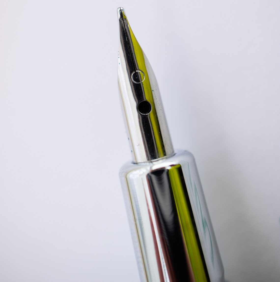
Pens:
- The Best Copper Pens (via JetPens Blog)
- Sailor Fountain Pen Nib & Line Comparison (via Yoseka Stationery)
- Review: Jinhao Candy Fountain Pen Bright and Fun (via Comfortable Shoes Studio)
- Reviewing the Parker “51” Fountain Pen. (via PENCIL REVOLUTION!)
- Fountain Pen Review: Esterbrook Estie Rocky Top Oversize (via Rants of The Archer)
- Savannah green and terra red (via Bleistift)
- How Many Pens Is Too Many (To Have Inked Up at Once): Managing a Collection (via The Gentleman Stationer)
- Perfection, Modified: Penco “Perfection Light” Bullet Pens (via The Gentleman Stationer)
Ink:
- Exclusive Robert Oster Inks: Ink Comparison with Snowy Studio (via Pen Chalet Blog)
- L’Artisan Pastellier Violette (via Fountain Pen Pharmacist)
- L’Artisan Pastellier Callifolio Omi Osun (via Fountain Pen Pharmacist)
- Robert Oster Rose Gold Antiqua (via Mountain of Ink)
- Colorverse Apollo 11 (via Mountain of Ink)
- Vanness Pens x Robert Oster Hemp Fountain Pen Ink Review (via The Pen Addict)
Pencils:
- Hardly Broken: the Kutsuwa Hokusign Pencil (via pencil talk)
- Review: Mitsubishi 9800DX Graphite Drawing Set (via Fueled by Clouds & Coffee)
Notebooks & Paper:
- Traveler’s Notebook Tutorial: How to Connect Multiple Refills and Accessories (via The Gentleman Stationer)
- 7 Tips for using washi tape in your bullet journal or planner (via All About Planners)
- The Philofaxy Guide to Diary Inserts (via Philofaxy)
- Well-Appointed Desk Vintage Writing Paper Pad Review (via Original Content Books)
- Analogue Planning and Task Management in Covid Times (via Writing at Large)
- B-Sides & Rarities (via TRAVELER’S COMPANY USA)
Art & Creativity:
- Current Sketching Kit – March 2021 (via Liz Steel)
- Sketchbook Page: New Beginnings (via Apple-Pine)
- Milly Peck on her comedic, cropped and artfully shaded drawings (via It’s Nice That)
- My sketchbook video set-up: what currently works for me. (via Apple Pine)
- 31-day Practice and Suck Less challenge (via Austin Kleon)
- Review: Canson XL Bristol Paper (180gsm) (via Parka Blogs)
Other Interesting Things:
- Inkquisitive Musings with Gourmet Pens Episode 1 (via Gourmet Pens)
- Cole Rise’s “NASA Critical Space Item” Stickers (via Tools and Toys)
- Period-Specific Cartoon Homages to Wandavision (via Kottke.org)
We need each other. Please support our sponsors and affiliates. Your patronage will let them know you appreciate their support of the pen community. Without them, and without you, we could not continue to do what we do. Thank you!