12 Days of Inkmas: Day 9 – Troublemaker Inks Sea Glass

12 Days of Inkmas: Day 9 – Troublemaker Inks Sea Glass

By Jessica Coles

Inkmas 2019

Welcome to another edition of the 12 days of Inkmas! On day 9, we are looking at a new ink.

Troublemaker Inks has come onto the ink scene quite recently with new and fascinating colors such as Petrichor and Abalone. I recently acquired the newest colors in the Troublemaker lineup – Sea Glass and Foxglove. Both are perfect additions to this ink collection. A review of Foxglove will be coming out later this week!

*photo from Troublemakerinks.com

The packaging of the Troublemaker Ink bottles is simple and attractive – heavy paper wrapped around the bottle and fastened with twine. I appreciate the minimalism here! The bottles inside are plastic and sealed tightly and I’ve never had one leak. The plastic bottle helps keep the weight down for shipping and the bottles are dark to help protect the color of the ink.

I love the little characters on each label – Sea Glass has a very cute fish.

When introducing this line of inks, Troublemaker advertises “We are exploring an extra-special way of shading in our newest colors.” They are described as inks with “A different kind of shading”. I completely agree with that. But there’s more than just different shading here.

These “differently shading inks” have also been described as multi-chromatic or strange inks. they are highly shading with colors that seperate into additional colors as the ink dries or is used in various nibs or on multiple paper types. Sailor Studio inks also act this way which is one of the reasons for the popularity of that line.


As you can see, Sea Glass is mainly a green that leans towards blue, but has an undertone of yellow-brown but shows a halo of emerald with medium application and a very dark green in heavier applications. At its lightest (in the lower right corner of this card), Sea Glass is a light sea foam green.

I have compared Sea Glass to a few other bluish-green shading inks. The lightest Sea Glass looks a bit like Sirena Mermaid, the undertones are close to the undertones found in Sydney Darling Harbor and the halo resembles that from Montblac If.

In a closeup of the writing (done with a Pilot Vanishing Point Broad Italic), the shading shows up beautifully. The main color here is close to a medium pine green.

There is a subtle undertone of the yellowish brown in heavily shading areas.

The pooled ink also shows a characteristic that I usually associate with Sailor Studio inks – lots of subtle undertones depending on how heavily the ink was applied, if it was applied in two layers or one, what type of nib or other instrument was used in the application (below, it was actually the bottle itself that applied the swatch).

I have had absolutely no issues using Troublemaker inks, even when the ink sits in a pen for several weeks. The inks are a bit on the wet side of normal and are easy to clean out of pens. They are not water-resistant (in fact, they are amazing when used in brush pens or with the addition of water), they don’t feather or bleed on fountain pen-friendly paper.

The only downside I have found with Troublemaker inks is the availability. These inks are manufactured in the Philippines and I have only found one retailer in the US that stocks Troublemaker (Shiguire inks). Ink can be ordered straight from Troublemaker with very reasonable shipping rates (free shipping at $20!). The problem, however, is supply and demand. Shipments are often sent out after a long wait period. At the moment, Troublemaker has closed orders, only opening order windows briefly. This caused frustration to the ink community – a community known for obsessing over new and interesting products. Of course, this restricted amount of ink has also created even higher demand!

I was one of the frustrated. But I have recently learned more about the individuals behind the Troublemaker brand – two young men in the Philippines who decided to test their hand making creative new inks. These two are responsible for all ink inventions, manufacturing, bottling, shipping, orders, website, and marketing all balanced with college!

I did not have an internationally known company selling well-made products around the world when I was the same age.

So my patience with Troublemaker inks has increased tremendously. I am excited to see new passion coming into the hobby and amazing talent with it. I’m excited to see what else this young duo has in store and I am more than happy to be able to encourage their drive. Plus – I LOVE the inks they create!


Tools:


DISCLAIMER: All materials used in this review were purchased by me. Please see the About page for more details.

12 Days of Inkmas: Day 8 – Kala Nostalgia Abstraction Mongolian Sandstorm

12 Days of Inkmas: Day 8 – Kala Nostalgia Abstraction Mongolian Sandstorm

Inkmas 2019When I saw the Kala Nostalgia Abstraction inks I was fascinated by the muted look of the colors. When I saw that the inks were marked as “pigment inks” my curiosity was piqued. So, I ordered two bottles.

I was most interested to try Monogolian Sandstorm. Over the years, I’ve always leaned towards a misty lavender ink and if it was waterproof (which most pigment inks are) that would be a double bonus.

Kala Nostalgia Abstraction Mongolian Sandstorm bottle

Kala Nostalgia Abstraction Mongolian Sandstorm cap detail

Mongolian Sandstorm, like the other Kala inks come in a 30ml glass bottle that is packaged in a paperboard box. The cap is embossed with the Kala logo which is a lovely touch.

Kala Nostalgia Abstraction Mongolian Sandstorm writing sample

The oddest thing about Mongolian Sandstorm is that the ink is darker when wet and then lightens as it dries. I wracked my brain trying to remember if there was any other material that behaved this way and the only thing I could think of was gouache.

Kala Nostalgia Abstraction Mongolian Sandstorm close-up

The most unpleasant thing I noticed about Mongolian Sandstorm was that it is wetter than most inks. So much so that it made my Japanese style EF appear almost like a broad. Above is a writing sample image showing another pen with the same nib next to Mongolian Sandstorm. The line weight difference is pretty ridiculous.

Kala Nostalgia Abstraction Mongolian Sandstorm writing on Tomoe River

I tried the pen on a bit of Tomoe River paper to see if the results would improve but the writing is equally indistinct.

Kala Nostalgia Abstraction Mongolian Sandstorm close-up on Tomoe River

Kala Nostalgia Abstraction Mongolian Sandstorm close-up on Rhodia

The two photos above are close-ups of the logo doodles I did. The top image is the version I did on the Tomoe River paper and the lower image is on Rhodia. The lines do not bleed but are still blobby.

Kala Nostalgia Abstraction Mongolian Sandstorm swatch comparison

Kala Nostalgia Abstraction Mongolian Sandstorm swatch comparison

I have two other hazy purple inks that are very similar in hue though they are not pigment inks: Pen BBS 270 and 346. Pen BBS 346 is a little bit darker but #270 Raspberry Milkshake is almost the same color, just not waterproof. Raspberry Milkshake is also a wetter ink. Pen BBS #346 is darker but a dry ink. It would perform better with a little bit of White Lightning.  (In PenBBS, #226 June Pearl and #315 Ice Lake are shimmer versions of similar colors if you prefer sparkle in your inks.)

Kala Nostalgia Abstraction Mongolian Sandstorm swatch comparison

Rohrer & Klingner Sketch Ink Jule is a good alternative if you’re looking for a waterproof hazy purple, though it is a little warmer with more red in the ink.

Overall, I’m not a fan of the Kala Nostalgia Abstraction inks thus far. It’s just not what I was hoping for.


Tools:


DISCLAIMER: The items included in this review were provided free of charge by JetPens for the purpose of review. Please see the About page for more details.

12 Days of Inkmas: Day 7 – Pen Saijiki Syurei

Inkmas 2019

Review by Laura Cameron

I’ve never tried any of the Pen Saijiki inks, so when I saw Syurei (4mL sample, $4.00), I thought the end of 2019 was the perfect time to snag this coral ink and swatch it for Inkmas!


Syurei is that orangey-pinky coral that was Pantone’s 2019 color of the year. I’ve collected a few of these coral inks this year, and I have to say they’re all super similar.

As you can see Syurei comes in just a smidge lighter than Diamine Coral, and with it’s light pinky bits, very close to J. Herbin Corail des Tropiques. It’s also similar to Pilot Iroshizuku Fuyu-Gaki, but that one is a bit more orange than pink.

All in all, a lovely color wrap up my year-long pursuit of corals!

DISCLAIMER: Some of the items included in this review were provided to us free of charge for the purpose of review. Please see the About page for more details.

12 Days of Inkmas: Day 6 – Colorverse Joy in the Ordinary Edition Coffee Break

12 Days of Inkmas: Day 6 – Colorverse Joy in the Ordinary Edition Coffee Break

Inkmas 2019There are so many things to appreciate the new Colorverse Joy in the Ordinary Series. First, they are in single 35ml bottles which allow for a less expensive, lower quantity purchase. Previous Colorverse inks were only available in two-bottle sets which cost upwards of $36. The Joy in the Ordinary series is also one of the only non-space sets that Colorverse has created. The previous non-space series was the tree-themed sets but those were still in the two-pack sets. Joy in the Ordinary celebrates the things that astronauts might miss when on interstellar travels — things like Rainy Days, Walking the Dog, and Brunch Dates.

Colorverse Coffee Break bottle

I confess I chose Coffee Break because of the name. I often use the same logic when choosing nail polish colors. There’s a reason I’ve bought two bottles of OPI I’m Not Just a Waitress, sometimes the name of a product alone is enough to sway my purchasing decisions. It was the same with Coffee Break. Who wouldn’t want an ink that evokes the feeling and color of a good cup of coffee.

Colorverse Coffee Break swatch

That the ink is also a lovely warm, cocoa-inspired brown solidifies this ink as a good brown, IMHO.

Colorverse Coffee Break swatch comparison


Of course, there are a lot of good warm browns. I suppose I should have looked at my ink stash before ordering yet another brown ink. Monteverde Brown Sugar is really close in color and it’s a fraction of the price. Pelikan Edlestein Smoky Quartz has a bit more yellow and is darker overall. Kaweco Caramel Brown is also darker but more red. SBRE Brown by Akkerman is more orangey. J. Herbin Cafe des Iles is not as saturated and slightly more red. J. Herbin, Kaweco and Monteverde are all cheaper options. If you are looking for an alternate, I’d recommend the Kaweco or Monteverde. They are both solid options.

Colorverse Coffee Break

In writing, the shading in the ink definitely creates a convincing coffee stain look. There doesn’t appear to be any sheening but the color is lovely.

Colorverse ink is historically dry but I did not need to add any White Lightning to it to keep its viscosity. Your mileage may vary depending on nib and feed.

I like Coffee Break. If I didn’t already have a dozen or more brown inks this would be the one I would want to buy again.


Tools:


Link Love: What’s the Plan?

Link Love: What’s the Plan?

This week’s Ink section features Diamine’s new UK exclusive colors. There’s a sneak peek of the new AL-Star Tourmaline in Pens but the bulk of the pen-iverse is talking about planners, bullet journaling and notebooks. Clearly, I am not the only one who spends a ridiculous amount of time plotting which planner to use each year. I really need to do a wrap-up of my notebook and planner success and failures before the new year. Would anyone want to read about that? Have you figured out your planning strategy for 2020? Love, Ana

Pens:

Ink:

Pencils:

Paper & Notebooks (and Planners!):

Art & Creativity:

Other Interesting Things:

12 Days of Inkmas: Day 5 KWZ Iron Gall Turquoise

Inkmas 2019


Review by Laura Cameron

While it isn’t a new ink, I love turquoises and teals so I was excited to order KWZ Iron Gall Turquoise and try it out! (4mL sample, $2.50). Although advertised as turquoise, this one looked to be a dark blue-green which made me think of blue spruce (seasonally appropriate!).

I wasn’t disappointed. KWZ Turquoise is a dark blue-green and gorgeous. As you can see from my tests, it’s dark and saturated, and in it’s darkest applications tends towards dark blue and almost black. I know some people think KWZ inks have a certain odor, but I didn’t notice anything when testing this one.

The only thing I found slightly disappointing is that this wasn’t really a “new” color to my stash. In fact, KWZ Iron Gall Turquoise is SUPER similar to the special 2018 St. Louis show ink that KWZ designed: Meet me in St. Louis. It also bore a striking resemblance to Robert Oster Blue Denim. So while this is a gorgeous color, I probably don’t need a full bottle!

DISCLAIMER: Some of the items included in this review were provided to us free of charge for the purpose of review. Please see the About page for more details.


12 Days of Inkmas: Day 4 – TWSBI 1791 Part 3: Emerald Green and Royal Purple

12 Days of Inkmas: Day 4 – TWSBI 1791 Part 3: Emerald Green and Royal Purple

Review by Tina Koyama

For my third and final installment of the TWSBI 1791 ink set, I’ll review Emerald Green and Royal Purple. (Please see Part 1 for images and comments about the full set.)

TWSBI Emerald Green and Royal Purple

Of the six inks in the set, Emerald Green is the most complex. Shading shows hints of dark green, turquoise and even a touch of reddish-brown.

TWSBI Emerald Green

Emerald is generally not my favorite side of green, so I had nothing in my collection that came close (or even lukewarm).

Emerald Green swatch closeup

But the shading I saw in the swatch made me think it would be a good candidate for another hacked Pilot Parallel, this time the 3.8mm (you can see the hacked 6mm in Part 2). This ink is fun in the Parallel, which showed more of the hue’s full range of subtleties.

hacked Pilot Parallel with Emerald

I sketched a couple of rows of people from the book People of the Twenty-First Century by Hans Eijkelboom. (This book, by the way, is a fascinating collection of possibly thousands of images of people Eijkelboom photographed on urban streets during the past couple of decades. They are made more visually interesting by being arranged in grids by theme – women wearing pink tanks, men wearing black raincoats, children in strollers, etc.)

Parallel sketches with Emerald Green

TWSBI’s Royal Purple may be my favorite of the set (wait, I said that about Prairie Green, didn’t I?). Although I see no sheening or complexity in this vibrant purple, it’s saturated and rich even with my fine nib dip pen.

TWSBI Royal Purple

It’s obvious that I favor this hue – I found several close matches in my collection. Closest is probably Nagasawa Pen Style Kobe Sannomiya with Iroshizuku Murusaki-shikibu at its heels, though both are just a smidge more on the blue side than TWSBI. Slightly more on the red side would be Diamine Majestic Purple.

Royal Purple comparison

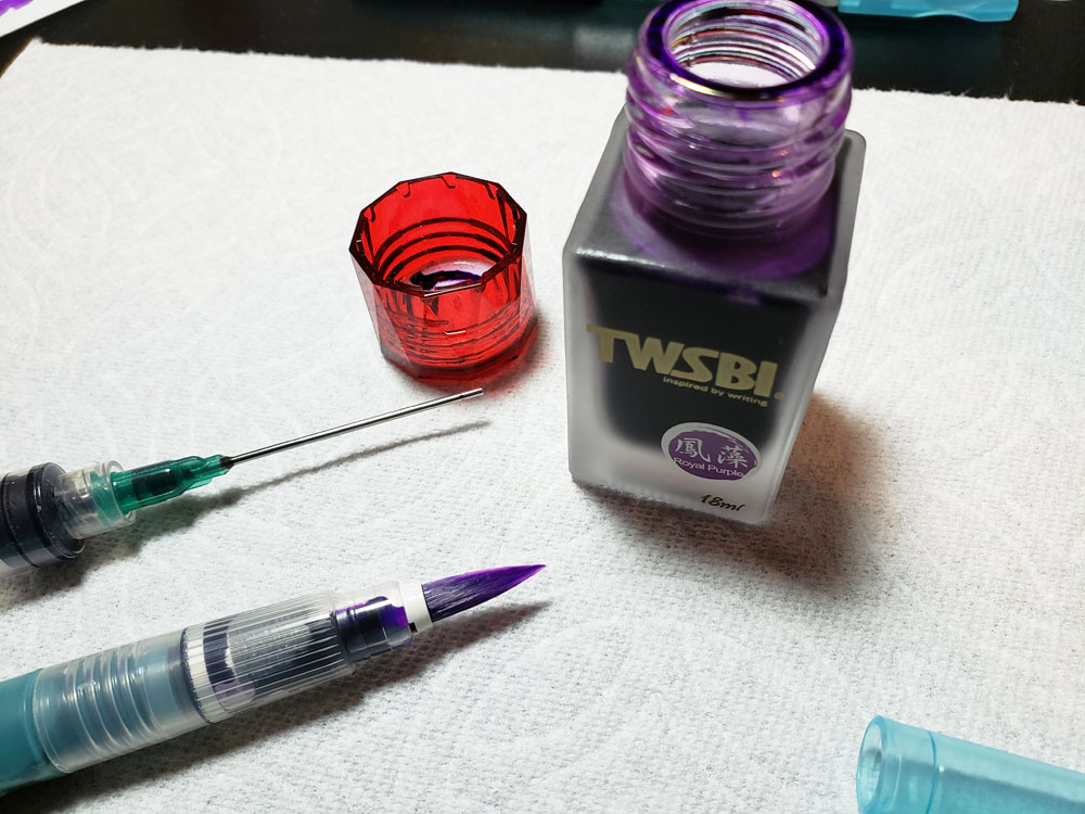
I like the intensity of this purple so much that I filled a waterbrush with it to make a brush pen.

TWSBI Royal Purple in waterbrush

Ink-filled waterbrushes are a lot of fun at life-drawing practice, especially the short poses, because it’s like painting with watercolors but faster. At a recent drawing event, where models posed two at a time, I made gesture sketches of both models within one minute. Royal Purple is on the left; Orange (reviewed in Part 2) is on the right.

 waterbrushes with sketch

Final Impressions

Overall, the limited-edition TWSBI 1791 set is a lovely jewel-hued collection, and the implication is that the company plans to continue releasing new editions. This is a solid start, and I hope TWSBI will explore more unusual or complex hues.

TOOLS


DISCLAIMER: The items included in this review were provided free of charge by JetPens for the purpose of review. Please see the About page for more details.

tina-koyamaTina Koyama is an urban sketcher in Seattle. Her blog is Fueled by Clouds & Coffee, and you can follow her on Instagram as Miatagrrl.

Update: 12/18/19 to add link to drawing event at Gage Academy.