This week I was tickled by the tale of the lost dog that got caught for stealing a unicorn plushie from Dollar General. Click on the link below to read the whole story, complete with happy ending.
Hope your week is filled with whatever comforts make you as happy as a stray dog loves a unicorn plushie.
Pens:
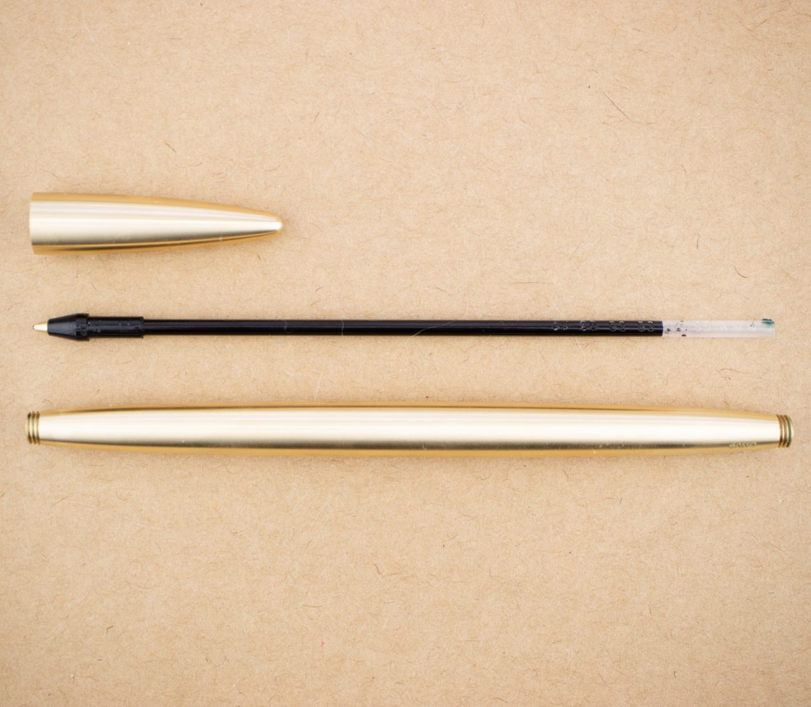
- Fountain Pen Review: Narwhal Original Demonstrator (via Rants of The Archer)
- Narwhal piston filler in yellow tang (via Bleistift)
- ONOTO THE PEN (via Cult Pens Blog)
- First Impressions of the Gravitas Pen SKITTLES Fountain Pen & Ballpoint (via Gourmet Pens)
- Vintage Indian ebonite – isn’t it time we celebrated our legacy? (via Inked Happiness)
- Pelikan M200 Café Creme Old Review and Update (via dapprman)
Ink:
- KWZ Standard Gummiberry (via Fountain Pen Pharmacist)
- L’Artisan Pastellier Callifolio Bordeaux (via Fountain Pen Pharmacist)
- Lamy Charged Green (via Mountain of Ink)
- Taccia Dark Washed Jeans on Rhodia (via Inkcredible Colours)
Pencils:
- Staedtler 275th anniversary pencils (via Pencil Fodder)
- Happy 100th anniversary, Blackwing clamp! (via pencil talk )
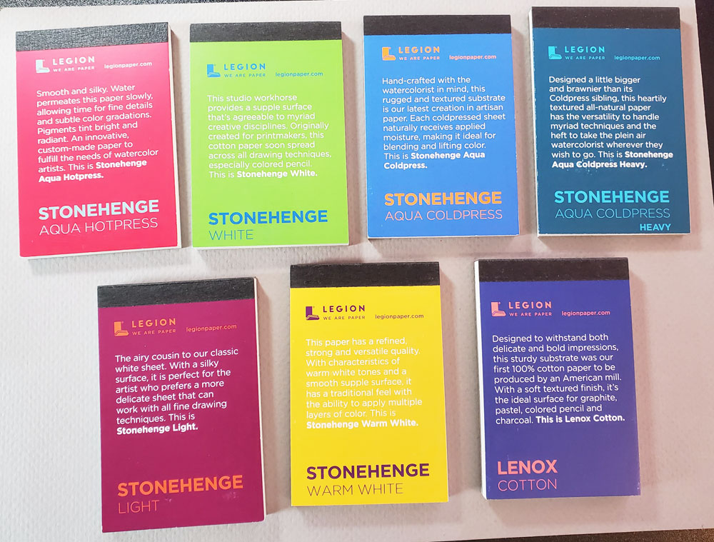
Notebooks & Paper:
- How to Organize Your Growing Planner Stickers Collection (via Planner Fun)
- They Sure Don’t Make It Like They Used To: Vintage Office Paper from The Well-Appointed Desk (via The Gentleman Stationer)
- Musubi Cosmo Air Light 83 Notebook Review (via The Pen Addict)
- The Carriage House Papermaking Kit: A Review (Part 1 of 2) (via The Pen Addict)
- Traveler’s Notebook New B-Sides & Rarities Sneakpeak (via Yoseka Stationery)
- Review: Muryō Bullet Journal Indexing System (via Comfortable Shoes Studio)
Art & Creativity:
- Explore the Louvre’s Entire Collection of 480,000 Artworks in a New Digital Database (via Colossal)
- 6 Themes That Defined Alphonse Mucha’s Art Nouveau Posters (via My Modern Met)
- I have a secret way to watch painting classes. (via Apple-Pine)
- Learn How Geometric Shapes Can Help You Draw Cartoon People (via My Modern Met)
- Swatchbook, a Book of CMYK Embroidery (via Kottke.org)
- Sashiko; the beautiful art of Japanese embroidery (via LoopKnitlounge)
- Schmincke Horadam Super-Granulating Watercolour Review (via Writing at Large)
Other Interesting Things:
- Dog Who Kept Stealing Stuffed Unicorn Finds Home With His Plushie Pal (via My Modern Met)
- Josephine Baker: a life of resistance (via Flow Magazine)
- Printable STOP ASIAN HATE Posters (via Huyen Dinh)
- How to up your remote working game for 2021 (via Creative Boom)
- 30 Best Typewriter Fonts — Free & Premium (via The Designest)
We need each other. Please support our sponsors and affiliates. Your patronage will let them know you appreciate their support of the pen community. Without them, and without you, we could not continue to do what we do. Thank you!