One of the best gifts that I received for the holidays was a lovely little custom wax seal stamp from Stampitude ($35-46). My husband saw an ad on Facebook (those really work!) and decided to have one made with my logo. He presented it to me a few days before the holidays as “just a little something I got you.” I was charmed and I’m having fun melting wax and sealing things!
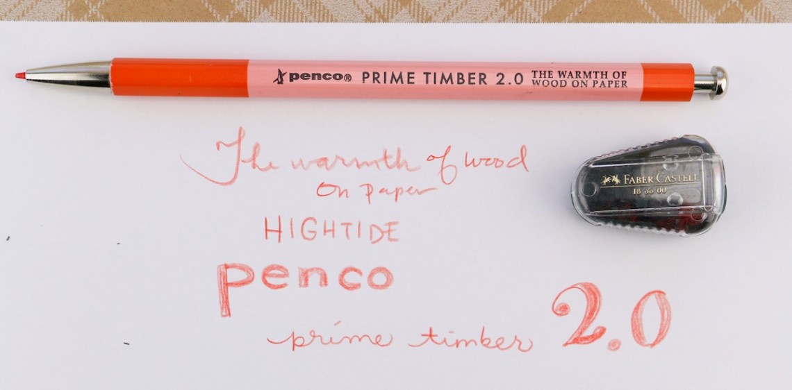
I have been meaning to write a review about this pencil for almost a year. I don’t entirely know why I’ve waited so long to actually put pencil to paper and write the review though. It’s not as if I was torn in my opinion about its performance. The Penco Prime Timber 2.0 by Hightide ($11) is the picture of simplicity. Its a soft, hex-shaped, woodcased mechanical pencil with a metal knock and conical end to facilitate the click mechanism. The advantage of this design is that it maintains the warmth of a woodcased pencil with the ease and convenience of a mechanical pencil.
Like a good pencil, the Prime Timber appears to be dip painted in two-tone gloss enamel and then stamped with branding info in black. I’ve used my Prime Timber long enough that some of the stamping is starting to wear away.
The only complaint I would have about Prime Timber is the join between the wood and the conical tip is not as smooth as it could be. Of course, it’s a mechanical pencil selling for about $10 so all other elements being equal, when in use, I don’t notice the transition any more than I notice the threads of a fountain pen so my issue is more aesthetic than in actual use.
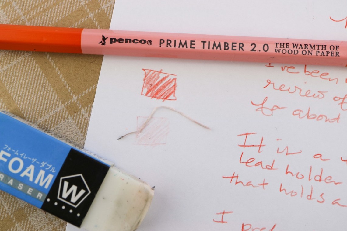
I was excited to acquire this pencil specifically because I like using red and non-photo blue drawing leads and they are easier to find in 2mm size these days. The 2mm leads are a bit more robust than smaller 0.5 or 0.7mm sized leads.
The Prime Timber came with a lead pointer which works really well. However, at the time of this review, I was not able to locate it so I used a Faber-Castell Pocket Lead Pointer. Either lead pointer is effective and does not take up too much space in a portable kit. The lead pointer that shipped with the pencil has a cap which keeps any loose material from transferring into your pencil case. The Faber-Castell does not have a cover but it smaller overall.
No reflection on the Prime Timber itself but the red lead I was using does not erase as completely with my trusty Sakura foam eraser as non-photo blue or traditional graphite lead. The advantage of drawing with red lead is that it can be separated out when scanned or photographed into the computer using RGB channel separation. Non-photo blue will not copy on a standard photo copier. Hence the name. And if scanned in black and white, it will not show up. Usually. Non-photo blue can be really light though so red can be easier to see on paper.
As a lefty, there is a secret bonus in using colored leads– they don’t smudge as readily as graphite. I can reap all the same benefits of graphite with colored pencil lead without the telltale smudge on the heel of my hand.
Generally speaking, I prefer using pencils on paper with a bit more tooth like Baron Fig, Leuchtturm1917, any sketchbook paper, standard 20# office bond, etc, over Rhodia which is a little too smooth. For consistency’s sake though, I did the writing sample on Rhodia though. It does make for a creamy looking writing sample.
I purchased the Penco Prime Timber 2.0 at Wonder Fair in Lawrence, KS. Similar models can be found online but I highly recommend trekking out to this gem on the prairie if you get a chance. Write Notepads features a fancier brass edition of this pencil for $14. It’s probably a little weightier and would feel a bit more like a drafting pencil as a result.
DISCLAIMER: Some items included in this review were provided free of charge. This review also includes affiliate links. The Well-Appointed Desk is a participant in the Amazon Services LLC Associates Program, an affiliate advertising program designed to provide a means for sites to earn advertising fees by advertising and linking to Amazon. Please see the About page for more details.
I have accumulated a lot of Ask the Desk questions lately so I decided to tackle a few of them in one GREAT BIG post. Please let me know if you have any advice as well. And submit your questions at the tab in bar at the top of the page. Thanks!
Gordon needs some help:
Dear Ana, I am a left-hander who has recently returned to using fountain pens. I have a lovely Franklin-Christoph Model 20p (the smaller EDC version) with a medium stub and, no surprise, have been dealing with the dreaded smudge problem. Before picking up again with fountain pens I’ve been using Doane 8x11pads, whose format I love, but it does smudge. Do you have suggestions for more fountain pen friendly and fast-drying paper and/or small international cartridges that dry fast (I’m partial to blue-black). Thanks so much for you help. Yours, Gordon
Gordon, the lefties at The Desk feel your frustration. Medium stubs are quite wet nibs so you have added to your struggle for dry time. Doane paper is not the worst for dry time overall so let’s start with some unconventional suggestions.
First, I wanted to start with items that could be added to your existing set-up. Rather than having to buy new notebooks or ink, these options might fix your issues.
Vanness White Lightning Ink Additive ($5.95) This additive can improve dry time of ink you already own. I have some tips for using it but a drop or two in 5-10ml of ink can improve flow and dry time. Adding White Lightning will require using a converter and bottled ink since you’ll have to decant your ink but it opens up your color options dramatically.
SmudgeGuard SG1 1-Finger Glove ($14.99) While this isn’t the most aesthetically appealing solution, many artists use a smudgeguard or slide an extra piece of paper under their hand to reduce smudging. Blotter paper works great but an index card make a fine substitution as well.
Paper alternatives:
Since you’re already using a paper not known to be too bad for smudging, I want to remind lefties in general, I recommend avoiding paper like Tomoe River which has longer than normal dry times if you are having smudging issues. I also recommend avoiding Rhodia paper, because it is very smooth, may also suffer from smudge issues. A good alternative may be Leuchtturm1917 which strikes a reasonable balance between dry time and being fountain pen friendly. Baron Fig could be another good option for lefties.
Other ink options:
Finally, there are some inks that have been especially formulated to be “quick drying” but will definitely limit your color options. If you want to pursue this route, look for inks that say “fast dry” on the label. However, utilizing standard inks (non-sheening/non-shimmer) and possibly adding White Lightning mentioned earlier may be all you need. Sheening and shimmer inks will often require longer dry times.
Ed asks:
I love the retro 51 rollerball refill. Do you know what pen bodies will work with it? While I love the Retro 51, sometimes I prefer a capped pen.
For a capped pen that takes the same Schmidt P8126/P8127 that is used in the Retro 51 pens (it’s just custom branded for Retro51) but capped, I recommend Kaweco Sport. It is available in plastics, metal and resin finishes for a variety of price points. All versions accept the P8126/8127 refill.
Most of the Monteverde Rollerball pens accept the Schmidt Short Capless sized refills though they will probably ship with the Monteverde branded version. It is essentially the same refill, just house branded for Monteverde just as the Schmidt refill is rebranded for Retro51.
The Schmidt 888 (plastic tube or the 5888 with metal tube) is the longer version of the same refill. There are a lot of brands that utilize this refill as its considered the standard size for European-style rollerballs. Pen Boutique has a great chart that lists compatible refills for many major brands.
Jeremy asks:
I would love some help in a pen recommendation. I am currently in grad school getting my PhD and find myself writing more than I ever had before. My normal go to for writing utensils has been my Fisher Space Pen Bullet when I want something with ink and a Pentel P205 when I want something with lead. The P205 serves my purposes well and I have no reason to replace that, however the Space Pen is absurdly uncomfortable when I find myself writing for days on end. Any recommendations for a pen under the $50 mark, the cheaper the better, that would be comfortable for extended periods of time when I write? Cheers!
Several years ago, I wrote a post for my Top 5 Pens under $30. I can’t say that my top choices have changed dramatically. Adding an extra $20 to the budget doesn’t necessarily alter things too dramatically but let me give it another glance.
If you are planning to use a rollerball, gel or ballpoint pen, and since you are using more slender pens and pencils in general, here are my best recommendations:
Caran d’Ache 849 (ballpoint starting at $19.95) This pen is similar in size and width to your favorite pencil. Its available in many colors and finishes and is a classic, just like your Pentel.
Retro 51 Tornado in Classic Lacquers (starting at $21) The Retro 51 is a classic as well, takes a favorite rollerball refill or a standard Parker-style ballpoint refill and is available in a ton of standard colors. Its slightly wider width may be more comfortable for longer writing sessions. Just be careful about carrying this pen in your pocket as the liquid refill may leak. For a capped alternative, see may recommendation to Ed in this post.
Lamy 2000 Multi Pen (€61.98) This pen goes slightly over your budget but contains four colors and is one of the most iconic pens available. It also allows for color changes as if by magic — just turn the pen so the color of your choice is facing up and depress the knock.
Refill Questions:
Chris asks:
I need a refill for an Anson Pen, I think it might be a 360?
I ended up learning a bit about the Anson Company in trying to locate a refill for this pen. If the pen is a ballpoint, it will most likely take a standard “stick refill” or a Cross threaded ballpoint refill like you might find at any big box office supply store (I found this photo below in an Ebay listing).
If the pen takes a nylon tip refill, a Waterman fibertip might fit. I’m guessing here based on the shape alone as I am not sure on the length required. While a slightly different shape, the Schmidt 6040 fineliner (or one of the many versions that are branded for Monteverde, Faber-Castell, et al) may be easier to acquire. The pen would also accept a Schmidt rollerball refill if the fineliner fit as well.
If you’re lucky enough to be near a brick and mortar pen store or a pen show, I recommend taking the pen there and trying out a few refills to find the perfect fit.
Gayle asks about other refills:
I want to put other colors in my Uni Jetstream 4+1 pen, other than black, blue, red, and green. Which refills designed for similar multi-pens will fit the Jetstream 4+1? If I understood your multi-pen FAQ video correctly, the Zebra Sarasa pre-fills are too short for the Jetstream 4+1, is that correct? Looking forward to your response!
Gayle, I don’t think I made a multi-pen FAQ video but now maybe I will. That said, let’s see which refills you can put in your Uni Jetstream 4+1 besides the standard blue, black, red and green.
Pictured here are options for the Jetstream 2+1 pen. Shown are the Uni Signo (Uni Style Fit) refills, both trimmed and whole; Frixion slim refills, with and without the end caps; Pilot Coleto refill without end cap but before trim; and standard Jetstream refills.
If you’re willing to apply a little hacking, the Uni Signo UMR refills (these are the Style Fit multi-pen refills) will fit. It just requires trimming a bit of the plastic off the end. The same with the Pilot Coleto refills. With the Coleto refills, you need to remove the plastic caps from the end, then trim to the proper length. Frixion multi pen refills will also fit but the little cap on the end will need to be removed and the refill trimmed to the proper length. These can all be trimmed with a sharp pair of household scissors, an x-acto knife or a pocket knife easily.
Lorraine has a refill issue too:
I have an old dual pen desk set from my grandfather that I would love to get working again. The refills are giving me trouble finding. It’s an old basic coppers colored spring load style. Kinda looks like one of those snap to size types. I can send a photo. What I’m really wanting to know is, is there a rollerball or gel or gel/hybrid that will work so the pens will be enjoyable to use? I don’t mind buying a few to try, but I’d love to get the search narrowed down. Thanks!! p.s. love listening to you on The Pen Addict!
Thanks, Lorraine. While I don’t have a copper version of this refill that you mentioned, I think it probably looks something like this:
Trying to find a non-oily ballpoint option is near impossible. The closest I found was a Pilot Dr. Grip which looked close. You’d probably have to save the spring from a previous refill to make it work however. While still ballpoint ink, its probably much better than the cheap oily ballpoint ink originally sold in the refills. The Uni Jetsream SXR refill might also work and is the best ballpoint refill. It might also require a little tweaking but it could be a contender. Wish I could have been more help. Readers, if you have any better suggestions, please leave them in the comments!
One distinctive characteristic of the popular Palomino Blackwing pencil is its trademark large, flat eraser and ferrule that make the Blackwing about an inch longer than conventional woodcased pencils. While I have many pencil cases, most are not quite long enough to accommodate new or freshly sharpened Blackwings. I’ve been looking for a trim case to neatly tuck away the several Blackwings I regularly have in rotation. The Sonic Kodawari ($22) seemed to fit the bill, especially since (according to JetPens) the word kodawari means “fastidious”!
Available in pink or black, the plastic-covered case is lightly textured. When the case is closed, it does, indeed, look fastidious. (I like to keep it on my desk upside-down, as shown in my photo; according to JetPens’ photos, the clasp would be on top.) The case stays secured with both a magnetic closure and a clasp.
I appreciate details such as the red top-stitching on the black case and the retro design element inside.
Inside are sensible compartments that keep things from shifting around too much and becoming disorganized. A hinged upper compartment holds six pencils.
The small compartment on top is just right for most bar erasers. I was eager to see how the Blackwings would fit, so I filled the lower space with six. Standard pencils would fit better below the eraser space, but the longer Blackwings lean against the eraser compartment wall with no problem.
I filled the hinged, upper compartment with six standard-length pencils. Although the ends lie on top of the Blackwings, the cover still closes adequately (there’s a tiny gap, which would be eliminated if all pencils were standard length).
Just for fun, I also tried filling the upper compartment with a few colored pencils. (This would be a sweet minimal portable sketch kit for me!)
Then I tried a different setup: several pens in the lower compartment and Blackwings in the upper hinged compartment. Everything fits better in this arrangement, with no gap when the cover is closed. (Pens will not fit in the hinged compartment’s slots.)
So – Blackwings, other pencils, a few pens, and an eraser, all in a sleek box that’s secure enough to toss into a backpack or large bag. Looks good – but if I were really going to take it with me, I’d want a small sharpener, too. Sadly, a KUM Blackwing 2-step sharpener does not fit, but a one-hole or two-hole wedge sharpener would easily fit in the eraser compartment.
I am using this on my desk, though, instead of taking it with me, so the sharpener doesn’t have to fit. The Sonic Kodawari is a tidy place to store a few favorite pencils.
(When I was a kid, I had a small box for my “special” pencils and erasers – back when I had so few special pencils and erasers that they would all fit in a small box. Not so anymore – I need a storage bin for all my “special” pencils and erasers and pens and . . .! But sometimes I long for the days of such simplicity. The Kodawari box gives me that illusion.)
DISCLAIMER: The items included in this review were provided free of charge by JetPens for the purpose of review. Please see the About page for more details.
Lipstick ink? What on earth does that mean? Taccia recently unveiled a new line of inks called Lip color ink, available in six colors: 01 Coral Pink, 02 Pink Beige, 03 Corinth Pink, 04 Burgundy, 05 Sunset, and 06 Rose Pale.
When I saw the lineup, I wondered why on earth someone would come out with inks that were so geared towards women and lipstick. Not that this tactic is a new one!
However, I was intrigued. This group of inks didn’t actually seem to be pointed at women but rather to the wide variety of shades available in lipstick as an inspiration.
I was pleasantly surprised by the variety in color with the Lip color inks. The names (along with the numbering system) were obviously inspired by classic lipstick colors and Taccia did a wonderful job recreating the colors of the named lipsticks.
Pink Beige is a Salmon colored – strong undertones of orange. Good shading and no sheen.
Taccia Coral Pink is one of my favorite shades. The undertones are less orange than Pink Beige, but as the pooled ink dries, a bit of the orange moves to the edges. Shading is more subtle and there is no sheen although there is a faint dark outline where ink pooled heavily.
Corinth Pink is very close to Coral Pink although it leans more toward brown undertones rather than just orange. Corinth Pink shows less shading and again no sheen. The same dark halo is present in Corinth Pink and shows slightly darker.
Sunset is my favorite of the Taccia Lip color line. The color is bright pinkish-coral ink, darker than Diamine Flamingo Pink. Gold sheen is present in the swatch as well as in writing but shading is minimal.
Rose Pale is darker than Diamine Hope Pink but looks very similar. A small amount of shading is present but no haloing and no sheen.
Taccia Burgundy is a rich rose pink, plenty of blue undertones. I was surprised to find that it was such a good match for a vintage ink – Sheaffer Persian Rose. Persian Rose is tough to find since Sheaffer discontinued it decades ago. Burgundy shows shading the the swatch, but I didn’t see shading in writing. A gold sheen is present although light.
The Taccia Lip color ink line is not water-resistant (no waterproof lipstick available!) but doesn’t bleed or feather on fountain pen friendly paper plus they are all easy to clean out of a pen (typically pinks and reds are not quick cleaning colors). All Taccia inks that I have used (including the Lip color line) are low maintenance inks that are neither wet nor dry.
I enjoyed the image that I was using lipstick in writing – Taccia did a great job matching these inks to actual lipstick colors. A few of the colors (Coral Pink, Sunset, Burgundy) are ones that are not commonly found – I already have a couple bottles ordered!
The Mark’s Edit had nice paper but I don’t think the format worked as well as I’d hoped. As you can see from the photo above, I didn’t really fill in much each week. I occasionally included some daily logging info to transpose into my Hobonichi. But clearly, this was not an effective tool for me. My work calendar is held hostage in Outlook and meetings get shceduled and rescheduled and moved so frequently that within a month or so, it became pointless to write them down. I ended up jotting the occasional note and list but mostly, the calendar was left blank.
The grey ribbon book mark indicates where the calendar ends and the blank “notes” pages begin. I didn’t use even one of the blank pages so I carried around a half-used notebook. I decided not to buy another one.
For the last month or so, I’ve been carrying my Hobonichi in a new Coal Creek leather cover. The material is lovely and the cover is well-constructed. The interior pen loop is not very effective. Even with a thin pen like the Caran D’ache 849, the cover doesn’t close. A pen loop on the right side would probably be more effective. The tolerances on the cover are really tight. If you over-stuff the Hobonichi, the cover will not lay flat either. It might work better with the Avec version as it splits the year into two smaller books. Cover aside, I actually logged my daily activities with the Hobonichi with very good regularity. I only ever missed a day or two and was usually able to back track and add in the activities from those days. I used Austin Kleon’s logging method to track my daily activities. Rather than using the Hobonichi for journaling or daily scheduling, I used it to write down things I did, what I watched or listened to and if I did anything or spent time with anyone. I like the method a lot and plan to pursue the same technique again this year.
In with the New
For my planner this year, I found this Simplicity Vintage Sewing Planner at Joanns. It caught my eye because of the vintage sewing illustrations on the cover and the discbound rings. The covers are thick plastic. I swapped out the plastic discs with more durable copper metallic rings. The calendars are undated but include the months at the top of each page. There are also pattern planning pages, swatch pages and a few other craft/sewing specific pages. The pages are half-letter/A5-ish in size. The tabs and cover extend further out so it’s definitely a larger planner than I used last year. The advantage of this planner is that I can remove pages I’m not using and add in new pages. The tab divider pages are inspiring to me with vintage illustrations and pithy quotes which I find super inspiring. I pulled out the weekly pages for the last half of the year and just left the monthly calendars to lighten the weight of the planner.
I don’t normally like spiral binding but there’s something super appealing about the discbound system. I have a hole punch I can use to add different pages and additional papers too. This means I can adjust the system as needed throughout the year.
As a replacement to my Hobonichi, I found this Knock Knock “You Got This” Journal. I had intended to buy another Hobonichi but when I saw this book, I couldn’t resist. The top of each page has a place to write the date and each page has dot grid in fluorescent orange. In the bottom corner is a “Productive Procrastination” square with a fill-in-the-blank question or word search, etc. Between the grey-on-grey, paper-covered hardcover with orange elastic and the puzzles, I was willing to take a chance on this notebook.
When I tested my favorite everyday pens, I was thrilled to discover that the book withstood fountain pen ink as well as an assortment of felt tip, rollerball and pencil.
No bleeding on the reverse of stock and I discovered a cache of inspirational quote stickers. Hopefully, this book will be as inspiring to use as the hobonichi. The pages are a little larger than the Hobonichi so I’ll have more room to log my daily activities.
As the previous decade ends and the new decade and year is welcomed, pen and stationery fans celebrate with lists, new notebooks, planners and journals and plans to make this the best year ever. I love starting new planners and journals at the start of the year. While I think “resolutions” in the traditional sense create unrealistic expectations, I love planning for the new year with goals and plans, be they big or small. I choose my reading challenge for the year (Goodreads) and pick new projects I want to complete (knitting, sewing and art). I can write down my projects and goals in my new planner while I still feel like I have a chance to pause and consider before the rush of my day-to-day steamrolls me. Do you make plans or resolutions for the new year?
This is also when we officially say good-bye to the Letter Writers Alliance as they close up shop and move on to new adventures of their own. Did the end of 2019 lead you to say good-bye to any projects, activities or commitments?
I like Kelly Rae Roberts (and others’) habit of selecting a word for the year. She chose “ease.” If you were to pick a word for the year for yourself, what would it be?


 I like Kelly Rae Roberts (and others’) habit of selecting a word for the year. She chose “ease.” If you were to pick a word for the year for yourself, what would it be?