

It looks like our stay-at-home/self-quarantining orders are going to last at least through the month of April. Many of us are learning to live a different sort of life, what seemed unthinkable a few weeks ago, is now starting to feel routine. Sometimes scary, sometimes just plain weird.
Last week, my hair stylist texted me to say that all appointments were cancelled through the month of April so my carefully maintained pink hair is starting to show its “true colors.” Weeks of sitting on the couch and not having to walk miles around an expansive office is starting to show as well.
So, I am ramping up my fitness routines: walking regularly now that the weather is warm and riding my stationary bike (yes, this time I mean stationary, not stationery) to help stave off the COVID-20 (as in pounds).
I am maintaining my logbook which I use to track the things I do each day. It used to include things like “lunch with Stephanie” or “dinner at the Tompkins, mmmm, pizza!” but now is a list of the films and tv shows I’ve watched, books I’m reading and knitting projects I’m working on.
Are you tracking anything? Or journaling?
Post of the Week:
- Why Hobbies (Still) Matter in the Midst of a Pandemic (via Inkpothesis)
Pens:
- Eyes on Iopenna, designed for Visconti by Gaetano Pesce (via Penquisition)
- Review: Pilot Custom 743 Fountain Pen & FA Nib (via The Pencilcase Blog)
- Curidas. 2. Contenders (via Crónicas Estilográficas)
- Conway Stewart: the pen that the WWII could not silence, refuses to be cowed down by Corona.
(via Inked Happienss) - Regalia Writing Labs Sequel Nib (via Write eXperience)
- Pelikan’s ST Nib: The Reason Behind The Flex (via The Pelikan’s Perch)
Ink:
- Vinta Inks Blue Floss Perya Stole My Heart. (via Gourmet Pens)
- Creating a colour wheel with four fountain pen inks (via Fountain Pen Ink Art)
- Diamine Coral (via Mountain of Ink)
- Diamine Music Set Vivaldi & Strauss (via The Gentleman Stationer)
Pencils:
- Vintage Beauty: Corgie 907 and National Pencil Day (via Writing at Large)
- Jerusalem Pencils “Park Avenue” Copy Pencil (via Writing at Large)
- Vintage Beauty: Eberhard Faber Colorbrite (via Writing at Large)
- Notable Pencils: Utrecht Color (via Fueled by Clouds & Coffee)
Notebooks & Paper:
- Fountain Pen Friendly vs Fountain Pen Fun Paper (via Fountain Pen Love)
- The Best Paper for Everday Writing, Part I: Best Hardcover Notebooks (via The Gentleman Stationer)
- Chris Russell’s Humanity Notebooks (via Notebook Stories)
- Endless Works Recorder Notebook Review (via Notebook Joy)
- Fabriano Ecoqua Gluebound Notebook Review (via Notebook Joy)
- Tracking Yearly Goals in a Notebook (via Notebook Stories)
- The five minute journal: simple positivity (via Flow Magazine)
Art & Creativity:
- Keeping an Artist’s Journal Class–FREE (via Cathy Johnson)
- Bluprint is Offering Free Creative Classes to Help During COVID Lockdown (via My Modern Met)
- What is on my table? (via Apple-Pine)
- Art Toolkit by Expeditionary Art Review (via Doodlewash)
- Shuttered Museums Are Sharing Flower-Inspired Artwork to Spread Beauty (via My Modern Met)
- Coronavirus Creativity Guide (via Sketchbook School)
- Video: Leonardo Periznieto: Lynx (via @montegrappaitalia)
- Eight marvelous and melancholy things I’ve learned about creativity (via TheOatmeal)
- Photographer Discusses Running a Creative Business During Coronavirus (via My Modern Met)
- Review: Fabriano 5 Watercolour Paper (50% cotton) (via Parka Blogs)
- Daler-Rowney Watercolor Swatches (via Jane Blundell Artist)
- Chris Ware’s Moving Pandemic-Themed Cover for the New Yorker (via Kottke.org)
Coloring:
- Comforting coloring page: Embracing your comfort zone (via Flow Magazine)
- Free Coloring Pages for All (via Doodlers Anonymous)
- 10 free coloring pages: Download and grab your crayons (via Think.Make.Share.)
- Counter-Print’s new downloadable colouring books featuring Anthony Burrill, Malika Favre, Zipeng Zhu, and more (via Creative Boom)
- Comforting coloring page: Tiny pleasures (via Flow Magazine)

Other Interesting Things:
- Why Mundane Moments Truly Matter (via NYTimes)
- Quarantine Book Club (via QuarantineBookClub.com)
- Bored in Quarantine? Here’s a New York Scene You Can Color (via NYTimes)
- The completely correct guide to vacationing at home (via Washington Post)
- Online Exhibition at the WWI Museum (via The World War)
- 12 Easy Ways to Take A Digital Detox (via Rediscover Analog)
- Pen palliates Pain – fighting the lock-down, fountain pen in hand! (via INKED HAPPINESS)
- Simple, beautiful, easy-to-use pen holder “Stainless steel pen holder for 1” (via No stationery, No life.)
- The 5 Simple Steps to Learning Calligraphy (via The Postman’s Knock)
- Update #2 – Using a Typewriter to Write News From Home (via oz.Typewriter)
- Month Theme for April 2020: A New Focus Each Week (via Quo Vadis Blog)
- The Top 20 Stationery Blogs (via Original Content Books)
- FREE April 2020 Digital Wallpapers prove it: Spring is here (viaThink.Make.Share.)
- Analogue v Digital – Book stuff (via Nero’s Notes)
- Interview with George Kartsotis – Owner of Retro 51 (via Original Content Books)
- “A chance to catch a breath”: Danielle Pender on why we should avoid the pressure to create (via It’s Nice That)
- Goats Take Over Empty Streets Of Seaside Town In Wales During The Coronavirus Outbreak (via Design You Trust)
- Ikea Instructions for COVID-19 Quarantine (via Kottke.org)

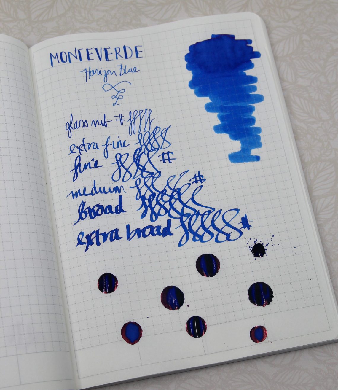
 As it turns out I don’t seem to have this exact blue in my ink stash! When I went looking for comparisons, the only thing that came close was
 I’m not sure what my next blue ink will be, but I couldn’t be happier with Horizon Blue!


