Today, I am spending the day watching the Adobe 99U Conference: The Creative Self. Usually, the conference is held in NYC but because of this year’s pandemic, the conference was held online and Adobe opened it up for free to anyone who wanted to participate. There is so much uncertainty in the creative field (there’s a post below suggesting a loss of 20% of all creative jobs in the UK) as tis true in so many other fields. Many of the topics deal with staying creative and fighting burnout which can apply to anyone whether you work in design or another field. We are all creative thinkers so check it out.
Strangely, there are two disappointing pens in the pen review section. We, as pen reviewers, tend to like most pens but we also know that it’s important to let readers know when pens are not good. Both of these pens are not one-off cases. I’ve seen other reviews of these products that suggest that these were not isolated incidents. I hope that both manufacturers are seeing this and planning to redesign and retool these products.
We will continue to post about both Black Lives Matter and the pandemic as it crosses our path and seems relevant and important. I want to see more BIPOC in the creative and pen community and getting more recognition for their contributions. The pandemic continues to effect our economy globally as well as our health and our communities (both digitally and in the real world) so I’ll include links where it seems appropriate.
Pens:
- Sailor Durian Musang King Fountain Pen Inked With Louis Vuitton Ink! (via Gourmet Pens)
- Video: Hardy Pen Wrights Pink Scale Juma Custom Fountain Pen (via Gourmet Pens)
- Conklin Duraflex Elements (Water) with Omniflex Nib: A Review (via The Pen Addict)
- Platinum Curidas – a Surprising Cracking Good Pen (via dapprman)
- Tactile Turn Side Click (via The Clicky Post)
- The Unsung History Of Pelikan, Inc. USA (via The Pelikan’s Perch)
- How To Choose The Best Pen For You (via The Gentleman Stationer)
Ink:
- L’Artisan Pastellier Callifolio Swatch Tests – the Pinks, Purples and Greens (via Nick Stewart FOUNTAIN PEN INK ART)
- Diamine Eau de Nil (via Fountain Pen Pharmacist)
- Strange Times (via Crónicas Estilográficas)
- Sailor 50 States California (via Mountain of Ink)
Pencils:
- Blackwing One-Step Long Point Sharpener Review (via The Pen Addict)
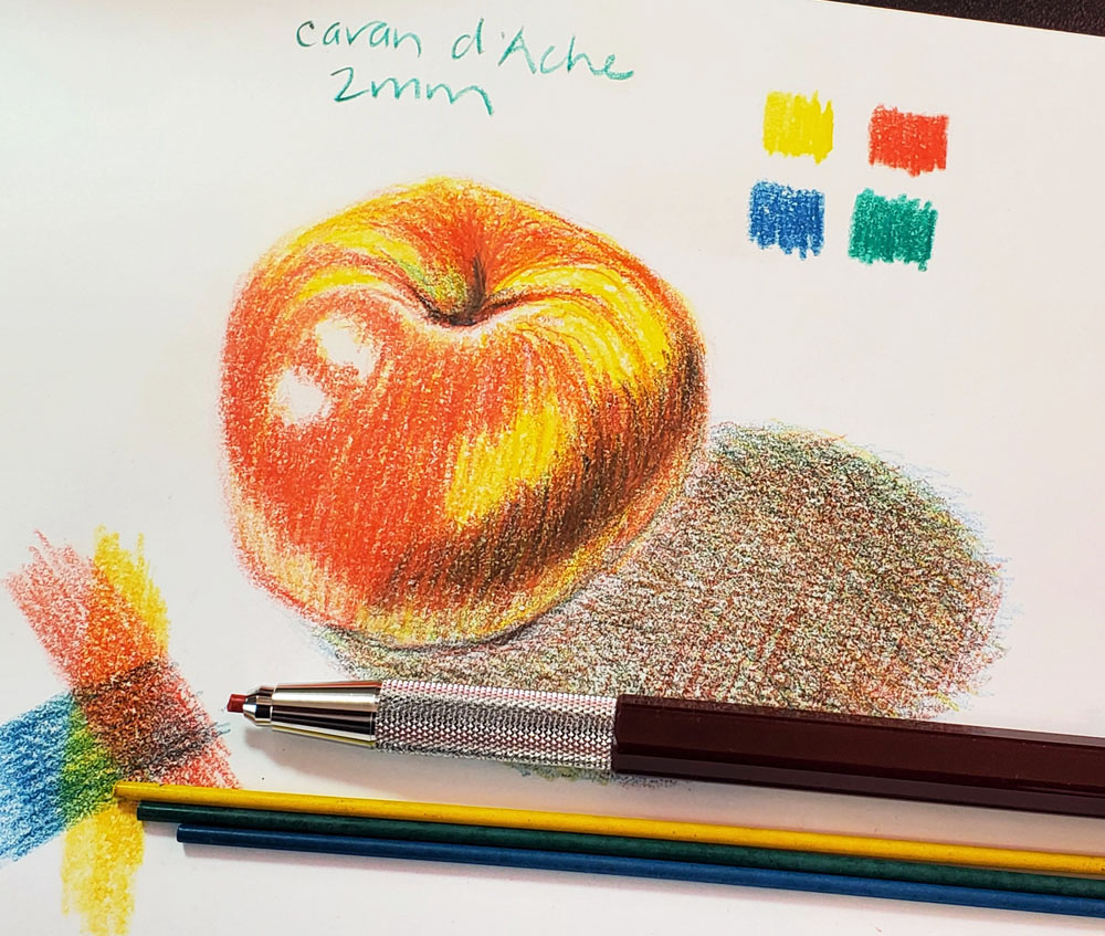
- Vintage Colored Pencils: Caran d’Ache (Non-Watercolor) (via Fueled by Clouds & Coffee)
Notebooks & Paper:
- MUJI’s virtual bullet journal workshop demonstrates that journalling doesn’t need to be perfect (via The Peak)
- Endless Work Endless Recorder & Brooch (via Penquisition)
- Some Thoughts on Productivity Systems (via Writing at Large)
- The Study: Issue #32 — Keeping a Commonplace Book (via The Cramped)
- How I Achieved Planner Peace (via Planner Fun)
- How To Use A Planner When You Have No Plans (via JetPens)
Art & Creativity:
- 13 of the Best Drawing Pens for Professionals and Beginners (via My Modern Met)
- How to Draw 3D Letters (via The Postman’s Knock)
- Watercolors in use (via José Naranja)
- On my table and a new solution for the old problem (via Apple-Pine)
- African American Photographer’s Archive Added to Library of Congress (via My Modern Met)
- More sticky note collages (via Austin Kleon)
- One in five UK creative jobs will be lost as a result of the Covid-19 emergency, says report (via It’s Nice That)
- A Digital Archive Mines the Depth of Design (via Hyperallergic)
- Creative Boom’s recommended summer reading list for 2020 (via Creative Boom)
Other Interesting Things:
- 5 “Splendiferous” Facts About Beloved British Author Roald Dahl (via My Modern Met)
- Guest post: Disassembling a Smith-Corona Zephyr (via The Typewriter Revolution blog)
- LEGO Ideas NASA Apollo Saturn V Set (via Tools and Toys)
- A New Resource Center Opens in Gee’s Bend, Home to Famous Quiltmakers (via Hyperallergic)
- 8 ways to be strong in a digital world (via Flow Magazine)
Black Lives Matter:
- Creative Resources + Initiatives in Support of Black Lives Matter (via BOOOOOOOM!)
- Hello Kitty Speaks Out in Support of Black Lives Matter (via Spoon & Tamago)
Coronavirus/COVID-19:
- Thai Mom’s Startroopers Face Shields Protect Against Coronavirus And Villains (via Design You Trust)