
When your brand new Caran d’Ache 849 Fountain Pen ($52.00) in Fluorescent Pink matches your current knitting project.

When your brand new Caran d’Ache 849 Fountain Pen ($52.00) in Fluorescent Pink matches your current knitting project.

I am shocked at how long it’s taken me to write a review about an “under-$50” fountain pen. Sometimes, I think reviews about pens in this price range require the greatest attention because they are the pens that can make-or-break a fountain pen fan. Should someone purchase just the right fountain pen in this price range, they will most likely become a lifelong pen fan. However, if they get a dud, it could become the end of the interest in fountain pens altogether. Maybe that’s why I took so much time putting this review together.
The new Sailor Compass fountain pen ($39.20) is Sailor’s latest low-priced fountain pen. I’m still trying to figure out the difference between the Compass and the Shikiori fountain pen which appears to be a rebranding of the ProColor. There are higher end models of the Shikiori with gold nibs and Pro Gear styling so the product line is confusing, to say the least.
The Compass, on the Sailor’s official website for Japan or the UK (global), do not even list the Compass so, as I write this review, I have to wonder if Sailor will even continue with this particular pen line. Do you see why it’s taken so long to write this review? It’s still available in the US and I’ve had questions about it. So… onwards we go!
First, let’s discuss the features and packaging.

The Compass ships with a converter and two cartridges (nice touch, thank you!). The converter that shipped with my Olive Transparent had a green twist mechanism (color coordination, another bonus). I suspect that Sailor has attempted to match the converters to each Compass pen. It’s a nice touch.

The converter is in the pen in this photo (sorry, I got ahead of myself!). The pen and accessories come in a box, lined with foam and wrapped in a clear plastic sleeve. IMHO, the packaging is a bit excessive for a pen at this price point. It also meant that I’m left with non-recyclable materials (at least in my part of the world) — foam, plastic and coated board box. Sigh.


When placed next to a (from left to right) ProColor, the Compasss, a different model of ProColor and a Pro Gear Slim, it’s clear to see some aesthetic differences. The Compass more closely resembles the ProColor on the left than the one on the right. The black ProColor on the right looks much more like the new Shikiori models listed on Sailor’s web site with the wider cap band and metal trim around the point where the clip joins the cap at the top. The Compass and the clear ProColor both have less metal hardware on the exterior of the pen.

When looking at nibs (ignore the 21K nib on the clear ProColor. I upgraded it. This is not the stock nib AT ALL!), the two nibs in the center show the visual differences between the current Compass nib and the earlier ProColor steel nib. While the earlier ProColor nib was narrow, it looks like it was molded to be a lot more curved and there is more decoration pressed into the front of the nib.While the decoration doesn’t necessarily make the earlier ProColor a better nib, it certainly makes it appear that Sailor put more care into making it.

This all leads up to my initial writing tests with the Compass MF (medium fine) nib. I prefer nibs with a little tooth, a bit of feedback to them but this nib tested the limits for me. I had to continually turn and twist the nib in an effort to find a good writing angle that didn’t feel scratchy or that didn’t require excessive pressure to get ink on the page. In general, this is not my experience with the higher end Sailor pens. The lightest of touches will deposit ink on the page with most Sailor 14K and 21K nibs and that is how I prefer it. So struggling to ink on the paper — let’s just say, I was getting frustrated. I also realized it was unfair to compare a steel nib to $100+ gold nibs. But I know that Pilot Metropolitans and Preppy pens are far easier to use. My Platinum Carbon Desk Pens do not cause me this kind of difficulty either. None of these pens cost as much as the Compass so either I got a dud nib (it happens) or the Compass nibs are sub-par.

I got my loupe out and took a look. Now, I know that for a lot of the people buying a pen like this, doing something like this is beyond their experience of expertise but, after some debate, I decided it was worth doing. If someone new to pens buys a Compass and runs into this issue, can they fix this on their own? So, if you look at the photo above, the tines have a little bit of space between them near the breather hole but as you look closer to the tip, there’s less and less space between the tines. It basically chokes the flow of ink.

I did two things. I flossed the tines with a brass shim* and then I used my finger to gentle pull one tine forward just a bit. Using your fingers can sometimes be your best tools. Notice how now you can see the line between the tines all the way from the breather hole to the tip of the nib?

My second attempt after opening up the tines just that tiny bit made the actual act of writing much less of a chore. The nib was still a bit scratchy so the next step would be to attempt smoothing the nib on some micromesh but just getting the ink out of the pen made the pen usable and that’s huge.

When comparing the Compass to other fountain pens in the $50-and-under category, the competition is fierce. My instinct it to compare the Compass to its Japanese rivals: Pilot and Platinum first, but there are also many European makers in this category as well. The pens pictured above are not all the options in this price range but certainly represent a good range of plastic and aluminum barrel as well as a variety of price points.
From left to right: The Faber-Castell Hexo, Faber-Castell Grip, Pilot Metropolitan, Sailor Compass, Pilot Prera, Lamy AL-Star, and Platinum Preppy.
Capped, the Compass is similar in length to the Hexo, Metropolitan and Preppy measuring approx. 5.25″ (133mm). Uncapped, the Compass is 4.3125″ (109.5mm). With converter filled, the Compass weighs 16gms capped or posted and 11gms uncapped. It’s a pretty light pen, but well balanced and not too big, even in my small hands.


Posted, the Compass is most similar in length to the Metropolitan at 5.75″ (146mm).
At $49MSRP ($39.20 retail), the Compass is up against Pilot and Platinum specifically in the under $50 Japanese fountain pens which is not somewhere that Sailor has really tried to compete much in the past. Pilot has dominated this market with the Pilot Metropolitan. Pilot also has their budget-friendly Varsity and more recently the Explorer. Platinum woos many with their budget Preppy, fancier Plaisir and more recently with the Prefounte and Procyon.
And when shopping for that “first big fountain pen” consumers aren’t likely to limit themselves to just Japanese brands so Faber-Castell, Lamy, Kaweco, Diplomat, TWSBI and Caran d’Ache all have legitimate candidates in this price range.
My experience with the Compass would need lead me to recommend that someone run out and buy one. Of course, I have a sample size of one and I could be the person who got the dud. I say this as the person who has the TWSBI curse. Ask me about it sometime. So, I would just say that, at the moment, it is not bumping any of other fountain pens off my “best pens under $50” list.
*Brass shims (0.002″ / 0.05 mm) can be purchased from hobby supply stores that specialize in model building and miniatures. Or try using a small piece of acetate from an old 35mm slide or negative.
DISCLAIMER: Some items included in this review were provided free of charge by Goldspot Pens for the purpose of review. Some items in this review include affiliate links. The Well-Appointed Desk is a participant in the Amazon Services LLC Associates Program, an affiliate advertising program designed to provide a means for sites to earn advertising fees by advertising and linking to Amazon. Please see the About page for more details.
Preview by Tina Koyama
Although I’m not following any prompts or even using group hashtags this year, I decided to participate in Inktober by continuing my ongoing series of daily hand drawings in ink. (I started the series in March in response to the pandemic; you can read about it here. Sketches are posted daily on Instagram.) In the upcoming weeks, I’ll be reviewing several inky products that I’ve been using, but I thought I’d give you a preview now while Inktober is still young, in case you want to give them a try!
Dip pens have never been my forte, and the last time I used one to draw was when I took a pen and ink class several years ago. So it was with some trepidation that I dipped the first Tokyo Slider Nikko Comic nib into a bottle of ink. I’m used to juicy, broad nib fountain pens and soft, forgiving pencils – the fine nibs in this set woke me up!

Regular readers of this blog may recall that I have a penchant (AKA obsession) for brush pens of all kinds. I found one I still hadn’t tried – the Pentel Pigment Ink Brush Pen with an extra-fine tip – so of course, I had to.
Boku-Undo E-Sumi watercolor inks look and act like watercolor paints, but they are actually tinted sumi inks. These are fun! The lovely, muted “shadow black” tones don’t show up well on the colored sketchbook pages I have been using for my hand drawings, but I’ll show you the colors on white paper in the full review. I’m using them with a Pentel Design Fude Menso brush with a very fine tip.


Stay tuned for the full reviews. What are you using for Inktober?
 Tina Koyama is an urban sketcher in Seattle. Her blog is Fueled by Clouds & Coffee, and you can follow her on Instagram as Miatagrrl.

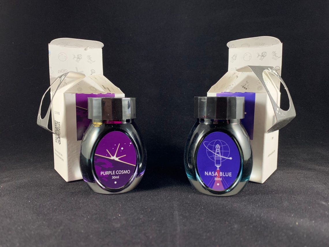
New inks are exciting; surprise new inks are even better! I received a package recently from Dromgoole’s that contained two new, surprise inks by ColorVerse – Purple Cosmo and NASA Blue. These inks are both Dromgoole’s exclusive inks that are available now at $15 for 30mL each either online or at their physical store in Houston.

I have to say, I enjoy this shape of bottles from ColorVerse more than the larger, round bottles. Space is used more efficiently with this shape although only an issue if you have WAY too many inks!
Of course, the first ink I tried was Purple Cosmo. Purple is always the best!
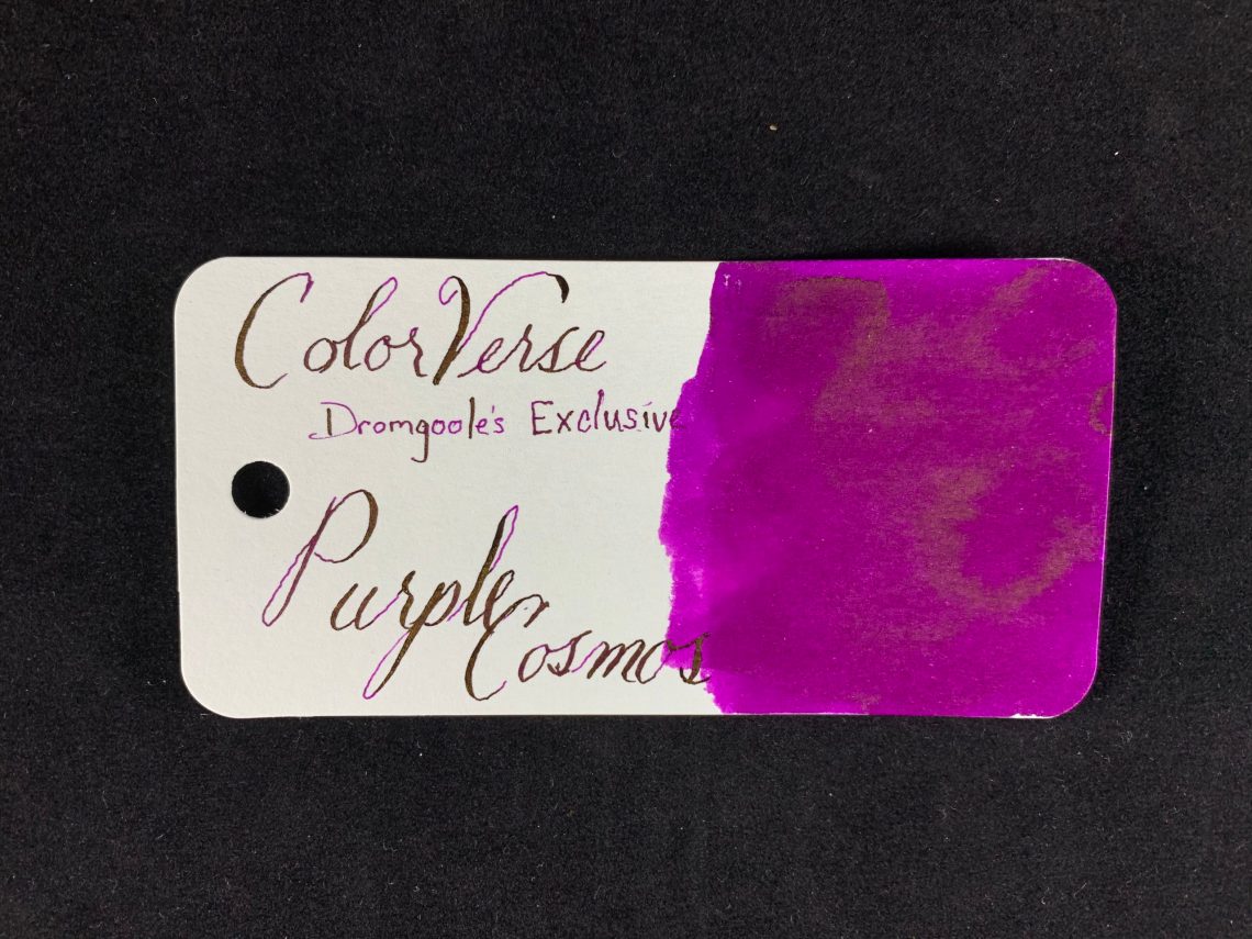
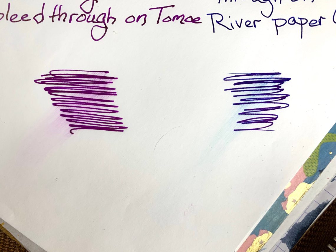
Please excuse the spelling on the swatch card – the name is actually Purple Cosmo. The ink is a bright, blueberry juice color with a gold sheen and it writes a bit towards the side of wet. I didn’t have any problem with feathering or bleed through on the Col-o-ring nor on Tomoe River paper (old).

Purple Cosmo is very close to Rohrer & Klingner Solferino but has a bit more sheen. Not nearly as much as Sailor Manyo Akebi, though.
NASA Blue is the second ink, a deep blue that leans towards blurple-y-ness with lots of pinkish red sheen.

The closest ink in my collection is Diamine Blue Edition Festive Cheer, including the color of the sheen. NASA Blue writes on the dry side of normal and also didn’t feather nor did it bleed through on the Col-o-ring cards or Tomoe River paper (old).

One issue with highly sheening inks is smearing. I did notice some smearing in the title Purple Cosmos of my writing test where I didn’t think I had touched it.

I specifically tried to smear a couple swatches of ink – both of these were scribbled onto the paper, allowed to dry for 12 hours and then purposely used a finger to smear. The result was definitely smeared although not as much as I had expected.
Compared to the amount of sheen, I think the smearing amount is acceptable.

In my longer writing, I had only the smearing in Cosmos at the top. The blue smears on the right side were made by ink that was on my hand before writing began. However, my hand never touched ink – it would look very different for left handers.

To sum up, I enjoyed these two inks and will absolutely use both again. Purple Cosmo is my favorite – bright, purple, gold sheen and a little on the wet side. I appreciate being given the chance to review these by Dromgoole’s – thank you! If you would like to purchase one or both of these inks (ESPECIALLY the purple), you can find them on the Dromgoole’s site – NASA Blue and Purple Cosmo.

DISCLAIMER: The inks in this review were provided free for the purpose of reviewing including the Col-o-rings which are provided to me by Ana because she knows she can keep me writing all the time in exchange for the wonderful cards. Please see the About page for more details.


This weekend Sailor North America is hosting its first virtual online ink show. Registration to participate opened on Friday, Oct 2nd at 9am Pacific. For a fee of $20 individuals are offered an opportunity to meet with a Sailor Ink expert 1-on-1 for 15 minutes to purchase a bottle of the “2020 Exclusive Pen Show Ink” (20ml) combined with any additional ink purchases. During the consulting session, attendees would also have access to any of Sailor’s inks currently available in the US including: Shikiori, Manyo, Bungubox, and Kobe.
More details and links to registration slots (if any are still available) can be found at sailor.pen.northamerica
As the pandemic continues, we are all searching to find ways to share our passions, keep our businesses thriving (or at least solvent) and keep connected with each other in a continually isolated existence. I think we all went into this with a certain amount of grit and determination but as time goes on we are all feeling the burdens of our losses great and small.
We all need each other. Please support our sponsors and affiliates. They help keep this blog going. Without them, we would not have products to review or a server to house our content. Your patronage of their shops, services and products will let them know you appreciate their support of the pen community. Without them, and without you, we could not continue to do what we do. Thank you!

Recently I’ve been doing A LOT of writing. I’ve been sending postcards to voters about the upcoming US election at the rate of 10-15 per week.
The upcoming election in the United States is a very big deal. Never have the two candidates been more divergent, and given issues like public health, the economy, immigration and more there’s a lot at stake. And I’ve felt like I needed to get involved in some way.
So I’ve been writing postcards to voters. In today’s day and age (and in the US) we receive tons of pre-printed direct mailings about which candidates to vote for. But how often do we receive a handwritten postcard encouraging us to do our civic duty? My intent in simple: encourage people to vote because their voice matters.
And so each week I’ve been sitting down with my Ink Joy Gels (who doesn’t love a little color?), some USPS pre-paid postcards, and writing to people I don’t know to encourage them to make their voices heard.

I’ve been using a lot of dark and pastel inks lately, and earlier this week I suddenly decided enough was enough. I needed some pink. And not just any pink… I wanted bright, in-your-face, rebelling-against-your-bad-day pink. It also occurred to me that I didn’t have a single Sailor inked up, but I didn’t really feel like any of my Sailors matched up well with the type of pink I had in mind.
Did I choose to give up on the perfect pink, or did I ditch my Sailors for another pen brand?
Neither. Instead, I grabbed one of the smallest but most impactful accessories in my pen collection. Then, I reached for my hot pink Franklin Christoph, carefully borrowed a nib from one of my Sailor Pro Gears, and just like that, my pocket 66 was eye-dropped with rebellious bright pink and fitted with one of my favorite nibs.

Flexible Nib Factory makes a variety of nib housings and feeds that allow you to take your pen customization to the next level. The housings are specifically designed to take nibs from some of your favorite brands like Pilot, Sailor, or Platinum, and fit them into standard Jowo or Bock housings. This opens up all kinds of new possibilities, including allowing you to use some the best nibs on the market in some of your favorite custom pens.

In addition to custom housing, Flexible Nib Factory makes replacement housing and feeds for Jowo nib units. The goal here is to keep the Jowo nib, but change up the feed and housing- either for the sake of asthetics or functionality (or both!). One option is a clear acrylic feed which looks particularly good in clear demonstrator pens.

You can also purchase ebonite feeds and housings, which improve ink flow and even come in a red version. These ebonite feeds are especially useful for flexible nibs, as they help provide a more steady and consistent ink flow as you change line variation on the page.

The pocket 66 (or any Franklin Christoph pen that takes a #6 sized nib) is a particularly great choice for the swap as the majority of Flexible Nib Factory’s custom housings do not allow for the use of a converter or cartridge (i.e. to use the feeds you must be able to eye-dropper the pen). This means you want to make sure your pen of choice does not have a metal body, section, or threads.
The hot pink match-up sent me down a bit of a rabbit hole. I quickly had an army of pocket 66s fitted with a variety of Sailor nibs, Platinum nibs, custom nibs, and crazy grinds.

A couple of notes:

Flexible Nib Factory includes detailed instructions on their site, but if you’ve never fully removed a nib, you may want to watch some videos or read some articles about your specific pen and practice on pens at the lower end of your collection first. TWSBI Eco nibs and feeds are friction fit into the section and removed in basically the same fashion as a Sailor or Platinum so they may be a good first candidate if you have one on-hand (BUT TWSBI feeds are significantly more fragile than Sailor or Platinum feeds- so you have to be extra careful to not push too hard on the feed against the nib).

Once you get the hang of things, swapping nibs between pens could not be any simpler, and Flexible Nib Factory housings and feeds are one of my favorite ways to bring even greater variety and customization to my pens. Everyone needs a hot-pink eye-dropped Sailor-Franklin Christoph frankenpen in their life this week, don’t you think?

DISCLAIMER: The items included in this review were purchased with my own funds. Please see the About page for more details.