At the beginning of this year, I looked at what was going on in the world around me, as well as my desire to journal a bit, and decided that I was tired of saving the good supplies for “one day” and that there was no time like the present. So I pulled out the Musubi notebook I had been hoarding since the Chicago Pen Show in 2018 and put it to good use.
I’ve only journaled half a dozen times so far, but I’ve used this process and a few cool tools (detailed at the bottom) to help me along the way. I end up primarily tracking my knitting projects, but I’ve also taken to adding my thoughts about what’s going on in the world, and every now and again a quote or two. While this is still a work in progress, I like that there isn’t the pressure of a dated journal so I can write whenever I want. I also love that the blank pages allow me to add in whatever media I want to use.
It feels good to use my tools and also to track what I’m up to over time. Whether this journal lasts me 1 year or spans 10, this is a habit I’m working on keeping!
Although travel continues to be limited- I have had the chance to go on a few small trips over the last couple of years. On a recent trip, I was reflecting on how much my travel kit has changed over time. In the past, I was inclined to bring ten or more fountain pens, an entire small bag of other supplies, and several pounds of notebooks. Not anymore! I use my stationery supplies a lot on trips, so I want to have enough with me- but too much is just extra weight and complexity. I’ve pared it down to a single pencil pouch and single notebook. In fact, recently this kit is all I’ve been carrying back and forth to work with me each day. That’s not typical for me, but it has reminded me how much I enjoy this group of items! Here’s a breakdown of my current set-up:
Pens
Uniball Signo Dx 0.28- Blue Black
Sometimes I alternate between black and blue black here- but no matter how much I minimize my travel kit, this Uniball Signo Dx is the pen that will always go with me. Could I go a day without this pen? Sure. Do I want to? Absolutely not.
Uniball Signo Dx UM-153- Black
There are use cases when I want a pen that lays down a thicker line. I really tried to diversify my kit with different brands or types of pens to fill this spot (sometimes I even rotate in a Retro 51), but I keep coming back to this one. Of note, depending on your needs the gold and white versions of this pen are also excellent.
Spoke Roadie
Sometimes you just “click” with a pen and this pen is that pen for me. The magnetic cap is satisfying, the size just works for me, and the refill options are really good. I sometimes use a compatible refill here, but most of the time I hack a 0.38 Signo Dx refill into this pen body. Is three versions of the same pen too many? No, I really don’t think so.
Platinum Desk Pen
It’s hard to explain my love for this pen. The first time I used this pen extensively was a Well-Appointed pen weekend. Even though there were basically an unlimited number of pens on the table to try, I could not put this one down. I guess it’s ironic to use a desk pen in a travel kit, but Ana taught me to cut down the pen to a more portable size, and now it’s the perfect travel companion. I almost always have this inked with Platinum Carbon Black.
Tombow Fudenosuke Brush Pen
Traveling is the time I’m most likely to take time to attempt to sketching. Because of this, I like to have a brush pen with me- and this Tombow is the one I most frequently take along. In my opinion, it’s one of the brush pens that’s easiest for me to control and use as someone who doesn’t often practice brush pen use.
Sharpie Marker
It’s a classic for a reason. There are times that just no other pen will do.
A Fountain Pen
This is the part of my travel kit that most frequently changes. Sometimes it’s a TWSBI Eco or a Sailor Pro Gear or Platinum 3776. It depends on the kind of trip I’m going on, how I’m traveling, and what I’ve been using recently. But there’s always a fountain pen. And unlike the early days, I only bring one. It keeps the kit compact and simple, and it’s gives me more time with the one pen I choose to bring.
Pencils
Blackwing Natural
This is my favorite Blackwing pencil. I almost don’t need any more special editions after this one!
Blackwing Pencil Cap
There are cheaper pencil caps that work just as well, but it’s a perfect match for the Natural and it’s a looker. You don’t need one, but if you have one it deserves a place in your travel kit.
Caran’dAche Luminance 6901 Colored Pencils
These colored pencils are pricey, but buying a few at your local art store is well worth it in my opinion. A lot of the pens above are black or blue black- so these colored pencils bring some much needed color to my kit. The colors that I bring change almost every trip, but I usually bring 3-4 with me.
Sonic Cupot Pencil Caps
These are much more reasonably priced than the pencil cap above. They do show some wear over time, but are they are fun and perfect for carrying colored pencils.
Accessories
SumoGrip Eraser
This is a pretty chunky eraser, but I still feel like it deserves the space in my kit. It’s retractable, and it’s just a great all-around eraser.
Blackwing Sharpener
This is not my favorite sharpener. But it strikes a good balance for me as something that can give me a decently long-point on a normal pencil and sharpen the colored pencils in my kit in a pinch. It contains the shavings and is extremely sturdy. I don’t use it often at home, but I tend to leave it in my travel case and carry it with me.
Shorthand Pencil Pouch
I have way too many pencil pouches, but this is the one that gets the most use by a long-shot. Shorthand is a shop that I’ve had the opportunity to visit in person, and absolutely loved. This pouch is the perfect size, compact but still manages to fit a surprising number of items. It’s long enough to fit a new Blackwing pencil with a pencil cap. It also has just enough structure to make it very useable unzipped on a table top. This pouch is what holds my travel kit together and keeps the kit from getting out of hand in terms of number of items I want to bring along with me on any given trip.
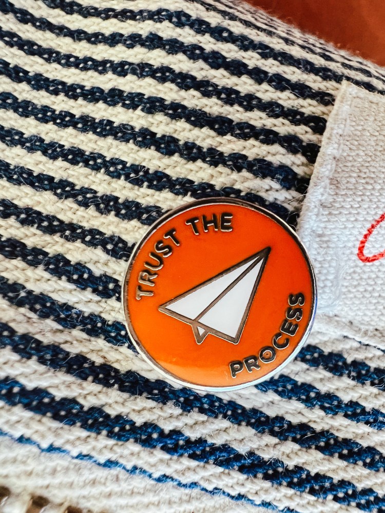
Trust the Process Pin
I got this little pin in-person at another lovely stationery shop, Baum-kuchen.
Well-Appointed Desk Pin
Lovely pin made my an even lovelier friend.
Typically, I pair my travel kit with my A6 William Hannah that has all kinds of different papers that have been hand punched and added in. Overall, it’s a compact versatile kit that has been a trusty companion for over a year now.
We spend a lot of time reviewing and promoting bottled fountain pen ink here on The Well-Appointed Desk. For as much as we love bottled ink, there is a time and a place for cartridges too. If, like me, you like to use fountain pens but work in an office environment (or maybe you are in a school environment or other “not in the comfort of your home office” situation), a fountain pen that readily takes cartridges can be a real blessing.
Why?
When I am in a meeting or on-the-go, a cartridge fountain pen can be quickly re-inked without mess, fuss or complication. I just untwist the barrel, pull out the old cartridge and pop in the new one from the barrel or from my pencil case where there are always a few floating around or stored in a container like the J. Herbin tins. This quick change means I don’t miss any part of a discussion while I dig for another pen or try re-inking from a bottle in the middle of a meeting — awkward!
I recommend a fountain pen (or heck even one of the many rollerball or felt tip pens we’ve reviewed here) that takes a standard international cartridge over pens that take proprietary cartridges. This will give you more flexibility: there are far more ink colors available and it’s easier to find cartridges in the wild should you need more.
How
I recommend keeping at least one fountain pen that takes the classic standard international ink cartridges on-hand and filled with cartridges. I particularly like models that can have one cartridge loaded and a spare in the barrel. Great examples of this are the Caran d’Ache 849 fountain pen and the Kaweco Special FP. There are plenty of others but these two slim pens are my official go-to office pens for ease of use and their ability to carry a spare cartridge in the barrel. Other good options are the Diplomat Esteem or Traveler.
My favorite brands for cartridges are:
J. Herbin: the cartridges come in darling metal tins that can be saved and used to carry other cartridges later (pro tip!)
Diamine: not only does Diamine offer lots of fan favorite color options like Ancient Copper, Oxblood and Purple Dream, they also sell a couple variety packs so you can purchase mini-collections of ink colors to try like the Elegance, Sovereign, Classic and others.
Retro 51: They only offer black and blue cartridges but I learned at a pen show that their black is the blackest black around.
Graf von Faber-Castell: Yes, these are pricey but not as pricey as buying a whole bottle of their ink so it you want some of the unique colors available from Faber-Castell, this is a great option.
Kaweco: Kaweco offers a good quality and color range, including their highlighter yellow color at a reasonable price. I’m also a big fan of their cartridge holder.
Monteverde: There are a great variety of their core colors available in cartridges and those colors have sheen and shading to boot.
Visconti: I confess I like the Visconti ink cartridges for the beautiful containers they used to be packaged in. Sadly, Visconti has switched their packaging to paperboard boxes but you can still find a few sellers online who still have the cartridges in the original matched bakelite-style plastic canisters. It’s worth seeking at least one container of Visconti cartridges for the canister alone. Check ebay.
Do you have a go-to pen you use with cartridges? Have you ever considered keeping a pen “cartridge only” as your work/car/bag pen? Tell me in the comments!
DISCLAIMER: Some items included in this review were provided free of charge for the purpose of review. Some items were purchased with funds from our amazing Patrons. You can help support this blog by joining our Patreon. Please see the About page for more details.
In addition to high-end, limited-edition, collectible pencils, Blackwing makes a few unique pencil accessories, including the Blackwing Point Guard ($10 each). Available in matte black, gold, silver, and a set of one of each color, the point guard is made in Taiwan of lightweight, machined aluminum. I chose matte black to match my favorite standard-edition Blackwing. Like all of Blackwing’s standard editions, the Point Guard’s esthetic is sleek, minimal and professional.
When the Point Guard first came out, I had heard some grumblings in the pencil community that its friction fit marred some barrel finishes or didn’t fit comfortably on some standard-size pencils. A good fit would be one that allows the cap to slide on without force and stay on during transport in a bag or pocket. I went through my pencil collection to find a variety of barrels to try it on. Of course, I put it first on several older and newer Blackwings; it fits all of them just fine and leaves no mark.
I also tried it on a Mitsubishi Hi-Uni, one of my all-time favorite pencils, and it fits fine also. I couldn’t find any standard-size graphite pencils in my collection that were a problem.
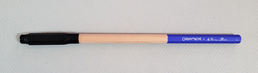
Next I tried several pencils that have ever-so-slightly-larger-than-standard barrels. These pencils often are a problem when I try to put them into sharpeners designed only for standard-size pencils, so I didn’t expect them to fit the Point Guard. The Caran d’Ache Museum Aquarelle colored pencil, the Caran d’Ache Klein Blue graphite pencil and the Derwent Drawing Pencil are all snug, but the Point Guard goes on without force. I see no marks on the barrels. These surprised me – I didn’t think they would fit at all.
This one also surprised me: The Caran d’Ache Supracolor, which I have always thought of as having a standard-size barrel, is slightly loose in the Point Guard. It stays on, but with less resistance than the Blackwings or the Hi-Uni.
Finally, I dug around in my pencil cups for an oddball: a Japanese prayer pencil with a square barrel. It fits also.
Maybe the Point Guard has improved over time, but I have nothing to grumble about.
Well, OK, I have one grumble: the price. Does a $10 Point Guard work better than a plastic Sonic Cupot (my personal favorite pencil cap, 6/$3.25)? No, but it will probably last longer, and for some, it might suit their professional image better than the Cupot’s elementary-school palette. I can’t argue with that.
DISCLAIMER: Some items included in this review were provided free of charge for the purpose of review. Some items were purchased with funds from our amazing Patrons. You can help support this blog by joining our Patreon. Please see the About page for more details.
Yesterday, it was 60ºF and tonight its threatening to snow anywhere from 4-15″ (depending on which weather report you trust). It reminded of all the mornings we had to shovel our cars out of the snow in Chicago and the tradition to mark the spot you worked so hard to clear. Thankfully, the Tribune collected some of the best. The image above looks like it could easily have been taken in front of our apartment. While I no longer have to dig out my parking space, I do have to shovel out my driveway. Maybe, in honor of my Chicago brethren, I’ll leave a couple milk crates and a broom to save my spot in the driveway.
Hope winter is treating you okay.
Oh, and the Pen Addict podcast hit a milestone 500 episodes this week. Who knew two guys could talk about Sailor pens and Retro 51 for 474 episodes (guess why I chose that number?)! Be sure to use the Pen Addict Bingo cards while listening to this episode.
We need each other. Please support our sponsors, affiliates or join our Patreon. Your patronage supports this site. Without them, and without you, we could not continue to do what we do. Thank you!
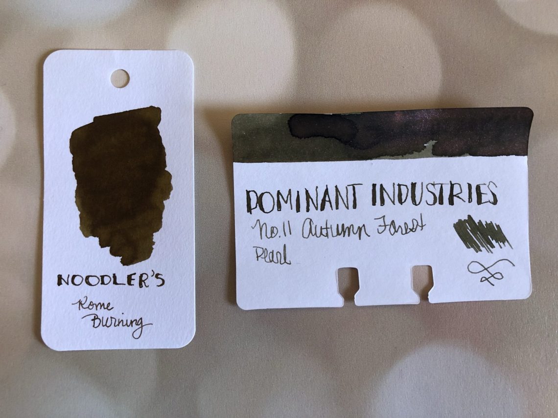
I first saw the Dominant Industry inks on Mike’s Friday happy hours (Inkdependence on YouTube). I filed them away as something I wanted to try and on a recent trip to Yoseka’s website, purchased a bottle of No. 11 Autumn Forest ($20 for 25mL).
Dominant Industry is a South Korean company that makes special small batch inks for dip pens. Read carefully when purchasing, because not all the inks they offer are fountain pen friendly (some are dip nib only but the listing will state that). They offer a variety of colors available in one of four different categories: Hologram, Mirror, Pearl, and Standard.
I chose No. 11, Autumn Forest as my first ink to try. This is a warm green-brown ink with a pinkish red pearl sheen. This ink is amazing to watch. When I received the bottle, I could see the pink/red pearl down at the bottom. I shook the bottle gently and then started to swatch. The ink went more green, and turned a bit browner as it dried. But while I was watching it I could see bits of blue, yellow, and that red sheen. It reminded me of leaves on the ground after they’ve fallen off the trees. They’re no longer bright brilliant reds, oranges and yellows, but a more nebulous green-brown with hints of all those other colors.
Autumn Forest is unlike anything else I have in my collection. I don’t tend towards forest or olivey-greenish browns, and nothing rivals the color with the sheen. I did pull Noodler’s Rome Burning out, but it doesn’t come close. I’m just fascinated with this ink and I’ve loaded it into one of my TWSBI’s so I can play with it over time.
DISCLAIMER: Some of the items included in this review were provided to us free of charge for the purpose of review. Please see the About page for more details.
I visited Wonder Fair in Lawrence, KS this weekend and was delighted to find the new Zebra Zensations 2mm mechanical colored pencils. Wonder Fair stocks the set of 12 ($11.76) as well as individual pencils ($0.90 each). The cost for these softly-rounded triangular, plastic, click-advance colored pencils was too good to pass up. I know that, at this price point, the quality of the cores may not be as high as pencils sold directly to the art market but I had never seen 2mm mechanical colored pencils so I couldn’t resist trying them.
The pencils come with blunt tips but a 2mm lead pointer made these wickedly sharp. The 2mm leads were hard enough to sharpen to a strong point so I was a little worried the cores might be very hard.
The cores advance with a click and a half-press of the knock will allow the core to be pushed back into the plastic housing for transport. No stabbing yourself with those wickedly sharp points!
Regardless of what I say about these pencils the portability and the comfortable soft, triangular shape makes the pencils worth owning. Whether you want the whole set for coloring or urban sketching or you just need a couple of colors for highlighting your journal pages, the price of these pencils make it hard to pass them up.
The packaging indicated that the pencils were refillable though, at this time, I was unable to find replacement leads. Also, the plastic housing the set came in can be transformed into a standing pencil case for ease of use. It a nice feature though I found that once I bent it into the stand shape, it was hard to close it back up for transport.
Most of the darker colors (reds, blues, purple and black) were much softer and more pigment rich than the lighter colors. I really like the #05 Blue (in the set) and #16 Terra Cotta (purchased individually). The white #21 pencil was not particularly useful except on dark papers and it was still pretty translucent. It might be usefull for tinting darker colors but I am pretty skeptical. If you want a white colored pencil for tinting other colors or blending, go for a softer brand like Prismacolor Premier (sold individually at most art supply stores). The peach color #04 was also very light and challenging to use. In the 12-color set, I found the #14 sage green to be an odd choice for such a basic set. I suppose it could be considered a very cool grey but most 12-color colored pencil sets would be more likely to include a brown or sepia color and a true neutral grey over the too light peach and sage. Even a turquoise might have made more sense. My inclination would be to purchase the pencils individually since the cost difference is negligible and you won’t end up with the lighter, less usable colors.
I frequently use black colored pencils as an alternative to graphite as it tends to smudge less — handy tip, lefites! I also love the red/blue pencil combo and use them to highlight, underline and add details to my planner and journal. As such, I wanted to compare the color and softness of the Zensations Black pencil to the classic Prismacolor Col-Erase Black and the red and blue Zensations to the classic Caran D’Ache Bi-Color. The black pencil is similar in hardness to the Col-Erase and even kind of erasable. Being able to carry the Zensations pencil instead of the Prismacolor Col-Erase means no need to carry a sharpener or point protector. When comparing the Red and Blue Zensations pencils to the Caran D’ache Bi-Color is a pretty unfair comparison. The Bi-Color is often about $5 for ONE PENCIL and uses the color rich pigments from a company known for their artist grade pencil products. However, the blue is pretty comparable. The red color is more pink compared to the Caran d’Ache. The Bi-Color is also a water soluble pigment so if you like to add water for a watercolor look, the Caran d’Ache Bi-Color is a better option.
I’m on the fence whether I will switch to the Zensations red and blue pencils in my daily kit as it is still so convenient to have them both in one pencil with my Bi-Color but I will definitely be adding the black Zensations to my daily carry. I’ll save the other colors for coloring and drawing for now.
The Set of 12 is $11.76 and individual pencils are available for $0.98 each directly from Zebra. I would have included links directly to my darling Wonder Fair to purchase these pencils but they are not listed on their website. You can call them and ask to order them and they will gladly pop them in the mail for you.
I was not paid to promote Wonder Fair. I just really like their shop. I also paid for the pencils in this review with funds from our Patrons. Other links included in this post were added to provide purchasing options. JetPens is a sponsor of this blog. More info on our About Us page.