Link Love: Pencil Intense

This week was pencil intense in a way I haven’t seen in … well… ever. If you’ve never considered pencils before, this week might change your mind. There is a watercolor pencil review, a video on how to get a wicked sharp point, a Retro 51 mechanical pencils review and a peek into the process of making pencils and the supply chain involved in the process.

Pencils aren’t the only thing getting love this week: pens, inks and even ringbound notebooks are seeing some love too. There’s also a great post on books featuring how to make your own art supplies, including Make Ink (which we reviewed awhile back) plus several others that are new to me.

Hope you all are having a Pencil Perfect week!

Pens:

Ink:

Pencils:

Notebooks & Paper:

Art & Creativity:

Other Interesting Things:

We need each other. Please support our sponsors and affiliates. Your patronage will let them know you appreciate their support of the pen community. Without them, and without you, we could not continue to do what we do. Thank you!

Fountain Pen Review: Schon DSGN Pocket Six

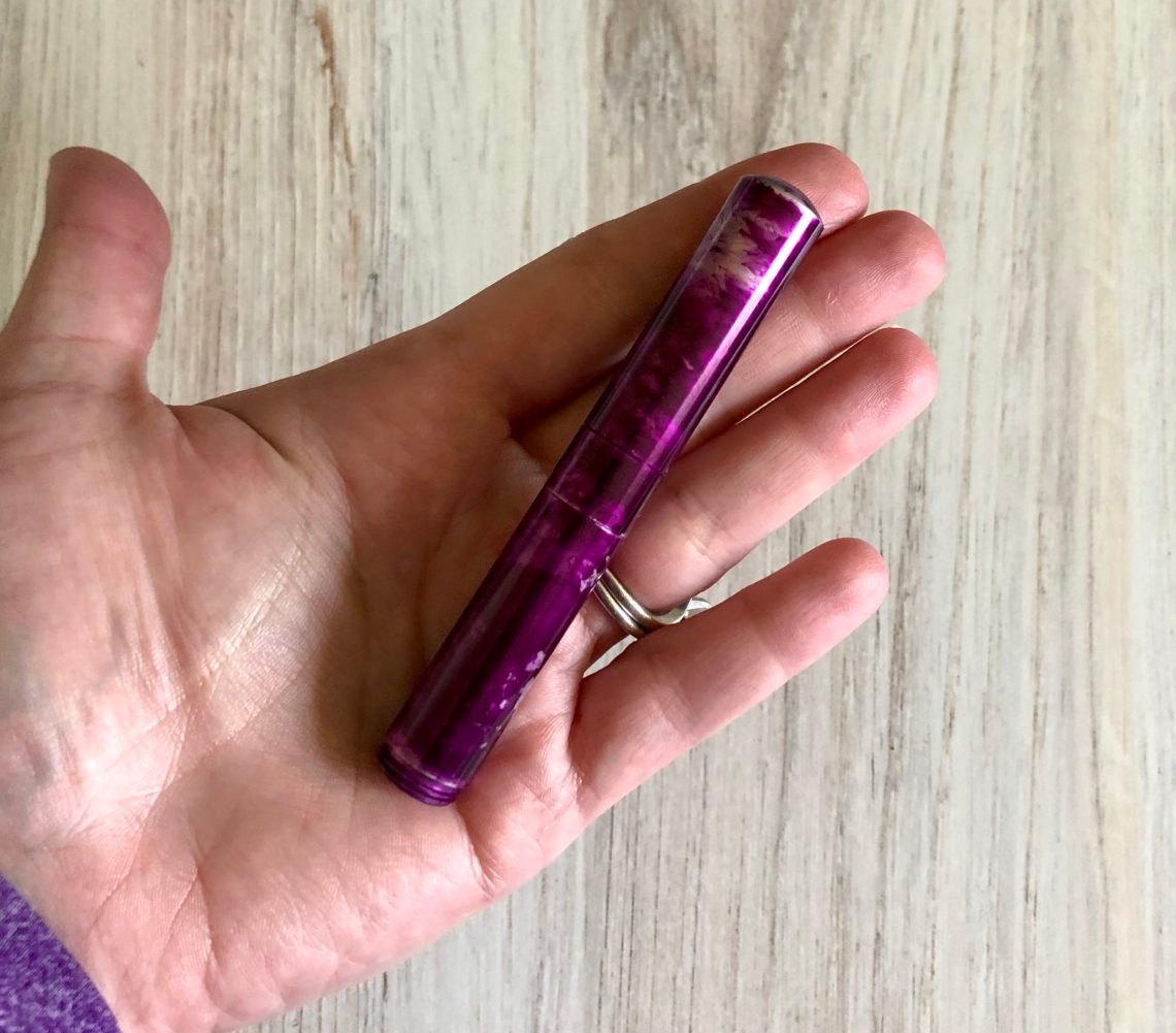
I’ve been eyeballing Schon DSGN pens for a while now. In the past I haven’t been able to get to an east coast pen show, so I haven’t seen them in person and then there haven’t been shows because of the pandemic, but I’ve been keeping an eye on Dromgoole’s. Last week I finally took the plunge and bought a Pocket Six in “Purple Potion” ($135).

Schon DSGN is owned by Ian Schon, a man with a passion for machining pens. He uses a variety of metals and machines them all here in the U.S. His products would be 100% American made save for using Jowo Nibs manufactured in Germany.

The Pocket Six is a wee little pen, designed to be small but act like a full size pen in writing. The pen is a mere 3.5″/19cm when capped, which makes it even tinier than my Kaweco Lilliput, and significantly shorter than Kaweco Sport and the Franklin Christoph Pocket 45. It weighs in at only 15g.

L to R: Vanness Limited Edition Franklin Christoph Pocket 45, Kaweco x Hello Kitty AL Sport, Kaweco Liliput in Fire Blue, Schon DSN Pocket Six

However, when posted it stands up against the bigger guys. The cap is a screw cap, and the back end of the body is threaded so that the cap can screw on for a nice stable fit. Posted, the pen is 5.25″/13.5cm in length. And they didn’t go small on the nib on this one – the “Six” in Pocket Six is because there’s a Jowo #6 nib on this baby.

This pen makes me smile. It’s small even in my small hands, but it writes like a much bigger pen. It took mine a few seconds to start, but after that it was a really pleasant writing experience. The aluminum body is lightweight and warmed up a little in my hand, making it comfortable to hold. Even though it’s a stock nib, I can’t complain. This one writes super smoothly.

Honestly the only slight drawback I see to the Pocket Six is that it’s small enough that it has to be a cartridge only pen. However if you’re handy with a syringe and ink, even that isn’t a problem for those with large ink collections!

I think I’m really going to enjoy this one.


DISCLAIMER: Some of the items included in this review were provided to us free of charge for the purpose of review. Please see the About page for more details.

Pen Review: Caran d’Ache 849 “Claim Your Style” Limited Edition

Pen Review: Caran d’Ache 849 “Claim Your Style” Limited Edition

Caran d'ache 849 Claim Your Style

The limited edition “Claim Your Style” Caran d’Ache 849 ($40)  in vert  comes in the same molded enamel clamshell case that most 849s ship in. It makes for an impressive presentation as a gift and the price point on an 849 is such that its a great gateway pen for friends, family and co-workers.

The “Claim Your Style” series features mixed colors on the barrel, knock and clip to create fresh modern statements on a classic pen barrel. The Vert model (the Vert colorway is currently sold out but there are several other options available) features an emerald green body, electric blue clip and metallic red knock.

849 Comparison
From left to right: Lamy 2000 multipen, Baron Fig Squire Click, Baron Fig Squire, Caran d’Ache 849, Caran d’Ache Edelweiss pencil and a Musgrave Tennessee Red pencil

As with all 849 pens, the proportions are petite and similar to Caran d’Ache pencils with the hex barrel and slender width. For many, this pen might be too slim for long writing sessions but, within our community, I think ballpoint pens get relegated to filling out forms in doctors’ offices, signing receipts and the occasional dashed note so I don’t think its a deterrent that the 849 is slender and more petite overall. It makes the pen pocketable and easy to stash in a bag or purse pocket.

Caran d'ache 849 Claim Your Style writing sample

For a ballpoint refill, the medium blue Goliath is a super smooth refill. Not as smooth as a Uni Jetstream refill but a good option if you want to have a pen in your bag, car or on your desk that can be used on just about any surface and does not require any maintenance. It’s a pen that you can have on your desk that a co-worker can comfortably borrow without the “oh, no! I can’t use a fountain pen!” moment. And you’ll still impress them with your sense of style.

Caran d'ache 849 Claim Your Style writing sample

By default, the Caran d’Ache 849 ballpoint pens ship with a medium blue Goliath refill. The Goliath refill is pretty much the same as a Parker-style refill with a perfectly flat end (no fins). I swapped out the refill a couple times to see how the pen performed with a black fine Goliath ballpoint refill ($9.25 each) and a Kaco 0.5mm black gel refill. The Kaco is a Parker-style refill and seemed to fit and activate the knock mechanism just fine. The black fine Goliath refill is designed to fit so there were no issues using it either. I prefer the silky, dense black line of the Kaco refill but the roller on these refills can be hit or miss and if you get any oils on your paper from your hand or lunch, you can get skipping.

All this is to say that if you don’t own an 849, you now have some very colorful reasons to add this pen to your collection. If the Limited Edition pricing is a bit steep for you, the standard color options are available for a significantly lower price ($20 each).


DISCLAIMER: The items included in this review were provided free of charge by Gentleman Stationer Shop for the purpose of review. This review includes affiliate links. The Well-Appointed Desk is a participant in the Amazon Services LLC Associates Program, an affiliate advertising program designed to provide a means for sites to earn advertising fees by advertising and linking to Amazon. Please see the About page for more details. Please see the About page for more details.

Brush Pen Review: Royal Talens Ecoline Brush Pens

Brush Pen Review: Royal Talens Ecoline Brush Pens

Royal Talens Ecoline Brush Pens ($3.40 each or sets available at various price points) feature a large, soft, flexible fiber tip and each of the 30 available colors features Ecoline’s liquid watercolor ink inside.

Ecoline Brush Pens

The tip is firm enough to allow both thick and thin lines. The colors in each pen can be blended or faded by adding water like pan watercolors. How successful blending is will depend largely on what kind of paper you are using. Watercolor paper, which is designed to be used with a lot of water will be more successful in more painterly experiments. Multimedia paper (Strathmore, Bienfang and Canson all offer versions of this type of paper) is the next best. Col-o-ring Paper is similar to multimedia paper in a lot of way but may curl or “taco” more easily when wet than watercolor or multimedia paper.

Ecoline Brush Pens
Testing on Col-o-ring Folio (soon to be available)

I got individual pens so I could choose colors I thought I would use more than the sets. I did want to have a full range of colors. I missed a purple though.

The physical pens are wide, like most brush pens, but lightweight and easy to hold. The colors range from bright and vivid to light and subtle. If you are considering purchasing these pens, consider what you might want to draw, paint or color and choose your colors accordingly. I like to do florals and silly doodles so I focused on colors I thought might be good in these uses.

Ecoline Brush Pens vs W&N
Testing on Bee Paper Super Deluxe Aquabee 6×9 sketchbook

I compared the Ecoline Brush Pens to what I consider to be the “Cadillac of Watercolor Brush Pens” — The Winsor & Newton Water Colour Brush Pens. I had similar colors in both brands — not exact matches but close.

While this is probably not a fair comparison, I think both pens are competing for the same type of user. Originally, I thought the W&N brush pens were very expensive but after some investigation, the prices for the W&N Water Color Brush Pens compared to the Ecoline, are pretty similar. Considering that the W&N have dual tips (the brush tip on one end and the fine tip on the other) the extra 20¢ per pen seems reasonable.

But the biggest advantage is that, when wet, the W&N pens blend much more easily and the amount of pigment in each color is much more intense and saturated. If you prefer to layer colors when color is dry, this may not be a deciding factor. W&N colors also show more granulation like traditional watercolors.

When blending, the Ecoline colors did not lift as easily with water or rewet as smoothly. Some “staining colors” from W&N also had some issues blending smoothly but both of my sample blends were not done on pre-wet paper so your results may vary with different techniques.

Ecoline Brush Pens vs W&N
testing on Col-o-ring paper

While both pens, the Ecoline and W&N do similar things and work pretty consistently but I’m inclined to recommend the W&N over the Ecoline because of the dual tip and I have more history with the brand in general. That said, the Ecoline is a solid option.


Tools:


DISCLAIMER: The Ecoline Pens included in this review were provided free of charge by JetPens for the purpose of review. Other items in this review include affiliate links. The Well-Appointed Desk is a participant in the Amazon Services LLC Associates Program, an affiliate advertising program designed to provide a means for sites to earn advertising fees by advertising and linking to Amazon. Please see the About page for more details.

Ink Review: Robert Oster Pen Chalet Exclusives

Ink Review: Robert Oster Pen Chalet Exclusives

Recently, Pen Chalet released an exclusive Robert Oster ink – Antelope Canyon. But the Chalet didn’t stop with just one special edition. Three more exclusive RO inks were added to the lineup to make a beautiful Arizona-inspired palette. I purchased a sample of each from Pen Chalet.

I have tried to balance colors so these are shown as accurately as possible, but I finally gave up attempting to do so with the four colors together. The best way to communicate the actual colors is to show a comparison with other inks you may have or may have seen in person.

Each ink color is named after a sight you may see in Arizona. I had several stock image credits that need to be used up, so I hope you enjoy the photos!

Antelope Canyon

First, for Antelope Canyon. Pen Chalet has a poetic description of each color: “This Pen Chalet Exclusive fountain pen ink encapsulates a piece of the majestic and iconic Antelope Canyon in Northern Arizona (Pen Chalet’s home state in the USA). The magnificent slot canyon’s tall, winding walls create a monumental sandstone, wave-like structure that transforms into a supernatural experience when light beams shine directly down into the openings of the canyon.”

Antelope Canyon is a beautiful brownish orange that shades wonderfully. It is close to Robert Oster Burned Orange but uses more yellow and brown. It’s a unique color and I love using it in an italic nib.

Monsoon Sky

Pen Chalet has this to say about Monsoon Sky:

“Arizona’s Sonoran Desert produces some of the most beautiful sunsets in the world…especially during monsoon season. Arizona’s monsoon sky is a surreal combination of clouds and colors that bring an otherworldly filter to notoriously blue skies for just a few months each year.”

Monsoon sky is an interesting color that doesn’t fit well in green or blue – it’s a greenish teal that has a strange yellowish undertone. The ink is beautiful and I smiled at how closely it matched another Pen Chalet special edition – Monsoon Storm by ColorVerse!

Sedona Red

Again, the poetic description from Pen Chalet:

“Inspired by Sedona’s eclectic atmosphere and the red rock phenomenons that made the area famous, Sedona Red fountain pen ink is a small piece of the fiery passion of the Southwest. With daring red hues hinting at spicy undertones and a bit of firepower paired with subtle color variations similar to the understated shades of the desert landscape, Sedona Red fountain pen ink emulates the fearless spirit of the West that still calls to adventurers from Sedona’s red rock formations.”

Sedona Red is a darker version of Robert Oster Burgundy and is close to J. Herbin Rouge Grenat. The sheen is a very dark greenish-black that shows up in writing and looks great.

Saguaro Green

Pen Chalet says:

“Saguaro Green fountain pen ink is an ode to the iconic Saguaro Cactus. Native to the Sonoran Desert of Arizona, the Saguaro Cactus is the largest cactus in the United States. Saguaro Green fountain pen ink is an olive-like color that mimics the Saguaro Cactus’s ability to break up the muted, desert landscape with energy and life.”

Saguaro cactus is a very odd plant. Beautiful, but otherworldly. Saguaro green is one of my new favorite ink colors. It’s a darker, slightly more yellow Tolstoy. Olive juice would be a good description. Like a green olive oil. Great color.

The theme around these four inks have made me long for vacations and camping. Arizona sounds like a great place for both!

To show the ink in writing, I’ve shown all four – first on Tomoe River paper:

Now on Cosmo Air Light 83:

Finally, both side by side:

I encourage you to grab one or four of these colors. Luckily, there’s a sample pack available from Pen Chalet if you want to try the bunch – 4mL of each ink for $11.99.

DISCLAIMER:  All of the items in this review were purchased by me.  Please see the About page for more details.

Link Love: First Day Jitters

First, I want to remind everyone that this weekend, Laura is participating in a knit-a-thon to raise money for food charities. She’ll be knitting for 12 straight hours and you can still help support her efforts. Looking forward to cheering her on from my bench seat.

Second, today is my first day at a new job. I’m nervous to start a new job with new people in a new place. I want to do a good job, be creative and clever and all those things. But… I am also worried about a lot of the dumb stuff that you worry about on your first day too like will there be a place to microwave my lunch or should I bring a salad instead? Do we get a lunch break or does everyone eat at their desk? Should I take anything to put on my desk like, you know, GOOD pens and a nice notebook? And then there’s modern day concerns like which mask should I wear? Plain or something with a pattern that shows a bit of style? I know it’s crazy to worry about this kind of thing but I do. Doesn’t everyone? So, while you all are tucked up at home working in your jammies or going about your daily routine, send me a little good luck mojo. Thanks!

Pens:

Ink:

Pencils:

Notebooks & Paper:

Art & Creativity:

Other Interesting Things:


We need each other. Please support our sponsors and affiliates. Your patronage will let them know you appreciate their support of the pen community. Without them, and without you, we could not continue to do what we do. Thank you!

Ink Review: KWZ Raspberry

A while ago I got a small sample of KWZ Raspberry ($15 for 60mL) and I loved it. I always meant to go back and purchase a whole bottle. When I got my Kaweco Hello Kitty edition, I decided Raspberry was the perfect ink for it.

I’ve used several KWZ inks in the past and they perform well. Some folks don’t like the slight smell of KWZ inks; when I opened the bottle for this review it reminded me a bit of the extracts I use in baking (vanilla, almond, etc.)

Raspberry is a reddish pink. I found it close to the pinky parts of Iroshizuku Yama Budo (without the sheeting) and to two of the Colorverse inks. It leans red with a touch of blue, and is a nice shading ink.

Can’t wait to use it more!

DISCLAIMER: Some of the items included in this review were provided to us free of charge for the purpose of review. Please see the About page for more details.

Can’t wait to use it more!