Review by Tina Koyama
The pocket-size notebook market is well-saturated with the stapled-paper basic. Finding a unique offering isn’t easy; in fact, only one comes easily to mind: Dapper Notes and Stationery. Handmade by Enon Avital, each fabric-covered, sewn notebook edition has a distinctive theme. Many past limited editions included cover designs in collaboration with other artists. Offered by subscription and individually (if you are fast and lucky enough), the small runs sell out quickly.
Dapper Notes’ current collaboration is with Stuart Bradley of Railway Station Press, publisher of non-fiction books. Their Kickstarter campaign, which ends June 16, brings together Avital’s Mikado notebooks and Bradley’s collection of reproductions of Hiroshige’s Last Woodblocks: 100 Famous Views of Edo, which includes 119 images ($30). Bradley’s 6-by-9-inch, perfect-bound book is in a vertical format with one full-color print per page. A spiral-bound Stamp Collectors Limited Edition album, which comes with six Hiroshige stamps, is also offered ($48). (Other books and postcards are also available at some reward levels. See the Kickstarter campaign for more details.)


The Mikado notebook edition includes two elegant cover designs of Hiroshige images, Flying Crane and Standing Crane ($15 each). The two cover images are based on woodblock number 102 of the Edo series, which shows two red-crowned cranes. According to the Kickstarter campaign information: “For the Japanese, the rare and beautiful red-crowned cranes are symbols of good luck and longevity.”


The standard 3 ½-by-5 ½-inch size, the notebooks’ dimensions are the only thing about them that is standard. Produced in England, the 7.5-ounce cotton twill fabric is glued by hand to book cloth. The two Mikado books include four varieties of end sheets made of hand-stenciled washi paper in red or blue. (First image below provided by Bradley. It’s one of eight pages in the book showing Avital’s bookmaking process and materials.)


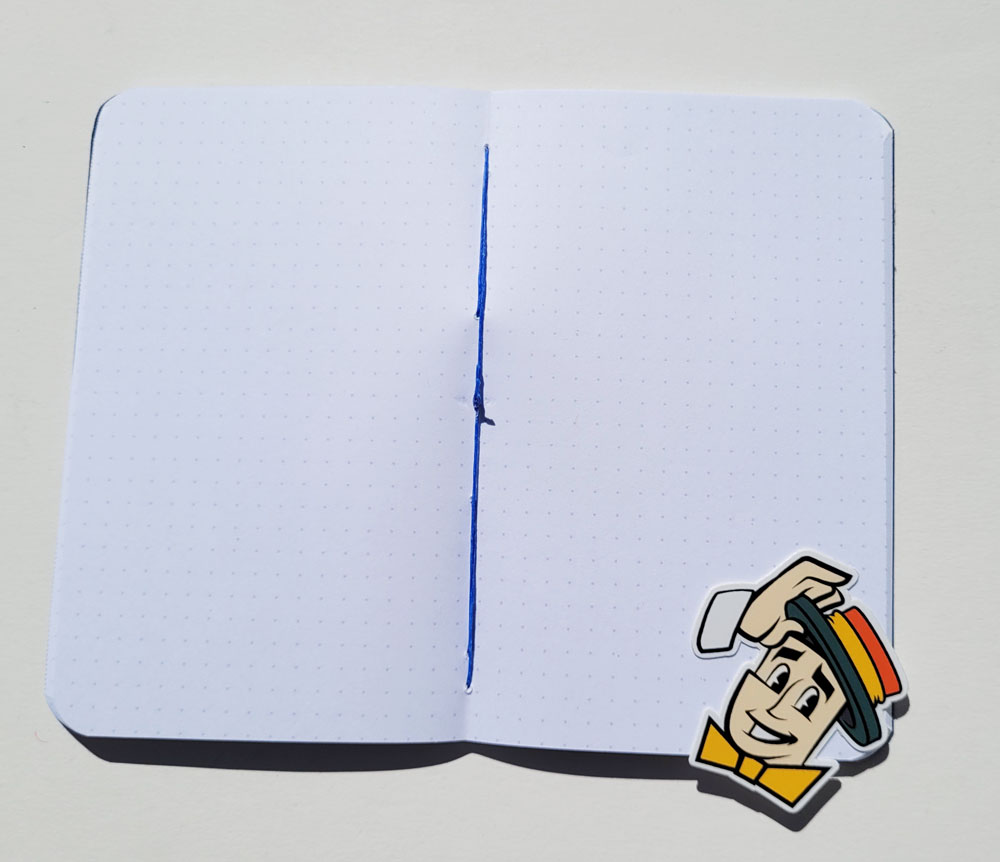
Flying Crane, the notebook shown in this review, has 48 pages of dot-grid ruled, 70-pound white paper. Standing Crane’s paper is grid ruled. The first page includes space for pertinent information. The last sheet includes a printed ruler, with information about the collaborators behind it.


The hand sewn book is stitched with heavy blue thread.

Interior paper of 70-pound weight is a nice treat in any pocket notebook. It has slightly more tooth than what’s typically found in Field Notes and other similar notebooks, so it takes well to both pencil and pen.
For my media tests, I pulled out some of my juiciest pens just to see what it could handle. Only bits of my super-juicy Sailor Fude De Mannen nib with Platinum Carbon Black ink and the Zebra Optex highlighter came through to the reverse side. Even the Caran d’Ache Museum Aquarelle pencil did not come through where I washed it lightly. I will enjoy both writing and sketching in this book.


Although it doesn’t bother me, one thing that some may complain about is that the book doesn’t stay completely closed when laid on a desktop, probably due to its thickness in a single signature. I do have a small concern about cover durability. I’m sure the fabric is more durable than paper against moisture, but the edges are already fraying a bit. I carry my pocket notebooks in a bag pocket where they receive little wear, so it will probably be fine. But those who hip-pocket carry might want to use a cover with this one. (I would be interested in hearing from readers who use Dapper’s books about how they fare after pocket-carrying for a while.)
Below are a couple more pages from Bradley’s book that show some of Avital’s bookmaking production steps. I was also given some lovely postcards that Bradley published featuring images from Hiroshige’s 53 Stations of the Tokaido Road woodblock prints.
If you have been wanting to try a unique, distinctive and handmade pocket notebook, Dapper Notebooks’ Mikado edition would be a good one to start with. The Kickstarter campaign ends June 16. Go!


DISCLAIMER: The items included in this review were provided free of charge for the purpose of review. Please see the About page for more details.
 Tina Koyama is an urban sketcher in Seattle. Her blog is Fueled by Clouds & Coffee, and you can follow her on Instagram as Miatagrrl.


