Our final planner category is all-in-one planners (see our previous posts on Ringbound, Discbound, and Elastic Bound)– these are bound books with hardcover, softcover or spiral binding that feature some combination of calendars and other features for planning.
This is probably the hardest category of planners to comprehensively discuss. There are literally hundreds of options available on the market including both dated and undated options. There are themed planners for moms, flower lovers, effin’ bird lovers, people with ADHD, planners that focus on productivity, planners that focus on goal setting and some that are just pretty. If you have a particular interest, there’s probably a planner designed with your interest in mind.
These all-in-one planners often feature an overview calendar for the year, weekly or monthly pages and then some feature daily or weekly spreads. If you like the compact nature of having all the year neatly bound into a book, an all-in-one planner may be a good option.
Fountain pen compatibility is not the main focus for many of the all-in-one planners on the market so I am attempting to focus on options that are more likely to be fountain pen-friendly. There are so many all-in-one planners on the market that I needed a way to streamline this post or it would have gone on FOREVER.
That said, sometimes you just want the planner you want and, fountain pens be damned! So, where noted, I’ve included planners that might not be as fountain pen-friendly. These will give you a chance to put that stash of gel, brush, ballpoint and rollerball pens to use. Most planners include a few sheets of note paper in the back. Be sure to use a page to test the pens you want to use before starting to use your all-in-one planner.
I am dividing up our recommendations into hardbound/softbound options and spiral options and just featuring our best recommendations.
Hard Cover Options
The advantage of a hard- or softbound planner is the compact quality. If you commute back and forth, go out on job calls, travel for work or need a planner to occupy the least amount of space, a hard- or softbound planner is a great option.
The most Fountain Pen Friendly: Hobonichi Techo and Jibun Techo

By far the most talked-about planner in the fountain pen community is the Hobonichi Techo (starting at $42). Available in A6 and A5 sizes and a pocketable Weeks format, this fountain pen friendly daily planner includes monthly calendars in the front. The A5 also includes weekly planning pages. While the Tomoe River paper is hotly debated as the stock has been updated/changed over the last couple years, the Hobonichi is far and away some of the best paper for fountain pen ink.
Hobonichi also offers a wide array of cover options to personalize your A6, A5 or Weeks planner. The simple black softcover is classy and can be used without a cover if you prefer.

The Kokuyo Jibun Techo (starting at $35) is available in A5 and A5 Slim versions. The DAYS edition features a page-a-day while the standard versions are a vertical weekly planner. The covers are soft but a plastic cover protector is available to improve durability.

The DAYS version (starting at $6) is a page-a-day planner and is a good competitor to the Hobonichi Techo.
The A5 Slim standard version does require tiny writing to make use of the layout to its full effect. The paper is Kokuyo’s own lightweight paper, similar to Tomoe River. If what you’re looking for is fountain pen-friendly paper and portability, you can’t go wrong with the Jibun Techo.
Runner up: Stalogy

While the Stalogy Editor’s Series 365 (starting at $25) feels more like a notebook with undated pages, many consider it a planner for the calendar at the top of each page and the 365 pages included. The Stalogy notebooks with the date options at the top of the page are available in A5, A6, B5 and B6 with a softcover. In the US, A5 is the easiest size to find.

I tend to use the Stalogy for journaling or meeting notes as it offers little in the way of pre-printed pages for year- or month-at-a-glance pages. The Stalogy website provides some templates and tips for making your own calendar page à la bullet journaling but if you’re looking for some of that work to be done for you, then the Stalogy is not for you. The paper is fountain pen-friendly.
The Classics:
When I think of all-in-one planners, my brain immediately goes to the classic Moleskine and Leuchtturm1917 daily and weekly planners. For many years, these were the go-to for a simple all-in-one planner. But the market has exploded and while these both continue to offer their original layouts, for many fountain pen enthusiasts, the paper just isn’t friendly enough.
The New Classic: Endless Recorder Planner

When it comes to the classic hardcover planner, there’s a new sheriff in town: The Endless Recorder Planner ($27.50 with black or beige cover) features their new flagship Regalia paper and a page-a-day layout as well as a year overview and monthly planning pages.

The Most Fun Planner: Brass Monkey Perpetual Late Show Planner

Color me biased but the folks at Brass Monkey (formerly the brains behind Easy Tiger here in KC) are witty with a serious dash of snark and an impeccable design aesthetic. That’s the perfect recipe for me. Their Perpetually Late Show Planner ($20) carries on the tradition of a planner packed with trivia and entertaining facts with space leftover for daily to-dos. The planner measure 6 x 9″ (slightly little larger than A5) with a fabric cover and is set up to be an undated planner so while the pages start in January, they leave it open for you to select the day of the week.

I can’t guarantee how fountain pen-friendly the paper is. Our previous tests with an earlier version of their planner was pretty good with a standard array of pens so I’m holding out hope for the Perpetually Late Show Planner to perform decently. Especially since I’m planning to order one for myself. Whether I start it this year or next — this is a planner I am going to need to own.
Runner-Up: Ink + Volt Goal Planner


The Ink + Volt Goal Planner ($49) focus on setting goals for the year, month and even a focus for the week. Aesthetically, I find the simplicity and clean lines of the Ink + Volt planner a great starting point, whether your goal is to keep it simple or add your own creative embellishments. In the past, we’ve tested other Ink + Volt notebooks so the paper should be equally fountain pen friendly.
Spiral Options
One of the best things about a spiral bound planner (whether coil or spiral) is the ability to fold the planner in half. This will make these slightly bulkier planner fit more easily on your desk.
The Queen of Spiral Planners: Erin Condren

If you have been in the stationery community for any length of time, you’ve probably heard the name Erin Condren. The Erin Condren LifePlanner (starting at $60 for the original 7 x 9″ version) took the world by storm several years ago and practically single-handedly reinvigorated the planner industry. From Erin Condren came Happy Planner, Emily Ley, and many others. The Erin Condren planners and her competitors create bright, colorful planners that tend to cross the line between planner and scrapbook with stickers, washi and lots of decorative plusses. Erin Condren offers licensed cover designs from Hello Kitty, Disney as well as beautiful painted options. There are customizing options like adding your name to the cover to choosing from three weekly layout spreads. The paper is 80# text so it should handle most pens. Our previous experience with Erin Condren was the Focused Productivity Planner and the paper quality was not great. I am not sure if the latest iterations have improved paper but the appeal of this planner collection is the layouts, color and the cult of Erin Condren more so than the paper quality.


Most Customizable Options: Agendio and Golden Coil


We have been long-term friends with the folks at Agendio (starting at $47) and now there is Golden Coil (starting at $70). Both companies offer an array of customizing options so if a bound planner appeals to you but you’ve like to build it yourself, its definitely worth spending some time on both of these sites to decide which system might work best for you. Agendio offers three different paper weights. The thickest is 120gsm/80# text which is the only paper weight option available from Golden Coil.


Both Agendio and Golden Coil offer options to add custom events and dates (you can pre-load your pages with birthdays, recurring events and holidays) as well as dozens of page layouts for monthly, weekly and daily pages. Agendio offers editable fields to further customize sections within the planner and even offers inserts to fit a Filofax or other binder.
Spiral Runner Up: Get To Work Book
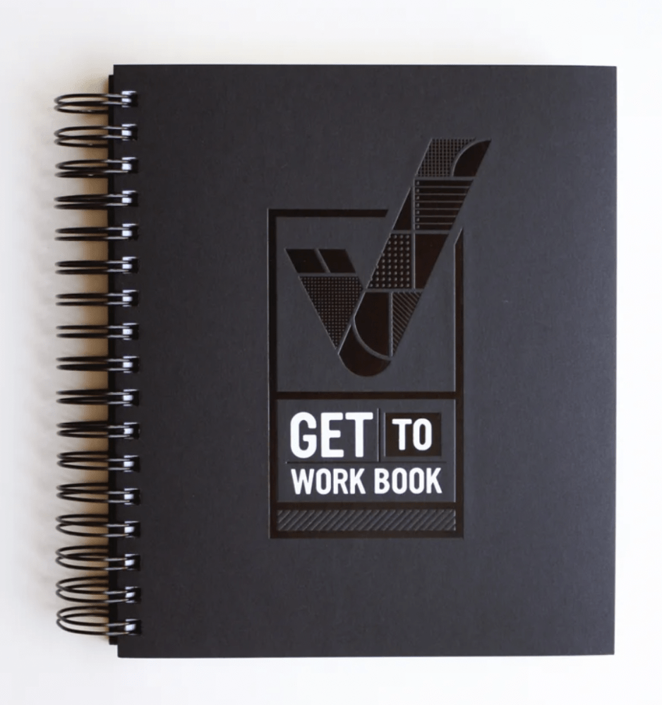
This hefty Get to Work Book planner ($55) is aesthetically stunning and includes all the monthly and weekly pages as well as action-oriented goal planning in a sturdy, simple black cover. This is less blingy than the Erin Condren-style planners and perfect for the minimalist with maximal plans. There are no specifics on the paper stock, hence, the runner-up position.

Conclusion:
By no means is this all, or even some, of the all-in-one planners currently available. Did I forget your favorite all-in-one planner? If so, leave it in the comments.
For more planner recommendations, check out The Strategist, Marie Claire and SPY for even more recommendations.
DISCLAIMER: The item in this review include affiliate links. The Well-Appointed Desk is a participant in the Amazon Services LLC Associates Program, an affiliate advertising program designed to provide a means for sites to earn advertising fees by advertising and linking to Amazon. Please see the About page for more details.