This week is full of delightful tidbits from across the pen community. There is a link to an illustrated Pen Zine, Dominant Industry made custom ink colors for Wonder Pens in colors inspired by the shop cats (of course), Crónicas Estilográficas writes about the Kanji nib for the Japanese Lamy and A Fleeting Ripple lists the pens he would run into a burning building to save. Makes you wonder… which pens would you try to save from imminent destruction?
Pens:
- fountain pen day: pens i’d run into a burning building for (via A Fleeting Ripple)
- The Lamy Naginata? (via Crónicas Estilográficas)
- Video-Review: Jacques Herbin Sloop (via Scrively)
- Pen Review: Opus 88 Minty Fountain Pen (via The Gentleman Stationer)
- My Favorite Style of Pen: A Second Look at the Aurora Optima Fountain Pen (via The Gentleman Stationer)
- Franklin-Christoph Model 46 x Gourmet Pens Stars on Sapphire Lakes Fountain Pen (via Gourmet Pens)
- Fountain Pen Zine by chiisagi (via Chiisagi)
- Getting Subjective… Laura’s Favorite Pens this Year! (Part One) (via Pen Boutique Blog)
Ink:
- Ink Review #727: Maruzen Athena Eternal Blue (via Fountain Pen Pharmacist)
- Dominant Industry Makes Us Cat Inks: Ginger Chicken and Tuna Grey (via Wonder Pens)
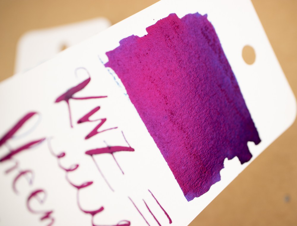
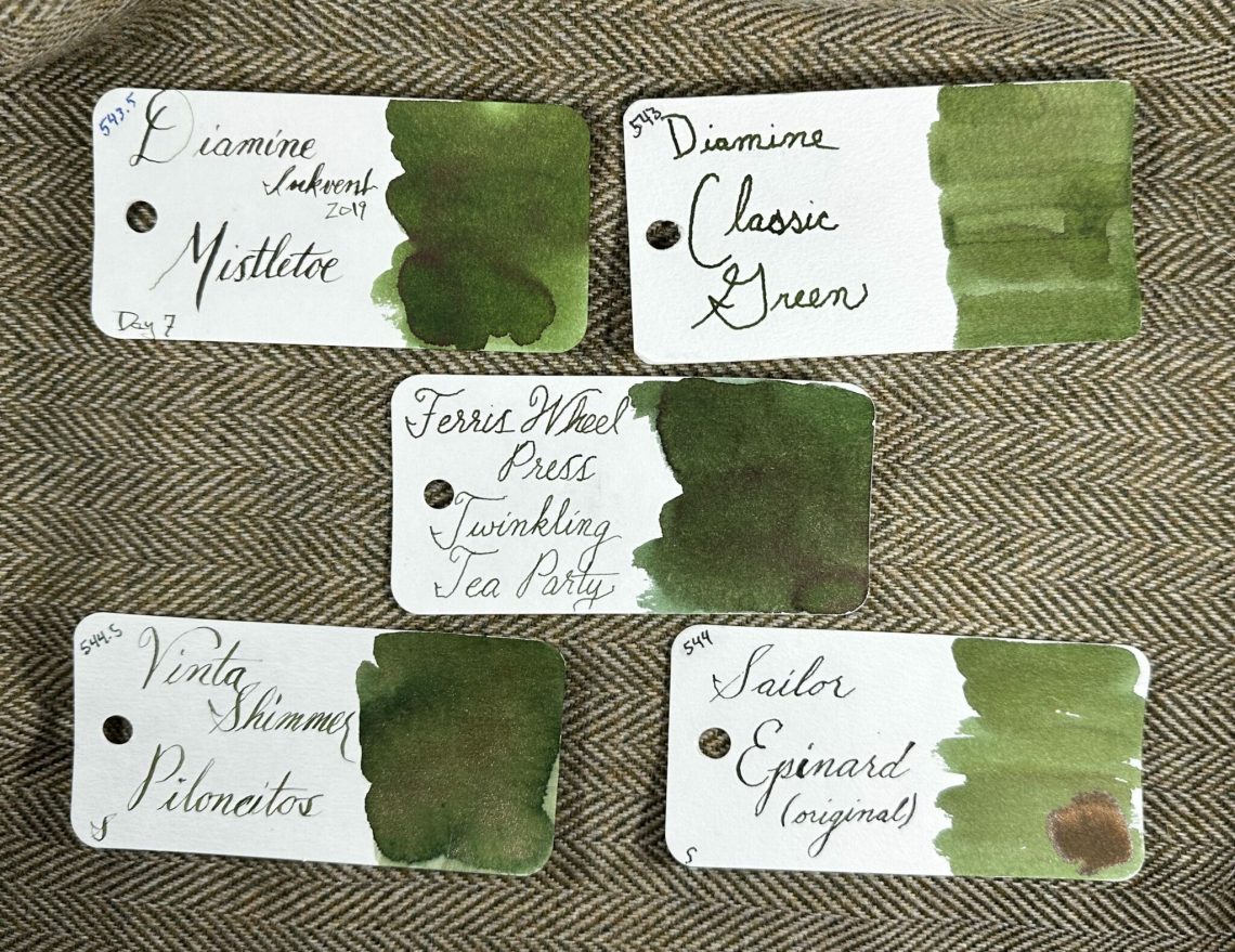
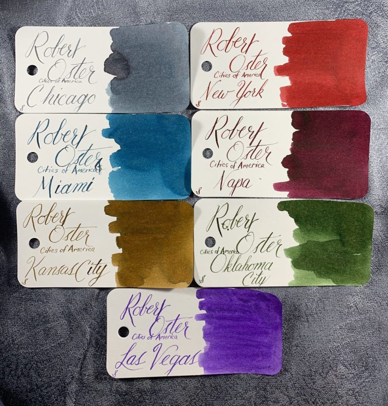
- finer things: ferris wheel press ink collection (via A Fleeting Ripple)
- Ink Review #1931: Kakimori 10 Koton (via Mountain of Ink)
Pencils:
- Vintage Caran d’Ache: 333 “Tulips” and Exciting Prismalo Update (via Fueled by Clouds & Coffee)
Notebooks & Paper:
- Write Notepads Classic Hardcover Notebook Review (via The Pen Addict)
Art & Creativity:
- On My Table: First Days of November 2022. (via Apple-Pine)
- Scan These Artworks and They Will Come to Life (via Hyperallergic)
Other Interesting Things:
- Knit to This: All There Is (via Modern Daily Knitting)
- Adele Says We’ve Been Pronouncing Her Name Wrong All Along (via My Modern Met)
- Jessica Oreck of the Office of Collecting & Design On Her Enormous Museum of Miniatures (via Colossal)
- Review: Ink-A-Pet – Sleeping Cat and Little Penguin (via Krafty Cats)
- A pilgrimage to NYC’s fabled Yoseka Stationery (via mnmlscholar)
We need each other. Please support our sponsors, affiliates or join our Patreon. Your patronage supports this site. Without them, and without you, we could not continue to do what we do. Thank you!