With all the amazing ink colors out there, sometime I just go back to the primary colors and marvel that these 3 hues can be mixed in various proportions to make all the other colors!
Recently I finished a sweater that had the primary colors, plus turquoise thrown in. So I had to search through my ink stash to see what might match!
I recently reviewed Midori MD Paper Products colored pencils in its very limited but lovely, understated palette. Midori also makes graphite pencils (6/$10) – equally sublime in their appearance and beautifully coordinated with other Midori stationery products. I was given the B grade for review, but I happen to have other drawing grades as well, so I’ll include them in my comments.
Like the colored pencils, the graphite pencil barrel has a subtle matte finish with simple branding. The barrel color is the vanilla ice cream off-white that appears on many of Midori’s notebook covers. Something about that matte finish is such a joy to touch!
Also matching the design of the colored pencils is the slightly convex, uncapped end that reveals a perfectly centered core. They sharpen nicely with a whiff of cedar.
I compared the Midori B grade with B grades in two of my favorite Japanese graphite pencils, Tombow Mono and Uni Mitsubishi Hi-Uni. Although not quite as smooth as either of the higher-priced pencils, the MD graphite quality is consistent and flawless. It feels slightly softer than the Tombow but slightly harder than the Hi-Uni. The B makes a great writing grade for those who prefer softer pencils. (Swatches and sketch shown in this review were made in a Stillman & Birn Zeta sketchbook, which has a smooth surface.)
The swatches below show the full range of MD grades available – HB through 6B.
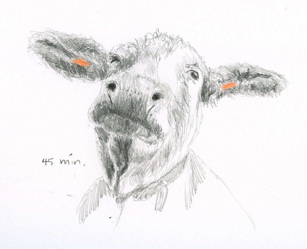
I have been taking crosshatching courses from France Van Stone (better known as Wagonized), and having the B in my hand was a good opportunity to work on one of the course exercises – a friendly, young cow. (France’s courses often use fun photo references of animals that I adore drawing!) I would typically use a softer grade for the final details, but this B did well enough even at the end.
The MDs are excellent writing and drawing pencils at a price that makes them a good value.
My only complaint is that the beautiful matte finish I love so much tends to become easily scuffed and marked. I’ve had the full set for a while, knocking about in a pencil cup, and they are showing their age prematurely. I’m sure the colored pencil barrels will suffer the same fate shortly. Most of the time, I appreciate evidence of wear and use on my art materials, and I don’t baby them. But something about that creamy, formerly pristine finish with scuffs is harder to look at. I don’t want my stationery to be better dressed than I am, but if I daily-carried a Midori pencil, I might be tempted to keep it in a Rickshaw sleeve.
DISCLAIMER: The items included in this review were provided free of charge by Gentleman Stationer for the purpose of review. Please see the About page for more details.
I realize I am about two year late to the joys (and sorrows ) of Cosmo Air Light (CAL) but I decided that since the paper was going away, I should be an informed blogger and experience the paper while I still had the opportunity. Also, I wanted be able to find and recommend other products that might be similar.
About the notebook:
The CAL notebook I got came from an Etsy seller named Danika58. The notebook features kraft cardstock covers with a black binding tape around the spine. There are 10- stitched signatures in the notebook and the soft tape-bound spine means the book lays flat easily. Because the cover stock is not as heavyweight as a traditional hardback notebook, this is the perfect notebook to use with a cover. The cardstock cover though heavy enough to survive on its own. There is NO branding on the notebooks at all so if you love it, be sure to remember where you purchased it because a year from now, you will not have any clues where it came from. Of course, a year from now, there probably won’t be anymore Cosmos Air Light paper anyway so its probably a non-issue.
Understanding the B6 Slim Size:
I have mentioned several times this year how much I am loving the B6 size so I thought I’d try a B6 Slim (approx. 7 x 4.25″) which is approx. 1″ narrower than the standard B6 size. As far as I can tell, the B6 Slim size relates back to specific Midori notebook sizes (Midori: also responsible for the A5 Slim sizing for the Traveler’s Notebooks). The Jibun Techo calendar/planners feature a size described as B6 Slim but it looks to be a little bit larger. Ah, the joys of “-ish” sizing.
Pictured above and below is my B6 Bassy & Co leather cover and the CAL B6 Slim notebook. I included a side view of the B6 Slim on top of my current Stalogy B6 to make it more apparent the width difference. The B6 Slim is going to be too narrow to work effectively in a standard B6 cover. Note to self.
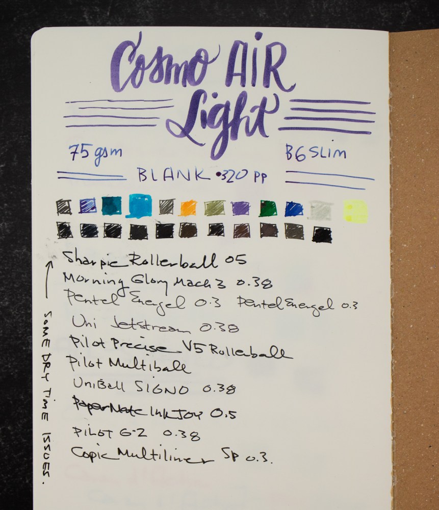
Writing & Pen Tests:
Jesi did a very thorough review of the Cosmo Air Light paper from Musubi awhile back and has continued to use the CAL paper as part of her ink reviews so I took a slightly less thorough approach to my pen tests and included (gasp!) pencils in the mix.
The CAL for pencils is a little hard. I recommend a slightly softer pencil, HB or softer and colored pencils with a softer core unless you want a really fine, light line. I prefer to not have to stab my paper to get the pigment onto the paper but everyone has their own preferences.
For my fountain pen tests, I used some of my everyday carry pens and had good results overall. Inks sheened or shaded as expected and lines were crisp.
There was some show through on the back side of the sheet but it’s very minimal. I could easily use the front and back of the pages.
Additional tests included the random assortment of pens I keep in a zipper pouch at work for meetings — a range of gel, rollerball, and felt tip pens for writing on copies, 3×5 notecards and post-it notes in meetings, brainstorms and working sessions. As mentioned earlier, hard pencils like my vintage Verithin was a bit lighter than on a softer, more textured paper. But its’ a pretty hard pencil. Normally, I prefer the Caran d’Ache red/blue pencil for it’s soft, creamy core.
I can see the appeal of the Cosmo Air Light paper. Like all fountain pen fanatics, I can see myself hoarding a few of these notebooks for posterity but now that I have used CAL, I feel better recommending the Regalia paper from Endless as a solid alternative. With the exception of multi-chromatic inks, the two stocks performed similarly under regular usage.
DISCLAIMER: Some items in this review were purchased with funds from our amazing Patrons. You can help support this blog by joining our Patreon. Please see the About page for more details.
In honor of Thanksgiving and the start of the holiday shopping season, we are offering all our readers 20% off all merchandise in our shops (Big Cartel & Etsy). Use the code THANKS at check out to apply discount. Coupon code is good through Monday, November 28, 2022.*
This is our way of saying thanks to all our readers and Patrons for the support this year. It means the world to us that you read, comment and support our inky adventures!
*Offer good on in-stock merchandise only. Discount does not include shipping.
Here in the US, Thanksgiving is tomorrow so if you’re reading this then you are either “pretending to work” your final day before the holiday weekend or you are using this post as an excuse to ignore a family member under the guise of “checking your work email.” Happy to provide a diversion.
Now, I want to remind you of two big events coming up.
First, Friday is the most consumer of all holidays, Black Friday. As most of us are probably already inundated with email newsletters about upcoming sales, I won’t list them all here as we have done in previous years. There are too many deals, discounts and sales to keep up with. Suffice it to say that this weekend will be chock full of fountain pen related deals. If you are hoping to recommend a gift idea to your family to purchase for you or you like to pick up a few things for yourself in the midst of shopping for gift cards for your nieces and nephews (like I will be doing — teenagers, need I say more?), then check out all your favorite online shops starting today through Monday.
Second, the annual Pen Addict Gift Guide episode is back! And unlike last year, I will be on the podcast to make lots of recommendations and generally heckle Brad for waiting so long to have me back on the show. I am not sure exactly what date the episode will go live. Myke will not be available to record the episode with us so it might not go up until next week but be assured… it’s coming!
We need each other. Please support our sponsors, affiliates or join our Patreon. Your patronage supports this site. Without them, and without you, we could not continue to do what we do. Thank you!
I don’t know about you, but I enjoy starting out the New Year with a fresh slate. This means that in the next month I’m reviewing everything I have going on and trying to figure out how I can finish as much in December as possible. On my list to be conquered:
Books:
I don’t know how I have so many books in progress. This year I set my Goodreads goal for 50 total books read, which is something I’ve been able to do easily in the past. Somehow I seem to have started a ton of books and left them unfinished. Sometimes it was because they were dense, sometimes my loan ran out before I finished, sometimes I started it and wanted to come back to it later. Regardless, I have 5 books left to read to meet my goal, and 7 books on my “currently reading” list. They are (in no particular order) –
For many years I was pretty good about finishing everything I started in knitting. As I’ve taken on more sample work, and it has become more of my job, I find myself shelving lots of my own projects to make way for more urgent ones. But half-finished projects clutter up my crafting space, mean that I can’t find needles and other tools when I want them (because they’re in bags somewhere) and generally give me things hanging over my head. So I have three projects I’d like to focus on.
Painting Honeycombs by Stephen West, yarn by Zen Yarn Garden – this was a knit-along that I helped lead during the year and didn’t get to finish. I’m about half done, and the blanket is only throw sized, so I should be able to finish with a week or two of dedicated work.
Oyster by Quail Studio, yarn by Rowan – when Rowan’s spring collection came out I was taken with this cotton cardigan. I thought it was super cute and hoped to wear it all summer long. I’ve finished the back, and started one of the fronts, so I bet I could knock it out with a few weeks of work. Of course I won’t wear it until spring….
Choose Your Adventure Gnome by Sarah Schira, in my handspun – earlier this year I couldn’t resist signing up for a gnome along. This time rather than being a cute little handheld gnome toy, I chose the large option and I’m creating a gnome that will be 3ish feet tall (see hand for scale?). I’ve ordered the stuffing and everything, but I stalled after finishing the pointy gnome hat. This one should be easy to finish – just a few nights of work and it would be such a fun podcast co-host!
Do you have anything you’d like to finish out this year so you can start with a clean slate in 2023?
My new job required that I upgrade my “daily carry”. Partly this is a result of needing to schlep my laptop to and from meetings around the office and partly because I needed a safe way to transport my laptop and accessories back and forth from home. We can work from home a couple days a week and, as we get closer to icy, snowy weather, the likelihood of needing to work from home made finding an adequate tote bag a priority.
I did a good deal of research trying to find a bag that looked durable but not too heavy. Once you drop a 16″ MacBook Pro into a bag along with notebooks, pens, and other daily needs, I didn’t want to walk with a limp. I had a beautiful Kate Spade leather tote at one point that I never carried because the bag, even when empty, weighed about 5lbs. According to the Apple web site, the 16″ MacBook Pro weighs 4.7lbs! That thing is HEAVY! So schlepping my laptop back and forth was going to require a nylon or canvas bag to reduce overall weight.
The Baggallini Essential Laptop Tote both fit my needs and had a couple added bonuses. First, its made from recycled water bottles so its a recycled fiber. And the price is considerably reasonable — it was about $68 when I purchased it two weeks ago.
A peek into the center front zippered pocket. Large enough to swallow my Passport-sized Traveler’s Notebook wallet.
The bag includes a bevy of pockets on the exterior: two center front pockets (one snap and one zippered), a pocket on each side large enough for a travel umbrella or a water bottle, and a snap pocket on the back that has a zipper at the bottom to allow the pocket to morph into a trolley strap to loop over a roller suitcase handle when traveling. This will prove handy in 2023, I am sure about that!
Both center front pockets will accommodate a cell phone of just about any size. The front snap pocket was large enough to slide my iPad Pro 9.7″ though it does stick out a bit. But still… big pocket!!!
View of the back pocket showing the zipper at the bottom
The large center compartment has a lightly padded section to put a laptop. It recommends a 15″ laptop so I took my chances sandwiching my 16″ MacBook Pro into the pocket but it does fit. There is enough space in the rest of the bag to fit my B6 notebook, pen case, sundries zip pouch and a cosmetics pouch.
There is even an elastic loop to hold a pen above the interior zip pouch where I store an eye glas cleaning wip and a couple spare face masks.
I like the light grey interior fabric which makes it easy to see inside the bag. I had been using a Fjallraven Totepack but there is no lining added to those bags so whatever color the exterior of the bag is, that’s the color of the interior as well. I bought a sensible black Fjallraven and the interior is the black hole. I can never find anything in it without taking everything out or using a flaslight.
The loop straps are long enough to go over my shoulder even with a winter coat on and the crossbody strap provides an alternative way to carry the bag if I’m walking long distances and the shoulder strap gets heavy. The cross body strap does not have any padding so I wouldn’t recommend this bag if you are looking for a more messenger-style bag.
Is this bag cool? No, not really. Its functional and plain but it doesn’t make me feel like a bag lady or too fancy to pair with a sweatshirt and yoga pants either. It feels professional without being too posh, if that makes sense.
The plethora of quick-access exterior pockets are great if you do mostly car commuting. City folks on public transport might prefer a bag with more enclosed pockets.
I had really wanted to get a Bellroy Tokyo Tote but it wouldn’t accommodated a 15″ or larger laptop. I think this Baggallini Essential Laptop Tote is a good alternative if you are carrying a larger than average laptop. And for the price, the quality seems excellent.
DISCLAIMER: The item in this review include affiliate links. The Well-Appointed Desk is a participant in the Amazon Services LLC Associates Program, an affiliate advertising program designed to provide a means for sites to earn advertising fees by advertising and linking to Amazon. Please see the About page for more details.