Link Love: Secret Stamp Messages

Link Love: Secret Stamp Messages

Even in these unprecedented times, there are some things that remain constant like scorching heat and humidity in June in the Midwest followed by a rain storm that brings much needed relief. With this milder, warm weather everyone wants to be outside at the pool, by the grill or on the patio with a cold drink in their hands and I am no exception. It makes me envy school-age kids who are spending the summer trying to figure out how to fill their time while we adults must figure out how to carve out a few minutes of time to relax and enjoy this time.

But isn’t “carving out time” why we pursue this hobby? We evaluate planning systems to maximize our time so we can fit it all in — the work AND the play. We want our analog tools because they help us slow down, get off the computer and reflect.

I hope that all of you are able to take some time this week to enjoy your time — whether that’s sitting outside and listening to wind blow through the trees or spending an evening watching your favorite movie in the cool dark. I was reminded this week (Thanks, Anthropecene Reviewed) that we are on this earth for a mere blink of eye. We should probably enjoy it, see everything we can and embrace the best moments.

Also, we can decode some postage stamps, consider a specialty nib or nib grind, try some inks, and even watch Patrick Stewart on Sesame Street.

Until next week…

Pens:

Ink:

Pencils:

Notebooks & Paper:

Art & Creativity:

Other Interesting Things:

We need each other. Please support our sponsors and affiliates. Your patronage will let them know you appreciate their support of the pen community. Without them, and without you, we could not continue to do what we do. Thank you!

Technicolor Tuesday: What ink matches my knitting?

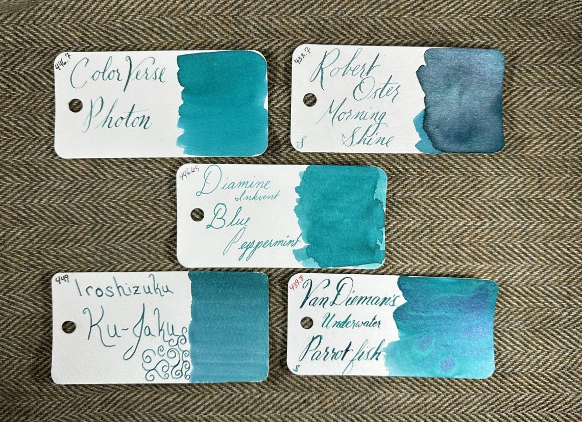
While I’ve been working on the yoke of my new sweater (Dovetail by Quinn Reverendo) I’ve been pondering what color inks would fit into this gemstone palette:

What do you think?

Giveaway Winner: Yenderings Pen Roll

Thanks to all of you who commented on the Giveaway Post telling me about your go to pen cases! I too have cases from Nock and Rickshaw and they accompany me to many a pen show. This Yenderings case is something really special though, and I wish I had one of these. This one, however, is going to Margret:

Congratulations Margret – I hope you love it!

Pen Rests: PenQT Pen Rest from Penquisition

Pen Rests: PenQT Pen Rest from Penquisition

I love that people in the pen community keep finding their own unique ways to add to the community.  Penquisition created the new PenQT Pen Rests ($4 each plus shipping). the 3D printed pen rest is modeled after the Penquisition logo (nib with question mark) and are available in a dizzying array of colors. These pen rests are small and lightweight but provide just enough resistance to keep pens from rolling off the desk or behind your computer (which is where my Apple Pencil and/or Wacom Pen ends up with frightening frequency). I relocate my pen rest to the kitchen table, lap desk or office as neded as it slips easily into my bag or carrying case. I look so profesh!

PenQT Pen Rests from Penquisition

They even made me a custom logo version just because they could. I’m sure they’d be open to suggestions or ideas for other shapes as well.


DISCLAIMER: The items included in this review were provided free of charge by Penquisition for the purpose of review. Please see the About page for more details.

Pencil Review: Non-Photo Blue Pencils

Pencil Review: Non-Photo Blue Pencils

Review by Tina Koyama

Back in the day, graphic designers and printers used “non-photo blue” pencils. Certain shades of blue that could not be detected by camera film (or copy machines), so rough drawing lines or notations could be left on the art and would not appear in the final form. Modern scanners can see that blue, so non-photo blue pencils are not effective in the same way anymore. However, image-editing software can be used to manipulate the contrast or hue of the blue so that it can be made invisible digitally. Non-photo blue pencils still have life – but in a different way. (I’m not digitally geeky enough to explain further than that – heck, I still use Photoshop Elements to edit my images! – so I hope Ana will correct me as needed.)

Editor’s Note: You can scan an image that has non-photo blue pencil along with black pen and ink using the RGB mode. Then open the image in an image editing application like Photoshop and go to the “channels” palette. The blue channel will show your black lines and not your pencil marks but the red and green channel will not. You can select that channel,  make a layer, and fill with that data only. For a visual demo, check out this video.

I’ve never worked in graphic design or printing, and I don’t use sophisticated image-editing apps, so I had no practical use for non-photo blue pencils. Coincidentally, two people I am currently studying with both recommend the non-photo blue pencil, so I was tickled that this old-school tool has yet more life – this time in an analog way.

My first influence is cartoonist Lynda Barry, whose how-to books I have been voraciously devouring of late. (I don’t think cartooning is my bag, but I have been wanting to develop my imaginary drawing skills, and I love her approach to teaching.) She specifically recommends the Staedtler non-photo blue pencil.

The second influence is an instructor at Gage Academy, Kathleen Moore, whose subject area is about as different from Barry’s as you can get: drawing and painting nature. I’ve taken several classes from her, and in the current one using colored pencils, she, too, recommends a non-photo blue pencil.

Both artists use a blue pencil for lightly sketching the initial line drawing before inking (in Barry’s case) or using colored pencils (in Moore’s case). Their reasons are similar: While not invisible to modern cameras, non-photo blue lines are so subtle and pale that they tend to magically blend and disappear once the final medium is applied. In addition, lightly applied pale blue pencil is easily erased. Moore demonstrated another practical reason: If an initial drawing is made with graphite, almost all of it must be carefully erased before applying colored pencil. If any large particles of graphite remain, they could smudge, muddying the colors. 

With two respected teachers telling me I should get a non-photo blue pencil, I had no hesitation. In addition to Barry’s favorite Staedtler ($3.50), I also picked up a Prismacolor Col-Erase ($1.10), a contemporary Prismacolor Verithin ($1.10), and a Caran d’Ache Sketcher ($5.95). In my own vintage collection, I had an old Eagle Verithin, so I added that to the lineup. Although any light blue hue would probably work for this purpose, I stayed with ones that had “non-photo blue” (or “copy not NP blue,” in the case of the Col-Erase) in their names, just to simplify the options.

non-photo blue pencils

First, I tested them on my Col-o-Ring Oversize pad, which is slightly toothy. Erasing tests were done with a Tombow Mono Zero and a standard gray kneadable eraser. The second (scanned) image shows the differences a bit better, since they are all quite pale.

tests on Col-o-Ring

 Col-o-Ring tests scanned

Next, I tested them on a sheet of Strathmore Bristol Smooth paper, which has a very smooth surface.

tests on Bristol

 Bristol tests scanned

The Col-Erase is the palest and hardest, followed closely by the contemporary and vintage Verithins. Not surprisingly, the Caran d’Ache is the softest, which is true of most Caran d’Ache colored pencils. What did surprise me was the Staedtler, which was the softest after the Caran d’Ache. Most Staedtler graphite pencils are quite a bit harder than other pencils of corresponding grades, so I was expecting this one to be on the hard side, too. All erased easily and cleanly on both types of paper, especially with the kneadable eraser.

If I were making a drawing in which it was important for the initial lines to disappear completely, I would choose one of the Verithins for being a good balance between paleness and visibility – at least to this artist. The Col-Erase is easily the palest, but I can barely see it! If I don’t mind the lines showing, I would choose the Staedtler or the Caran d’Ache, since they are easier to see (and I generally prefer using a softer pencil).

For Mother’s Day, I felt like honoring my mom’s memory by making a drawing based on a photo that was taken in the late 1930s around the time that she and my father were married. I made the initial drawing with the Staedtler and remembered to scan it before I got too far with the final coloring with Prismacolors. I didn’t erase at all – most lines disappeared under my final coloring. In the small areas where the Staedtler lines are still visible, I could easily erase them, but I don’t mind their presence. Non-photo blue pencils for under-drawings are now a permanent part of my sketch kit.

7 - incomplete drawing with Staedtler lines visible

Incidentally, the drawing was done on Stonehenge Lenox Cotton. It was one of the papers in the Stonehenge Legion sample set I reviewed recently. I typically use Strathmore Bristol Smooth for colored pencil drawings, but I liked the Lenox Cotton sample so much that I bought a pad. Compared to Bristol, it has a light, fine tooth that takes colored pencil pigment beautifully.

completed drawing


tina-koyamaTina Koyama is an urban sketcher in Seattle. Her blog is Fueled by Clouds & Coffee, and you can follow her on Instagram as Miatagrrl.

Paper Review: Nanami Zen Paper

In a previous post, I reviewed the Cosmo Air Light (CAL) notebook from Musubi and compared it to the Tomoe River (TR) notebook (also from Musubi). I have included a few photos from those reviews in this post for review purposes. I’ve used the same pens with the same ink where I could, and all inks are the same for each test.

One of my favorite Tomoe River retailers has long been Nanami Paper. The online store offers a focused inventory that includes notebooks, loose-leaf paper, paper pads, and some paper accessories. With supply issues of Tomoe River paper during pandemic lockdowns, the staff looked for other paper sources; this search has recently led to an introduction of Zen paper.

I obtained a small sample of Zen paper from Nanami – each sample sheet seems to be 1/3 of a sheet of A5 paper from a notebook. Nanami states on their site that their Studio notebooks using Zen paper will soon be available and I assume from this sample that A5 will be one option.

The ruling on my sample is a 4mm grid of light gray lines – each line is a dotted line which helps it fade into the background.

Below is my first test of Zen paper. The dry time for Robert Oster Ocean here was just a tad over 30 seconds. Cosmo Air Light paper clocked in at 35 seconds for the same. TR timed 43 seconds.

You can see above how the bright pattern behind the paper shows slightly. Below is the reverse side of the page (with other paper behind to block the bright tropical fruits.

The top of the TR paper below is using the same Robert Oster Ocean ink. Shading is about the same for both options but the haloing of the ink is more pronounced on the Zen paper. By haloing I am referring to the way each letter looks outlined by a slightly darker color.

With the same ink on CAL paper, I saw no haloing but much more shading.

I used the same 6 inks on the rest of the testing. Bungubox Sweet Love Pink ink shows very bright on Zen paper, but with no real sheen. Athena Eternal Blue sheens bright pink on CAL and Tomoe River and sheens a muted pink on Zen. Sailor Manyo Haha shades dramatically on the Zen paper, more so than on CAL or TR, but the purple and green colors did not show on this test. Sparkle from Robert Oster Rose Gold Antiqua was best on the Zen paper – both more visible and richer color. Pen Saijiki would only show sheen when I layered on lots of ink.

You can see below that ink did start showing through the page, but only when multiple layers of ink were applied.

My last test used Robert Oster Antelope Canyon which shades amazingly on CAL paper. On Zen paper, the result was pleasant shading but not dramatic. The shading was similar to the results from TR paper.

Below is the message on Nanami’s homepage regarding the new Zen paper. I don’t know how long this will be offered, but I am certain all handwritten letters would be appreciated!


NOTICE: The Studio Note is almost here! We expect it to arrive in early June. It is made of a new paper we found which is very similar to Tomoe River paper. We are calling it “ZEN” paper. It is 52 gsm and about the same color white as the “white” Tomoe River. If you’d like to try a sample sheet, as well as a sheet of the “New” Tomoe River, please send a self-addressed stamped envelope to:

Nanami Paper
Att: Samples by Mail
P.O. Box 17422
Irvine, California 92623-7422


    If possible, please use a typewriter or fountain pen in your letter to us. There’s no special reason, other than I love to see stuff like that!
    ___________________________________________________________________

DISCLAIMER: All of the items included in this review were purchased by me or were provided for free when I sent a self-addressed, stamped envelope to Nanami Paper and is available to anyone who does the same. Please see the About page for more details.

Link Love: Tomoe on our Minds

Link Love: Tomoe on our Minds

There were lots of posts this week about alternatives to the beloved Tomoe River paper. The pen community has made it its mission to find good alternatives and spread the news when they find it. Have you been seeking an alternative or settled on one you really like?

For random interesting bits, the kottke.org Quick Links can’t be beat. There’s a smattering of news snippets, pop culture anecdotes, and the occasional Lego or animal-interest link.

Pens:

Ink:

Notebooks & Paper:

Art & Creativity:

Other Interesting Things:

We need each other. Please support our sponsors and affiliates. Your patronage will let them know you appreciate their support of the pen community. Without them, and without you, we could not continue to do what we do. Thank you!