12 Days of Inkmas: Day 6 Pen BBS 398 Morning Ink

12 Days of Inkmas: Day 6 Pen BBS 398 Morning Ink

I am not sure what the general consensus is in the pen community about Pen BBS ink but it is in my TOP FIVE brands. I freaking LOVE Pen BBS ink. Their colors are wonderful, I’ve had no issues with staining or clogging, they make far and away THE BEST shimmer inks and their ink prices are the best. Pen BBS large hexagonal 60ml bottles with the embossed caps are really unique. If you haven’t added any Pen BBS inks to your collection yet, what are you waiting for?

All that to say, if you’ve been reading this blog for any time you’ll know that green is my favorite color (see the header above) so I’m always looking for the perfect green ink. Not too light, not too bright, not too dark. Finding the perfect green has been the most challenging ink to find.

Pen BBS does make one of my favorite greens thus far, No. 224 Tolstoy. It matches my Ranga Bamboo pen perfectly and the two have become an inseparably pair. For everyday use, Tolstoy is a little darker than my dream green so my hunt has continued. Pen BBS No. 398 Morning Ink (15ml bottle for $8) was my next foray into citrus greens. It’s a much brighter green. Why it’s “Morning Ink” I can’t fathom. No. 398 is a brighter, lighter citrus-y green with lots of shading though.

In writing, there are points where the shading is a little too light for my liking however. If I were to use a more cream or ivory colored paper stock, I think I’d lose the writing altogether.

On Tomoe River 68gsm, Morning Ink looks a tiny bit lighter than on our standard Rhodia testing paper.

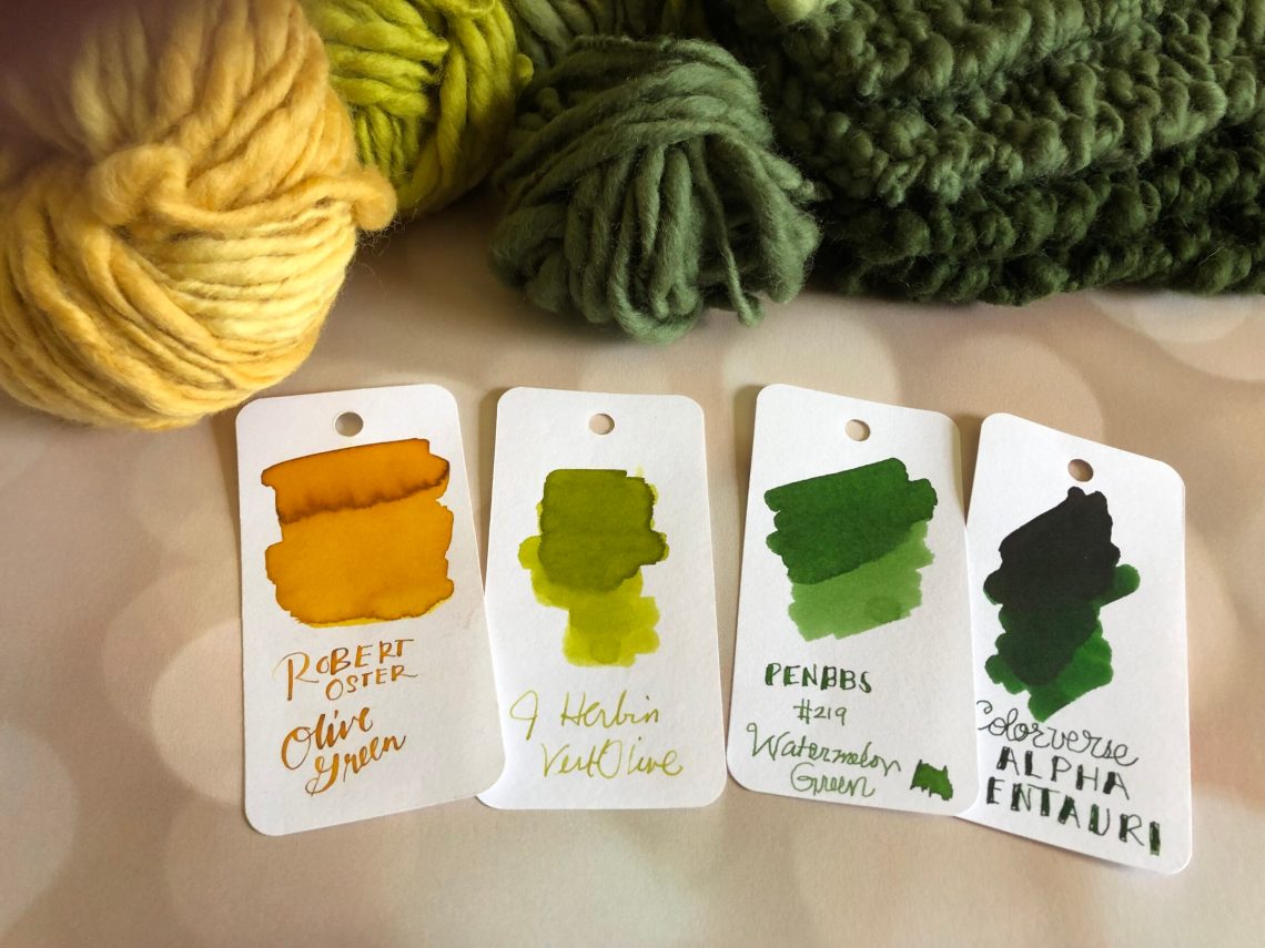
When compared to some of the myriad of other citrus green inks in my stash (a term stolen from my knitting posse), you’ll see I have several that are quite similar.

When spread out, it’s a little easier to see the subtle differences in the inks. Pen BBS No. 159 Bitter Herb is another citrus green ink that I really like from Pen BBS. It’s a bit darker than No. 398 Morning Ink which is a little more festive. Pen BBS No. 398 is probably closest in color to Diamine Light Green. Robert Oster Australis Tea is a little muddier version of a very similar color.

I think Pen BBS No. 398 is a fun, citrus green but not my “grail green”.

Do you have a color that you are always on the hunt for the perfect ink to match? The color of your childhood roller skates? The color of your grandmother’s wallpaper? The color of the flowers in your wedding bouquet?  Have you found it yet?


Tools:

12 Days of Inkmas: Day 5 Diamine Earl Grey

Diamine Earl Grey (30ml for $7.50) is probably my favorite grey ink. Anyone present at last week’s Patreon-only meet-up wouldn’t believe me because I unceremoniously spilled the entirety of the bottle off my desk onto the floor. Trust me when I say I was doing my tired floors a favor. The floors now have a lovely Jackson Pollock-spattered treatment to them that at least give them character which is more than they had before. At least it was a good ink color!

Diamine Earl Grey is similar to Sailor Jentle Chu-Shu in that both these inks are a cool, purply grey though Earl Grey is ever so slightly darker. What I would give if Diamine would scent Earl Grey with a little bergamot so it actually smelled like a delicious cup of tea!

I confess that, in writing, Earl Grey is cooler grey than what actual Earl Grey tea looks like but I will forgive Diamine their creative liberties because this ink is such a lovely grey color. Is it too much to ask for Diamine, a UK-based ink company, to actually mix an ink that looks like English Breaky, Builder’s Brew or Darjeeling? Embrace your Englishness, Diamine, give us your pinky’s-up most-tea-ish tea colors! Please?!?!

Regardless of the lack of genuine tea-like color, Earl Grey is still a favorite, even after it stained my hands for three days. The ink has a great range of shading from deep grey to pale lavender. No sheening though.

On both Rhodia and Tomoe River paper, Earl Grey gives a full range of shading, dries in a reasonable amount of time. Diamine Earl Grey is a more cost effective option than Sailor Chu-Shu and available in the smaller 30ml bottles as well as the massive 80ml tankards that are still cheaper than the 50ml bottles from Sailor.


Tools:


12 Days of Inkmas: Day 4

12 Days of Inkmas: Day 4

Inkmas 2020 Header

Merry Inkmas! Keeping with our traditional celebration, we are sharing some of our favorite inks for 12 days. Today I’m showing off the first ink from the Diamine Inkvent calendar 2021, so if you are still waiting to open day 1, avert your eyes!

I’ve had so much fun opening up a small bottle of new ink every morning this month. The first day surprised me because it didn’t seem to be Christmas-related; instead I would call it celebration-related.

Seize the Night is a very dark purple ink with a bright gold sheen. The sheen is not overwhelming. It complements the purple beautifully and is only apparent in certain lights/angles.

Seize the Night is a perfect name for this ink – it reminds me of a cocktail dress with gold sequins or a dark night sky lit up with dazzling lights.

When viewed on Col-o-Ring paper straight on, Seize the Night looks incredibly dark with no sheen – perfectly acceptable for work-related writing. An off-purple ink.

But then the party side shows. When angled towards the light, the gold sheen shines.

The base color in Seize the Night is a match for Van Dieman’s Sweet Fig ink. It is also a close match to Bungubox’s Ink of the Witch.

Large droplets of Seize the Night almost glow. The above photo is on Cosmo Air Light paper. Below is the same amount of ink on Tomoe River paper – the sheen is a bit more subtle on TR paper.

The writing I show here is again on Cosmo Air Light paper with a fine cursive Italic nib. It’s not difficult to get sheen from normal writing.

I’ve already put Seize the Night on my list to purchase after Inkvent is done. I hope that it will be available! After the 2019 Inkvent calendar, Diamine offered full 50mL bottles of each ink for sale under their Blue Edition collection. Hopefully they will offer this year’s inks under a Red Edition collection!

DISCLAIMER: Some of the items included in this review were provided to us free of charge for the purpose of review. Please see the About page for more details.

Link Love: Peri-inkle?

This week was a very Peri-week. Every design-related blog I follow posted about Pantone’s 2022 color of the year: Very Peri. Or to the rest of us, periwinkle. After 2021’s bi-polar color selections of isolation mopey grey and hopeful pale yellow, Pantone suggests that 2022 will be a more vibrant year. I love color and I think Very Peri is a pretty lavender purple but I still think its a little ambitious to designate a color for a whole year. Look at 2019. Pantone chose rosy “Living Coral” and we were all more “Cheeto Orange” in our lockdown homes. While I appreciate the effort, I’m also a little amused. What’s your take?

Posts of the Week:

Pens:

Ink:

Pencils:

Notebooks & Paper:

Art & Creativity:

Other Interesting Things:


We need each other. Please support our sponsors and affiliates or join our Patreon. Without you, we could not continue to do what we do. Thank you!

12 Days of Inkmas: Day 3 Kobe Bauhaus Orange

12 Days of Inkmas: Day 3 Kobe Bauhaus Orange

Last year Jesi bought me a ginormous book (see pic below for scale) on the Bauhaus art movement and the matching Kobe Bauhaus Orange Ink. I’ve been hoarding the ink, as you do with limited edition ink that was given as a gift. But I thought I’d share this treasure with you. The ink came in a box printed with Bauhaus-style graphics and the label also has primary colors so associated with the Bauhaus movement.

very goofy photo of me with the ginormous Bauhaus book.

On Col-o-ring paper, Kobe Bauhaus Orange is a deep reddish orange with a noticeable sheen.

A close-up of a Col-o-dex card to show the golden sheen.

On old Tomoe River paper, in areas with heavy coverage, the golden-almost-greenish sheen is also apparent. When writing on Tomoe with a fine stub nib, there’s not a lot shading but as with all Sailor inks, the ink is smooth and feels almost creamy when writing.

On classic Rhodia paper, there is less evidence of sheen or shading but the color is clear and the ink keeps a crisp edge.

I think it’s been awhile since I loaded a pen with a classic Sailor ink and had forgotten what great performing inks they are — like writing with melted ice cream.

For ink comparisons, I was most interested to see how similar the Kobe Bauhaus Orange was to the classic Sailor Kin-Mokusei and the Oster Pen Addict Fire on Fire. Kobe Bauhaus Orange has more sheen than Fire on Fire and Bauhaus Orange is more reddish than both of the colors. The Monteverde Topaz was probably the closest in color though the Monteverde does not sheen like the Kobe.

The Vinta Silab from the Vintage Collection has gobs more sheen but it’s also much more red in hue. Montblanc Lucky Orange is quite close in color but does not have the same sheen.

Overall, if I were reaching for a “scare away the grey” orange ink, I would pick the Bauhaus Orange. The lubricated formula makes writing with the ink as pleasurable as the color itself.


Tools:

12 Days of Inkmas: Day 2 Van Dieman’s Styx Valley Forest Green

This year for Inkmas I decided to search out new-to-me ink brands in colors appropriate for the holiday season. The first of these is Van Dieman’s Styx Valley Forest Green (30mL for $12.95).

This rich, foresty green is a perfect winter holiday green. It reminds me of pines and holiday boughs on the mantle. The ink itself was lovely to work with, but the saturated ink blots took forever to dry – over 24 hours.

In terms of comparisons, I think it’s fairly close to Yoseka Origins #1. Colorverse Alpha Centauri is similar, but a bit more yellow in tone.


DISCLAIMER: Some of the items included in this review were provided to us free of charge for the purpose of review. Please see the About page for more details.

12 Days of Inkmas: Day 1 Colorverse Shiny Black & Ornament Yellow

12 Days of Inkmas: Day 1 Colorverse Shiny Black & Ornament Yellow

Welcome to The Well-Appointed Desk annual Inkmas. Inkmas was born before Inkvent calendars and other inky countdowns so we have decided to continue our tradition as it is — a mix of new inks and old favorites which may or may not have been reviewed here before (we’ve been know to review the same inks and products more than once — they are either that good or that ridiculous, you be the judge!) We hope you enjoy our countdown to the holidays and hopefully you’ll find an ink or two that you hadn’t seen and absolutely must add to your holiday shopping list.

As our annual Inkmas approached, I made a trip down to my office and took a quick glance over my ink collection with one thing in mind: What we’re the inks that had gone unused or that I had overlooked in the last year that deserved some love?

Two inks immediately jumped out to me for an obvious reason. I had purchased full bottles Colorverse Shiny Black and Ornament Yellow at the very end of 2020, and not only had they gone unused for all of 2021- they weren’t even opened!

In my mind, they made ideal candidates for an Inkmas review for a few additional reasons. Between the ink names and bottles (did you see those shiny silver trees though??) they are definitely rocking the holiday vibes. They also happen to be the colors of my alma mater- which rose to the number one basketball team in the land for the first time in history this week (and yes, they lost the very next game but in these times shouldn’t we take every opportunity we have to celebrate?).

And finally, yellow and black are two colors that I tend to overlook when I’m both buying ink and inking up pens. There’s a piece of me that tends to think yellows will be unreadable and blacks will be boring. Time to give these two inks a chance to prove my assumptions wrong.

Colorverse Shiny Black is a true jet black ink with silver shimmer, while Colorverse Ornament Yellow is a golden yellow ink with a pinkish shimmer and a bit of sheen.

In writing, Shiny Black continues to be- well- shiny! The silver shimmer distributes evenly throughout nearly every letter. It’s hard to capture fully in a photo- but wow this ink really sparkles in the light!

The shimmer of Ornament Yellow gives the ink a pink or almost rose gold tint especially in areas where the ink pools. The additional color almost gives the ink the illusion of shading- and makes the yellow very readable. One assumption de-bunked, and one to go.

Did I really say black inks are boring? The amount of character that was evident with all these black inks side-by-side really surprised me, and made me want to ink one up ASAP. Looking at Shiny Black specifically, the silver shimmer makes it a unique addition to my collection.

The yellow hues also have some really unique and complex characteristics. Comparing Ornament Yellow to a few of the other yellows and golds that I own- the yellow color is similar to others, but it is again the unique color of the shimmer that sets it apart. The shimmer is a little more subtle than the shiny black, but i think I’m a big fan of the rose gold color.

Overall, I re-discovered an anything-but-boring -black and a very readable yellow with impressive rose-gold highlights. Im glad I revisited these! What inks have gone under-the-radar for you this year that might be worth looking at again?