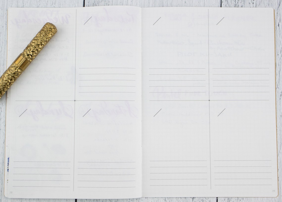
I cannot believe that someone hadn’t thought of doing this sooner but Yoseka created the Yoseka Labs Two-Month Weekly Planner sampler ($9.50) and it is genius. (There’s your TL:DR. Go buy it now.)


In a lovely B6-sized (12.5cm x 17.6cm / 4.9in x 6.9in) cahier-style notebook with 68gsm Tomoe River paper are an assortment of differnt weekly page layouts to try. Most weekly styles include two weeks of the layouts but a couple just have one week to try. There are also a couple options for monthly overview pages as well to test out. Honestly, Yoseka, you had me at B6.
The monthly spreads include a month-on-two-pages (classic monthly view calendar), Vertical Gantt (based on Bushimen’s PAL), and Horizontal Gantt (based on Art Print Japan’s Visualife Planner). The Gantt style calendars blow my mind a little but find them useful for Habit Tracking. It’s definitely a different style.


The weekly spreads include:
- Vertical Schedule
- Horizontal + Memo
- Vertical + Memo
- Horizontal Quadrant
- Vertical Quadrant (Divided)
- Vertical Quadrant (Memo)


Of the weekly layouts, the horizontal + memo and vertical + memo are my favorites. I don’t use my planner for time keeping as much as task lists and logging activities from what and where I ate to activities I did and media I consumed. I like bbeing able to got back through the year and see what movies were watched, books were read and which podcasts were keeping my attention during different moments in the year.

Yoseka, then included a printed sheet with a chart of which planners they sell that feature each of the different styles of layouts as well as the sizes available. It’s a great cheat sheet for finding which planner aligns with your favorite layout at a glance. So efficient!

Since the notebook is undated, you can try all these different layouts right now and still have tie to find your perfect planner for 2024. With a full 10 weeks of weekly planner pages, that’s enough to get you almost to the end of the calendar year too.
I think, depending on feedback from customers, Yoseka should offer some of the most popular options as full undated planners. The size is great, the paper is great. Honestly, blank B6 Tomoe River cahiers would be amazing to offer too! Please!!!
DISCLAIMER: Some items included in this review were purchased with funds from our amazing Patrons. You can help support this blog by joining our Patreon. Please see the About page for more details.


I found this on their site , prior to reading your article…as I had set out to make a matrix much like theirs, lol. Painstakingly researching planner types…I found this and was so relieved. I wrote them immediately as it is simply genius! I cannot wait to get mine. I must say, it’s already made me think of so many ways to use it, with the burden of laying out pages removed, that I also had thought it’d be great to use these year round :). Fabulous when people in the stationary-community go all-out super-niche!! Much applause coming from my tiny corner in New England, I assure!!
And yes…I concur….B6 Tomoe River Cahiers!!!