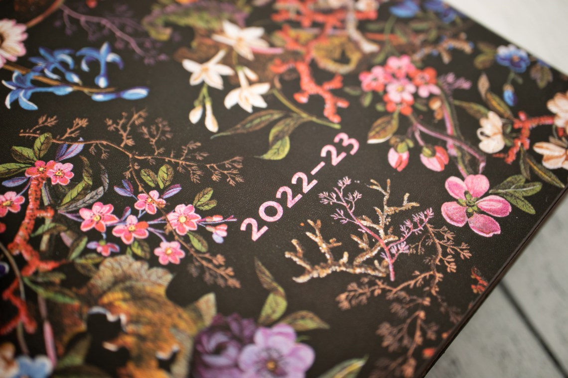
I grabbed a copy of the Paperblanks Midi Planner ($6.88 on sale, $22.95 USD/$24.95CAD at full price) recently when I was ordering even more of the heavyweight paper Midi notebooks which have become my go-to notebook these days. I wanted to give the thinner 80gsm paper Paperblanks make another chance and the sale price made it hard to resist. The design is called the Floralia and it is so riveting. The matte black cover features a beautiful print of flowers and some shimmer and sparkle accents on the flowers. As the light catches the art on the cover, the flowers look like they are popping off the cover.

The cover is a soft flexi with two ribbon bookmarks (sealed so they don’t fray!) and the Midi size is B6-ish at 4.75″ x 6.75″. B6 is 4.9 x 6.9 in (12.5 x 17.6 cm) so the Midi-sized notebooks will fit into any B6-sized notebook cover (another bonus for me since my daily carry notebook cover is B6).
Before the monthly calendars is a two-page year-at-a-glance spread with 2022 and 2023 and a key for the symbols used through the planner which include the first day of spring, first day of autumn, the moon phases and when daylight savings starts/ends (though it was not accurate to the US. Paperblanks is a Canadian company).

I bought the “horizontal no closure” version of the planner, which is essentially a standard week-on-two-pages design with a month-on-a-page in the front. The edition I got was an 18-month version that started in July 2022. The 80gsm paper means the book is not overly bulky and the 18-month model would be great for anyone who is in academia or who might be looking for a planner switch-up mid-year. The paper is acid-free, sustainable forest paper.
In the back of the planner are:
- international holidays for dozens of countries
- year-at-a-glance calendars for 2024 and 2025
- international dialing codes (so retro!!)
- some time zone clocks
- clothing conversion size charts
- quick glance measurement conversions for imperial to metric
- travel planning and important dates page
- 14 notes pages, lined
- 14 pages for address keeping

The paper is a creamy ivory color and has a slight tooth to it. In my usability test, I wasn’t expecting the paper to be fountain pen friendly because its so lightweight but I often grab whatever pen is handy to write in my planner so I want paper to be at least tolerant of fountain pens. There was a bit of showthrough on the reverse of the page but its not terrible and I think the ink I have been using is particularly wet and inclined to bleed.

I have started adding some daily events and notes. I know not everyone loves lines in the notebooks but for some reason, I don’t mind the lines in the Paperblanks planners. There is a slightly wider line between each day making a clean delineation between all the lines.

When you look at the reverse of the weekly page, the olive ink had some show through but the purple ink (I am pretty sure that’s Monteverde Birthday Cake in a Sailor ProGear with a H-MF nib) did not show through at all.

I used the notes pages to do some pen testing. I really like when planners work well with a lot of different kinds of pens because I just never know when I need to jot down an event. I might have been sketching and had a pencil in hand or I just grab a gel pen out of the cup on my table. The Paperblanks 80gsm paper really isn’t terrible. There is minor show through but very little bleed through. For a thin non-Japanese paper, its beyond acceptable. I would compare it to Leuchtturm 1917 for being a good all-around paper. If you are inclined to use super broad, juicy fountain pens, these 80gsm notebooks from Paperblanks might not be for you.
But if you, like me, has a rainbow of felt tip, gel, rollerball, pencils AND fountain pens, these planners might be a good option. And at the clearance prices, it could be worth giving them a try.


I realize that I am a bit biased about Paperblanks but I think they don’t get a lot of props from the pen community and the books are really good quality. No, they are not Hobonichi, Tomoe River or Midori MD paper but they are better than so many other options at reasonable prices (even when they are not on sale).
DISCLAIMER: Some items included in this review were provided free of charge for the purpose of review. Some items were purchased with funds from our amazing Patrons. You can help support this blog by joining our Patreon. Please see the About page for more details.


Very nice!
Typeface is Martin Majoor’s Scala Sans
Of course! Thanks for identifying it.