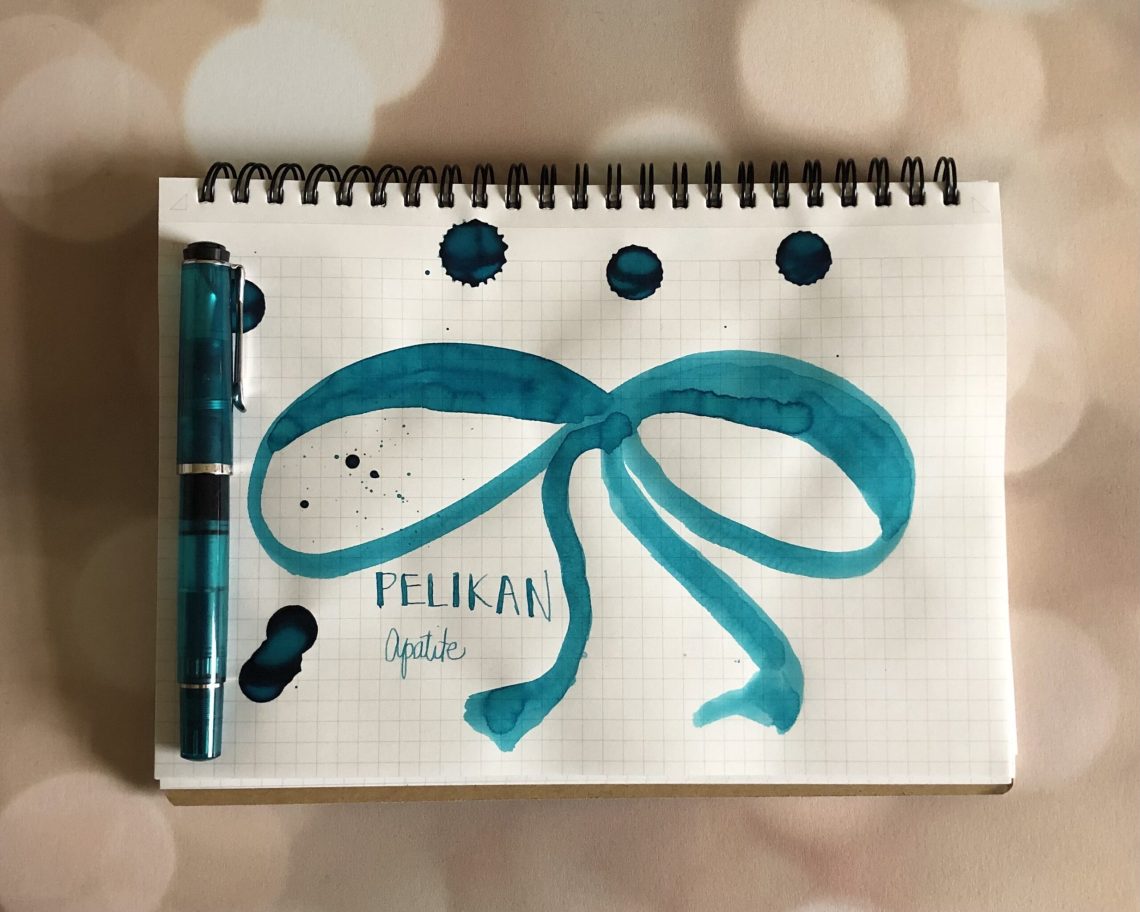
Just last week I reviewed my new Pelikan M205 Apatite, so of course I had to check out the matching ink. As you know, each year I audition inks for addressing my holiday cards. My family and my husband’s family celebrate different religions, so the challenge is always to find something that’s festive and fun, but not too tied to any particular holiday. This year I wondered if Apatite was the answer?


Apatite is a turquoise blue, which leans towards blue-green, as does the gemstone apatite. This is one of my favorite colors, so it stands to reason that I have TONS of shades very similar to it in my inky stash. I immediately thought it was a good match for Sheaffer Green, and in certain lights it is. To be honest, I think the photo below is a bit skewed (my camera can’t do blues sometimes!) because I think Apatite leans more green, but in the photo it looks super close to Robert Oster Torquay.

I think I’m going to give it a go this year!

- Paper: Maruman Mnemosyne N182A Inspiration Notebook A5
- Pen: Delike Glass Signature Pen ($37.80)
- Swatches: Col-o-Ring Ink Testing Book ($10) and Col-o-Dex Rotary Cards ($15)
- Inks: Pelikan Edelstein Apatite (50mL for $35)

Very pretty! Is it different enough from Edelstein Aquamarine to make it worthwhile having both in the ink drawer?
Sadly I don’t have Aquamarine to compare. I googled and found this one though: https://www.fountainpennetwork.com/forum/topic/367005-quick-comparison-pelikan-edelstein-apatite-vs-other-edelstein-blues/