Usually by now I’m knee deep in inks that match the Pantone color of the year, but I admit that this year I’m a little meh on the ink options. I do love grays, but a few years ago for Inktober I did a “31 Shades of Gray” theme and got all my grays in. And yellows? Well yellows don’t seem terribly practical to me because often they don’t translate well to every-day writing.
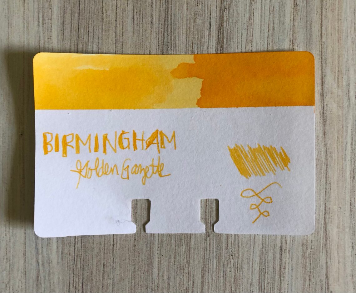
However, since it’s my schtick, I’m leaning in and here we go. Today I decided to try Birmingham Pen Company’s Golden Gazette (30mL for $11). Golden Gazette is kind of an egg yolk yellow – that orangey-yellow that makes me think of days full of sunshine.


This one is somewhat of a shader – the darker it gets the more orange it leans. I’m not sure this one is really practical for every-day writing because while you can definitely see it, I think a full page of writing in a narrow nib probably wouldn’t be super easy to read.


I really don’t have much in the way of yellows in my collection. You can see the closest one is the Pen BBS #111 which I probably would have called a light orange. The only true lemony yellow that matches the Pantone color of the year would be the Ban Mi Yellow. The remainder of my yellows are more gold – Robert Oster Honey Bee and Olive Green (which doesn’t really remind me of green olives at all?). Clearly this is a hole in my collection, but again I’m not sure how practical it is to fill this one.

Golden Gazette is one of Birmingham’s Swift inks which are designed to start easily, write wet and function in a variety of pens. This one was a wet writer, but it dried fairly quickly and I didn’t have any trouble with it at all.
Are there yellows you would like to see me review this year? Let me know about your favorites or ones you’d like to see in the comments!
- Paper: Crossfield Journal ($24.00)
- Pen: Delike Glass Signature Pen ($37.80)
- Swatches: Col-o-Ring Ink Testing Book ($10) and Col-o-Dex Rotary Cards ($15)
- Inks:Birmingham Pen Company’s Golden Gazette (30mL for $11)
DISCLAIMER: Some of the items included in this review were provided to us free of charge for the purpose of review. Please see the About page for more details.

Laura,
I'm not a fan of yellows, either; as you say, they can be hard to read. But Pure Pens Pendine Sands (https://www.purepens.co.uk/collections/pure-pens/products/pure-pens-ink-pendine-sands) isn't bad.Why does everyone get so involved with the Pantone colours of the year? They're usually not all that interesting.
Ruth