Van Dieman’s ink seems to be everywhere lately. By that, I mean there are LOTS of Van Dieman’s inks. The newest line up – Harvest – has 16 harvest themed ink colors that are perfect for a fall palette.
With so many inks, I’ll get right down to the photos instead of chatting too much! A couple notes about the overall colors – the inks are all great for fountain pens and are very easy to clean out. They are also not waterproof at all as a general rule. There were two exceptions in this group – Golden Nugget Pumpkin was legible after water was applied and wiped off and Beeswax became lighter with water but was actually water resistant. I have heard that Van Dieman’s inks are sometimes used in watercolor style paintings. Let us know if you have seen any!
First, the Yellows:

Van Dieman’s Beeswax is slightly darker in writing than Montblanc Lucky Pig or Robert Oster Sunrise Yellow.

Van Dieman’s Apple Cider is close to Robert Oster Olive Green in the swatch but slightly more orange in writing.

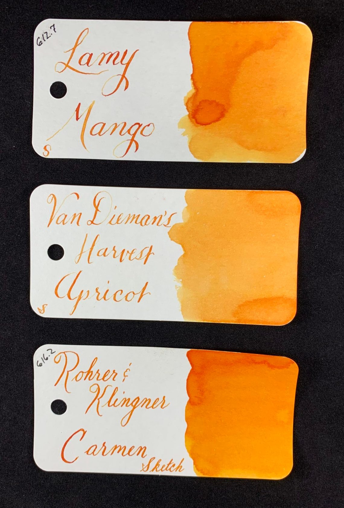
It was hard to find a close match to Van Dieman’s Apricot. It seems closest to the lighter portions of Lamy Mango.

In writing, Van Dieman’s Peanut Brittle is very close to Noodler’s Golden Brown.

Next up are the Reds and Oranges:

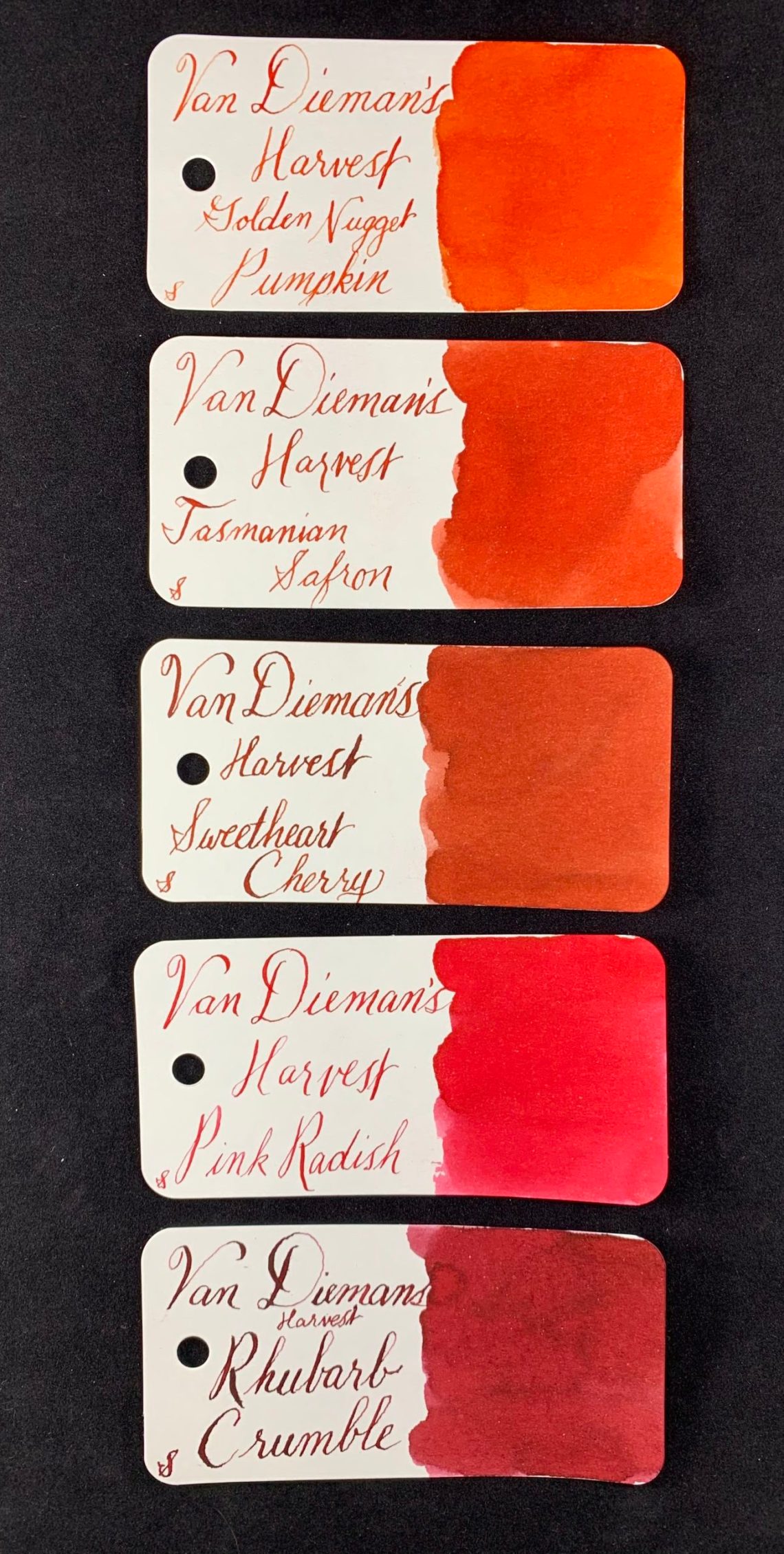
Van Dieman’s Golden Nugget Pumpkin is almost identical to Montblanc Lucky Orange although it looks a bit dustier.

Tasmanian Safron (yes, I checked the spelling) was hard to match exactly. Slightly more red than Monteverde Ruby.

Callifolio Aurora is a bit lighter and a tad more orange than Van Dieman’s Sweetheart Cherry.

Van Dieman’s Pink Radish is a darker version of Ferris Wheel Press Pink Eraser.

Monteverde Mercury Noir is only a touch more red than Van Dieman’s Rhubarb Crumble.

Now the best section, the Purples:

I was pleasantly surprised to find that Van Dieman’s Beetroot Relish (great name) is quite close to Pelikan Edelstein Amethyst although with a bit more blue. But considering how hard it is to find Amethyst, I think Beetroot Relish is a great alternative.

Robert Oster Berry d’Arche is a lighter form of Van Dieman’s Blackberry Jam.

Van Dieman’s Tasmanian Lavender is absolutely my favorite color of the Harvest line. My full bottle of it arrived last week. In writing it is a bit darker than Kobe #57 an Ferris Wheel Press Little Robina but it keeps the same lovely color.

Van Dieman’s Eggplant is a great match to Kobe #32.

Finally, the Greens and Brown:

Van Dieman’s Zucchini is a good match for Monteverde Jade Noir and also shows a hint of sheen.

Van Dieman’s Wasabi is a wonderful bright green and a bit more yellow than both Kaweco Palm Green and Diamine Apple Glory.

Van Dieman’s Nutmeg is one color that I couldn’t find a close match. Pilot Iroshizuku Tsukushi comes close but is darker and contains a bit more red.

It was tough to fit all of the swatches in my light box at the same time, but here they are!

- Swatch Cards: Col-o-ring cards (100 for $10)
- Ink: Van Dieman’s Harvest Inks ($12.95 for 30mL)
DISCLAIMER: The inks in this review were purchased by me although the Col-o-rings were provided to me by Ana because she knows she can keep me writing all the time in exchange for the wonderful cards. Please see the About page for more details.


That was a great review of those inks, Jessica. Thank you. I didn’t know about those.
This is the review for which I have been waiting. I have a few bottles of Van Dieman’s, and I like them very much.
How close is the Peanut Brittle to Van Dieman’s Leatherwood Honey Amber Ink?
Ruth
Thank you so much for this. This is the third time just today I’ve seen interesting samples from this company when I hadn’t really had them on my radar. Guess I need to wade on in and take a closer look and bring my credit card.
I found it interesting that your writing using Van Dieman’s Apricot is so readable. In my own usage, the ink is too light to read comfortably. The high contrast between the shading and light areas also didn’t help readability.
There are examples of paintings done using Van Dieman’s ink on their instagram account https://www.instagram.com/vandiemansink/