Review by Tina Koyama
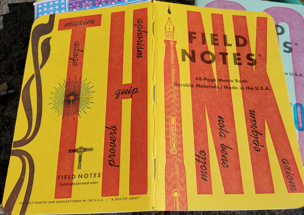
Popular pocket-notebook maker Field Notes Brand got together with 10 indie letterpress shops across the country, and the result is United States of Letterpress (three 48-page notebooks for $12.95). The limited-edition run is the 48th edition in the company’s series of quarterly notebook releases.


Each of three packs includes cover designs by three letterpresses. Each shop received a different cover stock to use, and the nine pastel colors make a cheerful and uplifting palette. Since some shops produced more than one cover design, the edition features a total of 16 colorful cover designs printed in red and blue (I love how the transparent inks appear green or orange in some applications).


In addition, the flysheets describing the series and the shop that produced each cover were printed by a 10th letterpress, Skylab Letterpress of Kansas City. It’s the only letterpress shop that contributed to every single book in the 40,000-pack edition.


Yet another press preprinted Field Notes’ standard cover elements and inner pages’ graph ruling. All told, US of Letterpress must be the most logistically complex edition produced by Field Notes. It’s also one of my favorites.
With direction given only on the ink colors to use, the shops were apparently given free rein to design the covers. The result is a wide variety of timely and socially conscious messages about empathy, community, citizenship, and the art of letterpress itself.


My favorite cover was designed by Springtide Press of Tacoma, Washington, just 40 miles down I-5 from me. I bet it’s a favorite of many other Desk readers, too.

The inside back cover of each notebook, which includes the standard colophon and practical applications (most of which must be letterpress in-jokes that I don’t get), has a unique feature: Instead of the usual 5-inch ruler, there’s a typography pica ruler. This sort of charming touch is one reason I keep buying and using Field Notes.

Final Impressions
Oh, I was going to end there, but I almost forgot that this is a review, so I should say something about the paper quality, shouldn’t I? The innards are 60-pound, bright white Finch Opaque Smooth, which seems to be one of Field Notes’ regular choices. It’s ideal for pencil, ballpoint, and gel pens. Fine nib fountain pen users might get away with it also; broad nibs not so much.
Long ago, I quit whining about Field Notes papers not being friendly to fountain pens or watercolors (though I do use both on some editions containing more tolerant papers). The stationery and art supply markets offer plenty of small notebooks and sketchbooks that would accommodate those media. I use Field Notes because the 12-year-old Chicago company continues to embrace challenges such as collaborating with 10 independent letterpress shops to bring out a unique, complicated edition. Not many pocket notebook makers can say that.
Field Notes always produces a short video to promote each quarterly edition. This one is especially terrific – it’s a 12-minute mini-documentary about independent American letterpresses. (Don’t miss Ana’s name in the credits)!
 Tina Koyama is an urban sketcher in Seattle. Her blog is Fueled by Clouds & Coffee, and you can follow her on Instagram as Miatagrrl.

1 comment / Add your comment below