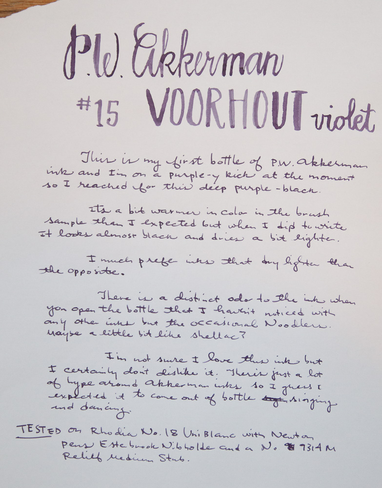
I was so excited to be able to choose a bottle of P.W. Akkerman ink at the Vanness table at the Atlanta Pen Show. For the past year, Akkerman has been “the ink” to acquire. And Vanness is the only place to get the ink in the US. So being able to peruse the quickly depleting stock at the pen show and seeing the ink sample swabs in person was a dream come true. I only purchased one bottle because (1) its pricey stuff ($30/bottle), (2) many of the colors had already sold out before I found the Vanness table and (3) I couldn’t make a sound decision to save my life. I really need to make a spreadsheet of all the inks and colors I have so I know what colors I have.
One of the most striking features of Akkerman is the extremely unique bottle. Its a very tall bottle with a long slender neck. Inside the neck is a ball that allows it to block the flow of ink back into the larger bottle reservoir. So, to ink up a pen, you tip the bottle slowly upside down and then right it so that the neck area fills with ink. This should be a very effective way to get the most mileage out of the bottle without a lot of trouble. And it looks really cool!
I’ve been on a bit of a purple/black kick recently so I picked up a bottle of the Akkerman#15 Voorhout Violet.

Voorhout Violet is definitely a purple/black color. In my swashy brush testing, there’s a nice array of dusty purply tones and a distinctly warm undertone. When writing however, the ink appears almost black and then lightens a little as it dries for that more of the purple tones show through, particularly with a wider nib. There’s a bit of shading but because the ink is so dark, its pretty subtle.
The ink behaved well and dried in a reasonable amount of time. I write my samples at a standard writing pace to test “real world” usage and I use Rhodia paper which can slow drying time a bit. But overall the performance was very good.
Oh, I forgot to mention the noticeable “lacquer” odor when I opened the bottle. It wasn’t a noxious smell but it was notable in that there was a smell. Most of my inks don’t have a noticeable smell, the exception being Noodler’s inks which have a similar odor to the Akkerman. Once I dipped my pen and closed the bottle, I no longer noticed the odor but I wanted to note it.

When compared with my growing arsenal of purple/black inks, the Akkerman is not notably distinct to the other colors I have. Private Reserve Ebony Purple is very similar. In writing, I’m not sure I’d be able to distinguish one from the other. Kaweco Summer Purple is also quite similar in color. And both the Kaweco and Private Reserve inks are considerably cheaper.
I’ll continue to use this ink and try it in an assortment of different pens and under more diverse writing conditions so I may feel differently about this ink in a few months. Right now though, I’m sort of “hmmm” about this color.
That said, I think the Akkerman inks are a good array of colors and worth the investment for the unique bottle alone. I will be trying more Akkerman inks in some of the more popular colors like #5 Shocking Blue and #24 Zuiderpark Blauw-Groen. I’m also itching to try the wildly yellow-green #28 Hofkwartier Green. I could always use more green ink, right?
Check out Ed Jelley’s review of Voorhout Violet for a different perspective.

I’d buy it for the bottle alone but the ink speaks just as loudly. Now I want it!
Can I ask? And I hope it makes sense: the Akkerman ink in your swab testing looks drier than the other ink samples you have up for comparison….notice the edges of the colour? Is there any reason for that to occur as an ink? Or am I looking into it too much….I wish you had had more of a chance to pick a more preferable ink! Thank you.
The swab looked different around the edges because, for the Akkerman, I used a paint brush for the swab and all the others I used a Q-Tip. I didn’t think about it until after I had done the review that the swab technique was not consistent. I do not think the Akkerman ink was drier than the others in writing. I’ll probably redo the swab for my records just to keep it all consistent.
These bottles with a marble in their ‘neck’ were first introduced in The Netherlands by a company called Gimborn. I love the design too. It is by a well known glass designer called A.C. Copier. See: http://www.overdiep.nl/ink/inkhomenl.html . Numbers: NL35, NL36 and NL37.