What is behind these simple black boxes? They hide the latest editions of the Field Notes Colors subscriptions. I love the packaging for these. They are gusseted black envelopes that hold three Field Notes with a wide flap on the back. I will definitely be reusing the packaging to store Field Notes.

I absolutely love the grey printing on the inside of the packaging. Its a subtle line drawing of an open notebook and the initials “FN” like a wallpaper pattern. Its probably my favorite thing about this edition.

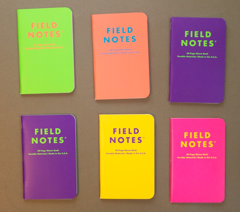
Inside the black wrapping is an assortment of glowing neon colored books. Six different colored covers and six different colored lettering which corresponds with the inside color (which is a reverse of the cover color combination). I received two sets of books and two purple covers and no blue covers.

Inside is the reverse color on the cover and the divisive reticle grid on the classic Finch paper. I haven’t actually used any of the Field Notes with the reticle grid so I don’t have an opinion about it yet. I like the looks but I don’t know if it would be distracting to write on.
Overall, I was tickled at how well-considered the Unexposed edition is. The dark packaging reminds me of the way that graphic arts colored paper is (or was) stored to protect it from sun damage. I like the surprise of opening the dark packaging and finding a rainbow of practically glow-in-the-dark books* inside. I’m not sure the reticle grid was a perfect match for these books but its a novel approach and straddles the overwhelming preferences for either lined or grid fairly well.
The best think about Field Notes editions is looking forward to what the team will come up with next. I like this collection and its such a mash-up that I don’t think I’ll mind using the books. I may have a stronger opinion about the reticle grid by the time the next edition is published since I’ll probably use these soon.

One last thing I meant to share ages ago… one Field Notes business card that I picked up when I visited the Field Notes HQ (AKA Coudal Partners) back in July. I love that it lokos like a teeny tiny Field Notes book and now would really like the next Field Notes Color Edition to be wee-sized Field Notes. A business card is 2″x3.5″ and for a quick grocery list or to jot down a phone number, it would be a perfect size. Who’s with me?
(Sorry about some of the blurry images on this… photographing the colors absolutely vibrated.)
*That’s an idea! Glow-in-the-dark grid or lines on a Field Notes book for late-night note taking. Field Notes folks? Are you listening?
